Data visualization
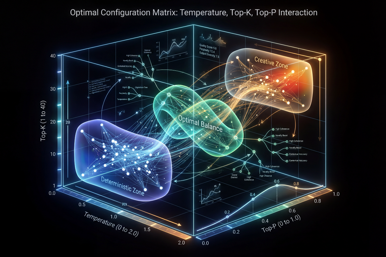
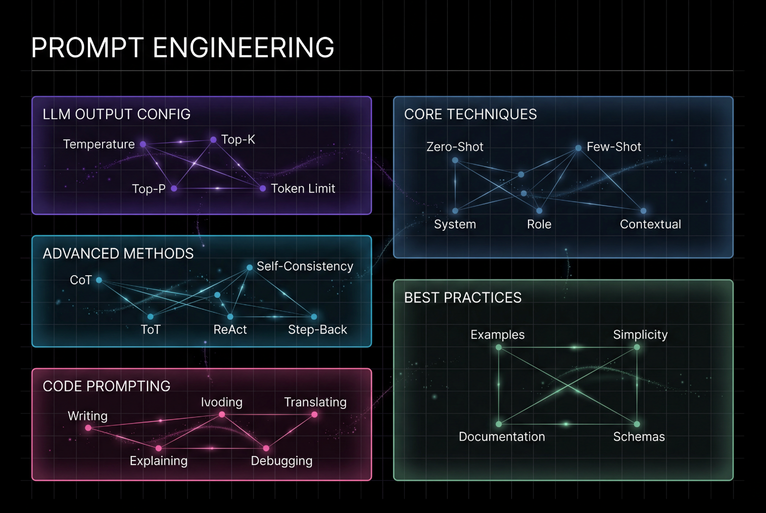
Transform raw data concepts into stunning, professional visualizations. Craft complex data flows, networks, or matrices with a hyper-refined Dataism aesthetic, ensuring clarity and impact without clutter.


คำแนะนำ
Professional technical infographic on pure black background (#000000) with subtle fine grid overlay (32px intervals, #333333 at 20% opacity). Main title "[YOUR TITLE IN UPPERCASE]" in 72pt bold white uppercase sans-serif at top center.
LAYOUT: Asymmetric multi-module layout - [specify: 2 left + 2 right / 2 left + 2 right + 1 bottom spanning / custom arrangement]
[MODULE 1] - [Position: TOP-LEFT/CENTER-LEFT] ([width]% width) - [Color] border ([HEX], 3px stroke, 16px radius):
Header "[MODULE TITLE]" in 28pt bold white uppercase, positioned top-left with 24px padding.
Content: [Choose visualization type]:
- Network diagram: [X] nodes (8px white circles with [color] glow) in [pattern: mesh/hub-spoke/sequential] layout
Node labels: "[Label 1]", "[Label 2]", "[Label 3]" (18pt white)
Connection lines: 1.5px width, 40% opacity, [color]
- Flow diagram: [X] sequential boxes/arrows showing process flow
Box style: rounded rectangle (12px radius), semi-transparent (#1A1A1A at 50%)
Arrows: 40px length, 2px stroke, [color]
- Gradient bar/scale: horizontal/vertical bar showing spectrum
Gradient: [color 1] → [color 2] → [color 3]
Markers: labeled points at key values
- Funnel/pyramid: narrowing visualization showing filtering/hierarchy
- Curve/chart: data visualization with labeled axes
- Grid arrangement: organized layout of [X] elements
Annotations: "[descriptive text]" (14pt white at 70% opacity)
Particle effects: 2-4px dots scattered within module
[MODULE 2] - [Position] ([width]% width) - [Color] border ([HEX], 3px stroke, 16px radius):
Header "[MODULE TITLE]" in 28pt bold white uppercase.
Content: [specify visualization and elements as above]
[MODULE 3] - [Position] ([width]% width) - [Color] border ([HEX], 3px stroke, 16px radius):
Header "[MODULE TITLE]" in 28pt bold white uppercase.
Content: [specify visualization and elements as above]
[MODULE 4] - [Position] ([width]% width) - [Color] border ([HEX], 3px stroke, 16px radius):
Header "[MODULE TITLE]" in 28pt bold white uppercase.
Content: [specify visualization and elements as above]
[OPTIONAL: BOTTOM SPANNING MODULE] - ([width]% width) - [Color/Gradient] border ([HEX], 3px stroke, 16px radius):
Header "[MODULE TITLE]" in 28pt bold white uppercase.
Content: [typically used for synthesis/summary/warnings/interactions]
VISUAL CONSISTENCY STANDARDS:
- Module borders: 3px stroke, 16px radius, inner glow (4px blur, 60% opacity, color-matched)
- Internal boxes: 8-12px radius, semi-transparent background (#1A1A1A at 50-60% opacity)
- Node circles: 8px diameter, white fill, colored inner glow matching module border
- Connection lines: 1.5px width, 40% opacity, color matching module
- Arrows: 40px length, 2px stroke, color matching module
- Module internal padding: 24px on all sides
- Element vertical spacing: 16px between components
- Icons (if needed): 24×24px minimal line-style
- Particle effects: 2-4px scattered dots for atmosphere
TYPOGRAPHY HIERARCHY:
- Main title: 72pt bold white (#FFFFFF) uppercase sans-serif
- Module headers: 28pt bold white uppercase sans-serif, top-left position with 24px padding
- Primary labels (nodes, key terms): 18pt regular white sans-serif
- Secondary descriptive text: 14pt regular white at 70% opacity sans-serif
- Tertiary annotations: 12pt regular white at 60% opacity sans-serif
- All text must maintain consistent font family throughout
COLOR PALETTE - SEMANTIC ASSIGNMENTS:
- Purple/Magenta (#9D4EDD, #C77DFF, #FF6B9D): Configuration, settings, foundational concepts
- Cyan/Blue (#00D9FF, #00B4D8, #0096C7): Core techniques, primary methods, processes
- Teal/Cyan-Green (#00B4D8, #0891B2): Advanced methods, specialized techniques
- Green (#52B788, #40916C): Best practices, recommendations, outcomes
- Red (#FF6B6B, #DC2626): Warnings, errors, negative states, cautions
- White (#FFFFFF): All text content
- Black (#000000): Pure background
- Grid (#333333 at 20% opacity): Background overlay
GLOW EFFECTS - STRICTLY CONTROLLED:
- Inner glow ONLY: 4px blur radius, 60% opacity, color matching module border
- Applied to: module borders, node circles, key connection lines, emphasis elements
- NO outer glow, NO excessive blur, NO bloom effects, NO light pollution
VISUAL ELEMENTS LIBRARY:
- Network connections: thin lines (1.5px) connecting nodes, 40% opacity, creating relationships
- Particle effects: small dots (2-4px) scattered within modules for technical atmosphere
- Flow arrows: directional indicators, 40px length, 2px stroke, showing process/sequence
- Gradient bars/scales: showing spectrum or progression with labeled markers
- Funnel/pyramid diagrams: showing filtering, hierarchy, or focus
- Curve/chart visualizations: data representations with labeled axes and clear markers
- Grid arrangements: organized layouts of multiple related elements
- Icon indicators: minimal 24×24px line-style icons for conceptual clarity
- Semi-transparent boxes: #1A1A1A at 50-60% opacity for nested content
DATAISM AESTHETIC PRINCIPLES:
- Hyper-refined quantified visual language
- Information architecture with clear hierarchical grouping
- Network thinking showing relationships between concepts
- Technical precision balanced with educational clarity
- Modular design principle with systematic measurement
- Minimal ornamentation, maximum information density
- Asymmetric but balanced composition
- Grid-based alignment for structural integrity
PROHIBITION LIST - STRICTLY ENFORCED:
- NO decorative text labels beyond functional information needs
- NO visible font specifications in image (no "72pt", "px" shown)
- NO technical code syntax visible (no "rgba()", hex codes displayed)
- NO ornamental flourishes or artistic embellishments
- NO text-heavy paragraphs (use concise labels only)
- NO inconsistent text sizing (follow specified hierarchy strictly)
- NO simple binary left-right layouts (use modular/asymmetric compositions)
- NO excessive blur/glow that obscures readability
- NO elements smaller than 12pt for text or 6px for visual elements
- NO reliance on color alone (supplement with labels and structure)
COMPOSITION REQUIREMENTS:
- Asymmetric modular composition with visual balance
- Clear visual hierarchy: title → module headers → content labels → annotations
- Strategic negative space between modules for breathing room
- 16:9 aspect ratio (1920×1080px recommended)
- Landscape orientation
- Grid-based alignment for all elements (32px grid system)
- Consistent margins and inter-module spacing
- Modules should not touch edges or each other
ACCESSIBILITY CONSIDERATIONS:
- High contrast ratio: minimum 7:1 between text and background
- Clear readable typography at specified sizes (no smaller than 12pt)
- Color coding supplemented by text labels and structural differentiation
- Sufficient spacing between interactive/distinct elements (minimum 16px)
- Information conveyed through multiple channels (color + text + structure)
OUTPUT SPECIFICATIONS:
- 16:9 landscape aspect ratio
- High resolution for clarity
- Pure black background with grid overlay
- Professional technical aesthetic
- Educational and presentation-ready quality
Agent