رسم يدوي نابض بالحياة للمحترفين الشباب
التعليمات
Based on selected material, generates slides. Ask user how many pages they want then proceed. 1. Visual Philosophy & Mood
The core philosophy is "De-institutionalization." It deliberately shuns the sterile perfection of smooth vector lines and generic stock imagery in favor of an honest, warm, and tactile aesthetic reminiscent of a startup’s culture or an independent indie magazine (Zine). It strikes a sophisticated balance: injecting humanistic care into professional productivity.
Keywords: Humanistic, Approachable, Artistic, Energetic, Imperfectly Authentic.
2. Color System & Materiality
The deck utilizes a high-contrast tri-color system.
Base: Off-white / Ivory — Softer than pure white, providing a paper-like texture.
Primary: Muted Yellow — Large blocks of color symbolize sunlight, energy, and focus.
Accent: Vibrant Pink — Used for granular details (lightbulbs, arrows, checkmarks) to guide the visual center of gravity.
Outline: Charcoal Black — A "soft" black with the grainy texture of a hand-drawn brush.
Materiality: Mimics the effect of marker pens on paper, featuring slight color "bleeding" and intentional white gaps to create "breathing room."
3. Layout Logic & Grid
Asymmetric Dynamic Balance.
Split Structure: Typically features a bold text headline on one side balanced by a large-scale character illustration on the other.
Negative Space: Significant use of white space; it doesn't feel compelled to fill every corner, ensuring the core message pops.
Alignment: Primarily left-aligned or centered with a loose, airy arrangement that mimics a poster layout rather than a traditional corporate presentation.
4. Typography Personality
Headline: A Display Handwritten Font with serif tendencies. The varying stroke thickness gives it a rustic, woodcut, or stamped feel, adding a sense of raw power to the screen.
Body: A modern, minimalist neutral Sans-serif (e.g., Montserrat or Open Sans). It provides a rational, legible anchor against the more emotional, illustrative background.
5. Graphic Elements & Language
Illustrative Language: Bold Outlines with slightly exaggerated human proportions (larger hands/feet). Facial expressions are hyper-simplified (minimalist line-drawn smiles).
Metaphorical Symbols: Minimalist icons (Lightbulb = Idea, Envelope = Communication, Gear = Mechanism) are brought to life through the Vibrant Pink accent.
Line Quality: Trembling, unclosed lines that convey the visual excitement of "spontaneous creation."
6. Visual Hierarchy & Depth
Flat Design 2.0: Zero shadows and zero gradients. Depth is achieved entirely through the layering of solid color blocks and outlines to separate foreground from background.
Visual Guiding: Uses pink "arrows" or "underlines" as signposts to create a clear "reading trajectory."
Characters as Anchors: Every slide features human action (drinking coffee, high-fiving, discussing), which serves to ground abstract concepts in reality.
7. Scenarios & Industry Alignment
Perfectly suited for AI tech firms, creative studios, mental health platforms, ESG education, or workplace culture transformations. It aligns seamlessly with the "Humanistic Texture" of brand building—positioning a company as empathetic, warm, and decidedly "un-corporate."
الوصف
موصى بها من قبل
nene@YouMind
لماذا نحب هذه المهارة
حوّل عروضك التقديمية بجمالية رسم يدوي فريدة تتحرر من الرتابة المؤسسية. تولد هذه المهارة شرائح Slides نابضة بالحياة وإنسانية، مثالية للشركات الناشئة، والاستوديوهات الإبداعية، أو أي علامة تجارية تسعى لمظهر أصيل وجذاب. أضف طابعًا مميزًا لمحتواك باستخدام تخطيطات ديناميكية ولوحة ألوان مذهلة لجذب جمهورك وجعل رسالتك تبرز حقًا.
اصنع شرائح Slides بلمسة إنسانية أصيلة، تمزج بين الذوق الفني والإنتاجية المهنية لتحقيق تأثير لا يُنسى.
مهارات ذات صلة
عرض الكل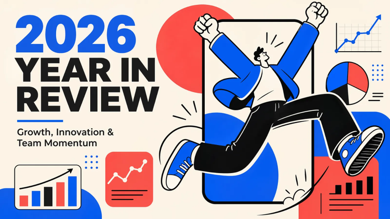 شرائح
شرائحمراجعة الأداء
روايات نابضة بالحياة ومركزة على الإنسان. اصنع عروضاً تقديمية جذابة برسومات جريئة ورؤى واضحة، مثالية لصناعات التكنولوجيا والإبداع سريعة النمو.
 شرائح
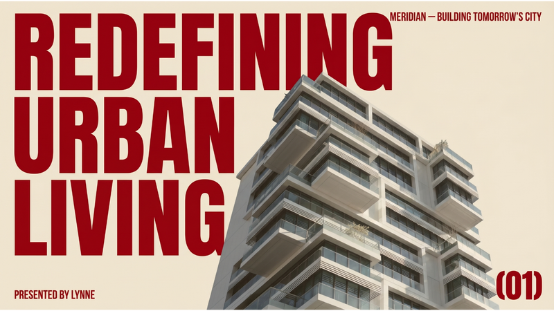
شرائحعرض تقديمي احترافي حديث
تقدم هذه المهارة عرض تقديم تجاري (pitch deck) كامل بتصميم تحريري حديث ومميز. وهي مثالية لرواد الأعمال والشركات الناشئة والمحترفين الذين يرغبون في تقديم أفكارهم بهوية بصرية راقية ومؤثرة تبرز عن العروض التقليدية. تقوم المهارة بتصميم كل Slide بحيث يثير الإحساس بمجلة معمارية فاخرة أو تحرير أزياء، باستخدام خلفية بيج دافئة وخط كبير بلون أحمر داكن. تستخدم تخطيطات غير متماثلة قوية، ومساحات بيضاء واسعة، ومجموعات صور تحريرية منتقاة بعناية. يمكنك تحديد موضوع العرض، اسم الشركة، المقدم، الشعار، والعدد المطلوب من الـ Slides، وستقوم المهارة بإنشاء جميع المواد البصرية اللازمة، بما في ذلك صور احترافية منزوعة التشبع تكمل التصميم العام. يركز العرض الناتج على الوضوح والأثر البصري، مما يضمن توصيل رسالتك الأساسية بسلطة. المخرجات النهائية هي عرض متماسك بصريًا حيث تشعر كل Slide وكأنها ملصق مصمم بشكل فريد، مما يجعل عرضك لا يُنسى ويجذب الانتباه.
تأثير الطباعة الفوقية ثنائي اللون
اصنع عروضًا تقديمية بأسلوب فني مميز مستوحى من تقنيات الطباعة الفوقية الكلاسيكية. تعمل هذه المهارة على تحويل محتواك إلى Slides جذابة بصريًا، مع التركيز على جمالية تحريرية مقيدة، باستخدام لوحات ألوان محدودة ومساحات بيضاء وفيرة. اختر من بين ثلاث لوحات ثنائية اللون: كوبالت وماجنتا الباردة لإحساس أوروبي كلاسيكي، أو القرمزي والأخضر الغابي الدافئين لاستحضار الطراز الأمريكي القديم، أو الأخضر الحكيم والوردي الساخن الجريئين بلمسة شرق آسيوية معاصرة. يتميز كل تصميم بخطوط طباعية فريدة، بما في ذلك عناوين خشبية خشنة ونصوص sans-serif نظيفة، مع تأثيرات نسيج الورق غير المطلي وعلامات تسجيل الحبر المرئية. ستنبض عروضك بالحياة مع رسوم توضيحية مفصلة على نمط النقش النحاسي، تكمل رسالتك دون إرباك. توازن المهارة بعناية بين النص والصور، لضمان سهولة القراءة والتأثير البصري من خلال تخطيطات غير متماثلة والتركيز على العناصر الأساسية. قدم Slides احترافية لا تُنسى، تتميز بمزيجها الفريد من سحر الطباعة التاريخي وحساسية التصميم الحديث.
رسم يدوي نابض بالحياة للمحترفين الشباب
التعليمات
Based on selected material, generates slides. Ask user how many pages they want then proceed. 1. Visual Philosophy & Mood
The core philosophy is "De-institutionalization." It deliberately shuns the sterile perfection of smooth vector lines and generic stock imagery in favor of an honest, warm, and tactile aesthetic reminiscent of a startup’s culture or an independent indie magazine (Zine). It strikes a sophisticated balance: injecting humanistic care into professional productivity.
Keywords: Humanistic, Approachable, Artistic, Energetic, Imperfectly Authentic.
2. Color System & Materiality
The deck utilizes a high-contrast tri-color system.
Base: Off-white / Ivory — Softer than pure white, providing a paper-like texture.
Primary: Muted Yellow — Large blocks of color symbolize sunlight, energy, and focus.
Accent: Vibrant Pink — Used for granular details (lightbulbs, arrows, checkmarks) to guide the visual center of gravity.
Outline: Charcoal Black — A "soft" black with the grainy texture of a hand-drawn brush.
Materiality: Mimics the effect of marker pens on paper, featuring slight color "bleeding" and intentional white gaps to create "breathing room."
3. Layout Logic & Grid
Asymmetric Dynamic Balance.
Split Structure: Typically features a bold text headline on one side balanced by a large-scale character illustration on the other.
Negative Space: Significant use of white space; it doesn't feel compelled to fill every corner, ensuring the core message pops.
Alignment: Primarily left-aligned or centered with a loose, airy arrangement that mimics a poster layout rather than a traditional corporate presentation.
4. Typography Personality
Headline: A Display Handwritten Font with serif tendencies. The varying stroke thickness gives it a rustic, woodcut, or stamped feel, adding a sense of raw power to the screen.
Body: A modern, minimalist neutral Sans-serif (e.g., Montserrat or Open Sans). It provides a rational, legible anchor against the more emotional, illustrative background.
5. Graphic Elements & Language
Illustrative Language: Bold Outlines with slightly exaggerated human proportions (larger hands/feet). Facial expressions are hyper-simplified (minimalist line-drawn smiles).
Metaphorical Symbols: Minimalist icons (Lightbulb = Idea, Envelope = Communication, Gear = Mechanism) are brought to life through the Vibrant Pink accent.
Line Quality: Trembling, unclosed lines that convey the visual excitement of "spontaneous creation."
6. Visual Hierarchy & Depth
Flat Design 2.0: Zero shadows and zero gradients. Depth is achieved entirely through the layering of solid color blocks and outlines to separate foreground from background.
Visual Guiding: Uses pink "arrows" or "underlines" as signposts to create a clear "reading trajectory."
Characters as Anchors: Every slide features human action (drinking coffee, high-fiving, discussing), which serves to ground abstract concepts in reality.
7. Scenarios & Industry Alignment
Perfectly suited for AI tech firms, creative studios, mental health platforms, ESG education, or workplace culture transformations. It aligns seamlessly with the "Humanistic Texture" of brand building—positioning a company as empathetic, warm, and decidedly "un-corporate."
الوصف
موصى بها من قبل
nene@YouMind
لماذا نحب هذه المهارة
حوّل عروضك التقديمية بجمالية رسم يدوي فريدة تتحرر من الرتابة المؤسسية. تولد هذه المهارة شرائح Slides نابضة بالحياة وإنسانية، مثالية للشركات الناشئة، والاستوديوهات الإبداعية، أو أي علامة تجارية تسعى لمظهر أصيل وجذاب. أضف طابعًا مميزًا لمحتواك باستخدام تخطيطات ديناميكية ولوحة ألوان مذهلة لجذب جمهورك وجعل رسالتك تبرز حقًا.
اصنع شرائح Slides بلمسة إنسانية أصيلة، تمزج بين الذوق الفني والإنتاجية المهنية لتحقيق تأثير لا يُنسى.
مهارات ذات صلة
عرض الكلشرائحمراجعة الأداء
روايات نابضة بالحياة ومركزة على الإنسان. اصنع عروضاً تقديمية جذابة برسومات جريئة ورؤى واضحة، مثالية لصناعات التكنولوجيا والإبداع سريعة النمو.
شرائحعرض تقديمي احترافي حديث
تقدم هذه المهارة عرض تقديم تجاري (pitch deck) كامل بتصميم تحريري حديث ومميز. وهي مثالية لرواد الأعمال والشركات الناشئة والمحترفين الذين يرغبون في تقديم أفكارهم بهوية بصرية راقية ومؤثرة تبرز عن العروض التقليدية. تقوم المهارة بتصميم كل Slide بحيث يثير الإحساس بمجلة معمارية فاخرة أو تحرير أزياء، باستخدام خلفية بيج دافئة وخط كبير بلون أحمر داكن. تستخدم تخطيطات غير متماثلة قوية، ومساحات بيضاء واسعة، ومجموعات صور تحريرية منتقاة بعناية. يمكنك تحديد موضوع العرض، اسم الشركة، المقدم، الشعار، والعدد المطلوب من الـ Slides، وستقوم المهارة بإنشاء جميع المواد البصرية اللازمة، بما في ذلك صور احترافية منزوعة التشبع تكمل التصميم العام. يركز العرض الناتج على الوضوح والأثر البصري، مما يضمن توصيل رسالتك الأساسية بسلطة. المخرجات النهائية هي عرض متماسك بصريًا حيث تشعر كل Slide وكأنها ملصق مصمم بشكل فريد، مما يجعل عرضك لا يُنسى ويجذب الانتباه.
تأثير الطباعة الفوقية ثنائي اللون
اصنع عروضًا تقديمية بأسلوب فني مميز مستوحى من تقنيات الطباعة الفوقية الكلاسيكية. تعمل هذه المهارة على تحويل محتواك إلى Slides جذابة بصريًا، مع التركيز على جمالية تحريرية مقيدة، باستخدام لوحات ألوان محدودة ومساحات بيضاء وفيرة. اختر من بين ثلاث لوحات ثنائية اللون: كوبالت وماجنتا الباردة لإحساس أوروبي كلاسيكي، أو القرمزي والأخضر الغابي الدافئين لاستحضار الطراز الأمريكي القديم، أو الأخضر الحكيم والوردي الساخن الجريئين بلمسة شرق آسيوية معاصرة. يتميز كل تصميم بخطوط طباعية فريدة، بما في ذلك عناوين خشبية خشنة ونصوص sans-serif نظيفة، مع تأثيرات نسيج الورق غير المطلي وعلامات تسجيل الحبر المرئية. ستنبض عروضك بالحياة مع رسوم توضيحية مفصلة على نمط النقش النحاسي، تكمل رسالتك دون إرباك. توازن المهارة بعناية بين النص والصور، لضمان سهولة القراءة والتأثير البصري من خلال تخطيطات غير متماثلة والتركيز على العناصر الأساسية. قدم Slides احترافية لا تُنسى، تتميز بمزيجها الفريد من سحر الطباعة التاريخي وحساسية التصميم الحديث.
اعثر على مهارتك المفضلة التالية
استكشف مزيدًا من مهارات الذكاء الاصطناعي المنتقاة للبحث والإبداع والعمل اليومي.