
Istruzione
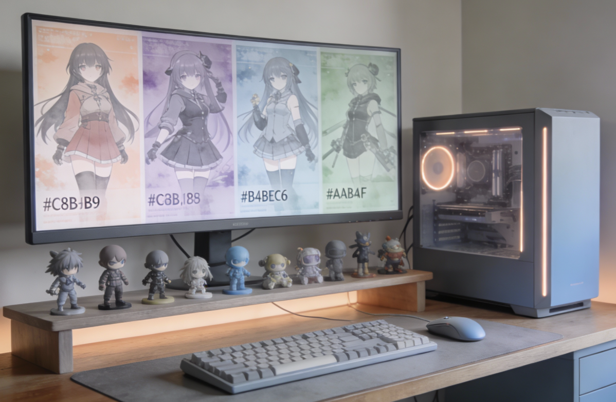
**Morandi Color Scheme** refers to a series of low-saturation, gray-toned, soft and muted color palettes inspired by the still-life paintings of Italian painter Giorgio Morandi. It does not refer to specific fixed colors, but rather a color philosophy: by mixing gray into pure hues, the colors become restrained, calm, elegant, and understated, creating a serene, sophisticated, and highly versatile visual effect. It is widely used in fashion, interior design, graphic design, and other fields.
#### Key Characteristics:
- **Low saturation + gray tone**: The biggest feature is the reduced color purity, with a soft layer of gray overlaid, making the colors non-aggressive and low-key.
- **Softness and tranquility**: Visually evokes calmness, comfort, and healing, with a premium and therapeutic feel.
#### Common Morandi Colors & Reference:
- Example paint codes (e.g., Dulux):
- Morandi Pink: 30YR 53/188
- Morandi Green: 90GY 55/051
- Morandi Gray: 17GG 40/107
- Descriptive color names (for reference only):
Hazy blue, muted bean green, smoky pink, grayish taupe, dried rose, sophisticated gray, indifferent camel, etc.
→ All these colors are created by adding gray or white to the original hue, toning down brightness.
- Example hex/RGB values (approximate, for reference):
- Grayish pink: RGB(200, 180, 185) / #C8B4B9
- Grayish blue: RGB(180, 190, 198) / #B4BEC6
- Grayish green: RGB(170, 180, 175) / #AAB4AF
- Grayish yellow/off-white: RGB(210, 200, 180) / #D2C8B4
#### Summary:
There is no single “universal” Morandi color chart. It is a family of colors sharing the same traits: low saturation and high grayness. When selecting, you need to find similar gray-toned matches within different color systems (Pantone, NCS, Dulux, etc.) according to the specific application.
- **Versatility**: Extremely easy to pair with other colors (especially within the same tone or with black/white), naturally creating depth and layering.
- **Essence of Morandi colors**: Restraint and balance — it tames bright colors into gentleness and gives subtle colors a rich texture. It is a color philosophy that instantly elevates taste and delivers comfortable, refined visual experiences.
#### Application Tips for “Morandi-ization” in Art/Design:
- For modern/minimalist objects: Keep clean lines and sharp angles; do not blur or soften edges.
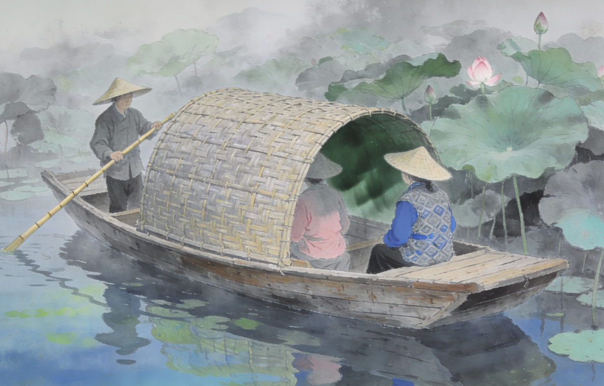
- For landscapes or figures: Slight blurring and visible brushstroke textures are allowed to enhance the painterly, dreamy Morandi atmosphere.
#### Color Usage Rules When Applying Morandi Style to an Image or Description:
- Total colors used: No more than 9, ideally 5–7.
- Identify the dominant/main color from the given image or text description.
- Randomly distribute accent/contrast colors and analogous (neighboring) colors around the main tone.
- Gradually reduce saturation and brightness in supporting colors so that the composition has a clear main color mood, while supporting colors enhance rather than overpower the overall Morandi atmosphere.
Agent