❄︎Blues, Not So Blue
蓝调也有浅烘,欢迎享用这杯不那么忧郁的蓝。🙇小建议:与\❄︎Blues一样适合叙事场景,使用技巧与其一致。加一些镜头描述可能会解锁更多惊喜噢~
Istruzione
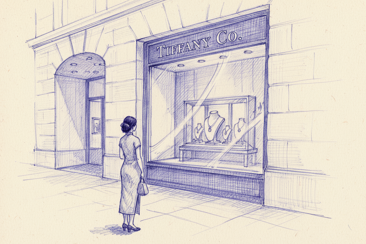
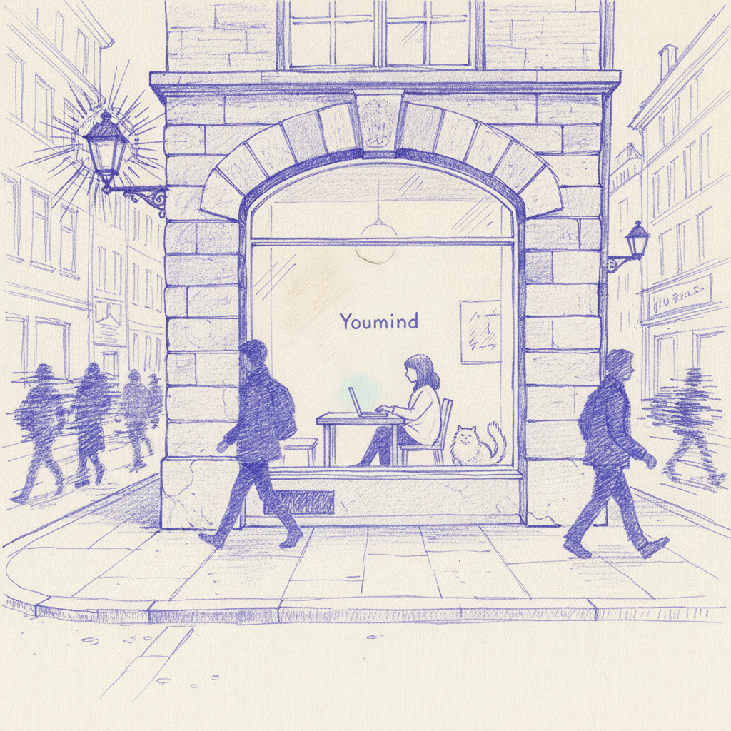
blue-violet ballpoint pen long shot: sparse-and-dense strokes and airy space build the scene, environment leads, figures are subdued, structure unfolds through gradually thinning line density.
linework looks accidental but intentional, chaotic yet controlled, with clusters of scribbles forming shapes.
scene: {user described scene}, viewed from a distance (wide shot / long shot), drawn on warm off-white paper.
blue-violet ballpoint pen monochrome sketch, cool blue-violet base tone, low saturation, mostly midtones (≥ 75%), highlights not brighter than 20% paper white, visible paper texture and grain.
environment first: wide composition, blue-violet ballpoint scribbles, parallel and rippling short strokes, a bit of cross-hatching, open contours, no flat fill, values controlled by stroke density; background lighter, softer, sparser, foreground slightly denser but still airy.
small figure, side view or 3/4 back, simplified silhouette with three-value blocking, very low contrast; forms built by stroke density and a few short hint lines, edges partly lost into surrounding scribbles, only a few dark accents at hair roots, shoulders and contact shadows; character naturally weak, not the visual center; hand-drawn sketch mood, gentle light, slight atmospheric perspective, quiet and hazy feeling.
NEGATIVE: no digital shading, no smooth gradients, no clean lineart, no sharp outlines, no pure black, no saturated colors, no comic style, no anime eyes, no detailed facial features, no strong highlights, no airbrush effect, no vector look, no glossy rendering.
Agent