Мінімалістична інфографіка
Мінімалістична інфографіка
Попередній перегляд
Опис
Перетворюйте будь-який складний контент на кришталево зрозумілі інфографіки. Дизайнуйте як професіонал, гарантуючи, що ваше повідомлення буде візуально спокійним, але потужно вражаючим, легко ведучи вашу аудиторію.
Рекомендовано
nene@YouMind
Чому нам подобається ця навичка
Створюйте приголомшливі мінімалістичні інфографіки, які роблять складну інформацію зрозумілою. Навичка чудово перетворює будь-яку тему на візуально стриманий, але впливовий дизайн для швидкого навчання аудиторії. Виділяйте ключові висновки одним акцентним кольором і чіткою ієрархією для легкого розуміння.
Інструкції
Розробіть **інфографіку**, щоб пояснити [Тему та зміст] [Цільовій аудиторії: наприклад, «менеджери-неспеціалісти / широка громадськість / молодші інженери»], відтворену в **чистому, чіткому, приємному та візуально спокійному** стилі.
### 1) Інформаційна структура та ієрархія (Акцент та ієрархія)
- **Вгорі:** **Головний заголовок** (одне речення, що підсумовує ключовий висновок), а потім **підзаголовок** (що вказує контекст, обсяг або дату).
- **Посередині:** Використовуйте **одне важливе число або висновок** як візуальний орієнтир (найбільший розмір шрифту / найбільший блок) — глядач має одразу зрозуміти, що найважливіше.
- **Внизу:** Розбийте вміст на **3–5 модулів** (кожен із підзаголовком + 2–3 маркованими пунктами, якомога коротше).
- Встановіть чітку ієрархію за допомогою **розміру шрифту / товщини / пробілів / позиціонування**: Заголовок > Ключовий висновок > Заголовки модуля > Основні пункти.
### 2) Масштаб і пропорції
- Блок ключового висновку має бути помітно більшим; інші модулі зменшуються за розміром залежно від важливості.
– Збалансуйте графіку та текст пропорційно — уникайте однакового розміру всіх елементів, що може призвести до «відсутності фокусної точки».
- Використовуйте систему сітки (наприклад, сітку з 12 колонками) з однаковим інтервалом між колонками для досягнення візуальної гармонії.
### 3) Контраст без зайвого
- Використовуйте лише **один висококонтрастний акцентний колір** для виділення «ключових висновків / критичних шляхів / міток у стилі заклику до дії»; всі інші кольори повинні бути низьконасиченими та м’яко нейтральними.
- Створюйте контраст через *різницю*, а не *гучність*: контраст розміру, контраст ваги, контраст цінності, контраст форми.
- Уникайте одночасної конкуренції кількох висококонтрастних елементів — це створює візуальний шум і хаос.
### 4) Повторення та візерунок
- Застосуйте єдиний стиль картки до всіх модулів: однаковий радіус межі, поля, стиль заголовка та обробка значків.
- Іконки повинні мати однакову ширину та стиль обведення (вибирайте або лінійний, або плоский, а не обидва варіанти); підтримувати однакове розташування в модулях (іконки повинні бути однаково зліва або зверху).
- Використовуйте повторення для встановлення порядку та зручності для сканування.
### 5) Баланс, вирівнювання та пробіли
- Залишайте достатньо пробілу — дайте інформації «дихати»; не заповнюйте кожен дюйм.
- Ретельно вирівнюйте: заголовки вирівнюйте по базовій лінії, картки вирівнюйте по краях, основний текст вирівнюйте по лівому краю та дотримуйтесь сітки по всій довжині.
- Збалансуйте візуальну вагу: поєднуйте важкі інформаційні блоки з легшими елементами (тонкі правила, приглушені анотації) для їх збалансування.
### 6) Рух та візуальний потік
- Організуйте контент за **зрозумілою траєкторією читання** — зверху вниз або зліва направо (наприклад, пронумеровані кроки 1→2→3, ледь помітні стрілки, прогресивне збільшення розміру).
- Ритм походить від *навмисного повторення та інтервалів*, а не від яскравих ефектів; направляйте око природно через композицію.
### 7) Типографіка та читабельність
- Обмеження до **максимум 2 стилів шрифтів** (або різної насиченості одного гарнітури); уникайте декоративних шрифтів.
- Основний текст має бути достатньо великим зі зручним міжрядковим інтервалом; кожен пункт має бути довжиною до 1,5 рядків (надавайте перевагу стислості).
- Якщо технічних термінів уникнути неможливо, додайте однорядкове пояснення або анотацію простою мовою.
### 8) Вихідні характеристики (відрегулюйте за потреби)
- **Полотно:** [Співвідношення сторін 16:9], Роздільна здатність: 1K
- **Стиль:** Сучасна мінімалістична, свіжа, легка, векторна естетика; ледь помітні або відсутні тіні; уникайте важких градієнтів та складних текстур.
- **Фон:** Однотонний колір або дуже світлий відтінок — ніколи не повинен конкурувати з контентом.
**Негативні обмеження:**
Без тісних макетів • Не більше 1 акцентного кольору • Без кількох висококонтрастних блоків, що борються за увагу • Без декоративних візерунків або шумових текстур • Не більше 2 шрифтів • Без однакової візуальної ваги в усіх модулях • Без перекосів.
**Тема та зміст:**
попросіть користувача надати інформацію, щоб ви могли проаналізувати
---
Вам не потрібно питати користувача про цільову аудиторію, мета цієї інфографіки — допомогти користувачеві швидко та якісно вивчити предмет.
Схожі навички
Переглянути всі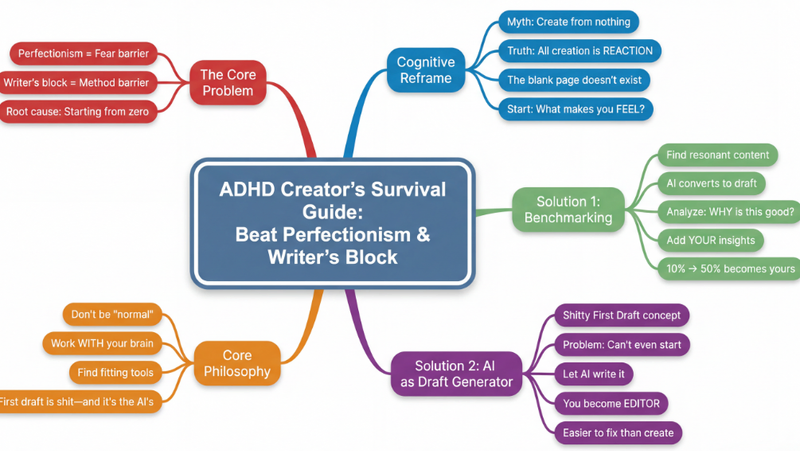 Дослідження
Інтелект-карта
Перетворюйте будь-який складний контент — статті, відео, PDF — на чіткі ієрархічні інтелект-карти. Миттєво візуалізуйте інформацію, схоплюйте ключові концепції та прискорюйте навчання без зусиль.
 Зображення
Квиток-інфографіка
Перетворіть ключові моменти на мінімалістичні картки у стилі квитків. Ідеально підходить для особистого брендингу, журналів змін, основних тез книг і списків «топ-5».
 Зображення
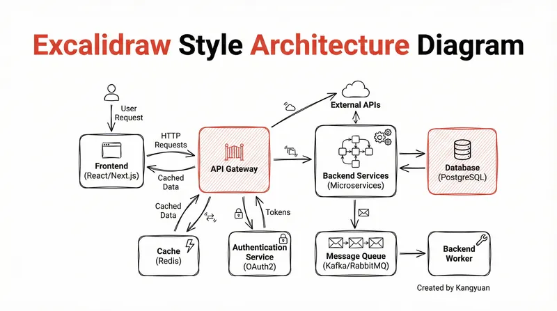
Діаграма в стилі Excalidraw
Перетворюйте складні системні дизайни на чіткі, намальовані від руки діаграми Excalidraw. Візуалізуйте свою архітектуру з мінімалістичною елегантністю, роблячи складні зв'язки миттєво зрозумілими та професійно представленими.
Інформація
- Версія
- v1
- Останнє оновлення
- Кредити за запуск
- За фактичним використанням
- Моделі
- Nano Banana Pro
