إنفوغرافيك بسيط
التعليمات
Design an **Infographic** to explain [Topic & Content] to [Target Audience: e.g., "non-specialist managers / general public / junior engineers"], rendered in a **clean, clear, pleasing, and visually quiet** style.
### 1) Information Structure & Hierarchy (Emphasis & Hierarchy)
- **Top:** A **main headline** (one sentence summarizing the key takeaway), followed by a **subheadline** (providing context, scope, or date).
- **Middle:** Feature **one critical number or conclusion** as the visual anchor (largest font size / largest block)—the viewer should instantly know what matters most.
- **Bottom:** Break content into **3–5 modules** (each with a sub-header + 2–3 bullet points, kept as short as possible).
- Establish clear hierarchy through **font size / weight / whitespace / positioning**: Headline > Key Conclusion > Module Headers > Body Points.
### 2) Scale & Proportion
- The key conclusion block should be noticeably larger; other modules decrease in size by importance.
- Balance graphics and text proportionally—avoid making all elements the same size, which creates "no focal point."
- Use a grid system (e.g., 12-column grid) with consistent spacing to achieve visual harmony.
### 3) Contrast Without Excess
- Use only **one high-contrast accent color** to highlight "key conclusions / critical paths / CTA-style labels"; keep all other colors low-saturation and softly neutral.
- Create contrast through *difference*, not *loudness*: size contrast, weight contrast, value contrast, shape contrast.
- Avoid multiple high-contrast elements competing simultaneously—this creates visual noise and chaos.
### 4) Repetition & Pattern
- Apply a unified card style across all modules: same border radius, margins, header styling, and icon treatment.
- Icons should share consistent stroke width and style (choose either line or flat, not both); maintain uniform layout within modules (icons consistently left or top).
- Use repetition to establish order and scannability.
### 5) Balance, Alignment & Whitespace
- Leave ample whitespace—let the information breathe; don't fill every inch.
- Align rigorously: baseline-align headlines, edge-align cards, left-align body text, and adhere to the grid throughout.
- Balance visual weight: pair heavy information blocks with lighter elements (thin rules, muted annotations) to counterbalance.
### 6) Movement & Visual Flow
- Organize content along a **clear reading path**—top-to-bottom or left-to-right (e.g., numbered steps 1→2→3, subtle arrows, progressive sizing).
- Rhythm comes from *intentional repetition and spacing*, not flashy effects; guide the eye naturally through the composition.
### 7) Typography & Readability
- Limit to **2 font styles max** (or different weights of a single typeface); avoid decorative fonts.
- Body text should be large enough with comfortable line spacing; keep each point to 1.5 lines or less (favor brevity).
- If technical terms are unavoidable, include a one-line plain-language explanation or annotation.
### 8) Output Specs (adjust as needed)
- **Canvas:** [Aspect ratio 16:9 ], Resolution: 1K
- **Style:** Modern minimalist, fresh, lightweight, vector-like aesthetic; subtle or no shadows; avoid heavy gradients and intricate textures.
- **Background:** Solid color or very light tint—should never compete with the content.
**Negative Constraints:**
No cramped layouts • No more than 1 accent color • No multiple high-contrast blocks fighting for attention • No decorative patterns or noise textures • No more than 2 typefaces • No equal visual weight across all modules • No misalignment.
**Topic & Content:**
ask user to provide so you can analyze
---
You don't need to ask user the target audience, the goal of this infographic is to help user to learn a subject fast and great.
الوصف
موصى بها من قبل
nene@YouMind
لماذا نحب هذه المهارة
اصنع إنفوجرافيك مبهرًا وبسيطًا يجعل المعلومات المعقدة مفهومة فورًا. تتفوق هذه المهارة في تلخيص أي موضوع إلى تصميم هادئ بصريًا لكنه مؤثر، مثالي لتثقيف الجمهور المستهدف بسرعة. أبرز النقاط الرئيسية بلون مميز واحد وتسلسل هرمي واضح، مما يضمن الفهم بسهولة.
حوّل أي محتوى معقد إلى إنفوغرافيك واضح للغاية. صمم كالمحترفين، لضمان أن تكون رسالتك هادئة بصريًا لكنها قوية التأثير، لتوجيه جمهورك بسهولة.
مهارات ذات صلة
عرض الكل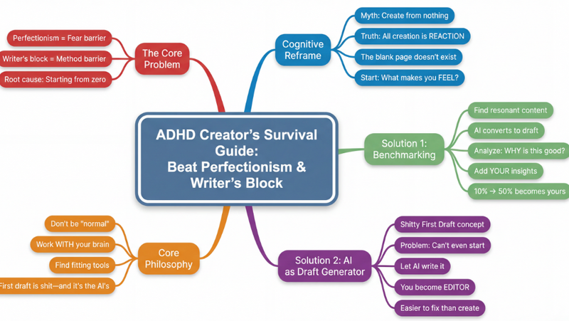 بحث
بحثخريطة ذهنية
حوّل أي محتوى معقد—مقالات، فيديوهات، ملفات PDF—إلى خرائط ذهنية هرمية واضحة كالبلور. تصور المعلومات فوراً، واستوعب المفاهيم الأساسية، وعزز تعلمك دون عناء.
 صور
صورإنفوجرافيك بأسلوب التذاكر
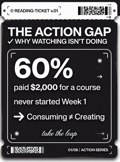
حوّل نقاطك الرئيسية إلى بطاقات بسيطة على نمط التذاكر. مثالية للعلامة التجارية الشخصية، سجلات التغيير، خلاصات الكتب، وقوائم 'أفضل 5'.
 صور
صوررسم تخطيطي بأسلوب Excalidraw
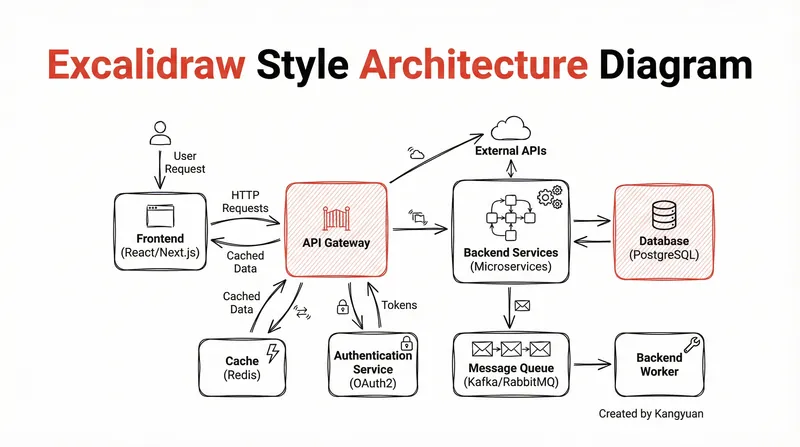
حوّل تصاميم الأنظمة المعقدة إلى رسومات تخطيطية واضحة ويدوية بأسلوب Excalidraw. تصور بنيتك التحتية بأناقة بسيطة، مما يجعل الروابط المعقدة مفهومة فوراً ومقدمة بشكل احترافي.
إنفوغرافيك بسيط
التعليمات
Design an **Infographic** to explain [Topic & Content] to [Target Audience: e.g., "non-specialist managers / general public / junior engineers"], rendered in a **clean, clear, pleasing, and visually quiet** style.
### 1) Information Structure & Hierarchy (Emphasis & Hierarchy)
- **Top:** A **main headline** (one sentence summarizing the key takeaway), followed by a **subheadline** (providing context, scope, or date).
- **Middle:** Feature **one critical number or conclusion** as the visual anchor (largest font size / largest block)—the viewer should instantly know what matters most.
- **Bottom:** Break content into **3–5 modules** (each with a sub-header + 2–3 bullet points, kept as short as possible).
- Establish clear hierarchy through **font size / weight / whitespace / positioning**: Headline > Key Conclusion > Module Headers > Body Points.
### 2) Scale & Proportion
- The key conclusion block should be noticeably larger; other modules decrease in size by importance.
- Balance graphics and text proportionally—avoid making all elements the same size, which creates "no focal point."
- Use a grid system (e.g., 12-column grid) with consistent spacing to achieve visual harmony.
### 3) Contrast Without Excess
- Use only **one high-contrast accent color** to highlight "key conclusions / critical paths / CTA-style labels"; keep all other colors low-saturation and softly neutral.
- Create contrast through *difference*, not *loudness*: size contrast, weight contrast, value contrast, shape contrast.
- Avoid multiple high-contrast elements competing simultaneously—this creates visual noise and chaos.
### 4) Repetition & Pattern
- Apply a unified card style across all modules: same border radius, margins, header styling, and icon treatment.
- Icons should share consistent stroke width and style (choose either line or flat, not both); maintain uniform layout within modules (icons consistently left or top).
- Use repetition to establish order and scannability.
### 5) Balance, Alignment & Whitespace
- Leave ample whitespace—let the information breathe; don't fill every inch.
- Align rigorously: baseline-align headlines, edge-align cards, left-align body text, and adhere to the grid throughout.
- Balance visual weight: pair heavy information blocks with lighter elements (thin rules, muted annotations) to counterbalance.
### 6) Movement & Visual Flow
- Organize content along a **clear reading path**—top-to-bottom or left-to-right (e.g., numbered steps 1→2→3, subtle arrows, progressive sizing).
- Rhythm comes from *intentional repetition and spacing*, not flashy effects; guide the eye naturally through the composition.
### 7) Typography & Readability
- Limit to **2 font styles max** (or different weights of a single typeface); avoid decorative fonts.
- Body text should be large enough with comfortable line spacing; keep each point to 1.5 lines or less (favor brevity).
- If technical terms are unavoidable, include a one-line plain-language explanation or annotation.
### 8) Output Specs (adjust as needed)
- **Canvas:** [Aspect ratio 16:9 ], Resolution: 1K
- **Style:** Modern minimalist, fresh, lightweight, vector-like aesthetic; subtle or no shadows; avoid heavy gradients and intricate textures.
- **Background:** Solid color or very light tint—should never compete with the content.
**Negative Constraints:**
No cramped layouts • No more than 1 accent color • No multiple high-contrast blocks fighting for attention • No decorative patterns or noise textures • No more than 2 typefaces • No equal visual weight across all modules • No misalignment.
**Topic & Content:**
ask user to provide so you can analyze
---
You don't need to ask user the target audience, the goal of this infographic is to help user to learn a subject fast and great.
الوصف
موصى بها من قبل
nene@YouMind
لماذا نحب هذه المهارة
اصنع إنفوجرافيك مبهرًا وبسيطًا يجعل المعلومات المعقدة مفهومة فورًا. تتفوق هذه المهارة في تلخيص أي موضوع إلى تصميم هادئ بصريًا لكنه مؤثر، مثالي لتثقيف الجمهور المستهدف بسرعة. أبرز النقاط الرئيسية بلون مميز واحد وتسلسل هرمي واضح، مما يضمن الفهم بسهولة.
حوّل أي محتوى معقد إلى إنفوغرافيك واضح للغاية. صمم كالمحترفين، لضمان أن تكون رسالتك هادئة بصريًا لكنها قوية التأثير، لتوجيه جمهورك بسهولة.
مهارات ذات صلة
عرض الكلبحثخريطة ذهنية
حوّل أي محتوى معقد—مقالات، فيديوهات، ملفات PDF—إلى خرائط ذهنية هرمية واضحة كالبلور. تصور المعلومات فوراً، واستوعب المفاهيم الأساسية، وعزز تعلمك دون عناء.
صورإنفوجرافيك بأسلوب التذاكر
حوّل نقاطك الرئيسية إلى بطاقات بسيطة على نمط التذاكر. مثالية للعلامة التجارية الشخصية، سجلات التغيير، خلاصات الكتب، وقوائم 'أفضل 5'.
صوررسم تخطيطي بأسلوب Excalidraw
حوّل تصاميم الأنظمة المعقدة إلى رسومات تخطيطية واضحة ويدوية بأسلوب Excalidraw. تصور بنيتك التحتية بأناقة بسيطة، مما يجعل الروابط المعقدة مفهومة فوراً ومقدمة بشكل احترافي.
اعثر على مهارتك المفضلة التالية
استكشف مزيدًا من مهارات الذكاء الاصطناعي المنتقاة للبحث والإبداع والعمل اليومي.