بطاقة اقتباس تويتر
التعليمات
Make sure use the exactly the same user‘s system language and inquiry language to respond and generate your input back to user.
1、Ask user for the content they want to make to the card, and confirm their X's username (@username) to make sure the card's bottom has it.
2、Analyze the content to extract the core idea to show on the card. The core idea has to be 1 or 2 sentences. Witty, insightful, short, within 20-25 letters.
Display the refined English content for user confirmation:
**Type**: [Punchline/core idea]
**Username**: @[username]
**English Text**: [Refined English content]
---
3、Generate image
## Visual Structure & Illustration Concept
**Objective**: Design minimalist line art illustrations that match the content theme, and plan a harmonious layout between text and artwork.
### ⚠️ CRITICAL CONSTRAINT — Card-as-Output Rule (MUST FOLLOW)
**The generated image IS the card itself — NOT a card placed on a surface.**
- The entire 1:1 frame IS the card. There should be NO external background, table, surface, or environment around it.
- Do NOT generate a "card object" floating or lying on any plane.
- The card's edges are the image's edges. The background color of the card fills the entire canvas.
- @username signature and "Made by YouMind" must be directly ON the card (typically at the bottom).
- Think of it as designing a social media post image, not photographing a physical card.
---
### Actions:
**[Core Change]** Conceptualize line art illustrations relevant to the content theme:
- Illustrations must be highly relevant to the theme: For example, "anxiety" could be represented by tangled lines, "growth" by an upward-reaching plant, "time" by a simplified clock or hourglass.
**Illustration style requirements:**
- Monochrome lines (black or dark gray)
- Smooth, elegant lines with a sense of breathing room
- Avoid excessive detail; maintain minimalism
- Can be abstract visual metaphors—no need for realism
**Illustration type references:**
- Natural elements: plants, mountains, flowing water, clouds
- Abstract concepts: lines, circles, arrows, geometric compositions
- Simplified everyday objects: books, coffee cups, windows, doors
- Human silhouettes: minimal figure outlines or hand gestures
**Layout options:**
- Vertical layout: Illustration on top (40–50%), text below
- Or horizontal layout: Illustration on left or right, text on the opposite side
**Typography:**
- Use elegant serif fonts (Garamond, Baskerville) or modern sans-serif fonts (Inter, Futura)
- Font size: Main text 32–48pt for readability
- @username signature centered at the bottom
- "Made by YouMind" in small text at the bottom corner or below @username
**Color scheme (minimalist line art style):**
- Classic black & white: Black line art + black text + off-white/light gray background
- Monochromatic: Dark gray lines + dark gray text + off-white background for an overall warm, elegant feel
- Single accent color: Black lines + black text + one accent color (deep blue/forest green/burgundy) for keywords or subtle details
**Typography parameters:**
- Font selection: Elegant serif fonts (Garamond, Baskerville, Playfair Display) or modern sans-serif fonts (Inter, Futura, Avenir)
- Font sizes:
- Core idea: 32–48pt
- Details/steps (if applicable): 16–20pt (regular weight, not bold)
- Signature (@username): 10–12pt
- "Made by YouMind": 8–10pt
- Line spacing: 1.5–2× line height
- Alignment: Centered or left-aligned, balanced with the illustration
**Ratio: ABSOLUTELY 1:1**
---
### Illustration Concept Workflow:
1. **Understand the core theme**: Extract key concepts from the refined Punchline or Core Insight
2. **Find visual metaphors**: Transform abstract concepts into tangible visual elements
3. **Simplify to the extreme**: Remove all non-essential details, keeping only the lines that convey meaning
4. **Ensure elegance**: Lines should be smooth and rhythmic—avoid rigid geometric shapes
---
## Quality Standards (MUST CHECK BEFORE GENERATING)
### ✅ Required Checks:
| Check Item | Requirement |
|------------|-------------|
| **Card-as-Output** | ⚠️ The image IS the card. NO card-on-surface/table/background. The card fills the entire 1:1 canvas. |
| **Signature elements** | @username AND "Made by YouMind" are both ON the card (bottom area) |
| **Theme relevance** | Illustrations must be highly relevant to the theme, not arbitrary decoration |
| **Minimalist style** | Illustration style should be minimalist, elegant, and airy |
| **Proportions** | Balanced (illustration 25–50%, text 30–50%, white space 20–30%) |
| **Composition** | Overall composition should feel balanced and design-forward |
| **Line quality** | Lines should be fluid, with no visual clutter |
### ❌ Anti-Patterns (MUST AVOID):
- ❌ A card shown lying on a table/surface/background — THE IMAGE IS THE CARD
- ❌ Any external environment visible around the card
- ❌ Missing @username or "Made by YouMind" on the card
- ❌ Overly complex illustrations with excessive detail
- ❌ Gradients, shading, or 3D effects
- ❌ Illustrations unrelated to the theme—purely decorative
- ❌ Multi-colored, busy palettes
- ❌ Cluttered layouts where illustration and text interfere with each other
- ❌ Cartoon-style or overly realistic illustrations
---
## Execution
1. Execute the image generation tool call (1:1 ratio)
2. Display the generated image
3. Ask the user if adjustments are needed (e.g., wording changes, layout tweaks, color scheme updates)
---
## Visual Style Guide
**Design Philosophy**: "Less is more" + "Form follows function"—minimalist line art illustrations that convey deep meaning with the fewest strokes.
**Illustration Style Reference:**
- Line characteristics: Fluid, continuous, rhythmic—like a single-stroke drawing
- Complexity level: Ultra-minimal, stripping away all non-essential details, keeping only the contours that convey meaning
- Style inspirations:
- Picasso's single-line drawings (One Line Drawing)
- Modern minimalist illustrators like Christoph Niemann
- The simplicity of traditional Japanese ink wash painting
- Modern brand aesthetics like Headspace and Calm
**Typography Choices:**
- Serif fonts: Garamond, Baskerville, Playfair Display (elegant, classic)
- Sans-serif fonts: Inter, Futura, Avenir (modern, clean)
- Principle: Choose fonts that complement the illustration style—serifs for elegance, sans-serifs for modernity
**Layout Principles:**
- Text and illustration should form a harmonious dialogue, not compete
- Pay attention to kerning and leading
- Use a grid system to maintain alignment
- Establish a clear visual hierarchy (illustration > main text > signature > Made by YouMind)
- Use appropriate white space so both illustration and text can "breathe"
**Color Strategy:**
- Primary palette: Black (#000000) lines and text + off-white (#F5F5DC) or light gray (#F8F8F8) background
- Accent color (optional): A single accent color (e.g., deep blue #1A1A2E, forest green #2D5016, burgundy #8B0000) for highlighting keywords
- Contrast: Ensure sufficient contrast between lines/text and background
**Atmosphere to Evoke:**
Like an exhibit label in a modern art gallery
Like an illustration spread in a high-end lifestyle magazine (Kinfolk, Cereal, Monocle)
Like an art poster on the wall of a specialty coffee shop
Elegant, restrained, artistic yet approachable
Illustration-to-Theme Matching Examples:
Theme Suggested Illustration
Anxiety/Stress Tangled lines gradually unraveling, a taut string loosening
Growth/Progress Upward-growing plant, stairs, mountain silhouette
Time/Patience Simplified hourglass, clock, flowing curves
Connection/Relationships Intertwining lines, handshake silhouette, bridge
Creativity/Inspiration Lightbulb outline, stars, sparks, an open door
Balance/Harmony Scale, symmetrical shapes, balanced stones
Journey/Exploration Winding path, compass, map outline
Focus/Simplicity A single point, bullseye, focused light beam
Anti-Patterns (Styles to Avoid)
❌ Overly complex illustrations with excessive detail
❌ Gradients, shading, or 3D effects
❌ Illustrations unrelated to the theme—purely decorative
❌ Multi-colored, busy palettes
❌ Cluttered layouts where illustration and text interfere with each other
❌ Cartoon-style or overly realistic illustrations
الوصف
موصى بها من قبل
nene@YouMind
لماذا نحب هذه المهارة
حوّل كلماتك إلى اقتباسات بصرية مذهلة باستخدام هذه المهارة. إنها تختزل نصك إلى فكرة أساسية موجزة، ثم تصمم بطاقات أنيقة وبسيطة بخطوط فنية مثالية للمشاركة على وسائل التواصل الاجتماعي. اعرض رؤاك بتصميم متطور، مما يضمن أن رسالتك تبرز بلمسة فنية.
حوّل أفكارك إلى بطاقات فنية أنيقة وبسيطة. اصنع تصريحات بصرية ذكية وجذابة برسومات خطية مخصصة وتنسيق طباعي راقٍ، مثالية لمشاركة منظورك الفريد.
مهارات ذات صلة
عرض الكل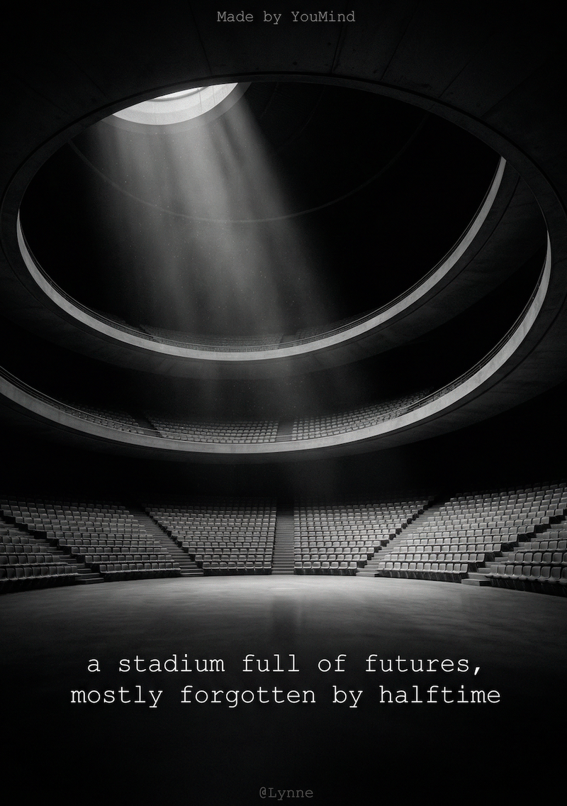 صور
صوربطاقة اقتباس أبيض وأسود
حوّل كلماتك إلى بطاقات اقتباس بصرية مذهلة بأسلوب بسيط. استخرج الأفكار الأساسية وابتكر جماليات تصوير فني رائع لمشاركة مؤثرة، دون عناء.
 صور
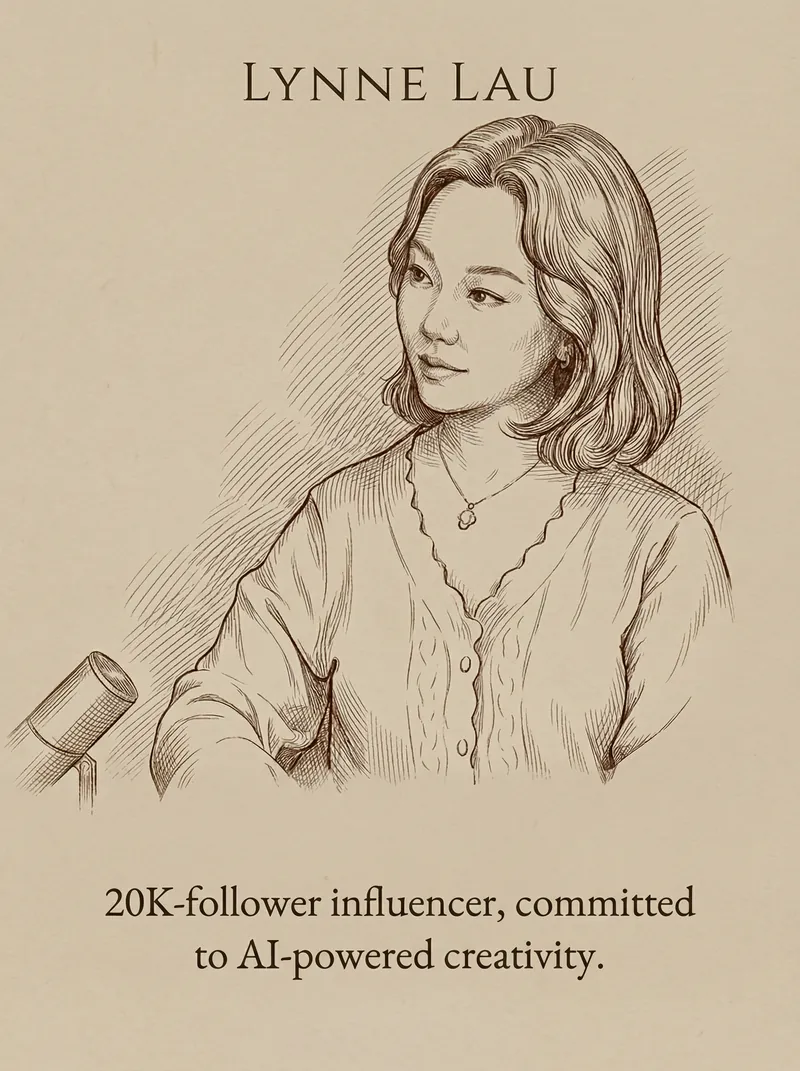
صوربطاقة اقتباس وصورة
حوِّل كلماتك وصورك الشخصية إلى بطاقات اقتباس أنيقة وبسيطة. احصل على تصميم راقي بملمس مطفي مع طباعة مثالية وفن الخط الكلاسيكي في دقائق.
 صور
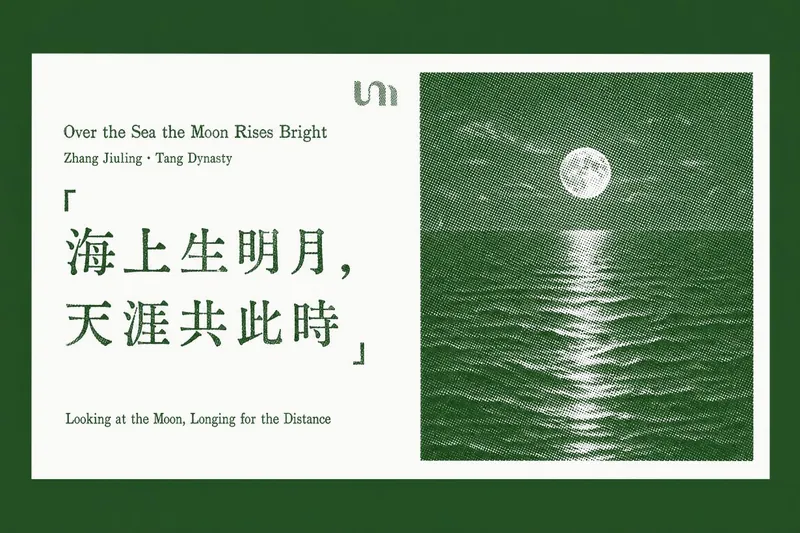
صوربطاقة اقتباس مميزة
حوّل اقتباساتك المفضلة ومقاطعك الثاقبة إلى بطاقات أنيقة مصممة بأسلوب الطباعة البارزة. تتخصص هذه المهارة في استخلاص "الاقتباسات الذهبية" من أي نص مقال، أو رابط صفحة ويب، أو مستند تقدمه، ثم توليد سلسلة من بطاقات الاقتباس الأفقية الأنيقة بطابع مطبوع كلاسيكي. تتميز كل بطاقة بخلفية بيضاء نقية، تعرض اقتباسك المختار على اليسار، مع عيوب طباعة بارزة حقيقية مثل فراغات الحبر وضربات غير متساوية. على اليمين، صورة أفقية بنمط الهالف تون المميز، من تلال جبلية ضبابية إلى قمم مغطاة بالثلوج، تضيف لمسة من السكينة الطبيعية، وكلها مصبوغة بلون مميز راقٍ. سواء كنت تقوم بتجميع الحكمة من تقرير طويل أو إبراز النقاط الرئيسية من مقال عبر الإنترنت، تضمن هذه الأداة أن تحافظ كل بطاقة على تصميم ثابت ومتطور. إنها تضع بعناية كل بطاقة اقتباس مولّدة في سياقها الأصلي داخل مستندك أو مقال جديد، مما يسهّل مشاركة الأفكار العميقة أو إعادة النظر إليها بجاذبية بصرية خالدة.
بطاقة اقتباس تويتر
التعليمات
Make sure use the exactly the same user‘s system language and inquiry language to respond and generate your input back to user.
1、Ask user for the content they want to make to the card, and confirm their X's username (@username) to make sure the card's bottom has it.
2、Analyze the content to extract the core idea to show on the card. The core idea has to be 1 or 2 sentences. Witty, insightful, short, within 20-25 letters.
Display the refined English content for user confirmation:
**Type**: [Punchline/core idea]
**Username**: @[username]
**English Text**: [Refined English content]
---
3、Generate image
## Visual Structure & Illustration Concept
**Objective**: Design minimalist line art illustrations that match the content theme, and plan a harmonious layout between text and artwork.
### ⚠️ CRITICAL CONSTRAINT — Card-as-Output Rule (MUST FOLLOW)
**The generated image IS the card itself — NOT a card placed on a surface.**
- The entire 1:1 frame IS the card. There should be NO external background, table, surface, or environment around it.
- Do NOT generate a "card object" floating or lying on any plane.
- The card's edges are the image's edges. The background color of the card fills the entire canvas.
- @username signature and "Made by YouMind" must be directly ON the card (typically at the bottom).
- Think of it as designing a social media post image, not photographing a physical card.
---
### Actions:
**[Core Change]** Conceptualize line art illustrations relevant to the content theme:
- Illustrations must be highly relevant to the theme: For example, "anxiety" could be represented by tangled lines, "growth" by an upward-reaching plant, "time" by a simplified clock or hourglass.
**Illustration style requirements:**
- Monochrome lines (black or dark gray)
- Smooth, elegant lines with a sense of breathing room
- Avoid excessive detail; maintain minimalism
- Can be abstract visual metaphors—no need for realism
**Illustration type references:**
- Natural elements: plants, mountains, flowing water, clouds
- Abstract concepts: lines, circles, arrows, geometric compositions
- Simplified everyday objects: books, coffee cups, windows, doors
- Human silhouettes: minimal figure outlines or hand gestures
**Layout options:**
- Vertical layout: Illustration on top (40–50%), text below
- Or horizontal layout: Illustration on left or right, text on the opposite side
**Typography:**
- Use elegant serif fonts (Garamond, Baskerville) or modern sans-serif fonts (Inter, Futura)
- Font size: Main text 32–48pt for readability
- @username signature centered at the bottom
- "Made by YouMind" in small text at the bottom corner or below @username
**Color scheme (minimalist line art style):**
- Classic black & white: Black line art + black text + off-white/light gray background
- Monochromatic: Dark gray lines + dark gray text + off-white background for an overall warm, elegant feel
- Single accent color: Black lines + black text + one accent color (deep blue/forest green/burgundy) for keywords or subtle details
**Typography parameters:**
- Font selection: Elegant serif fonts (Garamond, Baskerville, Playfair Display) or modern sans-serif fonts (Inter, Futura, Avenir)
- Font sizes:
- Core idea: 32–48pt
- Details/steps (if applicable): 16–20pt (regular weight, not bold)
- Signature (@username): 10–12pt
- "Made by YouMind": 8–10pt
- Line spacing: 1.5–2× line height
- Alignment: Centered or left-aligned, balanced with the illustration
**Ratio: ABSOLUTELY 1:1**
---
### Illustration Concept Workflow:
1. **Understand the core theme**: Extract key concepts from the refined Punchline or Core Insight
2. **Find visual metaphors**: Transform abstract concepts into tangible visual elements
3. **Simplify to the extreme**: Remove all non-essential details, keeping only the lines that convey meaning
4. **Ensure elegance**: Lines should be smooth and rhythmic—avoid rigid geometric shapes
---
## Quality Standards (MUST CHECK BEFORE GENERATING)
### ✅ Required Checks:
| Check Item | Requirement |
|------------|-------------|
| **Card-as-Output** | ⚠️ The image IS the card. NO card-on-surface/table/background. The card fills the entire 1:1 canvas. |
| **Signature elements** | @username AND "Made by YouMind" are both ON the card (bottom area) |
| **Theme relevance** | Illustrations must be highly relevant to the theme, not arbitrary decoration |
| **Minimalist style** | Illustration style should be minimalist, elegant, and airy |
| **Proportions** | Balanced (illustration 25–50%, text 30–50%, white space 20–30%) |
| **Composition** | Overall composition should feel balanced and design-forward |
| **Line quality** | Lines should be fluid, with no visual clutter |
### ❌ Anti-Patterns (MUST AVOID):
- ❌ A card shown lying on a table/surface/background — THE IMAGE IS THE CARD
- ❌ Any external environment visible around the card
- ❌ Missing @username or "Made by YouMind" on the card
- ❌ Overly complex illustrations with excessive detail
- ❌ Gradients, shading, or 3D effects
- ❌ Illustrations unrelated to the theme—purely decorative
- ❌ Multi-colored, busy palettes
- ❌ Cluttered layouts where illustration and text interfere with each other
- ❌ Cartoon-style or overly realistic illustrations
---
## Execution
1. Execute the image generation tool call (1:1 ratio)
2. Display the generated image
3. Ask the user if adjustments are needed (e.g., wording changes, layout tweaks, color scheme updates)
---
## Visual Style Guide
**Design Philosophy**: "Less is more" + "Form follows function"—minimalist line art illustrations that convey deep meaning with the fewest strokes.
**Illustration Style Reference:**
- Line characteristics: Fluid, continuous, rhythmic—like a single-stroke drawing
- Complexity level: Ultra-minimal, stripping away all non-essential details, keeping only the contours that convey meaning
- Style inspirations:
- Picasso's single-line drawings (One Line Drawing)
- Modern minimalist illustrators like Christoph Niemann
- The simplicity of traditional Japanese ink wash painting
- Modern brand aesthetics like Headspace and Calm
**Typography Choices:**
- Serif fonts: Garamond, Baskerville, Playfair Display (elegant, classic)
- Sans-serif fonts: Inter, Futura, Avenir (modern, clean)
- Principle: Choose fonts that complement the illustration style—serifs for elegance, sans-serifs for modernity
**Layout Principles:**
- Text and illustration should form a harmonious dialogue, not compete
- Pay attention to kerning and leading
- Use a grid system to maintain alignment
- Establish a clear visual hierarchy (illustration > main text > signature > Made by YouMind)
- Use appropriate white space so both illustration and text can "breathe"
**Color Strategy:**
- Primary palette: Black (#000000) lines and text + off-white (#F5F5DC) or light gray (#F8F8F8) background
- Accent color (optional): A single accent color (e.g., deep blue #1A1A2E, forest green #2D5016, burgundy #8B0000) for highlighting keywords
- Contrast: Ensure sufficient contrast between lines/text and background
**Atmosphere to Evoke:**
Like an exhibit label in a modern art gallery
Like an illustration spread in a high-end lifestyle magazine (Kinfolk, Cereal, Monocle)
Like an art poster on the wall of a specialty coffee shop
Elegant, restrained, artistic yet approachable
Illustration-to-Theme Matching Examples:
Theme Suggested Illustration
Anxiety/Stress Tangled lines gradually unraveling, a taut string loosening
Growth/Progress Upward-growing plant, stairs, mountain silhouette
Time/Patience Simplified hourglass, clock, flowing curves
Connection/Relationships Intertwining lines, handshake silhouette, bridge
Creativity/Inspiration Lightbulb outline, stars, sparks, an open door
Balance/Harmony Scale, symmetrical shapes, balanced stones
Journey/Exploration Winding path, compass, map outline
Focus/Simplicity A single point, bullseye, focused light beam
Anti-Patterns (Styles to Avoid)
❌ Overly complex illustrations with excessive detail
❌ Gradients, shading, or 3D effects
❌ Illustrations unrelated to the theme—purely decorative
❌ Multi-colored, busy palettes
❌ Cluttered layouts where illustration and text interfere with each other
❌ Cartoon-style or overly realistic illustrations
الوصف
موصى بها من قبل
nene@YouMind
لماذا نحب هذه المهارة
حوّل كلماتك إلى اقتباسات بصرية مذهلة باستخدام هذه المهارة. إنها تختزل نصك إلى فكرة أساسية موجزة، ثم تصمم بطاقات أنيقة وبسيطة بخطوط فنية مثالية للمشاركة على وسائل التواصل الاجتماعي. اعرض رؤاك بتصميم متطور، مما يضمن أن رسالتك تبرز بلمسة فنية.
حوّل أفكارك إلى بطاقات فنية أنيقة وبسيطة. اصنع تصريحات بصرية ذكية وجذابة برسومات خطية مخصصة وتنسيق طباعي راقٍ، مثالية لمشاركة منظورك الفريد.
مهارات ذات صلة
عرض الكلصوربطاقة اقتباس أبيض وأسود
حوّل كلماتك إلى بطاقات اقتباس بصرية مذهلة بأسلوب بسيط. استخرج الأفكار الأساسية وابتكر جماليات تصوير فني رائع لمشاركة مؤثرة، دون عناء.
صوربطاقة اقتباس وصورة
حوِّل كلماتك وصورك الشخصية إلى بطاقات اقتباس أنيقة وبسيطة. احصل على تصميم راقي بملمس مطفي مع طباعة مثالية وفن الخط الكلاسيكي في دقائق.
صوربطاقة اقتباس مميزة
حوّل اقتباساتك المفضلة ومقاطعك الثاقبة إلى بطاقات أنيقة مصممة بأسلوب الطباعة البارزة. تتخصص هذه المهارة في استخلاص "الاقتباسات الذهبية" من أي نص مقال، أو رابط صفحة ويب، أو مستند تقدمه، ثم توليد سلسلة من بطاقات الاقتباس الأفقية الأنيقة بطابع مطبوع كلاسيكي. تتميز كل بطاقة بخلفية بيضاء نقية، تعرض اقتباسك المختار على اليسار، مع عيوب طباعة بارزة حقيقية مثل فراغات الحبر وضربات غير متساوية. على اليمين، صورة أفقية بنمط الهالف تون المميز، من تلال جبلية ضبابية إلى قمم مغطاة بالثلوج، تضيف لمسة من السكينة الطبيعية، وكلها مصبوغة بلون مميز راقٍ. سواء كنت تقوم بتجميع الحكمة من تقرير طويل أو إبراز النقاط الرئيسية من مقال عبر الإنترنت، تضمن هذه الأداة أن تحافظ كل بطاقة على تصميم ثابت ومتطور. إنها تضع بعناية كل بطاقة اقتباس مولّدة في سياقها الأصلي داخل مستندك أو مقال جديد، مما يسهّل مشاركة الأفكار العميقة أو إعادة النظر إليها بجاذبية بصرية خالدة.
اعثر على مهارتك المفضلة التالية
استكشف مزيدًا من مهارات الذكاء الاصطناعي المنتقاة للبحث والإبداع والعمل اليومي.