دليل العلامة التجارية YouMind
التعليمات
## Color Palette
### Primary Colors
**Background**
- Color: `#f2f2f0`
- Description: Light neutral off-white, clean and minimal
- Usage: All slide backgrounds without exception
**Primary Text & Lines**
- Color: `#2B2B2B` or `#1A1A1A`
- Description: Very dark gray, nearly black
- Usage: All text content, header divider lines, geometric outlines, character outlines
### Accent Colors
**Vibrant Blue**
- Color: `#5B7FFF` (alternative: `#4D6FE8`)
- Description: Medium-bright blue with energy
- Usage: Circular nodes on geometric shapes, character clothing/scarves, button fills, decorative dots
**Muted Gold**
- Color: `#C9B568` (alternative: `#D4C17A`)
- Description: Warm mustard/gold tone
- Usage: Circular nodes on geometric shapes (alternating with blue), decorative accents
### Color Application Rules
- Background is ALWAYS `#E8E6E3`
- Text is ALWAYS `#2B2B2B`
- Blue and gold are ONLY used for circular nodes and character accents
- Never use blue or gold as large blocks or text colors
- Maintain high contrast between text and background
## Typography System
### Font Families
**Primary Display Font: Roca Two (or similar chunky serif)**
- Characteristics: Bold, friendly serif with rounded qualities
- Weight: Bold/Heavy
- Usage: All slide titles, main headlines, section headings
- Keep same font
**Secondary Body Font: Poppins (or Inter)**
- Characteristics: Clean, modern sans-serif with excellent readability
- Weight: Regular (400) for body, Medium (500) for emphasis
- Usage: All body text, subtitles, captions, page numbers, logo text
- keep same font
### Font Sizing Hierarchy
**Extra Large Titles** (Cover slides, major section dividers)
- Font: **Roca Two **
- Size: 72-96pt
- Color: `#2B2B2B`
- Usage: "Main Title", "Thank You", "Agenda"
**Large Headings** (Content slide titles)
- Font: **Roca Two **
- Size: 48-60pt
- Color: `#2B2B2B`
- Usage: "Our Vision", "Brand Positioning", "What Is YouMind About?"
**Body Text** (Paragraphs, descriptions)
- Font: Poppins Regular
- Size: 18-24pt
- Color: `#2B2B2B`
- Line Height: 1.6-1.8
- Usage: All paragraph content, descriptions
**Small Text** (Page numbers, footer, captions)
- Font: Poppins Regular
- Size: 16-18pt
- Color: `#2B2B2B`
- Usage: "Page X", website URLs, email addresses
**Button/Pill Text**
- Font: Poppins Regular or Medium
- Size: 20-24pt
- Color: `#2B2B2B`
- Usage: Text inside rounded pill buttons
### Typography Rules
- Never mix serif fonts - only **Roca Two ** for display
- Never use serif for body text - only Poppins
- Maintain consistent line height (1.6-1.8) for readability
- All text must be `#2B2B2B` - no exceptions
- Generous spacing between paragraphs (24-32pt)
## Layout System
### Global Header Structure
**Cover slide only (Page 1):**
**Left Header Element:**
- Logo
- Size: 32-40pt diameter
- Color: Black outline `#2B2B2B`
- Position: 60-80px from left edge, 60-80px from top
- Spacing: 12-16px between logo and text
**Right Header Element:**
- Font: Poppins Regular, 16-18pt
- Color: `#2B2B2B`
- Position: 60-80px from right edge, 60-80px from top
- Alignment: Right-aligned
**Header Divider:**
- Thin horizontal line
- Weight: 1-2pt
- Color: `#2B2B2B`
- Position: Below header elements, spanning full width with margins
- Margin from edges: 60-80px left and right
**Content slides (Pages 2-4) and closing slide (Page 5):**
- NO YouMind logo
- Only "Page X" text
- Position: Top-right corner, bottom-center, or other subtle placement
- No header divider line
- More vertical space available for content
### Margin System
**Standard Margins:**
- Top: 60-80px (below header divider add 40-60px more)
- Bottom: 60-80px
- Left: 80-100px
- Right: 80-100px
**Content Area:**
- After accounting for header and margins, content area is approximately 1200-1280px wide × 600-680px tall (for 16:9 at 1920×1080)
## Visual Elements
### Hand-Drawn Geometric Shapes
**Core Design:**
- Style: Imperfect, hand-drawn rectangles and squares
- Line weight: 2-3pt
- Color: Black `#2B2B2B`
- Quality: Organic, slightly wobbly lines (not perfectly straight)
- Connection: Lines connecting shapes at various angles
**Circular Nodes:**
- Shape: Perfect circles
- Size: 24-40pt diameter
- Fill: Solid color - either `#5B7FFF` (blue) or `#C9B568` (gold)
- Position: At connection points and corners of geometric shapes
- Pattern: Alternate blue and gold for variety
**Placement Rules:**
- Position in corners of slides (top-left, top-right, bottom-left, bottom-right)
- Never overlap with text content
- Keep 40-60px away from content areas
- Create visual balance - if left side has shapes, right side should too
- Typical arrangement: 2-4 connected rectangles with 3-6 circular nodes
### Rounded Pill Buttons
**Design Specifications:**
- Shape: Rounded rectangle (pill shape)
- Border: 2pt solid black `#2B2B2B`
- Fill: Transparent or `#E8E6E3` (same as background)
- Border radius: Full height radius (perfect pill)
- Padding: 16-24px horizontal, 12-16px vertical
- Text: Poppins Regular, 20-24pt, `#2B2B2B`
**Usage:**
- Navigation elements on Agenda slides
- Call-to-action buttons
- Section labels
- Always outlined, never filled with color
**Hover/Active State (if interactive):**
- Fill: `#5B7FFF` (blue)
- Text: White `#FFFFFF`
- Border: `#5B7FFF`
### Decorative Dot Grids
**Specifications:**
- Dots: Small circles, 3-4pt diameter
- Color: `#2B2B2B`
- Pattern: Regular grid, 12-16px spacing
- Arrangement: 6×6 or 8×8 grid
- Position: Top-right corner, 100-150px from edges
- Usage: Optional accent, adds visual interest without overwhelming
### Icons (Minimal Usage)
**Style:**
- Line art only, no fills
- Weight: 2-3pt
- Color: `#2B2B2B`
- Size: 48-64pt
- Examples: Eye icon (vision), target/crosshair (mission)
- Usage: Sparingly, only when reinforcing specific concepts
## Character Illustration System
### Character Design Specifications
**Basic Structure:**
- A minimalist, hand-drawn doodle illustration of a simple white humanoid character. The character has a rounded, elongated head, two small black dots for eyes, and a prominent pointed nose. It has no defined fingers or toes. It is wearing a thick, long, solid blue scarf [optional: substitute 'mustard gold scarf'] wrapped around its neck with the tail trailing down. The art style uses thick, textured black marker outlines and flat colors with no shading, set against a plain, off-white background. The character is [what fit the context]
**Blue Accent (CRITICAL):**
- Element: Scarf, shirt, or clothing item
- Color: `#5B7FFF` (vibrant blue)
- Style: Hand-drawn, flowing organic shapes
- Coverage: 15-25% of character
- Purpose: Brand identity, visual interest, movement
**Style Consistency:**
- Always hand-drawn quality (organic, imperfect lines)
- Always include blue accent element
- Maintain same line weight across all characters
- Keep proportions consistent across poses
### Minimalist Illustration Guidelines
**Simplicity First:**
- Keep all illustrations extremely simple and minimal
- Character height should NOT exceed 120pt (approximately 10-12% of slide height)
- Geometric elements should be small and confined to corners only
- Total illustration coverage should be less than 15% of slide area
- Avoid complex or detailed drawings
**Space and Breathing Room:**
- Maintain generous white space throughout the slide
- Text should occupy only 50-55% of content area (typically left side)
- Right side should remain mostly empty for visual breathing room
- Large margins on all sides: minimum 100px, preferably 100-120px
- Illustrations confined to bottom-right corner only, at least 100px from edges
**Layout Balance:**
- Center of slide should be clean and empty
- Avoid cluttering or filling all available space
- Use white space strategically to create focus and clarity
- Less is more: remove unnecessary visual elements
- Prioritize readability and spaciousness over decoration
الوصف
موصى بها من قبل
nene@YouMind
لماذا نحب هذه المهارة
توفر هذه المهارة دليلاً شاملاً للعلامة التجارية، مما يضمن هوية بصرية متسقة لعروض YouMind. تشرح بالتفصيل لوحات الألوان، والخطوط، وأنظمة التخطيط، والعناصر المرسومة يدويًا الفريدة، بما في ذلك رسوم الشخصيات مع لمسات زرقاء محددة. مثالية للحفاظ على صورة علامة تجارية متماسكة واحترافية عبر جميع الاتصالات البصرية.
حوّل أي عرض تقديمي باستخدام دليل العلامة التجارية لـ YouMind. قدّم شرائح Slides احترافية ومتسقة مع العلامة التجارية، مع طباعة وألوان وتخطيط متناسق، مما يأسر جمهورك بسهولة في كل مرة.
مهارات ذات صلة
عرض الكل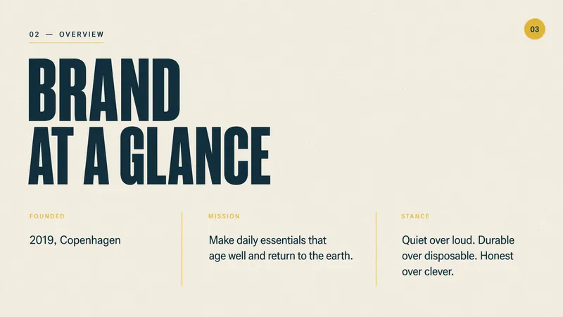 شرائح
شرائحدليل العلامة التجارية التحريري
Slides للعلامة التجارية مع تجربة راقية وواعية بيئياً. قدِّم شرائح نظيفة ودافئة وواثقة بجمالية تحريرية بسيطة، تأسر جمهورك بصور مذهلة وطباعة مؤثرة.
 شرائح
شرائحالفن المعاصر Slides
تنشئ هذه المهارة عروض تقديمية أنيقة وبسيطة لمقترحات المشاريع، وهي مثالية للمحترفين في المجالات الإبداعية مثل الفن والثقافة والتصميم والأزياء وتخطيط المعارض. وهي مصممة لأي شخص يحتاج إلى تقديم مشروع بهوية بصرية قوية وحديثة تبرز. تتميز العروض التقديمية بجمالية تحريرية مميزة، تتميز بخطوط sans-serif كبيرة الحجم، وصور فوتوغرافية بالأسود والأبيض مذهلة، ولوحة ألوان زرقاء ملكية ورمادية ناعمة صارمة. توقع تخطيطات نظيفة غير متماثلة مع مساحة بيضاء وفيرة وإطارات صور مستديرة فريدة، مما يعطي كل Slide تكوينًا يشبه المجلة. تقوم المهارة تلقائيًا بإنشاء جميع الصور اللازمة، مما يضمن الاتساق والملاءمة لموضوعك، من الصور الشخصية الاحترافية إلى مشاهد الحركة الديناميكية. يمكن للمستخدمين إدخال تفاصيل مشروعهم وستقوم المهارة بإنشاء مجموعة عروض تقديمية كاملة ومصقولة. الناتج هو مقترح جذاب بصريًا واحترافي يبدو واثقًا ومنظمًا، مثالي لمقترحات المشاريع الإبداعية أو الحملات التجارية أو عروض استوديوهات التصميم.
 صور
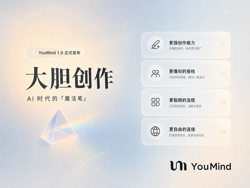
صورملصق بنمط صفحة هبوط YouMind
حوّل محتواك إلى سرد بصري مذهل مع ملصق نمط صفحة الهبوط من YouMind. هذه المهارة تصنع ملصقات إنفوجرافيك جميلة تجذب الانتباه بطابعها الرجعي المستقبلي الطبيعي الفريد. مثالية لعرض البيانات الرئيسية أو أبرز المشاريع أو ميزات المنتج، حيث تُعرض معلوماتك بتنسيق راقي وسهل الهضم. باستخدام لوحة ألوان متوازنة بين البارد والدافئ مع قاعدة زرقاء رمادية فاتحة ولمسات بيج-خوخي خفيفة، يجسد كل ملصق شعور واجهة مستخدم حديثة. توقع طباعة أنيقة، مع خط 'Source Han Serif' الموثوق للعناوين وخط sans-serif نظيف للنص الأساسي لضمان سهولة القراءة. يستخدم التخطيط شبكة 'Bento' الديناميكية، لترتيب محتواك في بطاقات ذات حواف ناعمة وجذابة مع مساحات تنفس واسعة، متجنبا التصاميم المزدحمة. ما وراء المرئيات اللافتة، تدمج المهارة عناصر تصميم دقيقة مثل حبيبات فيلم دقيقة موحدة، وتقديم انطباعي، وأيقونات زجاج مصنفر اختيارية لنقاط بياناتك. يمكن إضافة منشور ثلاثي شفاف واحد كلقطة أنيقة، بينما يوضع شعار YouMind الرسمي دائمًا بشكل متحفظ للحفاظ على اتساق العلامة التجارية. ينتج عن ذلك إنفوجرافيك احترافي وجيد التهوية وحديث ينقل رسالتك بفعالية.
دليل العلامة التجارية YouMind
التعليمات
## Color Palette
### Primary Colors
**Background**
- Color: `#f2f2f0`
- Description: Light neutral off-white, clean and minimal
- Usage: All slide backgrounds without exception
**Primary Text & Lines**
- Color: `#2B2B2B` or `#1A1A1A`
- Description: Very dark gray, nearly black
- Usage: All text content, header divider lines, geometric outlines, character outlines
### Accent Colors
**Vibrant Blue**
- Color: `#5B7FFF` (alternative: `#4D6FE8`)
- Description: Medium-bright blue with energy
- Usage: Circular nodes on geometric shapes, character clothing/scarves, button fills, decorative dots
**Muted Gold**
- Color: `#C9B568` (alternative: `#D4C17A`)
- Description: Warm mustard/gold tone
- Usage: Circular nodes on geometric shapes (alternating with blue), decorative accents
### Color Application Rules
- Background is ALWAYS `#E8E6E3`
- Text is ALWAYS `#2B2B2B`
- Blue and gold are ONLY used for circular nodes and character accents
- Never use blue or gold as large blocks or text colors
- Maintain high contrast between text and background
## Typography System
### Font Families
**Primary Display Font: Roca Two (or similar chunky serif)**
- Characteristics: Bold, friendly serif with rounded qualities
- Weight: Bold/Heavy
- Usage: All slide titles, main headlines, section headings
- Keep same font
**Secondary Body Font: Poppins (or Inter)**
- Characteristics: Clean, modern sans-serif with excellent readability
- Weight: Regular (400) for body, Medium (500) for emphasis
- Usage: All body text, subtitles, captions, page numbers, logo text
- keep same font
### Font Sizing Hierarchy
**Extra Large Titles** (Cover slides, major section dividers)
- Font: **Roca Two **
- Size: 72-96pt
- Color: `#2B2B2B`
- Usage: "Main Title", "Thank You", "Agenda"
**Large Headings** (Content slide titles)
- Font: **Roca Two **
- Size: 48-60pt
- Color: `#2B2B2B`
- Usage: "Our Vision", "Brand Positioning", "What Is YouMind About?"
**Body Text** (Paragraphs, descriptions)
- Font: Poppins Regular
- Size: 18-24pt
- Color: `#2B2B2B`
- Line Height: 1.6-1.8
- Usage: All paragraph content, descriptions
**Small Text** (Page numbers, footer, captions)
- Font: Poppins Regular
- Size: 16-18pt
- Color: `#2B2B2B`
- Usage: "Page X", website URLs, email addresses
**Button/Pill Text**
- Font: Poppins Regular or Medium
- Size: 20-24pt
- Color: `#2B2B2B`
- Usage: Text inside rounded pill buttons
### Typography Rules
- Never mix serif fonts - only **Roca Two ** for display
- Never use serif for body text - only Poppins
- Maintain consistent line height (1.6-1.8) for readability
- All text must be `#2B2B2B` - no exceptions
- Generous spacing between paragraphs (24-32pt)
## Layout System
### Global Header Structure
**Cover slide only (Page 1):**
**Left Header Element:**
- Logo
- Size: 32-40pt diameter
- Color: Black outline `#2B2B2B`
- Position: 60-80px from left edge, 60-80px from top
- Spacing: 12-16px between logo and text
**Right Header Element:**
- Font: Poppins Regular, 16-18pt
- Color: `#2B2B2B`
- Position: 60-80px from right edge, 60-80px from top
- Alignment: Right-aligned
**Header Divider:**
- Thin horizontal line
- Weight: 1-2pt
- Color: `#2B2B2B`
- Position: Below header elements, spanning full width with margins
- Margin from edges: 60-80px left and right
**Content slides (Pages 2-4) and closing slide (Page 5):**
- NO YouMind logo
- Only "Page X" text
- Position: Top-right corner, bottom-center, or other subtle placement
- No header divider line
- More vertical space available for content
### Margin System
**Standard Margins:**
- Top: 60-80px (below header divider add 40-60px more)
- Bottom: 60-80px
- Left: 80-100px
- Right: 80-100px
**Content Area:**
- After accounting for header and margins, content area is approximately 1200-1280px wide × 600-680px tall (for 16:9 at 1920×1080)
## Visual Elements
### Hand-Drawn Geometric Shapes
**Core Design:**
- Style: Imperfect, hand-drawn rectangles and squares
- Line weight: 2-3pt
- Color: Black `#2B2B2B`
- Quality: Organic, slightly wobbly lines (not perfectly straight)
- Connection: Lines connecting shapes at various angles
**Circular Nodes:**
- Shape: Perfect circles
- Size: 24-40pt diameter
- Fill: Solid color - either `#5B7FFF` (blue) or `#C9B568` (gold)
- Position: At connection points and corners of geometric shapes
- Pattern: Alternate blue and gold for variety
**Placement Rules:**
- Position in corners of slides (top-left, top-right, bottom-left, bottom-right)
- Never overlap with text content
- Keep 40-60px away from content areas
- Create visual balance - if left side has shapes, right side should too
- Typical arrangement: 2-4 connected rectangles with 3-6 circular nodes
### Rounded Pill Buttons
**Design Specifications:**
- Shape: Rounded rectangle (pill shape)
- Border: 2pt solid black `#2B2B2B`
- Fill: Transparent or `#E8E6E3` (same as background)
- Border radius: Full height radius (perfect pill)
- Padding: 16-24px horizontal, 12-16px vertical
- Text: Poppins Regular, 20-24pt, `#2B2B2B`
**Usage:**
- Navigation elements on Agenda slides
- Call-to-action buttons
- Section labels
- Always outlined, never filled with color
**Hover/Active State (if interactive):**
- Fill: `#5B7FFF` (blue)
- Text: White `#FFFFFF`
- Border: `#5B7FFF`
### Decorative Dot Grids
**Specifications:**
- Dots: Small circles, 3-4pt diameter
- Color: `#2B2B2B`
- Pattern: Regular grid, 12-16px spacing
- Arrangement: 6×6 or 8×8 grid
- Position: Top-right corner, 100-150px from edges
- Usage: Optional accent, adds visual interest without overwhelming
### Icons (Minimal Usage)
**Style:**
- Line art only, no fills
- Weight: 2-3pt
- Color: `#2B2B2B`
- Size: 48-64pt
- Examples: Eye icon (vision), target/crosshair (mission)
- Usage: Sparingly, only when reinforcing specific concepts
## Character Illustration System
### Character Design Specifications
**Basic Structure:**
- A minimalist, hand-drawn doodle illustration of a simple white humanoid character. The character has a rounded, elongated head, two small black dots for eyes, and a prominent pointed nose. It has no defined fingers or toes. It is wearing a thick, long, solid blue scarf [optional: substitute 'mustard gold scarf'] wrapped around its neck with the tail trailing down. The art style uses thick, textured black marker outlines and flat colors with no shading, set against a plain, off-white background. The character is [what fit the context]
**Blue Accent (CRITICAL):**
- Element: Scarf, shirt, or clothing item
- Color: `#5B7FFF` (vibrant blue)
- Style: Hand-drawn, flowing organic shapes
- Coverage: 15-25% of character
- Purpose: Brand identity, visual interest, movement
**Style Consistency:**
- Always hand-drawn quality (organic, imperfect lines)
- Always include blue accent element
- Maintain same line weight across all characters
- Keep proportions consistent across poses
### Minimalist Illustration Guidelines
**Simplicity First:**
- Keep all illustrations extremely simple and minimal
- Character height should NOT exceed 120pt (approximately 10-12% of slide height)
- Geometric elements should be small and confined to corners only
- Total illustration coverage should be less than 15% of slide area
- Avoid complex or detailed drawings
**Space and Breathing Room:**
- Maintain generous white space throughout the slide
- Text should occupy only 50-55% of content area (typically left side)
- Right side should remain mostly empty for visual breathing room
- Large margins on all sides: minimum 100px, preferably 100-120px
- Illustrations confined to bottom-right corner only, at least 100px from edges
**Layout Balance:**
- Center of slide should be clean and empty
- Avoid cluttering or filling all available space
- Use white space strategically to create focus and clarity
- Less is more: remove unnecessary visual elements
- Prioritize readability and spaciousness over decoration
الوصف
موصى بها من قبل
nene@YouMind
لماذا نحب هذه المهارة
توفر هذه المهارة دليلاً شاملاً للعلامة التجارية، مما يضمن هوية بصرية متسقة لعروض YouMind. تشرح بالتفصيل لوحات الألوان، والخطوط، وأنظمة التخطيط، والعناصر المرسومة يدويًا الفريدة، بما في ذلك رسوم الشخصيات مع لمسات زرقاء محددة. مثالية للحفاظ على صورة علامة تجارية متماسكة واحترافية عبر جميع الاتصالات البصرية.
حوّل أي عرض تقديمي باستخدام دليل العلامة التجارية لـ YouMind. قدّم شرائح Slides احترافية ومتسقة مع العلامة التجارية، مع طباعة وألوان وتخطيط متناسق، مما يأسر جمهورك بسهولة في كل مرة.
مهارات ذات صلة
عرض الكلشرائحدليل العلامة التجارية التحريري
Slides للعلامة التجارية مع تجربة راقية وواعية بيئياً. قدِّم شرائح نظيفة ودافئة وواثقة بجمالية تحريرية بسيطة، تأسر جمهورك بصور مذهلة وطباعة مؤثرة.
شرائحالفن المعاصر Slides
تنشئ هذه المهارة عروض تقديمية أنيقة وبسيطة لمقترحات المشاريع، وهي مثالية للمحترفين في المجالات الإبداعية مثل الفن والثقافة والتصميم والأزياء وتخطيط المعارض. وهي مصممة لأي شخص يحتاج إلى تقديم مشروع بهوية بصرية قوية وحديثة تبرز. تتميز العروض التقديمية بجمالية تحريرية مميزة، تتميز بخطوط sans-serif كبيرة الحجم، وصور فوتوغرافية بالأسود والأبيض مذهلة، ولوحة ألوان زرقاء ملكية ورمادية ناعمة صارمة. توقع تخطيطات نظيفة غير متماثلة مع مساحة بيضاء وفيرة وإطارات صور مستديرة فريدة، مما يعطي كل Slide تكوينًا يشبه المجلة. تقوم المهارة تلقائيًا بإنشاء جميع الصور اللازمة، مما يضمن الاتساق والملاءمة لموضوعك، من الصور الشخصية الاحترافية إلى مشاهد الحركة الديناميكية. يمكن للمستخدمين إدخال تفاصيل مشروعهم وستقوم المهارة بإنشاء مجموعة عروض تقديمية كاملة ومصقولة. الناتج هو مقترح جذاب بصريًا واحترافي يبدو واثقًا ومنظمًا، مثالي لمقترحات المشاريع الإبداعية أو الحملات التجارية أو عروض استوديوهات التصميم.
صورملصق بنمط صفحة هبوط YouMind
حوّل محتواك إلى سرد بصري مذهل مع ملصق نمط صفحة الهبوط من YouMind. هذه المهارة تصنع ملصقات إنفوجرافيك جميلة تجذب الانتباه بطابعها الرجعي المستقبلي الطبيعي الفريد. مثالية لعرض البيانات الرئيسية أو أبرز المشاريع أو ميزات المنتج، حيث تُعرض معلوماتك بتنسيق راقي وسهل الهضم. باستخدام لوحة ألوان متوازنة بين البارد والدافئ مع قاعدة زرقاء رمادية فاتحة ولمسات بيج-خوخي خفيفة، يجسد كل ملصق شعور واجهة مستخدم حديثة. توقع طباعة أنيقة، مع خط 'Source Han Serif' الموثوق للعناوين وخط sans-serif نظيف للنص الأساسي لضمان سهولة القراءة. يستخدم التخطيط شبكة 'Bento' الديناميكية، لترتيب محتواك في بطاقات ذات حواف ناعمة وجذابة مع مساحات تنفس واسعة، متجنبا التصاميم المزدحمة. ما وراء المرئيات اللافتة، تدمج المهارة عناصر تصميم دقيقة مثل حبيبات فيلم دقيقة موحدة، وتقديم انطباعي، وأيقونات زجاج مصنفر اختيارية لنقاط بياناتك. يمكن إضافة منشور ثلاثي شفاف واحد كلقطة أنيقة، بينما يوضع شعار YouMind الرسمي دائمًا بشكل متحفظ للحفاظ على اتساق العلامة التجارية. ينتج عن ذلك إنفوجرافيك احترافي وجيد التهوية وحديث ينقل رسالتك بفعالية.
اعثر على مهارتك المفضلة التالية
استكشف مزيدًا من مهارات الذكاء الاصطناعي المنتقاة للبحث والإبداع والعمل اليومي.