डेटा विज़ुअलाइज़ेशन
उपयोगकर्ता द्वारा दिए गए डेटा के आधार पर ऐसे विज़ुअलाइज़ेशन तैयार करें जो स्टोरीटेलिंग विद डेटा (SWD) सिद्धांत के अनुरूप हों। आवश्यक शर्तें: इस कौशल का उपयोग तब किया जाना चाहिए जब कोई उपयोगकर्ता डेटा प्रदान करे और "चार्ट बनाएं", "चार्ट जनरेट करें", "विज़ुअलाइज़ करें", "ग्राफ़ बनाएं" या "मुझे यह डेटा दिखाएं" का अनुरोध करे, या CSV/Excel/स्प्रेडशीट डेटा अपलोड करे और उसका ग्राफ़िकल रूप देखना चाहे। यदि उपयोगकर्ता केवल "इस डेटा का विश्लेषण करें" कहता है और डेटा विज़ुअलाइज़ेशन के लिए उपयुक्त है, तब भी चार्ट बनाने के लिए इस कौशल का उपयोग किया जाना चाहिए।
Featured by
nene@YouMind.AI
Why we love this skill
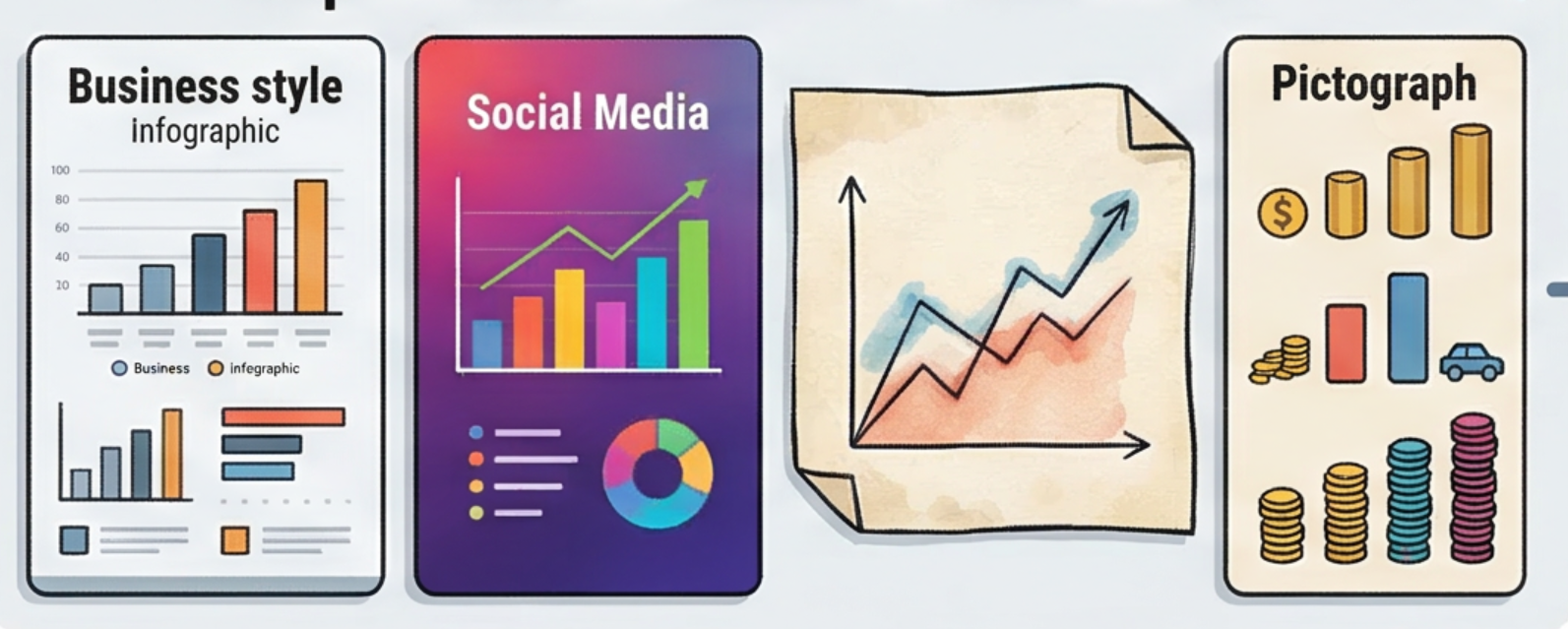
यह कौशल "डेटा स्टोरीटेलिंग" के छह सिद्धांतों पर आधारित है और उपयोगकर्ता की आवश्यकताओं के अनुसार चार्ट के प्रकार का बुद्धिमानी से चयन कर सकता है, जिससे पेशेवर व्यवसाय, सोशल मीडिया और हस्तलिखित शैलियों जैसे विविध दृश्य शैलियाँ उपलब्ध होती हैं। उच्च-गुणवत्ता वाली छवियाँ बनाने हों या इंटरैक्टिव HTML चार्ट, यह डेटा को अंतर्दृष्टिपूर्ण कहानियों में बदलने में मदद करता है, जिससे जटिल संख्याएँ एक नज़र में स्पष्ट हो जाती हैं।
निर्देश
लेखक ने निर्देशों को निजी पर सेट किया है। नीचे निर्देशों का संक्षिप्त परिचय दिया गया है।
इस कौशल का उद्देश्य कच्चे डेटा को स्पष्ट और आकर्षक विज़ुअलाइज़ेशन में बदलना है जो "डेटा के साथ कहानी कहना" (SWD) सिद्धांतों का पालन करते हैं, जिससे उपयोगकर्ताओं को डेटा से प्राप्त जानकारियों को अधिक प्रभावी ढंग से संप्रेषित करने में मदद मिलती है। यह विशेष रूप से उन पेशेवरों और शोधकर्ताओं के लिए उपयुक्त है जिन्हें निर्णय लेने, रिपोर्ट लिखने या सामग्री निर्माण के लिए डेटा विज़ुअलाइज़ेशन की आवश्यकता होती है। इस कौशल की मुख्य क्षमता उपयोगकर्ता द्वारा प्रदान किए गए डेटा, जैसे बार चार्ट, लाइन चार्ट या स्कैटर प्लॉट, के आधार पर सबसे उपयुक्त चार्ट प्रकार की स्वचालित रूप से पहचान करने और छह SWD सिद्धांतों के अनुसार इसे अनुकूलित करने की क्षमता में निहित है: संदर्भ को समझना, अनावश्यक सामग्री को हटाना, ध्यान केंद्रित करना, डिज़ाइनर की तरह सोचना और कहानी कहना। चार्ट बनाने से पहले, सिस्टम उपयोगकर्ता से आउटपुट विधि (छवियां या इंटरैक्टिव HTML), रंग शैली (पेशेवर व्यावसायिक, सोशल मीडिया या हस्तनिर्मित शैली) और स्केउमॉर्फिक चार्ट का उपयोग करना है या नहीं, के बारे में उनकी प्राथमिकताओं के बारे में सक्रिय रूप से पूछता है, यह सुनिश्चित करते हुए कि अंतिम परिणाम उपयोगकर्ता की आवश्यकताओं से पूरी तरह मेल खाता है। चाहे प्रस्तुतियों के लिए उच्च-गुणवत्ता वाली छवियों की आवश्यकता हो या सटीक डेटा विश्लेषण के लिए इंटरैक्टिव वेब चार्ट की, यह कौशल अनुकूलित समाधान प्रदान करता है। अंतिम आउटपुट चार्ट में अंतर्दृष्टिपूर्ण शीर्षक होंगे, प्रमुख जानकारी को हाइलाइट किया जाएगा और सभी अनावश्यक दृश्य विकर्षणों को हटा दिया जाएगा, जिससे एक स्पष्ट और प्रभावशाली डेटा कहानी सुनिश्चित होगी और संचार दक्षता में सुधार होगा।
Related Skills
View allवर्टिकल इमोजी क्रिएशन असिस्टेंट
यह इमोजी निर्माण समाधान जनरेटर विशेष रूप से विशिष्ट पेशेवर क्षेत्रों (जैसे शोधकर्ता, शिक्षक, प्रोग्रामर, डॉक्टर आदि) के लिए डिज़ाइन किया गया है। लक्षित दर्शकों की समस्याओं का गहन शोध करके, यह 100 परिदृश्यों, कैप्शन फ़ार्मुलों, निर्माण उपकरणों, परिचालन रणनीतियों और मुद्रीकरण के तरीकों सहित एक संपूर्ण समाधान तैयार करता है, जिससे उपयोगकर्ताओं को उच्च प्रभाव वाले इमोजी आईपी प्रोजेक्ट्स को शीघ्रता से लॉन्च करने में मदद मिलती है।

टेक्स्ट लेआउट कॉन्सेप्ट पोस्टर जेनरेटर प्रो
शब्दों/वाक्यांशों/ब्रांड नामों के लिए उच्च-गुणवत्ता वाले कॉन्सेप्ट पोस्टर तैयार करने का कौशल। इसमें खोज विश्लेषण के माध्यम से शब्दों के अर्थ को समझना, उपयोगकर्ता के साथ समझ की दिशा और पहलू अनुपात की पुष्टि करना, और फिर न्यूनतम, संयमित और सुव्यवस्थित ग्राफिक कला पोस्टर बनाने के लिए सटीक दृश्य रूपक योजनाओं का निर्माण करना शामिल है।

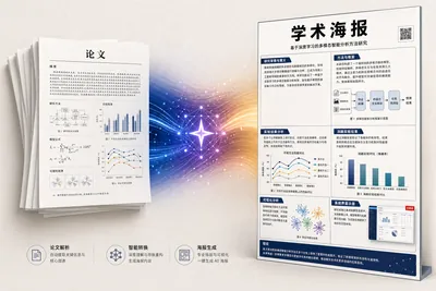
अकादमिक पोस्टर डिजाइन
यह प्रक्रिया अकादमिक शोध पत्र की PDF फ़ाइल को एक A0 आकार के ऊर्ध्वाधर अकादमिक पोस्टर चित्र में परिवर्तित करती है। कृत्रिम बुद्धिमत्ता (AI) दृश्य शैली, सूचना घनत्व और रंग योजना का अनुकूल रूप से मूल्यांकन करती है, शोध पत्र के "मुख्य बिंदुओं" की पहचान करती है और उन्हें प्रमुखता से प्रदर्शित करती है, योजनाबद्ध आरेखों को पुनः बनाती है, मूल डेटा चार्ट को संरक्षित करती है, और साक्ष्य-संबंधित दृश्यों (UI स्क्रीनशॉट/संवाद स्क्रीनशॉट) को "योजनाबद्ध आरेख" लेबल के साथ UI मॉकअप में पुनः बनाती है, जब उन्हें निकालना संभव नहीं होता है। साथ ही, यह अनौपचारिक स्वरूपण चिह्नों, जैसे कि प्रथम-प्रकाशित ऑनलाइन प्रकाशनों के लिए अस्थायी पृष्ठ संख्या, की पहचान करती है और उन्हें फ़िल्टर करती है। अंत में, GPT Image 2 एक ही चरण में मुद्रण और लगाने के लिए उपयुक्त उच्च-गुणवत्ता वाला पोस्टर तैयार करती है।
डेटा विज़ुअलाइज़ेशन
उपयोगकर्ता द्वारा दिए गए डेटा के आधार पर ऐसे विज़ुअलाइज़ेशन तैयार करें जो स्टोरीटेलिंग विद डेटा (SWD) सिद्धांत के अनुरूप हों। आवश्यक शर्तें: इस कौशल का उपयोग तब किया जाना चाहिए जब कोई उपयोगकर्ता डेटा प्रदान करे और "चार्ट बनाएं", "चार्ट जनरेट करें", "विज़ुअलाइज़ करें", "ग्राफ़ बनाएं" या "मुझे यह डेटा दिखाएं" का अनुरोध करे, या CSV/Excel/स्प्रेडशीट डेटा अपलोड करे और उसका ग्राफ़िकल रूप देखना चाहे। यदि उपयोगकर्ता केवल "इस डेटा का विश्लेषण करें" कहता है और डेटा विज़ुअलाइज़ेशन के लिए उपयुक्त है, तब भी चार्ट बनाने के लिए इस कौशल का उपयोग किया जाना चाहिए।
Featured by
nene@YouMind.AI
Why we love this skill
यह कौशल "डेटा स्टोरीटेलिंग" के छह सिद्धांतों पर आधारित है और उपयोगकर्ता की आवश्यकताओं के अनुसार चार्ट के प्रकार का बुद्धिमानी से चयन कर सकता है, जिससे पेशेवर व्यवसाय, सोशल मीडिया और हस्तलिखित शैलियों जैसे विविध दृश्य शैलियाँ उपलब्ध होती हैं। उच्च-गुणवत्ता वाली छवियाँ बनाने हों या इंटरैक्टिव HTML चार्ट, यह डेटा को अंतर्दृष्टिपूर्ण कहानियों में बदलने में मदद करता है, जिससे जटिल संख्याएँ एक नज़र में स्पष्ट हो जाती हैं।
निर्देश
लेखक ने निर्देशों को निजी पर सेट किया है। नीचे निर्देशों का संक्षिप्त परिचय दिया गया है।
इस कौशल का उद्देश्य कच्चे डेटा को स्पष्ट और आकर्षक विज़ुअलाइज़ेशन में बदलना है जो "डेटा के साथ कहानी कहना" (SWD) सिद्धांतों का पालन करते हैं, जिससे उपयोगकर्ताओं को डेटा से प्राप्त जानकारियों को अधिक प्रभावी ढंग से संप्रेषित करने में मदद मिलती है। यह विशेष रूप से उन पेशेवरों और शोधकर्ताओं के लिए उपयुक्त है जिन्हें निर्णय लेने, रिपोर्ट लिखने या सामग्री निर्माण के लिए डेटा विज़ुअलाइज़ेशन की आवश्यकता होती है। इस कौशल की मुख्य क्षमता उपयोगकर्ता द्वारा प्रदान किए गए डेटा, जैसे बार चार्ट, लाइन चार्ट या स्कैटर प्लॉट, के आधार पर सबसे उपयुक्त चार्ट प्रकार की स्वचालित रूप से पहचान करने और छह SWD सिद्धांतों के अनुसार इसे अनुकूलित करने की क्षमता में निहित है: संदर्भ को समझना, अनावश्यक सामग्री को हटाना, ध्यान केंद्रित करना, डिज़ाइनर की तरह सोचना और कहानी कहना। चार्ट बनाने से पहले, सिस्टम उपयोगकर्ता से आउटपुट विधि (छवियां या इंटरैक्टिव HTML), रंग शैली (पेशेवर व्यावसायिक, सोशल मीडिया या हस्तनिर्मित शैली) और स्केउमॉर्फिक चार्ट का उपयोग करना है या नहीं, के बारे में उनकी प्राथमिकताओं के बारे में सक्रिय रूप से पूछता है, यह सुनिश्चित करते हुए कि अंतिम परिणाम उपयोगकर्ता की आवश्यकताओं से पूरी तरह मेल खाता है। चाहे प्रस्तुतियों के लिए उच्च-गुणवत्ता वाली छवियों की आवश्यकता हो या सटीक डेटा विश्लेषण के लिए इंटरैक्टिव वेब चार्ट की, यह कौशल अनुकूलित समाधान प्रदान करता है। अंतिम आउटपुट चार्ट में अंतर्दृष्टिपूर्ण शीर्षक होंगे, प्रमुख जानकारी को हाइलाइट किया जाएगा और सभी अनावश्यक दृश्य विकर्षणों को हटा दिया जाएगा, जिससे एक स्पष्ट और प्रभावशाली डेटा कहानी सुनिश्चित होगी और संचार दक्षता में सुधार होगा।
Related Skills
View allवर्टिकल इमोजी क्रिएशन असिस्टेंट
यह इमोजी निर्माण समाधान जनरेटर विशेष रूप से विशिष्ट पेशेवर क्षेत्रों (जैसे शोधकर्ता, शिक्षक, प्रोग्रामर, डॉक्टर आदि) के लिए डिज़ाइन किया गया है। लक्षित दर्शकों की समस्याओं का गहन शोध करके, यह 100 परिदृश्यों, कैप्शन फ़ार्मुलों, निर्माण उपकरणों, परिचालन रणनीतियों और मुद्रीकरण के तरीकों सहित एक संपूर्ण समाधान तैयार करता है, जिससे उपयोगकर्ताओं को उच्च प्रभाव वाले इमोजी आईपी प्रोजेक्ट्स को शीघ्रता से लॉन्च करने में मदद मिलती है।
टेक्स्ट लेआउट कॉन्सेप्ट पोस्टर जेनरेटर प्रो
शब्दों/वाक्यांशों/ब्रांड नामों के लिए उच्च-गुणवत्ता वाले कॉन्सेप्ट पोस्टर तैयार करने का कौशल। इसमें खोज विश्लेषण के माध्यम से शब्दों के अर्थ को समझना, उपयोगकर्ता के साथ समझ की दिशा और पहलू अनुपात की पुष्टि करना, और फिर न्यूनतम, संयमित और सुव्यवस्थित ग्राफिक कला पोस्टर बनाने के लिए सटीक दृश्य रूपक योजनाओं का निर्माण करना शामिल है।
अकादमिक पोस्टर डिजाइन
यह प्रक्रिया अकादमिक शोध पत्र की PDF फ़ाइल को एक A0 आकार के ऊर्ध्वाधर अकादमिक पोस्टर चित्र में परिवर्तित करती है। कृत्रिम बुद्धिमत्ता (AI) दृश्य शैली, सूचना घनत्व और रंग योजना का अनुकूल रूप से मूल्यांकन करती है, शोध पत्र के "मुख्य बिंदुओं" की पहचान करती है और उन्हें प्रमुखता से प्रदर्शित करती है, योजनाबद्ध आरेखों को पुनः बनाती है, मूल डेटा चार्ट को संरक्षित करती है, और साक्ष्य-संबंधित दृश्यों (UI स्क्रीनशॉट/संवाद स्क्रीनशॉट) को "योजनाबद्ध आरेख" लेबल के साथ UI मॉकअप में पुनः बनाती है, जब उन्हें निकालना संभव नहीं होता है। साथ ही, यह अनौपचारिक स्वरूपण चिह्नों, जैसे कि प्रथम-प्रकाशित ऑनलाइन प्रकाशनों के लिए अस्थायी पृष्ठ संख्या, की पहचान करती है और उन्हें फ़िल्टर करती है। अंत में, GPT Image 2 एक ही चरण में मुद्रण और लगाने के लिए उपयुक्त उच्च-गुणवत्ता वाला पोस्टर तैयार करती है।
Find your next favorite skill
Explore more curated AI skills for research, creation, and everyday work.