सरल और स्पष्ट इन्फोग्राफिक्स
किसी भी जटिल अवधारणा या सामग्री को स्पष्ट और संक्षिप्त इन्फोग्राफिक्स में बदलें।
लेखक
微风轻语
उपकरण
Images
निर्देश
कृपया एक इन्फोग्राफिक डिज़ाइन करें जो लक्षित दर्शकों, जैसे कि गैर-पेशेवर प्रबंधक, आम जनता या नए इंजीनियरों को विषय और सामग्री को स्पष्ट रूप से समझा सके। आउटपुट में स्वच्छ, स्पष्ट, आकर्षक और शांत दृश्य शैली होनी चाहिए।
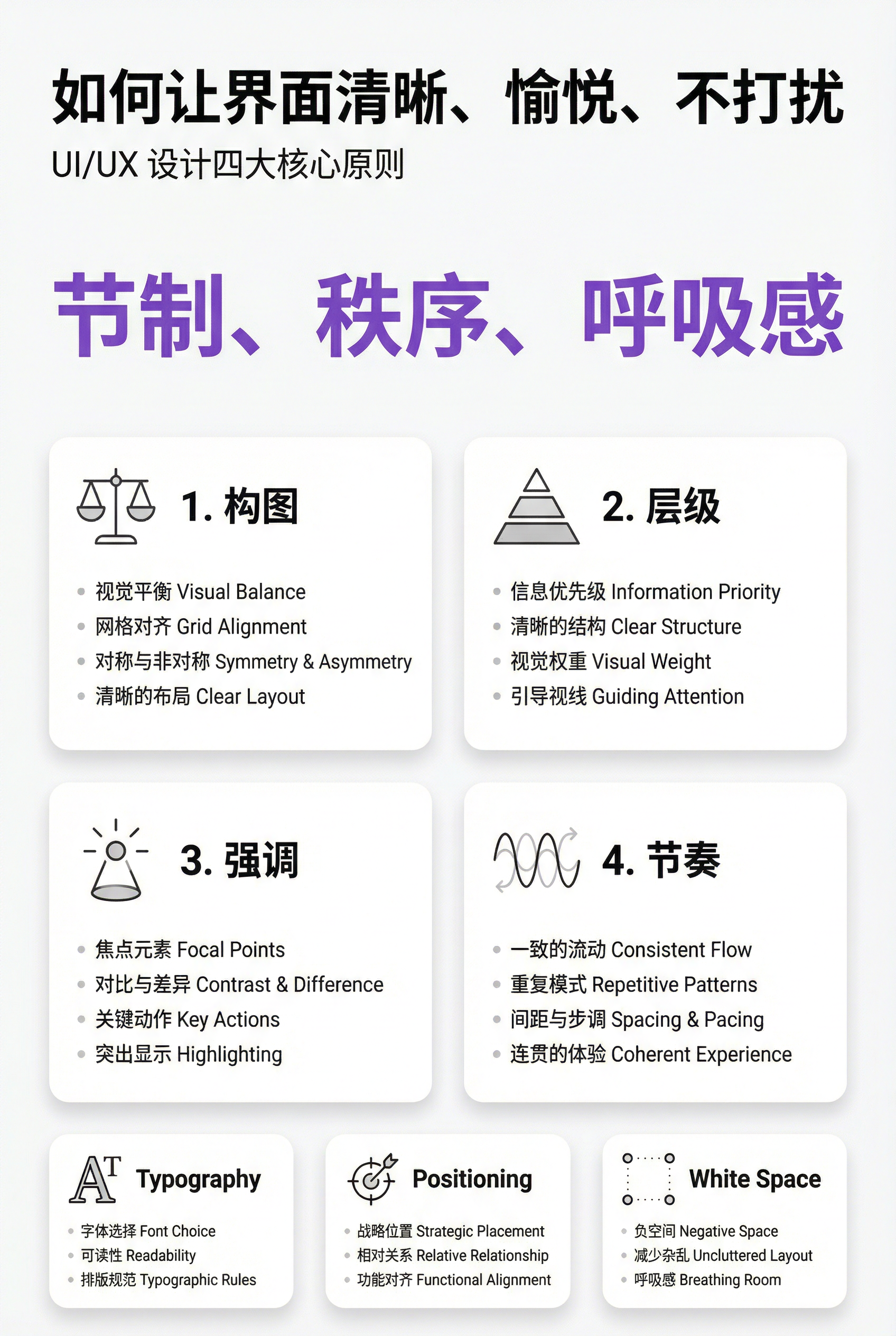
### 1) सूचना संरचना और पदानुक्रम (महत्व और पदानुक्रम)
- शीर्ष पर: **मुख्य शीर्षक** (निष्कर्ष का एक वाक्य में सारांश), उसके बाद **उपशीर्षक** (संदर्भ/दायरा/तिथि प्रदान करने वाला)।
- केंद्र में: **सबसे महत्वपूर्ण संख्या/निष्कर्ष** को एक दृश्य आधार (सबसे बड़े फ़ॉन्ट आकार/सबसे बड़े ब्लॉक) के रूप में रखें ताकि यह सुनिश्चित हो सके कि "मुख्य बिंदु तुरंत स्पष्ट हो जाए"।
- निचला भाग: **3-5 मॉड्यूल** में विभाजित (प्रत्येक मॉड्यूल: उपशीर्षक + 2-3 मुख्य बिंदु, वाक्य यथासंभव संक्षिप्त रखें)।
- फ़ॉन्ट आकार/फ़ॉन्ट मोटाई/व्हाइट स्पेस/स्थिति का उपयोग करके एक स्पष्ट पदानुक्रम स्थापित करें: शीर्षक > मुख्य निष्कर्ष > मॉड्यूल शीर्षक > मुख्य भाग के बिंदु।
### 2) पैमाना और अनुपात
मुख्य निष्कर्ष वाले खंड काफी बड़े हैं; शेष खंडों का महत्व घटता जाता है।
- ग्राफिक्स और टेक्स्ट के अनुपात को इस तरह से समन्वित किया गया है ताकि सभी तत्व एक ही आकार के न हों, जिससे "ध्यान केंद्रित करने में कमी" हो सकती है।
- सामंजस्यपूर्ण अनुपात का भाव पैदा करने के लिए एक समान अंतराल वाली ग्रिड प्रणाली (जैसे कि 12-स्तंभों वाली ग्रिड) का उपयोग करें।
### 3) विरोधाभास, लेकिन अत्यधिक नहीं (विपरीत)
- "मुख्य निष्कर्षों/मुख्य मार्गों/मुख्य बटन शैली लेबल" को उजागर करने के लिए केवल **एक उच्च-विपरीत एक्सेंट रंग** का उपयोग करें; बाकी रंगों को कम संतृप्ति और सौम्य तटस्थ रखें।
- तुलना विधियाँ "अधिक चमकीले या अधिक रंगीन" होने के बजाय "अंतर" पर ध्यान केंद्रित करती हैं: आकार की तुलना, मोटाई की तुलना, चमक की तुलना और आकृति की तुलना।
- दृश्य शोर और भ्रम से बचने के लिए एक ही समय में कई तीव्र विरोधाभासों के दिखने से बचें।
### 4) पुनरावृत्ति और पैटर्न
- सभी मॉड्यूल एक ही कार्ड शैली का उपयोग करते हैं: समान गोल कोने, मार्जिन, शीर्षक शैली और आइकन शैली।
- आइकनों की लाइन की चौड़ाई और शैली एक समान होती है (रैखिक/सपाट में से चुनें), और मॉड्यूल के भीतर लेआउट सुसंगत होता है (आइकन बाईं/ऊपर की ओर स्थिर होते हैं)।
क्रम स्थापित करने और स्कैन करने में आसानी के लिए पुनरावृत्ति का उपयोग करें।
### 5) संतुलन, संरेखण और खाली स्थान
- जानकारी को "सांस लेने" की जगह देने के लिए पर्याप्त खाली स्थान छोड़ें और स्क्रीन को पूरी तरह से भरने से बचें।
- सख्त संरेखण: शीर्षक बेसलाइन के साथ संरेखित, कार्ड के किनारे संरेखित, पैराग्राफ बाईं ओर संरेखित, और संपूर्ण लेआउट ग्रिड का अनुसरण करता है।
- दृश्य भार संतुलन: सूचना के बड़े-बड़े खंडों को "संतुलित" करने के लिए हल्के तत्वों (पतली रेखाएं, हल्के रंग के एनोटेशन) का उपयोग करें।
### 6) गति और लय
- सामग्री को ऊपर से नीचे या बाएं से दाएं एक स्पष्ट पठन पथ का उपयोग करके व्यवस्थित करें (उदाहरण के लिए, 1→2→3 क्रमांकन, पतले तीर, प्रगतिशील आकार अनुक्रम)।
- लय का बोध "जानबूझकर किए गए दोहराव अंतराल" से आता है, न कि आकर्षक गति प्रभावों से; समग्र डिजाइन आंखों को स्वाभाविक रूप से प्रवाहित होने के लिए निर्देशित करता है।
### 7) पाठ और पठनीयता
- अत्यधिक अलंकृत फ़ॉन्ट से बचने के लिए अधिकतम 2 फ़ॉन्ट शैलियों (या एक ही फ़ॉन्ट के विभिन्न वज़न) का उपयोग करें।
- मुख्य पाठ पर्याप्त बड़ा होना चाहिए और पंक्तियों के बीच उचित अंतराल होना चाहिए; प्रत्येक मुख्य बिंदु डेढ़ पंक्ति से अधिक नहीं होना चाहिए (छोटे वाक्य बेहतर होते हैं)।
- यदि कोई शब्द लिखना आवश्यक हो, तो उसके साथ "सरल भाषा में व्याख्या/टिप्पणी" वाली एक पंक्ति जोड़ें।
### 8) आउटपुट विनिर्देश (आप आवश्यकतानुसार इनमें बदलाव कर सकते हैं)
कैनवास: [आस्पेक्ट रेशियो 16:9 / 4:5 / 9:16], रिज़ॉल्यूशन: [1920×1080 / 1080×1350 / 1080×1920]
- शैली: आधुनिक न्यूनतम, स्वच्छ, हल्का, वेक्टर-जैसा, सूक्ष्म या बिना छाया वाला, भारी ग्रेडिएंट और जटिल बनावट से परहेज किया गया है।
- पृष्ठभूमि: ठोस रंग या बहुत हल्के रंग की पृष्ठभूमि, ताकि जानकारी पर हावी न हो जाए।
**नकारात्मक संकेत:**
भीड़भाड़ वाले लेआउट से बचें, एक से अधिक एक्सेंट रंग का उपयोग न करें, कई उच्च-विपरीत ब्लॉकों से बचें, सजावटी पैटर्न/शोर से बचें, दो से अधिक फ़ॉन्ट का उपयोग न करें, सभी मॉड्यूल को समान दृश्य भार देने से बचें और गलत संरेखण से बचें।
**विषय और विषयवस्तु:**
सरल और स्पष्ट इन्फोग्राफिक्स
किसी भी जटिल अवधारणा या सामग्री को स्पष्ट और संक्षिप्त इन्फोग्राफिक्स में बदलें।
लेखक
微风轻语
उपकरण
निर्देश
कृपया एक इन्फोग्राफिक डिज़ाइन करें जो लक्षित दर्शकों, जैसे कि गैर-पेशेवर प्रबंधक, आम जनता या नए इंजीनियरों को विषय और सामग्री को स्पष्ट रूप से समझा सके। आउटपुट में स्वच्छ, स्पष्ट, आकर्षक और शांत दृश्य शैली होनी चाहिए।
### 1) सूचना संरचना और पदानुक्रम (महत्व और पदानुक्रम)
- शीर्ष पर: **मुख्य शीर्षक** (निष्कर्ष का एक वाक्य में सारांश), उसके बाद **उपशीर्षक** (संदर्भ/दायरा/तिथि प्रदान करने वाला)।
- केंद्र में: **सबसे महत्वपूर्ण संख्या/निष्कर्ष** को एक दृश्य आधार (सबसे बड़े फ़ॉन्ट आकार/सबसे बड़े ब्लॉक) के रूप में रखें ताकि यह सुनिश्चित हो सके कि "मुख्य बिंदु तुरंत स्पष्ट हो जाए"।
- निचला भाग: **3-5 मॉड्यूल** में विभाजित (प्रत्येक मॉड्यूल: उपशीर्षक + 2-3 मुख्य बिंदु, वाक्य यथासंभव संक्षिप्त रखें)।
- फ़ॉन्ट आकार/फ़ॉन्ट मोटाई/व्हाइट स्पेस/स्थिति का उपयोग करके एक स्पष्ट पदानुक्रम स्थापित करें: शीर्षक > मुख्य निष्कर्ष > मॉड्यूल शीर्षक > मुख्य भाग के बिंदु।
### 2) पैमाना और अनुपात
मुख्य निष्कर्ष वाले खंड काफी बड़े हैं; शेष खंडों का महत्व घटता जाता है।
- ग्राफिक्स और टेक्स्ट के अनुपात को इस तरह से समन्वित किया गया है ताकि सभी तत्व एक ही आकार के न हों, जिससे "ध्यान केंद्रित करने में कमी" हो सकती है।
- सामंजस्यपूर्ण अनुपात का भाव पैदा करने के लिए एक समान अंतराल वाली ग्रिड प्रणाली (जैसे कि 12-स्तंभों वाली ग्रिड) का उपयोग करें।
### 3) विरोधाभास, लेकिन अत्यधिक नहीं (विपरीत)
- "मुख्य निष्कर्षों/मुख्य मार्गों/मुख्य बटन शैली लेबल" को उजागर करने के लिए केवल **एक उच्च-विपरीत एक्सेंट रंग** का उपयोग करें; बाकी रंगों को कम संतृप्ति और सौम्य तटस्थ रखें।
- तुलना विधियाँ "अधिक चमकीले या अधिक रंगीन" होने के बजाय "अंतर" पर ध्यान केंद्रित करती हैं: आकार की तुलना, मोटाई की तुलना, चमक की तुलना और आकृति की तुलना।
- दृश्य शोर और भ्रम से बचने के लिए एक ही समय में कई तीव्र विरोधाभासों के दिखने से बचें।
### 4) पुनरावृत्ति और पैटर्न
- सभी मॉड्यूल एक ही कार्ड शैली का उपयोग करते हैं: समान गोल कोने, मार्जिन, शीर्षक शैली और आइकन शैली।
- आइकनों की लाइन की चौड़ाई और शैली एक समान होती है (रैखिक/सपाट में से चुनें), और मॉड्यूल के भीतर लेआउट सुसंगत होता है (आइकन बाईं/ऊपर की ओर स्थिर होते हैं)।
क्रम स्थापित करने और स्कैन करने में आसानी के लिए पुनरावृत्ति का उपयोग करें।
### 5) संतुलन, संरेखण और खाली स्थान
- जानकारी को "सांस लेने" की जगह देने के लिए पर्याप्त खाली स्थान छोड़ें और स्क्रीन को पूरी तरह से भरने से बचें।
- सख्त संरेखण: शीर्षक बेसलाइन के साथ संरेखित, कार्ड के किनारे संरेखित, पैराग्राफ बाईं ओर संरेखित, और संपूर्ण लेआउट ग्रिड का अनुसरण करता है।
- दृश्य भार संतुलन: सूचना के बड़े-बड़े खंडों को "संतुलित" करने के लिए हल्के तत्वों (पतली रेखाएं, हल्के रंग के एनोटेशन) का उपयोग करें।
### 6) गति और लय
- सामग्री को ऊपर से नीचे या बाएं से दाएं एक स्पष्ट पठन पथ का उपयोग करके व्यवस्थित करें (उदाहरण के लिए, 1→2→3 क्रमांकन, पतले तीर, प्रगतिशील आकार अनुक्रम)।
- लय का बोध "जानबूझकर किए गए दोहराव अंतराल" से आता है, न कि आकर्षक गति प्रभावों से; समग्र डिजाइन आंखों को स्वाभाविक रूप से प्रवाहित होने के लिए निर्देशित करता है।
### 7) पाठ और पठनीयता
- अत्यधिक अलंकृत फ़ॉन्ट से बचने के लिए अधिकतम 2 फ़ॉन्ट शैलियों (या एक ही फ़ॉन्ट के विभिन्न वज़न) का उपयोग करें।
- मुख्य पाठ पर्याप्त बड़ा होना चाहिए और पंक्तियों के बीच उचित अंतराल होना चाहिए; प्रत्येक मुख्य बिंदु डेढ़ पंक्ति से अधिक नहीं होना चाहिए (छोटे वाक्य बेहतर होते हैं)।
- यदि कोई शब्द लिखना आवश्यक हो, तो उसके साथ "सरल भाषा में व्याख्या/टिप्पणी" वाली एक पंक्ति जोड़ें।
### 8) आउटपुट विनिर्देश (आप आवश्यकतानुसार इनमें बदलाव कर सकते हैं)
कैनवास: [आस्पेक्ट रेशियो 16:9 / 4:5 / 9:16], रिज़ॉल्यूशन: [1920×1080 / 1080×1350 / 1080×1920]
- शैली: आधुनिक न्यूनतम, स्वच्छ, हल्का, वेक्टर-जैसा, सूक्ष्म या बिना छाया वाला, भारी ग्रेडिएंट और जटिल बनावट से परहेज किया गया है।
- पृष्ठभूमि: ठोस रंग या बहुत हल्के रंग की पृष्ठभूमि, ताकि जानकारी पर हावी न हो जाए।
**नकारात्मक संकेत:**
भीड़भाड़ वाले लेआउट से बचें, एक से अधिक एक्सेंट रंग का उपयोग न करें, कई उच्च-विपरीत ब्लॉकों से बचें, सजावटी पैटर्न/शोर से बचें, दो से अधिक फ़ॉन्ट का उपयोग न करें, सभी मॉड्यूल को समान दृश्य भार देने से बचें और गलत संरेखण से बचें।
**विषय और विषयवस्तु:**
Find your next favorite skill
Explore more curated AI skills for research, creation, and everyday work.