🎨 Minimalist Elegant Art Page
🎨 Minimalist Elegant Art Page
Showcase
Description
Turn your content into an artistic, hand-drawn style webpage. Delicate line illustrations and color schemes give your information warmth and sophistication.
Recommended by
nene@YouMind
Why we love this skill
This skill turns your content into minimalist elegant hand-drawn webpages, blending modern digital design with traditional aesthetics. It smartly generates custom illustrations and uses refined color and typography to create artistic, brand-warm webpages that make your product visually stand out.
Instructions
Create a webpage based on the content provided by the user. The webpage style requirements are as follows:
### I. Visual Style Positioning - **Artistic Hand-drawn Style**: Adopting a line art style, blending modern digital design with traditional hand-drawn aesthetics. - **Color Scheme**: Using neutral colors (off-white/light gray) as the base, paired with dark gray main text, and using orange-red (accent color) as the visual focal color. - **Brand Tone**: Refined, artistic, and warm, targeting a discerning user group. ### II. Layout Structure Principles **Hero Section (First Screen Design)** - Left-right column layout (60:40 golden ratio) - Left side: - Oversized title (Display Font, 72-96px), dark font, strong visual impact - Key data highlighted in accent color (e.g., "15 Cities, 4749 locations") - Concise and powerful subtitle copy, stating the core value proposition - Ample white space, creating a high-end feel - Right side: - Customized hand-drawn illustrations, occupying 50% of the visual space - Consistent Illustration Style: Line drawing + local color accents - Illustration content deeply integrated with the brand story - **Navigation Bar Design** - Minimalist top navigation, fixed positioning - Logo + 2-3 main menu items - Right-side icon group (search/favorites/menu) - Transparent or pure white background with subtle shadows - **Content Card Area** - Card grid layout (3-4 columns, responsive) - Each card includes: - Title (Heading 3, 32-40px) - Description (2-3 lines, 16-18px, line height 1.6) - Accompanying hand-drawn illustration (consistent with the main visual style) - Light background (#F5F3F0), rounded corners (8-12px) - Hover state: Slightly rising + deepened shadow - ### III. Illustration System Specifications **Illustration Creation Guidelines** 1. 2. **Line Processing**: - Use 1-2px irregular hand-drawn lines to simulate realistic painting texture - Maintain smooth lines with a touch of artificiality, avoiding excessive mechanicalness. 3. **Color Usage:** - 80% gray lines + 20% brand color fill - Orange-red used only to emphasize elements (people, windows, key buildings) - Background uses gradient beige (#FDFBF7 → #F5F1EB) - 5. **Scene Composition:** - Urban scenes: blending landmark buildings + everyday life scenes - Overhead or isometric perspective - Adding small figures to enhance narrative and intimacy - 7. **Detail Density:** - Rich foreground details, moderately simplified midground, and outlined background - Maintain visual hierarchy, guiding the eye to key information - 9. ### IV. Font System - **Display Font (Title):** Serif font, heavy and powerful (e.g., Freight Display, Tiempos) - **Body Font (Body Text):** Sans-serif, highly legible (e.g., Inter, Manrope) - **Font Size Ratio**: Uses a modular scale (1.25 or 1.333) - - **Font Weight Levels**: Light (300) / Regular (400) / Medium (500) / Bold (700) - ### V. Interaction Details - - **Micro-animations**: Cards float up 4-8px upon hover, transition time 300-400ms - - **Loading Status**: Uses a skeleton screen to maintain brand tone - - **Responsive Breakpoints**: - - Desktop: 1440px+ - - Tablet: 768-1439px - - Mobile: 375-767px - - ### VI. Design Output Requirements Each design output should include: 1. 2. Clear visual hierarchy (achieved through size/color/white space) 3. 4. At least one custom illustration (deeply related to the content, generated using Nano Banana Pro) 5. 6. 2-3 accent color highlights (not exceeding 7. 8. Ample breathing space (section spacing ≥ 120px) 9. 10. Clear user action path 11. --- **Design Philosophy**: Use artistic visual language to convey the brand's uniqueness and warmth. Every pixel serves to tell a story, not simply showcase functionality. The design should make users feel, "This is for people who appreciate life," rather than a cold, commercial product.
The web page illustrations were all generated by nano banana pro.
Related Skills
View all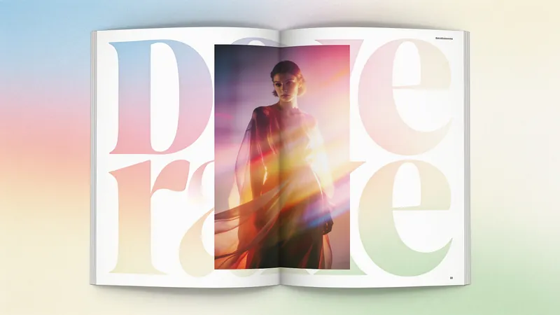 Webpage
Fashion Creative Design Page
A web design system with a fashion-editorial poster style: warm cream paper canvas (#fffef7), 300-weight oversized headlines (64–84px), full-bleed photography, zero shadows, square-corner cards + pill buttons with a 1440px radius. Suitable for needs such as "fashion design style", "magazine layout", "poster style", "art portfolio webpage", "studio portfolio", "gallery page". It can rewrite any content into a high-end fashion editorial style page.
 Image
ImageSemi-Flat Illustration Maker
Have you ever faced challenges like these when expressing ideas visually? Your brand needs a sense of sophistication, but purely flat illustrations feel too thin, lacking warmth and texture? You want to convey product details through a realistic style, but worry the image will become too complex and distract from the content itself? Abstract concepts, emotional stories, or complex ideas never quite look right—either too obvious or too obscure? You search through asset libraries but can’t find visuals that are both modern and elegant, while accurately capturing the core meaning? What we want is a visual language that feels just right—designed yet authentic, simple and powerful yet refined and engaging. Now, all you need to do is enter a piece of text. It will generate a semi-flat realistic illustration that gives your brand, content, or concept a distinctive visual appeal. What is it? An intelligent generation tool that transforms written content into modern, semi-flat realistic illustrations. It thoughtfully combines the clean outlines of flat illustration with the soft lighting and sense of volume found in realistic styles, finding an elegant balance between “too simple” and “too complex.” How does it work? Three simple steps Enter your text—whether it’s a brand story, an emotional monologue, a product description, or an abstract philosophical concept. It captures the core meaning with precision; (Optional) Adjust your composition or color preferences—you can set the direction for the image or let it interpret your input freely; Generate—a carefully composed illustration with sophisticated colors and finely rendered texture appears instantly. No drawing experience is required. You provide what to say; it takes care of how to show it. What makes its visual language distinctive? Outlines, but not flat—It preserves the fresh, modern outlines of flat illustration while using soft shadows and subtle volume to make objects feel dimensional rather than thin; Realistic, but not photorealistic—It avoids excessive photo-level detail, retaining only the warmth created by light, shadow, and materials, so the image feels believable while leaving room for imagination; Clean, but not empty—A pure white background keeps the visual focus on the subject, ensuring the image stays clean, restrained, and centered on the message you want to convey. Every piece strikes a subtle balance between design appeal and storytelling power. Where can it be used? Visualizing brand stories—Modern illustrations tailored to your brand’s character, conveying restrained yet richly textured visual symbols; Illustrating in-depth content—Make articles, reports, or columns less dry by letting images resonate with the words; Product explanations / concept presentations—Transform complex features or abstract ideas into an intuitive, elegant visual language; Decorative art / cover design—Clean, sophisticated imagery that naturally suits books, albums, or interior decoration. What you receive is more than just an image You’ll receive a clean illustration with no text to distract from the image, along with a visual style analysis. It briefly explains why the composition, lighting, and color palette were chosen to reflect your text, helping you better understand the design logic behind the image and making it easier to explain the creative direction to your team.
 Image
ImageJapanese Watercolor from Photos
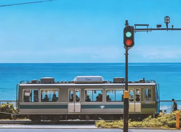
Turn landscape and streetscape photos into Japanese gallery-style, hand-painted watercolor art illustrations, complete with generous paper space and refined handwritten typography. ✨ Key highlights Gallery-quality negative space: The subject is kept small and centered, surrounded by generous warm-white cotton paper texture for a modern stationery and art-print feel. Authentic hand-painted watercolor texture: Naturally creates washed, blended effects, translucent layers of color, and loose hand-painted edges—without harsh outlines or a digital look. Intelligent scene refinement: Preserves key landmarks, architectural outlines, and distinctive light and shadow from the original image while naturally simplifying busy backgrounds and unnecessary objects. Poetic handwritten typography: Automatically adds a poetic short line and year at the bottom in dark gray or navy handwritten lettering, creating a calm, restrained everyday atmosphere. 📸 Ideal uses Reimagining travel memories: Turn streets, small shops, mountains, and seascapes from your travels into vintage postcards. Personal creative designs: Create phone wallpapers, stationery posters, physical postcards, and decorative art prints. Social media visuals: Provide restrained, sophisticated, and stylistically consistent artistic covers for platforms such as Xiaohongshu and WeChat Moments. 🚀 How to use Upload any landscape, architecture, or streetscape photo with a clear composition to automatically generate a matching minimalist watercolor art print.
Information
- Version
- v1
- Last updated
- Runtime credits
- Usage-based
- Models
- Auto