Profile Makeover Plan
Make your profile clear in five seconds
Profile Makeover Plan
Make your profile clear in five seconds
Showcase
Description
Your content may be solid, but strangers leave within three seconds of opening your profile. The problem is almost always the storefront: your name doesn’t show what you do, your bio says “Documenting life and sharing reflections,” your cover image has nothing to do with your content, and even you’ve forgotten which three posts are pinned. **Profile Makeover Plan** treats your profile as one cohesive whole and provides specific, replaceable copy for each of the five essentials: name (three versions—real-name, niche-based, and memorable), profile picture (three paths—person, object, or wordmark—with the tradeoffs of each), bio (the “who I am + who it’s for + what I offer + why trust me” formula, with the first three covered in the first 20 characters), cover image (a visual description that marks the area hidden by the profile picture), and three pinned posts (one signature piece, one methodology post, and one latest post). It also includes a five-second test: show the profile to someone who has never seen the account for five seconds and ask three questions. Hard rules: no image generation, only visual descriptions; no text should appear in the visuals (Chinese text may render incorrectly, and you can overlay the wording yourself); no imitation of any specific account; no help disguising anyone’s identity; no guidance on buying followers, reciprocal follows, or inflating metrics; and no promises of follower growth.
Recommended by
淡苍
Why we love this skill
A practical profile makeover focused on the key challenge: helping strangers understand who you are. It turns profile improvements into concrete, testable steps without fake polish.
Related Skills
View all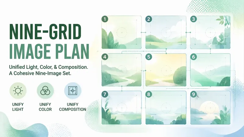 Image
Image9-Grid Visual Plan
Each of the nine images looks fine on its own, but together they look like they were made by nine different people—that’s the most common way a 9-grid layout fails. The problem is rarely that any single image looks bad. It’s that the nine images lack consistent lighting, color, and composition.【9-Grid Visual Plan】doesn’t just provide nine attractive images; it defines the relationships between them: first set one unifying theme, then assign each image a role (Image 1: hook; 2–4: development; Image 5: turning point; 6–8: payoff; Image 9: closing), and lock in the “three elements of consistency”—the same lighting (fixed direction and softness), the same color palette (with a 60/30/10 ratio and one specified color that cannot change across the nine images), and the same composition (consistent subject placement and scale). Each image includes a prompt you can copy directly for generation, specifying the subject, position, lighting, camera distance, and aspect ratio, along with the text-overlay position and character limit. Strict rules: no images are generated; no text may appear anywhere in the image (AI-generated Chinese text can be garbled and cannot be edited); no portraits of real celebrities; no existing cartoon, anime, game, or film characters; no imitation of a specific blogger or brand’s 9-grid style; and no promises of more likes or followers.
Atmospheric Covers
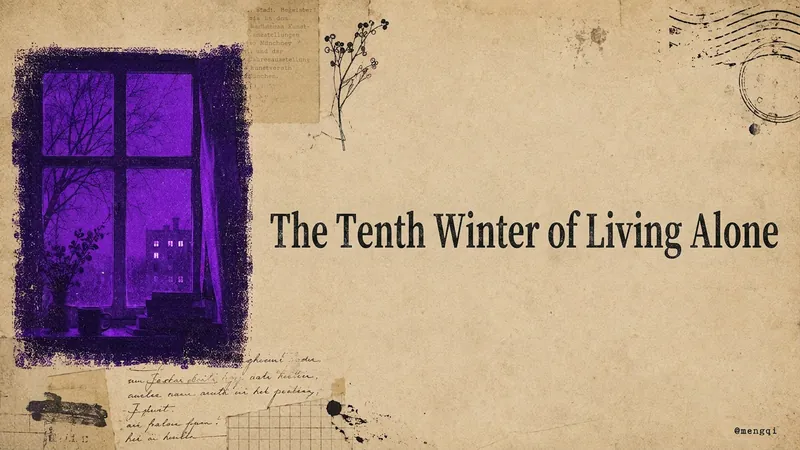
This is an everyday productivity tool for content creators who publish to Xiaohongshu, WeChat Official Accounts, WeChat Channels, Twitter, and YouTube. How many covers do you have to make by hand for every post you publish? Xiaohongshu needs a vertical cover with extra-bold serif type that stays readable in feed thumbnails. WeChat Official Account needs a horizontal header image. WeChat Channels needs a vertical 6:7 cover with text placed toward the top to avoid the UI overlay. Twitter needs a quote card. YouTube needs a restrained essay cover. Five platforms, five aspect ratios, five sets of text-density rules—if you adjust them manually every time, covers alone can eat up half an afternoon. Worse, the result is either too plain and template-like, or too cluttered like a sticker collage, and the styles never match each other, so your account's visual identity always feels scattered. This Skill takes that high-frequency task off your plate. Drop in a sentence, a mood, a title, or a whole article. It first extracts the keywords, translates them into a central visual concept, and expands that into 3–5 atmospheric elements. Then it produces covers for all five platforms at once—vertical or horizontal, whitespace ratio, and text rules are all adjusted automatically to each platform's style. All five images share the same imagery, the same mood color, and the same paper-textured cover family, so your account's visual identity naturally becomes a cohesive system. What makes it most valuable is that the visuals are rich without being messy, with the weight of printed matter rather than a pile of digital stickers. It has a built-in mood-to-color engine: quiet moods go cobalt blue, afternoons go ochre orange, a solitary winter goes violet. You don't need to understand color theory to get the right feel. One sentence in, five platform covers out, with a unified brand feel—no more tweaking each one individually. All you need to do: Input: a sentence, a mood, a topic, or a piece of content. ↓ Get all five platform-tailored atmospheric covers for Xiaohongshu, WeChat Official Account, WeChat Channels, Twitter, and YouTube in one go. ↓ Sit back and watch the followers roll in!
 Image
ImageLong-Form Carousel Splitter
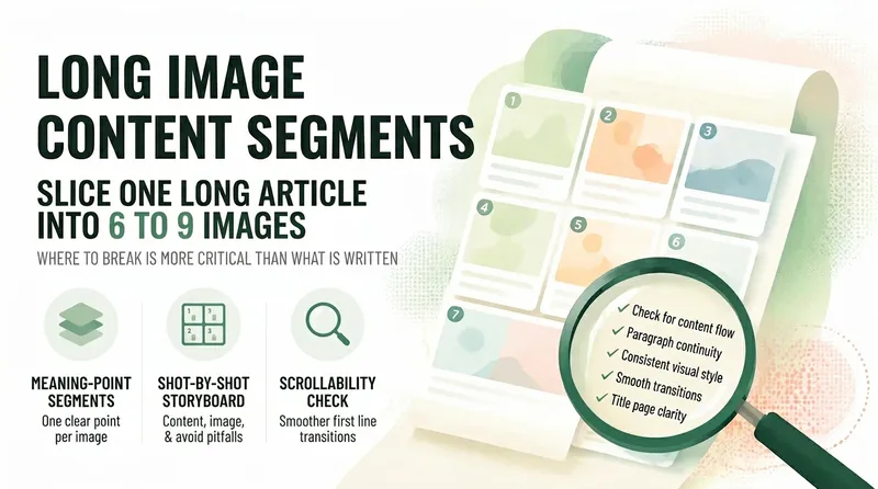
Long posts rarely get read to the end, so everyone wants to split them into slides—but most people split them the wrong way: dividing by word count leaves every slide feeling like a mini essay, the first slide gives away the conclusion and stops people from swiping, and the last slide burns goodwill with a forced follow prompt. 【Long-Form Carousel Splitter】doesn’t split by word count. It splits by "how many complete ideas there are": one idea per slide, with fewer slides preferred over more. So it may first tell you, "This piece is really only enough for 7 slides," instead of forcing it into nine. It then provides a slide-by-slide storyboard: what each slide covers, which sentences to include (with word counts), visual requirements, and the most common mistake to avoid on that slide. The first slide only needs to make people stop, with the minimum necessary information. The last slide only needs to leave them with one memorable line, not a summary. It also includes a practical swipeability check: read the first line of each slide together as a standalone passage. If it sounds like a complete sentence, the breakpoints are probably right. Hard rules: It does not generate images, put text in visuals, rewrite the original copy for you, include any existing IP characters, imitate the layout of a specific account, or promise completion rates.
Information
- Version
- v2
- Last updated
- Runtime credits
- Usage-based
- Models
- Auto
