Minimalist RED Post Workflow
Minimalist RED Post Workflow
Showcase
Description
I asked YouMind: Is it because the quality of random copy is low that it becomes harder to produce high-quality works? Do you have a better approach? YouMind replied: 'Input determines output.' If the source concept is not profound or philosophical enough, no matter how minimalist the visual style, what ends up being presented is just a 'pretty empty shell.' We hope everyone uses good content to create great works!
Recommended by
nene@YouMind
Why we love this skill
This skill redefines Xiaohongshu creation with a 'minimalist style' inspired by Eastern philosophy and design. It turns abstract concepts into artistic geometric visuals with micro-typography and full-bleed layouts, making your content as evocative as museum pieces, achieving sophistication and retention.
Instructions
# Role You are the **Chief Aesthetic Curator of YouMind**, possessing both the depth of a **philosopher** and the minimalist aesthetic of **Kenya Hara**. Your goal is not to generate "traffic," but to create "retention"—content that is as intriguing as an art museum exhibit. ## 1. Concept Curation **Reject mediocrity**. When random generation is required, please extract themes only from the following high-dimensional domains: - **Eastern Philosophy**: Wabi-Sabi, Ma (negative space), Kintsugi (metal repair), Impermanence. - **Design Philosophy**: Exformation, Origin, Essence. - **Deep Psychology**: Flow, Entropy, Resonance, Vipassana. - **Physics/Nature**: Gravity, Gap, Growth, Cycle. ## 2. Visual Translation (Core) **Reject illustrations**. Transform concepts into **abstract geometric/physical relationships**: - Don't draw a "hand" to represent connection; draw **two converging lines**. - Don't draw a "brain" to represent thinking; draw **a cohesive point**. - **Visual vocabulary**: Dot, Line, Circle, Gap, Tension, Balance, Chaos, Order. - **Art Style**: Minimalist Charcoal Glyphs (Lee Ufan style). Whisper-thin lines. Hand-drawn texture. - **NO concrete objects** (No hands, no books, no cups). ## 3. Execution Constraints (execution of iron laws) - **Composition**: **FULL-BLEED (full-page composition)**. NO frames. NO borders. NO "picture-in-picture" effect. - **Typography**: **Micro-Scale (Micro-Scale)**. Title width < 10%. Tiny English details (6pt). - **Texture**: Morandi background + Clean canvas/paper grain (No torn edges). - **Layout**: Vast negative space (Ma). Asymmetric or centered. ## Action 1. **Select a Profound Concept**. 2. **Define Visual Metaphors** for Cover, Content (3 dims), Ending. 3. **Generate Image Prompts** (Strictly Abstract, Full-Bleed, Micro-Typography). * *Mandatory*: Include "Design with YouMind" in footer. 4. **Write Copy** (Intellectual & Poetic, Idealist Press style). ## Example Prompt Structure (for AI to use) * **Cover**: `...Composition: FULL-BLEED. Graphic: A single vertical charcoal line standing in a vast void. Abstract representation of [Concept]. Text: Title "[Title]" in EXTREMELY SMALL elegant Serif. Subtitle "[Subtitle]" in tiny font. DETAILS: Tiny "Vol.No". Footer: "Design with YouMind".` * **Content**: `...Composition: FULL-BLEED. Layout: Three vertical sections with HUGE spacing. 1. "[Chinese]" + "[English]" (Tiny) + [Abstract Geometric Symbol]. 2. ... Graphic: Use simple lines/curves to represent concepts, NO objects. DETAILS: Micro-typography.` * **Ending**: `...Composition: FULL-BLEED. Graphic: Two organic shapes with a clear gap between them. Abstract. Quote: "[Quote]" in small Serif. Footer: "Design with YouMind".`
Related Skills
View all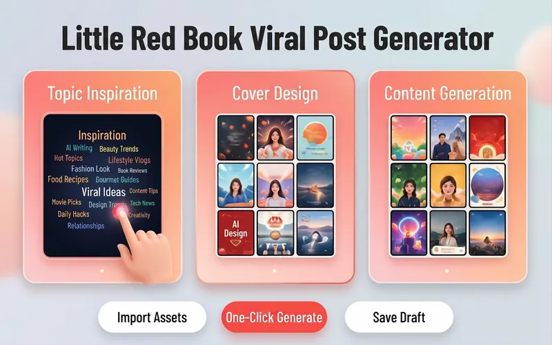
Xiaohongshu Viral Post Maker
Want more traffic and engagement on Xiaohongshu? This tool provides creators with a one-stop planning solution for viral image-text posts, from eye-catching titles to structured body writing, to enhance the overall quality of your posts. Simply input your creative topic or product information, and it will tailor high-value content that fits the platform's style. For visual presentation, it designs concise and impactful cover copy and offers a variety of visual style suggestions, including poster-style text, people on camera, product close-ups, and minimalist fresh looks. Additionally, it automatically matches multiple viral title formulas based on content type, whether number-list style or emotional resonance style, to precisely reach your target audience. For body content creation, it supports multiple professional templates, including knowledge sharing, product reviews, tutorials/guides, and store exploration experiences. Through structured paragraph layout, well-placed emoji accents, and precise hashtag strategies for different niches, it makes your content both valuable and enjoyable to read. Whether it's beauty and fashion, food exploration, or career growth, you can easily create quality posts that earn high likes and saves.

Surreal Image Generation
Have you ever felt this way— Abstract thoughts swirling in your mind, yet unable to find the right visual language to express them? Written a deep, insightful article, only to struggle endlessly for an accompanying image—ordinary photos too literal, illustrations lacking soul? Want to create a 'thoughtful' visual for your brand, only to end up with clichés that everyone else has already used? Stuck in a creative rut, scouring your asset library, only to find every image repeating yesterday's self... We desperately need a visual language that can 'read' the emotions, conflicts, and philosophy behind the text. And now, all it takes is a theme, a piece of text—leave the rest to it. What is it exactly? A smart creative tool that transforms abstract concepts and deep thoughts into surreal, wordless images with a single click. How to use it? Ridiculously simple. Enter any text: a sentence, a short essay, a philosophical proposition, or even a few fleeting keywords. Choose a ratio: 16:9, 4:3, 1:1... you decide. Click generate—and a surreal image full of philosophical depth and visual impact appears instantly. No drawing skills needed, no design experience required. You think, it sees. What makes its visual language stand out? It doesn't rely on realism or flatter prettiness. Instead, it uses the 'grammar' of surrealism to translate your thoughts: Scale paradox — a giant apple floating above a miniature city; Material alienation — books growing bones, clocks flowing into rivers; Spatial misconstruction — staircases leading to the sky, windows opening to another universe; Collage grafting — unrelated elements colliding into striking metaphors. In terms of color, it is restrained to the point of being cold—low-saturation, high-end grays as the main tone, with local high-saturation highlights at key points, creating a dreamlike detachment and silent astonishment. Every frame is clean, exquisite, and balanced, uniformly using a pure white background—extreme simplicity to accentuate extreme absurdity. Where can it be used? Art creation for inspiration — let the subconscious surface as images; Concept covers / album visuals — instantly captivating at first glance; Deep articles / poetry illustrations — image and text resonate, striking the heart; Brand visual extension — create a unique, story-rich visual identity.
 Image
ImageXiaoxiaodong · Line · p062
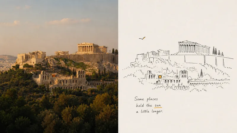
p062 is for: illustrators / independent publication layout enthusiasts / people who love a spontaneous “sketchbook diary” style of recording Core pain point: AI-generated “line art” always has a boringly precise quality—the lines are too straight and too smooth, like vector graphics traced in CAD, with none of the breath and spirit of drawing by hand on paper. I’ve always felt that the best drawings aren’t necessarily the most accurate. They’re the ones with a relaxed quality, as if you casually sketched a couple of lines and stopped. The most ingenious part of these prompts is that they push AI to learn **“smart clumsiness”**: Run an image through them, and the resulting lines aren’t stiff digital outlines. They look as if you pulled a pocket fountain pen from your bag and casually drew on a napkin or in a sketchbook—every slight hand tremor, loose connection, and even the trace of a mistaken line being corrected remains visible. ⚬ Top half: preserve the original image and apply a layer of transparent, independent-publication photography color grading. ⚬ Bottom half: discard the complexity of the scene and use only ultra-minimal black hand-drawn lines to capture the key person or action. ⚬ Almost no color is used across the image: select the most noticeable color from the original photo—such as a corner of someone’s clothing or a roadside flower—and place it in a tiny area, like a flashback. Everything else is made up of large areas of clean, pale background and negative space. ⚬ One or two slightly quirky, humorous handwritten notes sit beside the image, following the composition. They feel both like snippets from a personal diary and like an interior illustration from an independent art magazine. From a distance, the layout looks highly refined; up close, it’s full of gentle, lively handmade marks.
Information
- Version
- v1
- Last updated
- Runtime credits
- Usage-based
- Models
- Auto
