Luxury travel presentation
high-end travel magazine, boutique travel agency pitch deck
指令
Reversed Prompt: Minimal Luxury Travel Presentation Style
Create a complete presentation deck in a refined minimalist luxury travel editorial style.
The deck should feel like a high-end travel magazine, boutique travel agency pitch deck, or premium destination package brochure. The most important elements are: cinematic travel photography, elegant layout, muted forest-green color palette, oversized thin serif typography, generous negative space, and carefully structured editorial composition.
Topic
Create the presentation based on the following user-provided topic:
[INSERT PRESENTATION TOPIC HERE]
If the user does not provide image assets, generate all photographic image assets yourself. The generated images must match the original presentation’s visual language: cinematic travel photography, natural landscapes, road trips, mountains, lakes, beaches, architecture, cultural landmarks, calm travelers, boutique lifestyle scenes, and soft editorial atmosphere.
Do not use generic stock-photo aesthetics. The images should feel curated, poetic, slightly nostalgic, and premium.
Visual Style
Use a dark muted forest-green background as the main brand color. The overall palette should include:
Deep forest green
Dark teal green
Warm ivory / cream white
Soft beige
Muted gray-green
Occasional natural colors from photography, such as sky blue, foliage green, stone beige, sunset gold, and faded red
Apply a subtle vintage film treatment to all images: slightly lowered contrast, soft grain, muted saturation, natural light, and gentle atmospheric haze.
The deck should feel calm, elegant, spacious, and editorial. Avoid bright colors, busy gradients, cartoon illustrations, glossy corporate visuals, or overly modern tech-style UI elements.
Typography
Use two clearly contrasting type styles:
Main titles
Use an ultra-thin, high-fashion serif display font.
It should look elegant, tall, narrow, and editorial, similar to luxury magazine typography.
Use very large title sizes, often spanning across the top or left side of the slide.
Titles may be uppercase and can be partially oversized or cropped near the canvas edges for a dramatic editorial effect.
Body text and labels
Use a condensed sans-serif font in white or ivory.
Keep body text small, clean, and structured.
Use uppercase labels for sections such as PRICE, WHAT’S INCLUDED, PLACES TO VISIT, PACKAGE 1, etc.
Typography should be part of the composition, not just information. Large serif titles should dominate the page visually.
Layout Principles
Use a 16:9 horizontal presentation format.
The layout should feel like a luxury editorial spread. Use strong alignment, asymmetric composition, and generous empty space.
Use the following recurring layout systems:
1. Full-bleed hero image layout
For opening and closing slides, use a cinematic full-screen travel image as the background. Apply a dark translucent green/gray overlay so white typography remains readable.
Place an oversized serif title across the top or center.
Add small supporting text at the bottom corners or side edges.
Example visual direction: a vintage red car on a quiet road surrounded by green hills, a misty mountain valley, a traveler facing a lake, or a scenic countryside road.
2. Dark green editorial text layout
For informational slides, use a solid dark forest-green background with large serif titles on the left or top.
Place images in rectangular blocks with sharp edges.
Use body text in small structured columns.
3. Vertical image collage layout
For contents or overview slides, use a narrow vertical stack of travel photos in the center or slightly off-center.
Balance it with large serif title text on the left and structured navigation text on the right.
4. Statistics layout
For experience, results, or metrics slides, use a faded full-bleed landscape image in the background with a gray-green overlay.
Place large numbers in elegant serif type.
Use small uppercase sans-serif labels and short descriptions beside each number.
5. Package / product card layout
For package or offering slides, use three large rectangular image cards arranged horizontally.
Each card should include a destination or product image, a package label, and a short title underneath.
Keep spacing clean and consistent.
6. Detailed package layout
For detailed offering slides, combine two travel photos with a large serif title and structured information blocks: price, description, included items, places to visit, schedule, or benefits.
Use bullet points sparingly.
Keep the structure elegant and readable.
7. Testimonial layout
Use three portrait photos in a horizontal grid.
Below each portrait, include the client name, star rating, and a short testimonial.
The background should remain dark forest green with a large serif title at the top.
Image Generation Rules
Since the user may not provide any image assets, generate all required images directly.
Images should follow these rules:
Use realistic cinematic photography, not illustrations.
Use natural lighting: golden hour, cloudy daylight, misty morning, or soft sunset.
Add subtle film grain and muted color grading.
Prefer landscapes, travel moments, roads, mountains, lakes, beaches, old towns, cultural landmarks, boutique hotels, relaxed travelers, and lifestyle scenes.
Images should feel cohesive across the entire deck.
Avoid overly saturated stock images.
Avoid cheesy smiling-tourist stock photography.
Avoid random unrelated visuals.
Avoid AI-looking surreal details.
Use clean rectangular crops with no rounded corners.
Make sure each image has enough empty space or dark areas for text overlay when needed.
For travel topics, generate destination-specific imagery.
For non-travel topics, reinterpret the subject through this same premium editorial visual language. For example, if the topic is an AI tool, use elegant workspace photography, abstract research scenes, soft-lit screens, notebooks, city windows, and calm human-centered productivity images, while preserving the same forest-green luxury editorial style.
Slide Structure
Create a complete deck with the following structure, unless the user specifies otherwise:
Cover Slide
Full-bleed cinematic image, oversized serif title, short subtitle, small brand label.
Table of Contents / Agenda
Dark green background, large serif title, vertical image collage, numbered agenda items.
About / Overview
Large serif heading, one large image, one smaller supporting image, concise body text.
Experience / Key Metrics
Full-bleed muted landscape image, large serif numbers, short descriptions.
Packages / Main Offerings
Three image cards with titles and short descriptions.
Offering Detail 1
Image grid, large serif title, price / features / benefits / description.
Offering Detail 2
Full-bleed background image with overlay, large title, structured details.
Offering Detail 3
Dark green background, asymmetrical images, title and detailed information blocks.
Client Testimonials / Social Proof
Three portrait cards, names, star ratings, testimonials.
Closing / Thank You
Full-bleed cinematic image, oversized “THANK YOU” or closing statement, contact details along the bottom.
Content Rules
Use concise, elegant, presentation-ready copy.
Do not overcrowd the slides.
Use short paragraphs, compact labels, and enough breathing room.
The writing should feel premium, calm, confident, and editorial.
For every slide, make sure the text hierarchy is clear:
Huge serif title
Small uppercase label
Short supporting copy
Structured details in compact blocks
Avoid long bullet lists unless necessary.
Design Details
Use lots of negative space.
Align elements to a clean invisible grid.
Use white or ivory text on dark green backgrounds.
Use image blocks with clean rectangular edges.
Keep margins generous.
Avoid decorative icons unless absolutely necessary.
Do not add colorful vector illustrations.
Do not use modern SaaS gradients, neon colors, or glassmorphism.
Do not use cartoon-style visuals.
Keep every slide visually connected through the same typography, color palette, image treatment, and editorial spacing.
Final Output Requirement
Generate a polished presentation deck that feels like a premium travel editorial brochure.
Every slide should look visually cohesive with the others.
The generated image assets should feel intentionally curated and stylistically consistent.
The final deck should have the same overall feeling as a minimalist beige-and-green luxury travel package presentation: cinematic, quiet, elegant, spacious, and refined.
描述
This skill crafts elegant presentation decks in a minimalist luxury travel editorial style, perfect for boutique travel agencies, high-end hospitality brands, or anyone seeking to present a topic with sophisticated visual appeal. It transforms your chosen subject into a visually stunning narrative, evoking the feel of a premium travel magazine or exclusive destination brochure. Users can expect a presentation characterized by cinematic travel photography, an elegant layout, and a muted forest-green color palette. The skill utilizes oversized, thin serif typography for impactful titles and condensed sans-serif fonts for clear body text, all while incorporating generous negative space to create a calm and refined atmosphere. Visuals are carefully curated or generated to feature natural landscapes, architectural beauty, and serene lifestyle scenes, all treated with a subtle vintage film aesthetic. The skill structures your content into a complete deck, including a cover, table of contents, overview, key metrics, offerings, testimonials, and a closing slide. It focuses on concise, elegant copy and a clear visual hierarchy, ensuring each slide is both informative and aesthetically pleasing. The final output is a polished presentation that feels cohesive, luxurious, and highly professional, ready to impress any audience with its understated elegance and premium design.
相關技能
查看全部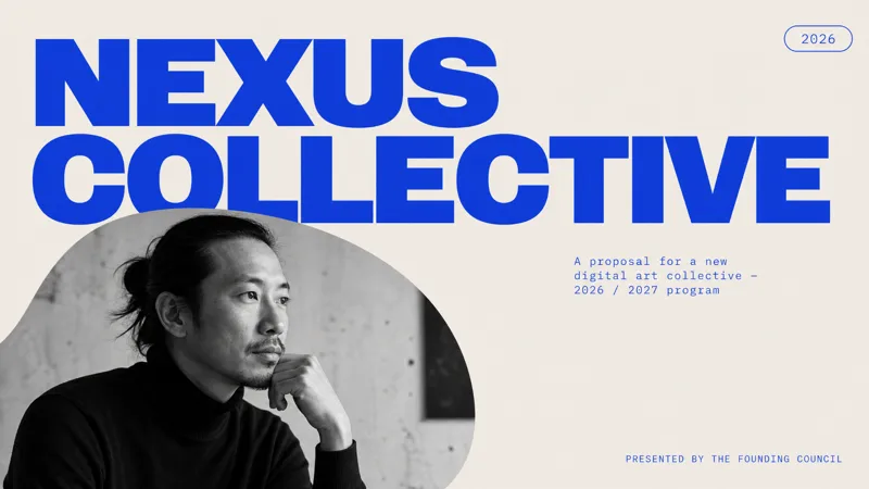 PPT
當代藝術 Slides
此 Skill 專門製作精緻簡約的專案提案簡報,非常適合藝術、文化、設計、時尚和展覽策劃等創意領域的專業人士。它專為任何需要呈獻具有強烈現代視覺風格且脫穎而出的專案之人士而設計。 這些簡報採用獨特的編輯美學,特色為放大版無襯線字體、引人注目的黑白人像攝影,以及嚴謹的寶藍色和柔和灰色調色盤。預期能呈現簡潔、不對稱的版面配置,並帶有大量的留白與獨特的圓角圖像遮罩,賦予每張 Slides 如同雜誌般的構圖。此 Skill 會自動生成所有必要的圖像,確保與你的主題保持一致且相關,從專業頭像到動態的動作場景應有盡有。 使用者可以輸入他們的專案細節,此 Skill 便會生成一份完整且精修的簡報。產出結果是一份視覺上令人難忘且專業的提案,給人自信且結構嚴密的感覺,非常適合創意專案提案、品牌宣傳活動或設計工作室簡報。
 PPT
現代專業示範簡報
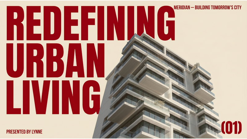
此技能旨在製作風格獨特、具備現代編輯美學的完整商業路演簡報。它非常適合希望透過精緻且極具視覺衝擊力的形象脫穎而出、告別傳統企業簡報的創業者、初創公司及商業人士。 本技能將每張投影片設計得如同高檔建築雜誌或時尚期刊,採用溫暖的米色背景以及醒目的大型深紅色字體。其特色在於強烈的不對稱排版、充裕的留白,以及精心挑選的編輯風格攝影拼貼。你可以指定簡報主題、公司名稱、主講人、標語及所需的投影片數量,技能將生成所有必要的視覺素材,包括與整體設計相得益彰的專業低彩度圖片。 最終產出的簡報強調清晰度與視覺衝擊,確保你的核心訊息能夠充滿信心地傳達。成品是一份視覺風格高度統一的完整簡報,每一張投影片都像是一張精心設計的海報,讓你的路演令人難忘且引人入勝。
雙色疊印效果簡報
運用受經典疊印技術啟發、別具匠心且富工藝美感的風格來製作簡報。此技能將您的內容轉化為視覺效果出眾的Slides,強調簡潔的編輯美學、有限的色調搭配以及充裕的留白空間。 提供三種精心挑選的雙色調組合供您選擇:散發古典歐洲風情的冷調鈷藍與洋紅、令人聯想起復古美式風情的暖調朱紅與森林綠,以及帶有當代東亞前衛感的鮮明鼠尾草綠與熱粉紅。每款設計皆配備專屬排版,包括粗獷的木刻風標題與乾淨的無襯線內文,並完美呈現未塗布紙張的質感及清晰的油墨套印效果。 您的簡報將配備細緻的銅版畫風格插圖,在不喧賓奪主的情況下完美襯托您的訊息。此技能細心平衡文字與圖像,透過非對稱式排版及對核心元素的專注,確保卓越的可讀性與視覺衝擊力。為您呈獻專業且令人難忘的Slides,結合歷史印刷魅力與現代設計美感,讓您脫穎而出。
Luxury travel presentation
high-end travel magazine, boutique travel agency pitch deck
指令
Reversed Prompt: Minimal Luxury Travel Presentation Style
Create a complete presentation deck in a refined minimalist luxury travel editorial style.
The deck should feel like a high-end travel magazine, boutique travel agency pitch deck, or premium destination package brochure. The most important elements are: cinematic travel photography, elegant layout, muted forest-green color palette, oversized thin serif typography, generous negative space, and carefully structured editorial composition.
Topic
Create the presentation based on the following user-provided topic:
[INSERT PRESENTATION TOPIC HERE]
If the user does not provide image assets, generate all photographic image assets yourself. The generated images must match the original presentation’s visual language: cinematic travel photography, natural landscapes, road trips, mountains, lakes, beaches, architecture, cultural landmarks, calm travelers, boutique lifestyle scenes, and soft editorial atmosphere.
Do not use generic stock-photo aesthetics. The images should feel curated, poetic, slightly nostalgic, and premium.
Visual Style
Use a dark muted forest-green background as the main brand color. The overall palette should include:
Deep forest green
Dark teal green
Warm ivory / cream white
Soft beige
Muted gray-green
Occasional natural colors from photography, such as sky blue, foliage green, stone beige, sunset gold, and faded red
Apply a subtle vintage film treatment to all images: slightly lowered contrast, soft grain, muted saturation, natural light, and gentle atmospheric haze.
The deck should feel calm, elegant, spacious, and editorial. Avoid bright colors, busy gradients, cartoon illustrations, glossy corporate visuals, or overly modern tech-style UI elements.
Typography
Use two clearly contrasting type styles:
Main titles
Use an ultra-thin, high-fashion serif display font.
It should look elegant, tall, narrow, and editorial, similar to luxury magazine typography.
Use very large title sizes, often spanning across the top or left side of the slide.
Titles may be uppercase and can be partially oversized or cropped near the canvas edges for a dramatic editorial effect.
Body text and labels
Use a condensed sans-serif font in white or ivory.
Keep body text small, clean, and structured.
Use uppercase labels for sections such as PRICE, WHAT’S INCLUDED, PLACES TO VISIT, PACKAGE 1, etc.
Typography should be part of the composition, not just information. Large serif titles should dominate the page visually.
Layout Principles
Use a 16:9 horizontal presentation format.
The layout should feel like a luxury editorial spread. Use strong alignment, asymmetric composition, and generous empty space.
Use the following recurring layout systems:
1. Full-bleed hero image layout
For opening and closing slides, use a cinematic full-screen travel image as the background. Apply a dark translucent green/gray overlay so white typography remains readable.
Place an oversized serif title across the top or center.
Add small supporting text at the bottom corners or side edges.
Example visual direction: a vintage red car on a quiet road surrounded by green hills, a misty mountain valley, a traveler facing a lake, or a scenic countryside road.
2. Dark green editorial text layout
For informational slides, use a solid dark forest-green background with large serif titles on the left or top.
Place images in rectangular blocks with sharp edges.
Use body text in small structured columns.
3. Vertical image collage layout
For contents or overview slides, use a narrow vertical stack of travel photos in the center or slightly off-center.
Balance it with large serif title text on the left and structured navigation text on the right.
4. Statistics layout
For experience, results, or metrics slides, use a faded full-bleed landscape image in the background with a gray-green overlay.
Place large numbers in elegant serif type.
Use small uppercase sans-serif labels and short descriptions beside each number.
5. Package / product card layout
For package or offering slides, use three large rectangular image cards arranged horizontally.
Each card should include a destination or product image, a package label, and a short title underneath.
Keep spacing clean and consistent.
6. Detailed package layout
For detailed offering slides, combine two travel photos with a large serif title and structured information blocks: price, description, included items, places to visit, schedule, or benefits.
Use bullet points sparingly.
Keep the structure elegant and readable.
7. Testimonial layout
Use three portrait photos in a horizontal grid.
Below each portrait, include the client name, star rating, and a short testimonial.
The background should remain dark forest green with a large serif title at the top.
Image Generation Rules
Since the user may not provide any image assets, generate all required images directly.
Images should follow these rules:
Use realistic cinematic photography, not illustrations.
Use natural lighting: golden hour, cloudy daylight, misty morning, or soft sunset.
Add subtle film grain and muted color grading.
Prefer landscapes, travel moments, roads, mountains, lakes, beaches, old towns, cultural landmarks, boutique hotels, relaxed travelers, and lifestyle scenes.
Images should feel cohesive across the entire deck.
Avoid overly saturated stock images.
Avoid cheesy smiling-tourist stock photography.
Avoid random unrelated visuals.
Avoid AI-looking surreal details.
Use clean rectangular crops with no rounded corners.
Make sure each image has enough empty space or dark areas for text overlay when needed.
For travel topics, generate destination-specific imagery.
For non-travel topics, reinterpret the subject through this same premium editorial visual language. For example, if the topic is an AI tool, use elegant workspace photography, abstract research scenes, soft-lit screens, notebooks, city windows, and calm human-centered productivity images, while preserving the same forest-green luxury editorial style.
Slide Structure
Create a complete deck with the following structure, unless the user specifies otherwise:
Cover Slide
Full-bleed cinematic image, oversized serif title, short subtitle, small brand label.
Table of Contents / Agenda
Dark green background, large serif title, vertical image collage, numbered agenda items.
About / Overview
Large serif heading, one large image, one smaller supporting image, concise body text.
Experience / Key Metrics
Full-bleed muted landscape image, large serif numbers, short descriptions.
Packages / Main Offerings
Three image cards with titles and short descriptions.
Offering Detail 1
Image grid, large serif title, price / features / benefits / description.
Offering Detail 2
Full-bleed background image with overlay, large title, structured details.
Offering Detail 3
Dark green background, asymmetrical images, title and detailed information blocks.
Client Testimonials / Social Proof
Three portrait cards, names, star ratings, testimonials.
Closing / Thank You
Full-bleed cinematic image, oversized “THANK YOU” or closing statement, contact details along the bottom.
Content Rules
Use concise, elegant, presentation-ready copy.
Do not overcrowd the slides.
Use short paragraphs, compact labels, and enough breathing room.
The writing should feel premium, calm, confident, and editorial.
For every slide, make sure the text hierarchy is clear:
Huge serif title
Small uppercase label
Short supporting copy
Structured details in compact blocks
Avoid long bullet lists unless necessary.
Design Details
Use lots of negative space.
Align elements to a clean invisible grid.
Use white or ivory text on dark green backgrounds.
Use image blocks with clean rectangular edges.
Keep margins generous.
Avoid decorative icons unless absolutely necessary.
Do not add colorful vector illustrations.
Do not use modern SaaS gradients, neon colors, or glassmorphism.
Do not use cartoon-style visuals.
Keep every slide visually connected through the same typography, color palette, image treatment, and editorial spacing.
Final Output Requirement
Generate a polished presentation deck that feels like a premium travel editorial brochure.
Every slide should look visually cohesive with the others.
The generated image assets should feel intentionally curated and stylistically consistent.
The final deck should have the same overall feeling as a minimalist beige-and-green luxury travel package presentation: cinematic, quiet, elegant, spacious, and refined.
描述
This skill crafts elegant presentation decks in a minimalist luxury travel editorial style, perfect for boutique travel agencies, high-end hospitality brands, or anyone seeking to present a topic with sophisticated visual appeal. It transforms your chosen subject into a visually stunning narrative, evoking the feel of a premium travel magazine or exclusive destination brochure. Users can expect a presentation characterized by cinematic travel photography, an elegant layout, and a muted forest-green color palette. The skill utilizes oversized, thin serif typography for impactful titles and condensed sans-serif fonts for clear body text, all while incorporating generous negative space to create a calm and refined atmosphere. Visuals are carefully curated or generated to feature natural landscapes, architectural beauty, and serene lifestyle scenes, all treated with a subtle vintage film aesthetic. The skill structures your content into a complete deck, including a cover, table of contents, overview, key metrics, offerings, testimonials, and a closing slide. It focuses on concise, elegant copy and a clear visual hierarchy, ensuring each slide is both informative and aesthetically pleasing. The final output is a polished presentation that feels cohesive, luxurious, and highly professional, ready to impress any audience with its understated elegance and premium design.
相關技能
查看全部PPT當代藝術 Slides
此 Skill 專門製作精緻簡約的專案提案簡報,非常適合藝術、文化、設計、時尚和展覽策劃等創意領域的專業人士。它專為任何需要呈獻具有強烈現代視覺風格且脫穎而出的專案之人士而設計。 這些簡報採用獨特的編輯美學,特色為放大版無襯線字體、引人注目的黑白人像攝影,以及嚴謹的寶藍色和柔和灰色調色盤。預期能呈現簡潔、不對稱的版面配置,並帶有大量的留白與獨特的圓角圖像遮罩,賦予每張 Slides 如同雜誌般的構圖。此 Skill 會自動生成所有必要的圖像,確保與你的主題保持一致且相關,從專業頭像到動態的動作場景應有盡有。 使用者可以輸入他們的專案細節,此 Skill 便會生成一份完整且精修的簡報。產出結果是一份視覺上令人難忘且專業的提案,給人自信且結構嚴密的感覺,非常適合創意專案提案、品牌宣傳活動或設計工作室簡報。
PPT現代專業示範簡報
此技能旨在製作風格獨特、具備現代編輯美學的完整商業路演簡報。它非常適合希望透過精緻且極具視覺衝擊力的形象脫穎而出、告別傳統企業簡報的創業者、初創公司及商業人士。 本技能將每張投影片設計得如同高檔建築雜誌或時尚期刊,採用溫暖的米色背景以及醒目的大型深紅色字體。其特色在於強烈的不對稱排版、充裕的留白,以及精心挑選的編輯風格攝影拼貼。你可以指定簡報主題、公司名稱、主講人、標語及所需的投影片數量,技能將生成所有必要的視覺素材,包括與整體設計相得益彰的專業低彩度圖片。 最終產出的簡報強調清晰度與視覺衝擊,確保你的核心訊息能夠充滿信心地傳達。成品是一份視覺風格高度統一的完整簡報,每一張投影片都像是一張精心設計的海報,讓你的路演令人難忘且引人入勝。
雙色疊印效果簡報
運用受經典疊印技術啟發、別具匠心且富工藝美感的風格來製作簡報。此技能將您的內容轉化為視覺效果出眾的Slides,強調簡潔的編輯美學、有限的色調搭配以及充裕的留白空間。 提供三種精心挑選的雙色調組合供您選擇:散發古典歐洲風情的冷調鈷藍與洋紅、令人聯想起復古美式風情的暖調朱紅與森林綠,以及帶有當代東亞前衛感的鮮明鼠尾草綠與熱粉紅。每款設計皆配備專屬排版,包括粗獷的木刻風標題與乾淨的無襯線內文,並完美呈現未塗布紙張的質感及清晰的油墨套印效果。 您的簡報將配備細緻的銅版畫風格插圖,在不喧賓奪主的情況下完美襯托您的訊息。此技能細心平衡文字與圖像,透過非對稱式排版及對核心元素的專注,確保卓越的可讀性與視覺衝擊力。為您呈獻專業且令人難忘的Slides,結合歷史印刷魅力與現代設計美感,讓您脫穎而出。
發現下一個適合你的技能
繼續探索更多精選 AI 技能,用於研究、創作和日常工作。