تقرير مبيعات/نمو/ميزانية
التعليمات
Based on selected content to generate slides. Ask user how many pages they want before start creating.
1. Visual Philosophy & Mood
Philosophy: "Organic Integration." It breaks away from the rigid boxes of traditional corporate decks, using fluid "blob" shapes to represent agility and continuous growth. This softness effectively counteracts the potential "coldness" of hard data, making complex marketing or growth logic feel more accessible.
Mood: Modern, transparent, and forward-thinking. It strikes a perfect balance between "professional trust" and "innovative energy"—ideal for carrying high-growth forecasts or large-scale budget proposals.
2. Color System & Materiality
Palette: "Aurora Gradients."
Bright Coral (#FF6B81): Used to highlight sales spikes, conversion peaks, or core growth KPIs.
Sky Blue (#48C6EF): Represents the baseline, stable budget foundations, or technological trust.
Deep Navy Violet (#2D326F): Used for typography to ensure maximum readability for financial figures.
Materiality: "Glassmorphism." The use of frosted, semi-transparent overlays creates a sense of depth, allowing data layers to "float" above the background. This prevents complex charts from feeling cluttered or heavy.
3. Layout Logic & Grid
Asymmetric Balance: Leverages significant negative space and shifted centers of gravity to create balance. This provides the necessary "visual breathing room" required when comparing multi-dimensional datasets.
Modular Encapsulation (Card UI): Content is housed in rounded, semi-transparent containers. This "dashboard-style" logic is perfect for displaying parallel KPIs, budget breakdowns, or multi-channel ROI while maintaining granular clarity.
4. Typography Personality
Font Choice: Geometric Sans-serifs (e.g., Montserrat, Poppins, Gilmer).
Characteristics: Heavyweight titles are reserved for bold financial numbers to convey authority and certainty. Small body text with generous line spacing ensures that even dense sales terms or growth footnotes remain easy to scan during a presentation.
5. Graphic Elements & Language
Fluid Vector Shapes: Large, smooth S-curves or cloud-like gradients subliminally suggest market momentum and unstoppable growth trends.
Dynamic Spheres: Scattered gradient orbs act as visual anchors, strategically placed to draw the eye toward critical data inflection points within a chart.
Streamlined Data Visualization: Simplified lines and dot-markers turn complex growth curves into abstract trends, forcing the audience to focus on the "big picture" rather than minor data noise.
6. Visual Hierarchy & Depth
Hierarchy:
Top Layer: North Star Metrics (Total Sales, ROI, Growth %).
Middle Layer: Data explanation cards and supporting infographics.
Base Layer: Soft brand-ambient gradients.
Sense of Depth: By using opacity overlaps instead of harsh drop shadows, the deck remains lightweight and efficient, even when packed with budget tables and pie charts.
7. Scenarios & Industry Alignment
Core Scenarios: Specifically engineered for data-heavy environments. It excels at marketing performance reviews, annual budget allocations, sales forecasting, and user growth funnels. It transforms heavy data into a compelling brand narrative.
Target Audience: From the perspective of an AI Company CMO, this style is most effective for convincing stakeholders who demand both rational data results and emotional brand momentum
الوصف
موصى بها من قبل
nene@YouMind
لماذا نحب هذه المهارة
يعمل منشئ التقارير هذا على تحويل البيانات الخام إلى عروض تقديمية جذابة بصريًا واستراتيجية. بفضل عناصر تصميم مبتكرة مثل "Glassmorphism" والتدرجات اللونية من Aurora، يجعل الأرقام المعقدة سهلة المنال وجذابة. مثالي لتوقعات النمو والميزانيات أو تحليلات أداء التسويق، فهو يتيح التواصل الفعال للمعلومات المالية الحاسمة.
مثالية للعروض التقديمية المعتمدة على البيانات. قم بإنشاء عروض تقديمية ديناميكية مع تدرجات أورورا الأنيقة وتأثيرات Glassmorphism، لضمان أن تبدو بياناتك دائمًا مقنعة وواضحة.
مهارات ذات صلة
عرض الكل شرائح
شرائحمراجعة الأداء
روايات نابضة بالحياة ومركزة على الإنسان. اصنع عروضاً تقديمية جذابة برسومات جريئة ورؤى واضحة، مثالية لصناعات التكنولوجيا والإبداع سريعة النمو.
 صفحة ويب
تقرير مشروع Warm Tones (HTML)
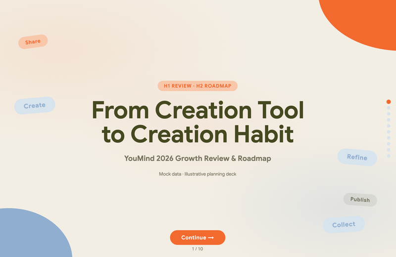
حوّل بياناتك واستراتيجيتك إلى عروض تقديمية عالية الجودة وجاهزة للمتصفح باستخدام نظام Warm Modular Clarity. تنشئ هذه المهارة تقارير HTML مستقلة مصممة لمراجعات نمو المنتج واستراتيجية الأعمال والرؤى التقنية. تتميز كل مجموعة بألوان معقدة من الزيتوني والحيادي الدافئ، مما يوفر جمالية احترافية مع لمسة ودودة تركز على سرد القصص الموجه نحو القرار بدلاً من النقاط العامة.
 شرائح
شرائحموجز هندسي عصري بألوان باردة
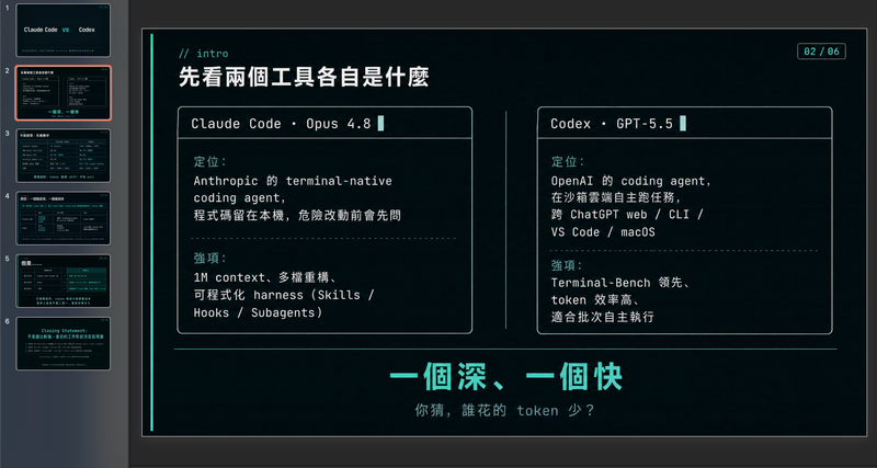
صمّم مخططات عروض تقديمية احترافية مدفوعة بالبيانات بأناقة هندسية متطورة. تتخصص هذه المهارة في توليد أطر عمل منظمة للعروض التقديمية تجمع بين مرئيات نظيفة، ولوحة ألوان عصرية باردة، ومنظور بضمير المتكلم. من خلال إعطاء الأولوية لسرد القصص القائم على البيانات على حساب العاطفة المبالغ فيها، تساعدك هذه المهارة على بناء سردية دقيقة تقنيًا وجافة وجذابة في آنٍ واحد، مثالية لمشاركة الأفكار مع جمهور مباشر لا يُقدّر المجاملات. تبدأ العملية باستشارة مركّزة لتحديد أهدافك المحددة، ونبرتك المفضلة، والقيود، لضمان أن الناتج يطابق أسلوبك الشخصي. ثم تجري بحثًا فوريًا على الويب لجمع إحصاءات قابلة للتحقق، وبيانات مقارنة، وحقائق غير بديهية، مما يضمن أن كل شريحة تستند إلى الواقع وليس إلى العموميات. الناتج النهائي هو إطار عمل كامل شريحة بشريحة، بما في ذلك اقتراحات محددة للتصورات، وعناصر تفاعلية للجمهور، ودليل توقيت إيقاعي لحديثك. مصمم لمن يقدّرون البساطة والاستعارات التقنية، يتميز الإطار الناتج بكثافة معلوماتية عالية دون ازدحام. يستخدم إشارات تصميم مستوحاة من واجهة الأوامر، وجداول بيانات دقيقة، وفكاهة لطيفة لإبقاء جمهورك مركزًا على الأفكار الأساسية. سواء كنت تعرض مقارنة تقنية أو اكتشافًا شخصيًا، ستحصل على وثيقة جاهزة للاستخدام يمكن إدخالها في أدوات توليد الشرائح المفضلة لديك أو استخدامها كدليل تصميم يدوي.
تقرير مبيعات/نمو/ميزانية
التعليمات
Based on selected content to generate slides. Ask user how many pages they want before start creating.
1. Visual Philosophy & Mood
Philosophy: "Organic Integration." It breaks away from the rigid boxes of traditional corporate decks, using fluid "blob" shapes to represent agility and continuous growth. This softness effectively counteracts the potential "coldness" of hard data, making complex marketing or growth logic feel more accessible.
Mood: Modern, transparent, and forward-thinking. It strikes a perfect balance between "professional trust" and "innovative energy"—ideal for carrying high-growth forecasts or large-scale budget proposals.
2. Color System & Materiality
Palette: "Aurora Gradients."
Bright Coral (#FF6B81): Used to highlight sales spikes, conversion peaks, or core growth KPIs.
Sky Blue (#48C6EF): Represents the baseline, stable budget foundations, or technological trust.
Deep Navy Violet (#2D326F): Used for typography to ensure maximum readability for financial figures.
Materiality: "Glassmorphism." The use of frosted, semi-transparent overlays creates a sense of depth, allowing data layers to "float" above the background. This prevents complex charts from feeling cluttered or heavy.
3. Layout Logic & Grid
Asymmetric Balance: Leverages significant negative space and shifted centers of gravity to create balance. This provides the necessary "visual breathing room" required when comparing multi-dimensional datasets.
Modular Encapsulation (Card UI): Content is housed in rounded, semi-transparent containers. This "dashboard-style" logic is perfect for displaying parallel KPIs, budget breakdowns, or multi-channel ROI while maintaining granular clarity.
4. Typography Personality
Font Choice: Geometric Sans-serifs (e.g., Montserrat, Poppins, Gilmer).
Characteristics: Heavyweight titles are reserved for bold financial numbers to convey authority and certainty. Small body text with generous line spacing ensures that even dense sales terms or growth footnotes remain easy to scan during a presentation.
5. Graphic Elements & Language
Fluid Vector Shapes: Large, smooth S-curves or cloud-like gradients subliminally suggest market momentum and unstoppable growth trends.
Dynamic Spheres: Scattered gradient orbs act as visual anchors, strategically placed to draw the eye toward critical data inflection points within a chart.
Streamlined Data Visualization: Simplified lines and dot-markers turn complex growth curves into abstract trends, forcing the audience to focus on the "big picture" rather than minor data noise.
6. Visual Hierarchy & Depth
Hierarchy:
Top Layer: North Star Metrics (Total Sales, ROI, Growth %).
Middle Layer: Data explanation cards and supporting infographics.
Base Layer: Soft brand-ambient gradients.
Sense of Depth: By using opacity overlaps instead of harsh drop shadows, the deck remains lightweight and efficient, even when packed with budget tables and pie charts.
7. Scenarios & Industry Alignment
Core Scenarios: Specifically engineered for data-heavy environments. It excels at marketing performance reviews, annual budget allocations, sales forecasting, and user growth funnels. It transforms heavy data into a compelling brand narrative.
Target Audience: From the perspective of an AI Company CMO, this style is most effective for convincing stakeholders who demand both rational data results and emotional brand momentum
الوصف
موصى بها من قبل
nene@YouMind
لماذا نحب هذه المهارة
يعمل منشئ التقارير هذا على تحويل البيانات الخام إلى عروض تقديمية جذابة بصريًا واستراتيجية. بفضل عناصر تصميم مبتكرة مثل "Glassmorphism" والتدرجات اللونية من Aurora، يجعل الأرقام المعقدة سهلة المنال وجذابة. مثالي لتوقعات النمو والميزانيات أو تحليلات أداء التسويق، فهو يتيح التواصل الفعال للمعلومات المالية الحاسمة.
مثالية للعروض التقديمية المعتمدة على البيانات. قم بإنشاء عروض تقديمية ديناميكية مع تدرجات أورورا الأنيقة وتأثيرات Glassmorphism، لضمان أن تبدو بياناتك دائمًا مقنعة وواضحة.
مهارات ذات صلة
عرض الكلشرائحمراجعة الأداء
روايات نابضة بالحياة ومركزة على الإنسان. اصنع عروضاً تقديمية جذابة برسومات جريئة ورؤى واضحة، مثالية لصناعات التكنولوجيا والإبداع سريعة النمو.
صفحة ويبتقرير مشروع Warm Tones (HTML)
حوّل بياناتك واستراتيجيتك إلى عروض تقديمية عالية الجودة وجاهزة للمتصفح باستخدام نظام Warm Modular Clarity. تنشئ هذه المهارة تقارير HTML مستقلة مصممة لمراجعات نمو المنتج واستراتيجية الأعمال والرؤى التقنية. تتميز كل مجموعة بألوان معقدة من الزيتوني والحيادي الدافئ، مما يوفر جمالية احترافية مع لمسة ودودة تركز على سرد القصص الموجه نحو القرار بدلاً من النقاط العامة.
شرائحموجز هندسي عصري بألوان باردة
صمّم مخططات عروض تقديمية احترافية مدفوعة بالبيانات بأناقة هندسية متطورة. تتخصص هذه المهارة في توليد أطر عمل منظمة للعروض التقديمية تجمع بين مرئيات نظيفة، ولوحة ألوان عصرية باردة، ومنظور بضمير المتكلم. من خلال إعطاء الأولوية لسرد القصص القائم على البيانات على حساب العاطفة المبالغ فيها، تساعدك هذه المهارة على بناء سردية دقيقة تقنيًا وجافة وجذابة في آنٍ واحد، مثالية لمشاركة الأفكار مع جمهور مباشر لا يُقدّر المجاملات. تبدأ العملية باستشارة مركّزة لتحديد أهدافك المحددة، ونبرتك المفضلة، والقيود، لضمان أن الناتج يطابق أسلوبك الشخصي. ثم تجري بحثًا فوريًا على الويب لجمع إحصاءات قابلة للتحقق، وبيانات مقارنة، وحقائق غير بديهية، مما يضمن أن كل شريحة تستند إلى الواقع وليس إلى العموميات. الناتج النهائي هو إطار عمل كامل شريحة بشريحة، بما في ذلك اقتراحات محددة للتصورات، وعناصر تفاعلية للجمهور، ودليل توقيت إيقاعي لحديثك. مصمم لمن يقدّرون البساطة والاستعارات التقنية، يتميز الإطار الناتج بكثافة معلوماتية عالية دون ازدحام. يستخدم إشارات تصميم مستوحاة من واجهة الأوامر، وجداول بيانات دقيقة، وفكاهة لطيفة لإبقاء جمهورك مركزًا على الأفكار الأساسية. سواء كنت تعرض مقارنة تقنية أو اكتشافًا شخصيًا، ستحصل على وثيقة جاهزة للاستخدام يمكن إدخالها في أدوات توليد الشرائح المفضلة لديك أو استخدامها كدليل تصميم يدوي.
اعثر على مهارتك المفضلة التالية
استكشف مزيدًا من مهارات الذكاء الاصطناعي المنتقاة للبحث والإبداع والعمل اليومي.