مراجعة الأداء
التعليمات
Based on selected material, generates slides. Ask user how many pages they want then proceed.
1. Visual Philosophy & Mood
Philosophy: "Human-Centric Data." Rather than pursuing clinical minimalism, the design uses hand-drawn strokes to inject warmth and personality into cold, analytical data.
Mood: Vibrant, confident, and transparent. It communicates a "serious but not stiff" geek culture—showing that the team is professional without losing its creative soul.
2. Color System & Materiality
Core Palette: A high-contrast variation of primary colors.
Electric Blue (#2D7CF1): Symbolizes technology, trust, and scalable growth.
Coral Red (#F15A5A): Utilized for emphasis, warnings, or key achievements to maximize visual impact.
Off-White/Cream (#F5F2E9): Replaces stark white to reduce eye strain while adding a tactile, premium, and slightly vintage feel.
Materiality: Pure Flat Design. No gradients or drop shadows; the focus is entirely on the purity and saturation of the color blocks.
3. Layout Logic & Grid
Modular Layout: Extensive use of the "Bento Box" grid, partitioning information into rounded rectangles of varying sizes.
Negative Space: High "breathability" where text maintains a generous margin from the edges to avoid clutter.
Asymmetric Balance: A juxtaposition of structured text/charts on one side and large-scale freehand illustrations on the other, creating a "Left Brain (Rational) vs. Right Brain (Emotional)" synergy.
4. Typography Personality
Headlines: Bold Geometric Sans-serif (e.g., Montserrat or Archivo). The personality is rigid, modern, and carries a sense of authority.
Body Text: Standard Sans-serif. Prioritizes readability with slightly increased letter spacing for a calm, composed appearance.
5. Graphic Elements & Language
Illustration Style: Bold Linework Illustration characterized by:
Thick black outlines.
Exaggerated human proportions (long limbs, small heads) to convey dynamism.
Spot Color filling: Colors within the illustrations are strictly unified with the brand’s blue and red palette.
Containers: High Corner Radius (large rounded corners) to soften the "aggressive" nature of corporate competition.
6. Visual Hierarchy & Depth
Flat Depth: Instead of shadows, depth is created through element layering—such as characters overlapping data bars—to suggest a three-dimensional space.
Information Layering: Massive headline hierarchy followed by KPI values, with descriptive text being the finest. The visual path is: Headline → Hero Graphic/Big Number → Detailed List.
7. Scenarios & Industry Alignment
Industry Fit: High-growth AI companies, creative agencies, SaaS platforms, and tech startups.
Use Cases: Year-end/Quarterly reviews, fundraising decks, and culture building. This style is exceptionally effective at packaging "growth momentum" and "team synergy" into a compelling narrative.
الوصف
موصى بها من قبل
nene@YouMind
لماذا نحب هذه المهارة
تقوم هذه المهارة بصياغة شرائح Slides تقييم الأداء بفلسفة فريدة "Human-Centric Data"، تمزج بين الرسومات النابضة بالحياة والمرسومة يدويًا وتخطيط منظم معياري. توازن بشكل مميز بين الاحترافية واللمسة الإبداعية للعروض التقديمية الديناميكية.
روايات نابضة بالحياة ومركزة على الإنسان. اصنع عروضاً تقديمية جذابة برسومات جريئة ورؤى واضحة، مثالية لصناعات التكنولوجيا والإبداع سريعة النمو.
مهارات ذات صلة
عرض الكل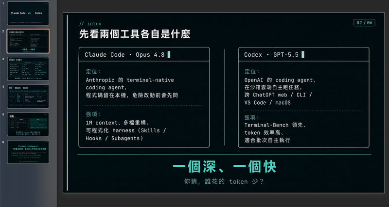 شرائح
شرائحموجز هندسي عصري بألوان باردة
صمّم مخططات عروض تقديمية احترافية مدفوعة بالبيانات بأناقة هندسية متطورة. تتخصص هذه المهارة في توليد أطر عمل منظمة للعروض التقديمية تجمع بين مرئيات نظيفة، ولوحة ألوان عصرية باردة، ومنظور بضمير المتكلم. من خلال إعطاء الأولوية لسرد القصص القائم على البيانات على حساب العاطفة المبالغ فيها، تساعدك هذه المهارة على بناء سردية دقيقة تقنيًا وجافة وجذابة في آنٍ واحد، مثالية لمشاركة الأفكار مع جمهور مباشر لا يُقدّر المجاملات. تبدأ العملية باستشارة مركّزة لتحديد أهدافك المحددة، ونبرتك المفضلة، والقيود، لضمان أن الناتج يطابق أسلوبك الشخصي. ثم تجري بحثًا فوريًا على الويب لجمع إحصاءات قابلة للتحقق، وبيانات مقارنة، وحقائق غير بديهية، مما يضمن أن كل شريحة تستند إلى الواقع وليس إلى العموميات. الناتج النهائي هو إطار عمل كامل شريحة بشريحة، بما في ذلك اقتراحات محددة للتصورات، وعناصر تفاعلية للجمهور، ودليل توقيت إيقاعي لحديثك. مصمم لمن يقدّرون البساطة والاستعارات التقنية، يتميز الإطار الناتج بكثافة معلوماتية عالية دون ازدحام. يستخدم إشارات تصميم مستوحاة من واجهة الأوامر، وجداول بيانات دقيقة، وفكاهة لطيفة لإبقاء جمهورك مركزًا على الأفكار الأساسية. سواء كنت تعرض مقارنة تقنية أو اكتشافًا شخصيًا، ستحصل على وثيقة جاهزة للاستخدام يمكن إدخالها في أدوات توليد الشرائح المفضلة لديك أو استخدامها كدليل تصميم يدوي.
 شرائح
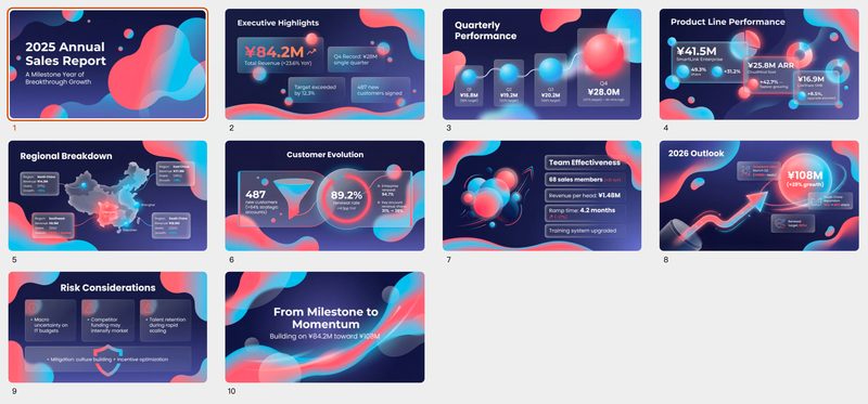
شرائحتقرير مبيعات/نمو/ميزانية
مثالية للعروض التقديمية المعتمدة على البيانات. قم بإنشاء عروض تقديمية ديناميكية مع تدرجات أورورا الأنيقة وتأثيرات Glassmorphism، لضمان أن تبدو بياناتك دائمًا مقنعة وواضحة.
 شرائح
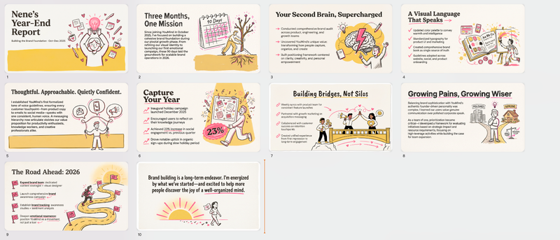
شرائحرسم يدوي نابض بالحياة للمحترفين الشباب
اصنع شرائح Slides بلمسة إنسانية أصيلة، تمزج بين الذوق الفني والإنتاجية المهنية لتحقيق تأثير لا يُنسى.
مراجعة الأداء
التعليمات
Based on selected material, generates slides. Ask user how many pages they want then proceed.
1. Visual Philosophy & Mood
Philosophy: "Human-Centric Data." Rather than pursuing clinical minimalism, the design uses hand-drawn strokes to inject warmth and personality into cold, analytical data.
Mood: Vibrant, confident, and transparent. It communicates a "serious but not stiff" geek culture—showing that the team is professional without losing its creative soul.
2. Color System & Materiality
Core Palette: A high-contrast variation of primary colors.
Electric Blue (#2D7CF1): Symbolizes technology, trust, and scalable growth.
Coral Red (#F15A5A): Utilized for emphasis, warnings, or key achievements to maximize visual impact.
Off-White/Cream (#F5F2E9): Replaces stark white to reduce eye strain while adding a tactile, premium, and slightly vintage feel.
Materiality: Pure Flat Design. No gradients or drop shadows; the focus is entirely on the purity and saturation of the color blocks.
3. Layout Logic & Grid
Modular Layout: Extensive use of the "Bento Box" grid, partitioning information into rounded rectangles of varying sizes.
Negative Space: High "breathability" where text maintains a generous margin from the edges to avoid clutter.
Asymmetric Balance: A juxtaposition of structured text/charts on one side and large-scale freehand illustrations on the other, creating a "Left Brain (Rational) vs. Right Brain (Emotional)" synergy.
4. Typography Personality
Headlines: Bold Geometric Sans-serif (e.g., Montserrat or Archivo). The personality is rigid, modern, and carries a sense of authority.
Body Text: Standard Sans-serif. Prioritizes readability with slightly increased letter spacing for a calm, composed appearance.
5. Graphic Elements & Language
Illustration Style: Bold Linework Illustration characterized by:
Thick black outlines.
Exaggerated human proportions (long limbs, small heads) to convey dynamism.
Spot Color filling: Colors within the illustrations are strictly unified with the brand’s blue and red palette.
Containers: High Corner Radius (large rounded corners) to soften the "aggressive" nature of corporate competition.
6. Visual Hierarchy & Depth
Flat Depth: Instead of shadows, depth is created through element layering—such as characters overlapping data bars—to suggest a three-dimensional space.
Information Layering: Massive headline hierarchy followed by KPI values, with descriptive text being the finest. The visual path is: Headline → Hero Graphic/Big Number → Detailed List.
7. Scenarios & Industry Alignment
Industry Fit: High-growth AI companies, creative agencies, SaaS platforms, and tech startups.
Use Cases: Year-end/Quarterly reviews, fundraising decks, and culture building. This style is exceptionally effective at packaging "growth momentum" and "team synergy" into a compelling narrative.
الوصف
موصى بها من قبل
nene@YouMind
لماذا نحب هذه المهارة
تقوم هذه المهارة بصياغة شرائح Slides تقييم الأداء بفلسفة فريدة "Human-Centric Data"، تمزج بين الرسومات النابضة بالحياة والمرسومة يدويًا وتخطيط منظم معياري. توازن بشكل مميز بين الاحترافية واللمسة الإبداعية للعروض التقديمية الديناميكية.
روايات نابضة بالحياة ومركزة على الإنسان. اصنع عروضاً تقديمية جذابة برسومات جريئة ورؤى واضحة، مثالية لصناعات التكنولوجيا والإبداع سريعة النمو.
مهارات ذات صلة
عرض الكلشرائحموجز هندسي عصري بألوان باردة
صمّم مخططات عروض تقديمية احترافية مدفوعة بالبيانات بأناقة هندسية متطورة. تتخصص هذه المهارة في توليد أطر عمل منظمة للعروض التقديمية تجمع بين مرئيات نظيفة، ولوحة ألوان عصرية باردة، ومنظور بضمير المتكلم. من خلال إعطاء الأولوية لسرد القصص القائم على البيانات على حساب العاطفة المبالغ فيها، تساعدك هذه المهارة على بناء سردية دقيقة تقنيًا وجافة وجذابة في آنٍ واحد، مثالية لمشاركة الأفكار مع جمهور مباشر لا يُقدّر المجاملات. تبدأ العملية باستشارة مركّزة لتحديد أهدافك المحددة، ونبرتك المفضلة، والقيود، لضمان أن الناتج يطابق أسلوبك الشخصي. ثم تجري بحثًا فوريًا على الويب لجمع إحصاءات قابلة للتحقق، وبيانات مقارنة، وحقائق غير بديهية، مما يضمن أن كل شريحة تستند إلى الواقع وليس إلى العموميات. الناتج النهائي هو إطار عمل كامل شريحة بشريحة، بما في ذلك اقتراحات محددة للتصورات، وعناصر تفاعلية للجمهور، ودليل توقيت إيقاعي لحديثك. مصمم لمن يقدّرون البساطة والاستعارات التقنية، يتميز الإطار الناتج بكثافة معلوماتية عالية دون ازدحام. يستخدم إشارات تصميم مستوحاة من واجهة الأوامر، وجداول بيانات دقيقة، وفكاهة لطيفة لإبقاء جمهورك مركزًا على الأفكار الأساسية. سواء كنت تعرض مقارنة تقنية أو اكتشافًا شخصيًا، ستحصل على وثيقة جاهزة للاستخدام يمكن إدخالها في أدوات توليد الشرائح المفضلة لديك أو استخدامها كدليل تصميم يدوي.
شرائحتقرير مبيعات/نمو/ميزانية
مثالية للعروض التقديمية المعتمدة على البيانات. قم بإنشاء عروض تقديمية ديناميكية مع تدرجات أورورا الأنيقة وتأثيرات Glassmorphism، لضمان أن تبدو بياناتك دائمًا مقنعة وواضحة.
شرائحرسم يدوي نابض بالحياة للمحترفين الشباب
اصنع شرائح Slides بلمسة إنسانية أصيلة، تمزج بين الذوق الفني والإنتاجية المهنية لتحقيق تأثير لا يُنسى.
اعثر على مهارتك المفضلة التالية
استكشف مزيدًا من مهارات الذكاء الاصطناعي المنتقاة للبحث والإبداع والعمل اليومي.