Kami design
Instruções
# Design System
## Manifesto
kami's aesthetic compresses into one sentence: **warm parchment canvas, ink-blue accent, serif carries authority, refuse cool grays and hard shadows**.
This is not a UI framework. It is a set of aesthetic constraints for print. It assumes a high-quality document should read like literature, not a dashboard. Every rule's trade-off is the same one: rather than add another option, remove another temptation.
**The eight invariants** (think hard before violating any):
1. Page background parchment `#f5f4ed`, never pure white
2. Single accent: ink-blue `#1B365D`, no second chromatic color
3. All grays warm-toned (yellow-brown undertone), no cool blue-grays
4. English: serif for everything (headlines and body). Chinese: serif headlines, sans body. Sans only for UI elements (labels, eyebrows, meta) in both
5. Serif weight locked at 500, no bold
6. Line-heights: tight headlines 1.1-1.3, dense body 1.4-1.45, reading body 1.5-1.55. **Never 1.6+**
7. Tag backgrounds must be solid hex, never rgba (WeasyPrint renders a double rectangle)
8. Depth via ring shadow or whisper shadow, never hard drop shadows
9. **No italic anywhere**. No `font-style: italic` in any template or demo. No italic @font-face declarations needed
This system is a fusion of Anthropic's visual language and real Chinese / English resume iteration. Details below.
---
## 1. Color
**Single accent, warm neutrals only, zero cool tones** - this is the core.
### Brand
```css
--brand: #1B365D; /* Ink Blue - the only chromatic color. CTAs, accents, section-title underlines. */
--brand-light: #2D5A8A; /* Coral - brighter variant, for links on dark surfaces. */
```
**Rule**: ink-blue covers ≤ **5% of document surface area**. More than that is ornament, not restraint.
### Surface
```css
--parchment: #f5f4ed; /* Page background - warm cream, the emotional foundation */
--ivory: #faf9f5; /* Card / lifted container - brighter than parchment */
--warm-sand: #e8e6dc; /* Button default / interactive surface */
--dark-surface: #30302e; /* Dark-theme container - warm charcoal */
--deep-dark: #141413; /* Dark-theme page background - not pure black, slight olive undertone */
```
**Never**: `#ffffff` pure white as page background. `#f8f9fa` / `#f3f4f6` or any cool-gray surface.
### Text
```css
--near-black: #141413; /* Primary text - deepest but not pure black, warm olive undertone */
--dark-warm: #3d3d3a; /* Secondary dark / dark link color */
--charcoal: #4d4c48; /* Button text / dense body */
--olive: #5e5d59; /* Subtext - descriptions, captions */
--stone: #87867f; /* Tertiary - dates, metadata */
--warm-silver: #b0aea5; /* Light text on dark surfaces */
```
**Mnemonic**: every gray has a **yellow-brown undertone**. In `rgb()`, warm gray is R ≈ G > B (or R > G > B with small gaps). Cool gray is R < G < B or R = G = B (neutral).
### Border
```css
--border-cream: #f0eee6; /* Softest border - default cards */
--border-warm: #e8e6dc; /* Prominent border - section dividers */
--border-soft: #efede4; /* Dotted divider - between list items */
--border-dark: #30302e; /* Border on dark surfaces */
```
### Ring shadow (not traditional box-shadow)
```css
--ring-warm: #d1cfc5; /* Button hover / focus */
--ring-deep: #c2c0b6; /* Pressed state */
```
### Functional (use sparingly)
```css
--error: #b53333; /* Deep warm red - serious without alarming */
--focus: #3898ec; /* Focus ring blue - the only cool color, strictly for accessibility */
```
### Translucent -> Solid conversion (TAGS MUST BE SOLID)
**Why**: WeasyPrint's alpha compositing for padding vs glyph areas produces a visible double rectangle on zoom. See `production.md` Part 4 Pitfall #1.
Ink Blue `#1B365D` over parchment `#f5f4ed`:
| rgba alpha | Solid hex |
|---|---|
| 0.08 | `#EEF2F7` |
| 0.14 | `#E4ECF5` |
| **0.18** | **`#E4ECF5`** ← default tag |
| 0.22 | `#ead3c7` |
| 0.30 | `#D6E1EE` |
---
## 2. Typography
### Stacks
```css
/* Serif for headlines - Silicon Valley editorial */
font-family: "Newsreader", /* Google Fonts - preferred */
"Source Serif 4", "Source Serif Pro",
"Charter", /* macOS system font */
Georgia, "Times New Roman", serif;
/* Sans for UI elements - Silicon Valley default */
font-family: "Inter", "TsangerJinKai02",
-apple-system, BlinkMacSystemFont,
"Helvetica Neue", Arial, sans-serif;
/* Mono for code */
font-family: "JetBrains Mono", "SF Mono", "Fira Code",
Consolas, Monaco, monospace;
```
For Chinese documents, see `design.md` for the TsangerJinKai02 + Source Han stack.
### Size scale (pt for print A4, px for screen)
**Print:**
| Role | Size | Weight | Line-height | Use |
|---|---|---|---|---|
| Display | 36-48pt | 500 | 1.10 | Cover title, one-pager hero |
| H1 Section | 18-22pt | 500 | 1.20 | Chapter titles |
| H2 | 14-16pt | 500 | 1.25 | Subsection |
| H3 | 12-13pt | 500 | 1.30 | Item titles |
| Body Lead | 11pt | 400 | 1.55 | Intro paragraphs |
| Body | 9.5-10pt | 400 | 1.55 | Reading body |
| Body Dense | 9-9.2pt | 400 | 1.42 | Dense body (resume, one-pager) |
| Caption | 8.5-9pt | 400 | 1.45 | Notes, figure captions |
| Label | 7.5-8pt | 600 | 1.35 | Small labels, corner tags |
| Tiny | 7pt | 400 | 1.40 | Footer, minor metadata |
**Screen (px)** ≈ pt × 1.33 (9pt ≈ 12px, 18pt ≈ 24px).
### Weight
- **Serif**: locked at 500. Not 400, not 700. Single-weight consistency is part of the design language.
- **Sans body**: 400 default
- **Sans labels / small titles**: 500 or 600
- **Forbidden**: 900 black, 100 thin
### Line-height
Print documents are **tighter** than English web body. English web typically runs 1.6-1.75; in print at pt sizes that feels loose and floats.
| Tier | Value | Use |
|---|---|---|
| Tight headline | 1.10-1.30 | Display, H1, H2 |
| Dense body | 1.40-1.45 | Resume, one-pager, dense information |
| Reading body | 1.50-1.55 | Long-doc chapters, letters |
| Label / caption | 1.30-1.40 | Small labels, multi-line metadata |
**Forbidden**:
- 1.60+ - loose feel, web rhythm, not print
- 1.00-1.05 - lines collide except at extreme display sizes
### Letter-spacing
- Body text: **0** (or +0.05pt imperceptible)
- English headings above 20pt: -0.3 to -0.5pt (tighten, English serifs handle it)
- Small labels (< 10pt): +0.2 to +0.5pt for readability
- All-caps overlines: +0.5 to +1pt mandatory
---
## 3. Spacing
### Base unit: 4pt (4px on screen)
| Tier | Value | Use |
|---|---|---|
| xs | 2-3pt | Inline adjacent elements |
| sm | 4-5pt | Tag padding, dense layout |
| md | 8-10pt | Component interior |
| lg | 16-20pt | Between components / card padding |
| xl | 24-32pt | Section-title margins |
| 2xl | 40-60pt | Between major sections |
| 3xl | 80-120pt | Between chapters (long docs) |
### Page margins (A4)
| Document | Top | Right | Bottom | Left |
|---|---|---|---|---|
| Resume (dense) | 11mm | 13mm | 11mm | 13mm |
| One-Pager | 15mm | 18mm | 15mm | 18mm |
| Long Doc | 20mm | 22mm | 22mm | 22mm |
| Letter | 25mm | 25mm | 25mm | 25mm |
| Portfolio | 12mm | 15mm | 12mm | 15mm |
**Rule**: denser = smaller margins, more formal (letter) = larger margins.
---
## 4. Components
### Cards / Containers
```css
.card {
background: var(--ivory);
border: 0.5pt solid var(--border-cream);
border-radius: 8pt;
padding: 16pt 20pt;
}
.card-featured {
border-radius: 16pt;
box-shadow: 0 4pt 24pt rgba(0,0,0,0.05); /* whisper shadow */
}
```
Radius scale: 4pt -> 6pt -> 8pt (default) -> 12pt -> 16pt -> 24pt -> 32pt (hero containers).
### Buttons
```css
/* Primary - brand-colored */
.btn-primary {
background: var(--brand);
color: var(--ivory);
padding: 8pt 16pt;
border-radius: 8pt;
box-shadow: 0 0 0 1pt var(--brand); /* ring shadow */
}
/* Secondary - warm-sand */
.btn-secondary {
background: var(--warm-sand);
color: var(--charcoal);
padding: 8pt 16pt;
border-radius: 8pt;
box-shadow: 0 0 0 1pt var(--ring-warm);
}
```
### Tags
Three tiers from weak to strong visual weight:
**Lightest solid** (default, most restrained):
```css
.tag {
background: #EEF2F7; /* 0.08 solid equivalent */
color: var(--brand);
font-size: 8pt;
font-weight: 600;
padding: 1pt 5pt;
border-radius: 2pt;
letter-spacing: 0.4pt;
text-transform: uppercase;
}
```
**Standard solid** (when more contrast needed):
```css
.tag {
background: #E4ECF5; /* 0.18 solid equivalent */
color: var(--brand);
padding: 1pt 6pt;
border-radius: 4pt;
}
```
**Gradient brush** (only when "hand-painted" feel is required - use sparingly):
```css
.tag {
background: linear-gradient(to right, #D6E1EE, #E4ECF5 70%, #EEF2F7);
color: var(--brand);
padding: 1pt 5pt;
border-radius: 2pt;
}
```
**Philosophy**: tint depth should be one step lighter than what decoration wants. Prefer pale over saturated. In iteration, "gradient brush" often steals focus - lightest solid wins most of the time.
**Never**: `background: rgba(201, 100, 66, 0.18)` - WeasyPrint double-rectangle bug.
### Lists
```css
ul, ol {
padding-left: 16pt;
line-height: 1.55;
}
ul li::marker { color: var(--brand); }
```
Editorial bookish variant - **em-dash instead of bullet**:
```css
ul.dash { list-style: none; padding-left: 0; }
ul.dash li::before {
content: "- ";
color: var(--brand);
}
```
### Quote
```css
.quote {
border-left: 2pt solid var(--brand);
padding: 4pt 0 4pt 14pt;
color: var(--olive);
line-height: 1.55;
}
```
### Code
```css
.code-block {
background: var(--ivory);
border: 0.5pt solid var(--border-cream);
border-radius: 6pt;
padding: 10pt 14pt;
font-family: var(--mono);
font-size: 8.5pt;
line-height: 1.5;
}
```
### Section Title
```css
.section-title {
font-family: var(--serif);
font-size: 14pt;
font-weight: 500;
color: var(--near-black);
margin: 24pt 0 10pt 0;
}
```
### Metric
Key numbers side-by-side (one-pager header, resume top, portfolio cover):
```css
.metrics { display: flex; gap: 24pt; }
.metric { flex: 1; display: flex; align-items: baseline; gap: 6pt; }
.metric-value {
font-family: var(--serif);
font-size: 16pt;
font-weight: 500;
color: var(--brand);
font-variant-numeric: tabular-nums; /* align digits in columns */
}
.metric-label { font-size: 9pt; color: var(--olive); }
```
---
## 5. Depth & Shadow
**Core rule**: do not use traditional hard shadows. Depth comes from three sources:
### 1. Ring shadow (border-like)
```css
box-shadow: 0 0 0 1pt var(--ring-warm);
box-shadow: 0 0 0 1pt var(--ring-deep); /* hover / active */
```
### 2. Whisper shadow (barely visible lift)
```css
box-shadow: 0 4pt 24pt rgba(0, 0, 0, 0.05);
```
### 3. Section-level light/dark alternation
Long docs alternate parchment `#f5f4ed` and `#141413` dark sections. The entire section's ambient light shifts - more dramatic than any shadow.
**Forbidden**: `box-shadow: 0 2px 8px rgba(0,0,0,0.3)` and relatives.
---
## 6. Print & Pagination
### break-inside protection
```css
.card, .metric, .project-item, .quote, .code-block, figure, .callout {
break-inside: avoid;
}
```
### Force break
```css
.page-break { break-before: page; }
```
### Page background extending past margins
```css
@page {
size: A4;
margin: 20mm 22mm;
background: #f5f4ed; /* extends past margin area, prevents printed white edges */
}
```
---
## 7. Quick decisions
When you're not sure "what should I use":
| Need | Use |
|---|---|
| Big headline | serif 500, size by level, line-height 1.10-1.30 |
| Reading body (EN) | serif 400, 9.5-10pt, line-height 1.55 |
| Reading body (CN) | sans 400, 9.5-10pt, line-height 1.55 |
| Emphasize a number | `color: var(--brand)`, no bold |
| Divide two sections | 1pt brand border-bottom, or 0.5pt warm-gray dotted |
| Quote someone | 2pt brand left border + olive color |
| Show code | ivory background + 0.5pt border + 6pt radius + mono |
| Primary vs secondary button | Primary = brand fill + ivory text; Secondary = warm-sand + charcoal |
| Highlight one card in a list | `border: 0.5pt solid var(--brand)` or `border-left: 3pt solid var(--brand)` |
| Start a chapter | serif heading + 1pt brand line below |
| Cover page | Display-size heading + right-aligned author/date + heavy whitespace |
| Data card | ivory background + 8pt radius + serif big number + sans small label |
Not on this table -> return to first principles: **serif carries authority, sans carries utility, warm gray carries rhythm, ink-blue carries focus**.
# Content Strategy
How to write, not how to lay out. Good typography with bad content is just "polished mediocrity". This document covers the writing principles.
---
## Core principles (all documents)
### 1. Data over adjectives
- ❌ "Delivered significant business growth"
- ✅ Write the specific numbers and deltas
Every sentence should survive the follow-up question "how much, specifically?". If you can't answer, don't write it.
### 2. Judgment over execution
Junior writes "what they did". Mid writes "how they did it". **Senior writes "why they made that call, and what they predicted correctly"**.
- ❌ "Led the platform build-out"
- ✅ Write what judgment you made and how it was proven right
### 3. Distinctive phrasing over industry clichés
- ❌ "Embrace the AI era, pioneer digital transformation paradigms"
- ✅ Say it in your own words, skip the industry vocabulary
**Distinctive phrasing is memorable**. A line you invented beats a line borrowed from an earnings call. It sounds like a person thinking, not a deck regurgitating.
### 4. Honest boundaries
- If you didn't do it, don't claim it
- If you don't know the exact number, don't invent one. Write a vague but honest magnitude
- Attribute collaborators
---
## Per-document strategies
### One-Pager
**Single purpose**: the reader grasps the point in 30 seconds.
**Structure**:
1. **Headline** (serif display) + one-line subtitle (sans body)
2. **Metrics** - 3-4 cards, numbers first
3. **Core argument** (1-2 paragraphs)
4. **Key evidence / roadmap** (3-5 short bullets)
5. **Next step / contact** (footer)
**Rules**:
- Total: 200-350 words
- All section headlines should work as a standalone outline - reading just the headlines should deliver the gist
- Data must fill 30%+ of the body
- No opening ceremony ("In recent years, as technology has rapidly evolved...")
### Long Document
**Structure**:
1. **Cover** - big title + subtitle + author + date
2. **Contents** (auto-generated or hand-written TOC)
3. **Executive Summary** (≤ 1 page + 3-5 takeaways)
4. **Body** - chapters that each stand alone as an essay
5. **Appendix / references** (if applicable)
**Rules**:
- Every chapter opens with a "claim paragraph" (2-3 sentences summarizing the argument)
- After long paragraphs (>5 lines), intersperse callouts / quotes / figures to relieve eye fatigue
- Highlight key data / conclusions with `<span class="hl">`
- Use "chapter breaks" (blank page + chapter number) between major sections
### Letter
**Structure**:
1. Letterhead (sender info, top right or centered)
2. Date (right-aligned)
3. Recipient salutation (left-aligned)
4. Body (3-5 paragraphs)
5. Sign-off ("Sincerely," / "Best regards,")
6. Signature (serif 500)
7. Enclosures (if any)
**Rules**:
- Minimal - no decorative elements
- Body prefers serif (editorial feel)
- Slightly larger type (11-12pt body) - this will be read, not scanned
- Paragraph spacing ≥ 10pt
**Common use cases**:
- Resignation / notice
- Recommendation letter
- Formal collaboration proposal
- Personal statement
### Portfolio
**Structure**:
1. **Cover** (name + one-line positioning + contact)
2. **About** (half-page introduction)
3. **Per-project 1-2 pages**:
- Project title + type tag + date range
- One-line description
- 2-3 hero images (if applicable)
- Role + challenge + outcome
4. **Selected works list** (additional projects as a short list)
5. **Contact** (return to contact details)
**Rules**:
- Visuals first, text supports
- Every project's outcome must be quantifiable
- Photos > design mockups > code screenshots (the more abstract, the better)
- Don't list every tech stack - a mono tag row is enough
### Resume
The most constrained document type in kami.
**Hard constraints**:
- Strictly 2 A4 pages
- Every project follows three-part: Role / Actions / Impact
- 5 core skills, each with at least one brand-color emphasis
- Team size, tech stack, narrative voice must stay consistent throughout
**Key sections**:
- Header + 4 metric cards
- Summary (~50 words)
- Timeline (3 steps - long-range evolution signal)
- 3-5 core projects
- Public work / impact (optional)
- 5 core skills
- Education
**Metric card selection rule**:
- 1 card on **time** (years, consistency)
- 1 card on **scale** (team, users, projects, or other quantifiable scope)
- 2 cards on **results** (quantifiable external proof)
---
## Coupling rules (layout × content)
### Emphasis rhythm
Across any document:
- ≤ 2 emphasized items per line
- Emphasis must be a **quantifiable number** or a **distinctive phrase**
- Do not emphasize adjectives
### Number formatting
| ✅ | ❌ |
|---|---|
| 5,000+ | 5000+ (missing thousands separator) |
| 90% | 90 % (space before percent) |
| ~$10M | $9,876,543 (false precision reads fake) |
| 2026.04 | April 2026 (when horizontal space is tight) |
| -> | → |
### Emphasis is not bold
Use `color: var(--brand)` alone - don't also add `font-weight: bold`. Bold breaks the single-weight design language.
---
## Pre-ship checklist
Run through before every draft:
- [ ] Any jargon like "leverage / unlock / embrace / pioneer"? Cut.
- [ ] Does every paragraph's first sentence stand alone? If not, that paragraph has no claim.
- [ ] Are all numbers verifiable? If asked "where did this come from", can you answer?
- [ ] At least one **distinctive phrase** (not industry boilerplate)?
- [ ] Every emphasized (brand-colored) span is either a number or a distinctive phrase? If not, remove the emphasis.
- [ ] Paragraph lengths even? No paragraph over 5 lines?
- [ ] Number format consistent (commas, percent signs, arrows)?
- [ ] Page count within the document's constraint (resume 2, one-pager 1, letter 1)?
---
## Writing references
- **Paul Graham's essays** - short, direct, judgmental. The gold standard for essayistic writing.
- **Stripe Press books** - print-grade typography paired with deep content. Where to learn the craft of the single sentence.
- **Minto's Pyramid Principle** - conclusion first, evidence below. The shape of every one-pager and exec summary.
- **Ben Horowitz's blog** - how to write technical and business judgment in prose ordinary people can read. The template for long-doc voice.
None are required, but reading any one of them will move the dial on both your writing and your judgment.
Descrição
Kami holds one design idea across every format: warm parchment canvas, a single ink-blue accent, serif for authority, sans for utility, editorial whitespace tuned for print. Inspired by Anthropic's visual language.
Habilidades relacionadas
Ver tudo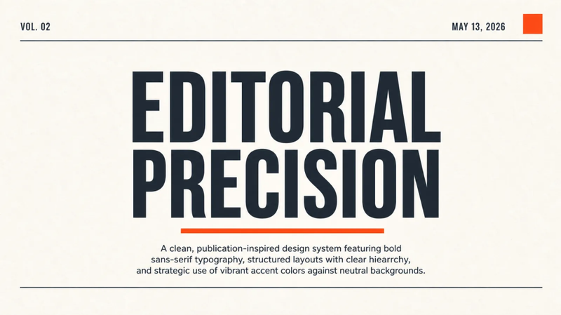 Slides
: Minimalismo Editorial
Um sistema de design limpo e inspirado em publicações, com tipografia sans-serif marcante, layouts estruturados com hierarquia clara e uso estratégico de cores vibrantes sobre fundos neutros. O estilo enfatiza a legibilidade e a sofisticação profissional por meio de um uso generoso
Kami design
Instruções
# Design System
## Manifesto
kami's aesthetic compresses into one sentence: **warm parchment canvas, ink-blue accent, serif carries authority, refuse cool grays and hard shadows**.
This is not a UI framework. It is a set of aesthetic constraints for print. It assumes a high-quality document should read like literature, not a dashboard. Every rule's trade-off is the same one: rather than add another option, remove another temptation.
**The eight invariants** (think hard before violating any):
1. Page background parchment `#f5f4ed`, never pure white
2. Single accent: ink-blue `#1B365D`, no second chromatic color
3. All grays warm-toned (yellow-brown undertone), no cool blue-grays
4. English: serif for everything (headlines and body). Chinese: serif headlines, sans body. Sans only for UI elements (labels, eyebrows, meta) in both
5. Serif weight locked at 500, no bold
6. Line-heights: tight headlines 1.1-1.3, dense body 1.4-1.45, reading body 1.5-1.55. **Never 1.6+**
7. Tag backgrounds must be solid hex, never rgba (WeasyPrint renders a double rectangle)
8. Depth via ring shadow or whisper shadow, never hard drop shadows
9. **No italic anywhere**. No `font-style: italic` in any template or demo. No italic @font-face declarations needed
This system is a fusion of Anthropic's visual language and real Chinese / English resume iteration. Details below.
---
## 1. Color
**Single accent, warm neutrals only, zero cool tones** - this is the core.
### Brand
```css
--brand: #1B365D; /* Ink Blue - the only chromatic color. CTAs, accents, section-title underlines. */
--brand-light: #2D5A8A; /* Coral - brighter variant, for links on dark surfaces. */
```
**Rule**: ink-blue covers ≤ **5% of document surface area**. More than that is ornament, not restraint.
### Surface
```css
--parchment: #f5f4ed; /* Page background - warm cream, the emotional foundation */
--ivory: #faf9f5; /* Card / lifted container - brighter than parchment */
--warm-sand: #e8e6dc; /* Button default / interactive surface */
--dark-surface: #30302e; /* Dark-theme container - warm charcoal */
--deep-dark: #141413; /* Dark-theme page background - not pure black, slight olive undertone */
```
**Never**: `#ffffff` pure white as page background. `#f8f9fa` / `#f3f4f6` or any cool-gray surface.
### Text
```css
--near-black: #141413; /* Primary text - deepest but not pure black, warm olive undertone */
--dark-warm: #3d3d3a; /* Secondary dark / dark link color */
--charcoal: #4d4c48; /* Button text / dense body */
--olive: #5e5d59; /* Subtext - descriptions, captions */
--stone: #87867f; /* Tertiary - dates, metadata */
--warm-silver: #b0aea5; /* Light text on dark surfaces */
```
**Mnemonic**: every gray has a **yellow-brown undertone**. In `rgb()`, warm gray is R ≈ G > B (or R > G > B with small gaps). Cool gray is R < G < B or R = G = B (neutral).
### Border
```css
--border-cream: #f0eee6; /* Softest border - default cards */
--border-warm: #e8e6dc; /* Prominent border - section dividers */
--border-soft: #efede4; /* Dotted divider - between list items */
--border-dark: #30302e; /* Border on dark surfaces */
```
### Ring shadow (not traditional box-shadow)
```css
--ring-warm: #d1cfc5; /* Button hover / focus */
--ring-deep: #c2c0b6; /* Pressed state */
```
### Functional (use sparingly)
```css
--error: #b53333; /* Deep warm red - serious without alarming */
--focus: #3898ec; /* Focus ring blue - the only cool color, strictly for accessibility */
```
### Translucent -> Solid conversion (TAGS MUST BE SOLID)
**Why**: WeasyPrint's alpha compositing for padding vs glyph areas produces a visible double rectangle on zoom. See `production.md` Part 4 Pitfall #1.
Ink Blue `#1B365D` over parchment `#f5f4ed`:
| rgba alpha | Solid hex |
|---|---|
| 0.08 | `#EEF2F7` |
| 0.14 | `#E4ECF5` |
| **0.18** | **`#E4ECF5`** ← default tag |
| 0.22 | `#ead3c7` |
| 0.30 | `#D6E1EE` |
---
## 2. Typography
### Stacks
```css
/* Serif for headlines - Silicon Valley editorial */
font-family: "Newsreader", /* Google Fonts - preferred */
"Source Serif 4", "Source Serif Pro",
"Charter", /* macOS system font */
Georgia, "Times New Roman", serif;
/* Sans for UI elements - Silicon Valley default */
font-family: "Inter", "TsangerJinKai02",
-apple-system, BlinkMacSystemFont,
"Helvetica Neue", Arial, sans-serif;
/* Mono for code */
font-family: "JetBrains Mono", "SF Mono", "Fira Code",
Consolas, Monaco, monospace;
```
For Chinese documents, see `design.md` for the TsangerJinKai02 + Source Han stack.
### Size scale (pt for print A4, px for screen)
**Print:**
| Role | Size | Weight | Line-height | Use |
|---|---|---|---|---|
| Display | 36-48pt | 500 | 1.10 | Cover title, one-pager hero |
| H1 Section | 18-22pt | 500 | 1.20 | Chapter titles |
| H2 | 14-16pt | 500 | 1.25 | Subsection |
| H3 | 12-13pt | 500 | 1.30 | Item titles |
| Body Lead | 11pt | 400 | 1.55 | Intro paragraphs |
| Body | 9.5-10pt | 400 | 1.55 | Reading body |
| Body Dense | 9-9.2pt | 400 | 1.42 | Dense body (resume, one-pager) |
| Caption | 8.5-9pt | 400 | 1.45 | Notes, figure captions |
| Label | 7.5-8pt | 600 | 1.35 | Small labels, corner tags |
| Tiny | 7pt | 400 | 1.40 | Footer, minor metadata |
**Screen (px)** ≈ pt × 1.33 (9pt ≈ 12px, 18pt ≈ 24px).
### Weight
- **Serif**: locked at 500. Not 400, not 700. Single-weight consistency is part of the design language.
- **Sans body**: 400 default
- **Sans labels / small titles**: 500 or 600
- **Forbidden**: 900 black, 100 thin
### Line-height
Print documents are **tighter** than English web body. English web typically runs 1.6-1.75; in print at pt sizes that feels loose and floats.
| Tier | Value | Use |
|---|---|---|
| Tight headline | 1.10-1.30 | Display, H1, H2 |
| Dense body | 1.40-1.45 | Resume, one-pager, dense information |
| Reading body | 1.50-1.55 | Long-doc chapters, letters |
| Label / caption | 1.30-1.40 | Small labels, multi-line metadata |
**Forbidden**:
- 1.60+ - loose feel, web rhythm, not print
- 1.00-1.05 - lines collide except at extreme display sizes
### Letter-spacing
- Body text: **0** (or +0.05pt imperceptible)
- English headings above 20pt: -0.3 to -0.5pt (tighten, English serifs handle it)
- Small labels (< 10pt): +0.2 to +0.5pt for readability
- All-caps overlines: +0.5 to +1pt mandatory
---
## 3. Spacing
### Base unit: 4pt (4px on screen)
| Tier | Value | Use |
|---|---|---|
| xs | 2-3pt | Inline adjacent elements |
| sm | 4-5pt | Tag padding, dense layout |
| md | 8-10pt | Component interior |
| lg | 16-20pt | Between components / card padding |
| xl | 24-32pt | Section-title margins |
| 2xl | 40-60pt | Between major sections |
| 3xl | 80-120pt | Between chapters (long docs) |
### Page margins (A4)
| Document | Top | Right | Bottom | Left |
|---|---|---|---|---|
| Resume (dense) | 11mm | 13mm | 11mm | 13mm |
| One-Pager | 15mm | 18mm | 15mm | 18mm |
| Long Doc | 20mm | 22mm | 22mm | 22mm |
| Letter | 25mm | 25mm | 25mm | 25mm |
| Portfolio | 12mm | 15mm | 12mm | 15mm |
**Rule**: denser = smaller margins, more formal (letter) = larger margins.
---
## 4. Components
### Cards / Containers
```css
.card {
background: var(--ivory);
border: 0.5pt solid var(--border-cream);
border-radius: 8pt;
padding: 16pt 20pt;
}
.card-featured {
border-radius: 16pt;
box-shadow: 0 4pt 24pt rgba(0,0,0,0.05); /* whisper shadow */
}
```
Radius scale: 4pt -> 6pt -> 8pt (default) -> 12pt -> 16pt -> 24pt -> 32pt (hero containers).
### Buttons
```css
/* Primary - brand-colored */
.btn-primary {
background: var(--brand);
color: var(--ivory);
padding: 8pt 16pt;
border-radius: 8pt;
box-shadow: 0 0 0 1pt var(--brand); /* ring shadow */
}
/* Secondary - warm-sand */
.btn-secondary {
background: var(--warm-sand);
color: var(--charcoal);
padding: 8pt 16pt;
border-radius: 8pt;
box-shadow: 0 0 0 1pt var(--ring-warm);
}
```
### Tags
Three tiers from weak to strong visual weight:
**Lightest solid** (default, most restrained):
```css
.tag {
background: #EEF2F7; /* 0.08 solid equivalent */
color: var(--brand);
font-size: 8pt;
font-weight: 600;
padding: 1pt 5pt;
border-radius: 2pt;
letter-spacing: 0.4pt;
text-transform: uppercase;
}
```
**Standard solid** (when more contrast needed):
```css
.tag {
background: #E4ECF5; /* 0.18 solid equivalent */
color: var(--brand);
padding: 1pt 6pt;
border-radius: 4pt;
}
```
**Gradient brush** (only when "hand-painted" feel is required - use sparingly):
```css
.tag {
background: linear-gradient(to right, #D6E1EE, #E4ECF5 70%, #EEF2F7);
color: var(--brand);
padding: 1pt 5pt;
border-radius: 2pt;
}
```
**Philosophy**: tint depth should be one step lighter than what decoration wants. Prefer pale over saturated. In iteration, "gradient brush" often steals focus - lightest solid wins most of the time.
**Never**: `background: rgba(201, 100, 66, 0.18)` - WeasyPrint double-rectangle bug.
### Lists
```css
ul, ol {
padding-left: 16pt;
line-height: 1.55;
}
ul li::marker { color: var(--brand); }
```
Editorial bookish variant - **em-dash instead of bullet**:
```css
ul.dash { list-style: none; padding-left: 0; }
ul.dash li::before {
content: "- ";
color: var(--brand);
}
```
### Quote
```css
.quote {
border-left: 2pt solid var(--brand);
padding: 4pt 0 4pt 14pt;
color: var(--olive);
line-height: 1.55;
}
```
### Code
```css
.code-block {
background: var(--ivory);
border: 0.5pt solid var(--border-cream);
border-radius: 6pt;
padding: 10pt 14pt;
font-family: var(--mono);
font-size: 8.5pt;
line-height: 1.5;
}
```
### Section Title
```css
.section-title {
font-family: var(--serif);
font-size: 14pt;
font-weight: 500;
color: var(--near-black);
margin: 24pt 0 10pt 0;
}
```
### Metric
Key numbers side-by-side (one-pager header, resume top, portfolio cover):
```css
.metrics { display: flex; gap: 24pt; }
.metric { flex: 1; display: flex; align-items: baseline; gap: 6pt; }
.metric-value {
font-family: var(--serif);
font-size: 16pt;
font-weight: 500;
color: var(--brand);
font-variant-numeric: tabular-nums; /* align digits in columns */
}
.metric-label { font-size: 9pt; color: var(--olive); }
```
---
## 5. Depth & Shadow
**Core rule**: do not use traditional hard shadows. Depth comes from three sources:
### 1. Ring shadow (border-like)
```css
box-shadow: 0 0 0 1pt var(--ring-warm);
box-shadow: 0 0 0 1pt var(--ring-deep); /* hover / active */
```
### 2. Whisper shadow (barely visible lift)
```css
box-shadow: 0 4pt 24pt rgba(0, 0, 0, 0.05);
```
### 3. Section-level light/dark alternation
Long docs alternate parchment `#f5f4ed` and `#141413` dark sections. The entire section's ambient light shifts - more dramatic than any shadow.
**Forbidden**: `box-shadow: 0 2px 8px rgba(0,0,0,0.3)` and relatives.
---
## 6. Print & Pagination
### break-inside protection
```css
.card, .metric, .project-item, .quote, .code-block, figure, .callout {
break-inside: avoid;
}
```
### Force break
```css
.page-break { break-before: page; }
```
### Page background extending past margins
```css
@page {
size: A4;
margin: 20mm 22mm;
background: #f5f4ed; /* extends past margin area, prevents printed white edges */
}
```
---
## 7. Quick decisions
When you're not sure "what should I use":
| Need | Use |
|---|---|
| Big headline | serif 500, size by level, line-height 1.10-1.30 |
| Reading body (EN) | serif 400, 9.5-10pt, line-height 1.55 |
| Reading body (CN) | sans 400, 9.5-10pt, line-height 1.55 |
| Emphasize a number | `color: var(--brand)`, no bold |
| Divide two sections | 1pt brand border-bottom, or 0.5pt warm-gray dotted |
| Quote someone | 2pt brand left border + olive color |
| Show code | ivory background + 0.5pt border + 6pt radius + mono |
| Primary vs secondary button | Primary = brand fill + ivory text; Secondary = warm-sand + charcoal |
| Highlight one card in a list | `border: 0.5pt solid var(--brand)` or `border-left: 3pt solid var(--brand)` |
| Start a chapter | serif heading + 1pt brand line below |
| Cover page | Display-size heading + right-aligned author/date + heavy whitespace |
| Data card | ivory background + 8pt radius + serif big number + sans small label |
Not on this table -> return to first principles: **serif carries authority, sans carries utility, warm gray carries rhythm, ink-blue carries focus**.
# Content Strategy
How to write, not how to lay out. Good typography with bad content is just "polished mediocrity". This document covers the writing principles.
---
## Core principles (all documents)
### 1. Data over adjectives
- ❌ "Delivered significant business growth"
- ✅ Write the specific numbers and deltas
Every sentence should survive the follow-up question "how much, specifically?". If you can't answer, don't write it.
### 2. Judgment over execution
Junior writes "what they did". Mid writes "how they did it". **Senior writes "why they made that call, and what they predicted correctly"**.
- ❌ "Led the platform build-out"
- ✅ Write what judgment you made and how it was proven right
### 3. Distinctive phrasing over industry clichés
- ❌ "Embrace the AI era, pioneer digital transformation paradigms"
- ✅ Say it in your own words, skip the industry vocabulary
**Distinctive phrasing is memorable**. A line you invented beats a line borrowed from an earnings call. It sounds like a person thinking, not a deck regurgitating.
### 4. Honest boundaries
- If you didn't do it, don't claim it
- If you don't know the exact number, don't invent one. Write a vague but honest magnitude
- Attribute collaborators
---
## Per-document strategies
### One-Pager
**Single purpose**: the reader grasps the point in 30 seconds.
**Structure**:
1. **Headline** (serif display) + one-line subtitle (sans body)
2. **Metrics** - 3-4 cards, numbers first
3. **Core argument** (1-2 paragraphs)
4. **Key evidence / roadmap** (3-5 short bullets)
5. **Next step / contact** (footer)
**Rules**:
- Total: 200-350 words
- All section headlines should work as a standalone outline - reading just the headlines should deliver the gist
- Data must fill 30%+ of the body
- No opening ceremony ("In recent years, as technology has rapidly evolved...")
### Long Document
**Structure**:
1. **Cover** - big title + subtitle + author + date
2. **Contents** (auto-generated or hand-written TOC)
3. **Executive Summary** (≤ 1 page + 3-5 takeaways)
4. **Body** - chapters that each stand alone as an essay
5. **Appendix / references** (if applicable)
**Rules**:
- Every chapter opens with a "claim paragraph" (2-3 sentences summarizing the argument)
- After long paragraphs (>5 lines), intersperse callouts / quotes / figures to relieve eye fatigue
- Highlight key data / conclusions with `<span class="hl">`
- Use "chapter breaks" (blank page + chapter number) between major sections
### Letter
**Structure**:
1. Letterhead (sender info, top right or centered)
2. Date (right-aligned)
3. Recipient salutation (left-aligned)
4. Body (3-5 paragraphs)
5. Sign-off ("Sincerely," / "Best regards,")
6. Signature (serif 500)
7. Enclosures (if any)
**Rules**:
- Minimal - no decorative elements
- Body prefers serif (editorial feel)
- Slightly larger type (11-12pt body) - this will be read, not scanned
- Paragraph spacing ≥ 10pt
**Common use cases**:
- Resignation / notice
- Recommendation letter
- Formal collaboration proposal
- Personal statement
### Portfolio
**Structure**:
1. **Cover** (name + one-line positioning + contact)
2. **About** (half-page introduction)
3. **Per-project 1-2 pages**:
- Project title + type tag + date range
- One-line description
- 2-3 hero images (if applicable)
- Role + challenge + outcome
4. **Selected works list** (additional projects as a short list)
5. **Contact** (return to contact details)
**Rules**:
- Visuals first, text supports
- Every project's outcome must be quantifiable
- Photos > design mockups > code screenshots (the more abstract, the better)
- Don't list every tech stack - a mono tag row is enough
### Resume
The most constrained document type in kami.
**Hard constraints**:
- Strictly 2 A4 pages
- Every project follows three-part: Role / Actions / Impact
- 5 core skills, each with at least one brand-color emphasis
- Team size, tech stack, narrative voice must stay consistent throughout
**Key sections**:
- Header + 4 metric cards
- Summary (~50 words)
- Timeline (3 steps - long-range evolution signal)
- 3-5 core projects
- Public work / impact (optional)
- 5 core skills
- Education
**Metric card selection rule**:
- 1 card on **time** (years, consistency)
- 1 card on **scale** (team, users, projects, or other quantifiable scope)
- 2 cards on **results** (quantifiable external proof)
---
## Coupling rules (layout × content)
### Emphasis rhythm
Across any document:
- ≤ 2 emphasized items per line
- Emphasis must be a **quantifiable number** or a **distinctive phrase**
- Do not emphasize adjectives
### Number formatting
| ✅ | ❌ |
|---|---|
| 5,000+ | 5000+ (missing thousands separator) |
| 90% | 90 % (space before percent) |
| ~$10M | $9,876,543 (false precision reads fake) |
| 2026.04 | April 2026 (when horizontal space is tight) |
| -> | → |
### Emphasis is not bold
Use `color: var(--brand)` alone - don't also add `font-weight: bold`. Bold breaks the single-weight design language.
---
## Pre-ship checklist
Run through before every draft:
- [ ] Any jargon like "leverage / unlock / embrace / pioneer"? Cut.
- [ ] Does every paragraph's first sentence stand alone? If not, that paragraph has no claim.
- [ ] Are all numbers verifiable? If asked "where did this come from", can you answer?
- [ ] At least one **distinctive phrase** (not industry boilerplate)?
- [ ] Every emphasized (brand-colored) span is either a number or a distinctive phrase? If not, remove the emphasis.
- [ ] Paragraph lengths even? No paragraph over 5 lines?
- [ ] Number format consistent (commas, percent signs, arrows)?
- [ ] Page count within the document's constraint (resume 2, one-pager 1, letter 1)?
---
## Writing references
- **Paul Graham's essays** - short, direct, judgmental. The gold standard for essayistic writing.
- **Stripe Press books** - print-grade typography paired with deep content. Where to learn the craft of the single sentence.
- **Minto's Pyramid Principle** - conclusion first, evidence below. The shape of every one-pager and exec summary.
- **Ben Horowitz's blog** - how to write technical and business judgment in prose ordinary people can read. The template for long-doc voice.
None are required, but reading any one of them will move the dial on both your writing and your judgment.
Descrição
Kami holds one design idea across every format: warm parchment canvas, a single ink-blue accent, serif for authority, sans for utility, editorial whitespace tuned for print. Inspired by Anthropic's visual language.
Habilidades relacionadas
Ver tudoSlidesSlides: Minimalismo Editorial
Um sistema de design limpo e inspirado em publicações, com tipografia sans-serif marcante, layouts estruturados com hierarquia clara e uso estratégico de cores vibrantes sobre fundos neutros. O estilo enfatiza a legibilidade e a sofisticação profissional por meio de um uso generoso
Encontre sua próxima habilidade favorita
Explore mais habilidades de IA selecionadas para pesquisa, criação e trabalho do dia a dia.