Featured by
nene@YouMind.AI
Why we love this skill
This skill is your personal "data storyteller," instantly transforming dry scientific data into vivid and engaging narratives. It excels at interpreting complex data using relatable analogies and minimalist charts, allowing even users with no prior knowledge to easily understand hot topics like global carbon emissions and adolescent myopia rates. Say goodbye to jargon and grasp the deeper meaning behind the data in just 3 minutes!
Instructions
The author has set the instructions to private. Below is a brief overview.
description
Like a data storyteller, transform complex data into vivid narratives. Even beginners can instantly understand professional reports, letting the data truly speak for itself.
Related Skills
View allClassroom Explanation Diagram Generator
Transform the lecture transcript into a complete set of Keynote-style 16:9 teaching infographics, outputting both a text and image explanation version and a minimalist image collection in two documents. Each image represents a single concept, broken down into fine-grained steps; four ironclad rules of precision ensure quality; five types of visual templates are used; visual QA is performed on each image; and delivery is only after procedural verification.


One Soft Thing
Share how you feel after work, and One Soft Thing will give you one small, doable evening activity, plus a gentle card to help you come back to yourself.


Multi-Agent Investment Research Team: A-Share Stock Selection and Investment Committee Analysis
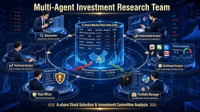
It's not an AI assistant, but a virtual investment research team. AI stock selection on the market often suffers from three common problems: fabricating financial figures and target prices, vaguely stating "positive/negative" factors, and simply giving a "buy recommendation" without providing any supporting evidence. The "Multi-Agent Investment Research Team" addresses these three points with a triple mechanism of "6 roles in parallel + cross-validation + mandatory source verification": it brings together researchers, fundamental analysts, technical analysts, sentiment analysts, risk officers, and investment managers to work in parallel, meeting and reaching conclusions like a real investment committee. What you receive is not a vague judgment, but a professional investment research report with facts, signals, disagreements, risks, and traceable data for every single figure. Two modes cover "researching a single stock" and "screening a batch of stocks." Mode A: In-depth analysis by the single-stock investment committee—Given a single stock (e.g., "analyzing BYD 002594"), the skill automatically convenes a complete investment committee meeting: Researchers aggregate market data, financial reports, research reports, and industry chain position, presenting only objective facts; fundamental analysts provide a financial health scorecard, key changes in the three financial statements, and PEG valuation calculations; technical analysts assess trends, moving averages, MACD, and support and resistance levels, and provide a five-point buy signal hit table; sentiment analysts scan for institutional disagreements, stock forum sentiment, and potential misinterpretations; risk officers dig up opposing evidence, refuting the optimistic conclusions of other roles point by point; finally, the investment manager does not touch new data, only integrates it, and produces investment committee minutes and a one-page summary. Mode B - Multi-condition Stock Selection Screening: From your specified range (CSI 300, a specific industry concept sector, or your own stock pool), a three-layer funnel filtering process is used: First, L1 financial hard screening (three consecutive quarters of growth, ample cash flow, PEG < 1 or a significant increase in contract liabilities); then L2 technical timing (platform breakout, golden cross of moving averages, breakout with increased volume, strong pullback with reduced volume, MACD crossing above the zero line); finally, L3 information verification (research report ratings and industry chain logic, eliminating targets with "purely technical analysis without fundamental logic"). After the candidate list is generated, the Top N targets can be automatically connected to Mode A for in-depth analysis. You will receive the following deliverables: Option A: Fixed delivery of the "five-piece set": ① A comprehensive analysis report integrating all six roles; ② Data sources and evidence tables, with each key conclusion corresponding to "Data → Source → Date"; ③ Meeting minutes of the investment committee (topics → viewpoints → disagreements → consensus → variables to be tracked); ④ A risk list sorted by severity (high/medium/low); ⑤ A one-page summary by the investment manager, condensing the core logic, key variables, validation points, and confidence levels. Option B: Delivery of a candidate stock list (code | name | hit criteria | key data | source | trigger date) + explanation of screening criteria and definitions, with the option to optionally include the complete five-piece set for top candidates. All deliverables are saved as files, with filenames including the target and date for easy reuse and archiving.
Data Storytelling
Featured by
nene@YouMind.AI
Why we love this skill
This skill is your personal "data storyteller," instantly transforming dry scientific data into vivid and engaging narratives. It excels at interpreting complex data using relatable analogies and minimalist charts, allowing even users with no prior knowledge to easily understand hot topics like global carbon emissions and adolescent myopia rates. Say goodbye to jargon and grasp the deeper meaning behind the data in just 3 minutes!
Instructions
The author has set the instructions to private. Below is a brief overview.
description
Like a data storyteller, transform complex data into vivid narratives. Even beginners can instantly understand professional reports, letting the data truly speak for itself.
Related Skills
View allClassroom Explanation Diagram Generator
Transform the lecture transcript into a complete set of Keynote-style 16:9 teaching infographics, outputting both a text and image explanation version and a minimalist image collection in two documents. Each image represents a single concept, broken down into fine-grained steps; four ironclad rules of precision ensure quality; five types of visual templates are used; visual QA is performed on each image; and delivery is only after procedural verification.
One Soft Thing
Share how you feel after work, and One Soft Thing will give you one small, doable evening activity, plus a gentle card to help you come back to yourself.
Multi-Agent Investment Research Team: A-Share Stock Selection and Investment Committee Analysis
It's not an AI assistant, but a virtual investment research team. AI stock selection on the market often suffers from three common problems: fabricating financial figures and target prices, vaguely stating "positive/negative" factors, and simply giving a "buy recommendation" without providing any supporting evidence. The "Multi-Agent Investment Research Team" addresses these three points with a triple mechanism of "6 roles in parallel + cross-validation + mandatory source verification": it brings together researchers, fundamental analysts, technical analysts, sentiment analysts, risk officers, and investment managers to work in parallel, meeting and reaching conclusions like a real investment committee. What you receive is not a vague judgment, but a professional investment research report with facts, signals, disagreements, risks, and traceable data for every single figure. Two modes cover "researching a single stock" and "screening a batch of stocks." Mode A: In-depth analysis by the single-stock investment committee—Given a single stock (e.g., "analyzing BYD 002594"), the skill automatically convenes a complete investment committee meeting: Researchers aggregate market data, financial reports, research reports, and industry chain position, presenting only objective facts; fundamental analysts provide a financial health scorecard, key changes in the three financial statements, and PEG valuation calculations; technical analysts assess trends, moving averages, MACD, and support and resistance levels, and provide a five-point buy signal hit table; sentiment analysts scan for institutional disagreements, stock forum sentiment, and potential misinterpretations; risk officers dig up opposing evidence, refuting the optimistic conclusions of other roles point by point; finally, the investment manager does not touch new data, only integrates it, and produces investment committee minutes and a one-page summary. Mode B - Multi-condition Stock Selection Screening: From your specified range (CSI 300, a specific industry concept sector, or your own stock pool), a three-layer funnel filtering process is used: First, L1 financial hard screening (three consecutive quarters of growth, ample cash flow, PEG < 1 or a significant increase in contract liabilities); then L2 technical timing (platform breakout, golden cross of moving averages, breakout with increased volume, strong pullback with reduced volume, MACD crossing above the zero line); finally, L3 information verification (research report ratings and industry chain logic, eliminating targets with "purely technical analysis without fundamental logic"). After the candidate list is generated, the Top N targets can be automatically connected to Mode A for in-depth analysis. You will receive the following deliverables: Option A: Fixed delivery of the "five-piece set": ① A comprehensive analysis report integrating all six roles; ② Data sources and evidence tables, with each key conclusion corresponding to "Data → Source → Date"; ③ Meeting minutes of the investment committee (topics → viewpoints → disagreements → consensus → variables to be tracked); ④ A risk list sorted by severity (high/medium/low); ⑤ A one-page summary by the investment manager, condensing the core logic, key variables, validation points, and confidence levels. Option B: Delivery of a candidate stock list (code | name | hit criteria | key data | source | trigger date) + explanation of screening criteria and definitions, with the option to optionally include the complete five-piece set for top candidates. All deliverables are saved as files, with filenames including the target and date for easy reuse and archiving.
Find your next favorite skill
Explore more curated AI skills for research, creation, and everyday work.