Brand Story Website
Brand Story Website
Showcase
Description
Transforms brand story copy and materials into a scrolling narrative webpage with high-end aesthetics, conveying brand value and emotion through visual design and interactive effects.
Recommended by
nene@YouMind
Why we love this skill
This skill transforms brand stories into immersive visual magazines, using meticulous layout, elegant animations, and smooth storytelling to create a sophisticated, minimal interactive webpage that lets users deeply experience the brand's charm.
Instructions
Core mission
Background: Brand stories often exist in text documents or PowerPoint presentations, lacking an immersive presentation style. An excellent brand page should resemble a visually engaging magazine that can be scrolled through, using carefully designed layout, animations, and rhythm to allow visitors to naturally understand the brand philosophy and experience the brand's tone while browsing.
Specific objectives:
The brand story is broken down into 4-8 narrative nodes, with each node corresponding to a visual chapter.
Study benchmark brand websites to extract visual inspiration and design references.
Design a sophisticated visual style system (color scheme, typography, layout, motion effects) that aligns with the brand's identity.
Generate a scrolling interactive webpage that includes modules such as timeline, milestones, and product evolution.
Ensure the page has a visually sophisticated, elegant, and minimalist feel, avoiding cheap or overly decorated designs.
Key constraints:
The visual style must be consistent with the brand's tone (e.g., tech brands → calm and restrained, beauty brands → warm and soft).
Animation effects should be restrained and moderate, serving the narrative rather than showing off technical skills.
Page loading speed and smooth interaction need to ensure a good user experience.
Before carrying out the task, users are required to provide relevant information such as the brand story, background, and values.
Step 1: Understanding the Brand Story and Extracting the Narrative Structure
Objective: To gain a deep understanding of the core content of the brand story and identify key narrative points and emotional curves.
action:
Carefully read the brand story copy provided by the user and identify the following elements:
-Brand Origin/Founding Background
-Core Concepts/Values
- Key milestone events (product launch, awards, user breakthroughs, etc.)
- Founder's story or team story (if any)
-Brand Vision/Future Direction
- Break the story down into 4-8 narrative nodes, each node containing:
- Node title (concise and impactful, 5-10 words)
-Core information (summarized in 1-2 sentences)
- Emotional tone (e.g., warmth, determination, breakthrough, outlook)
Construct the narrative flow and determine the logical relationships and emotional progression between nodes.
Quality Standards:
- The number of narrative nodes should be moderate (too few will make the narrative seem thin, too many will make it lengthy).
- Each node has a clear narrative purpose, avoiding information duplication.
-The overall narrative has a beginning, development, climax, and resolution, with emotional climaxes.
Step 2: Research benchmark brands and collect visual inspiration
Objective: Based on brand tone, search and analyze outstanding brand websites with similar or comparable styles to extract visual inspiration and design references.
action:
1. Determine the direction of the benchmark search:
Based on the brand tone keywords extracted in Step 1 (such as "{brand tone keywords}"), construct a search strategy.
Define 2-3 search dimensions:
Benchmarks in the same industry (e.g., outstanding domestic cosmetic brands)
Cross-industry collaborations with similar themes (e.g., brands in other categories that also emphasize "Eastern aesthetics," such as tea drinks and home furnishings).
Award-winning design examples (e.g., award-winning websites with similar styles on Awwwards and FWA)
2. Search and filter comparable brands:
Use a search tool to search for keywords such as:
"{Industry} + Brand Website + Design"
"{tone keywords} + brand website + award"
"Best {Industry} Website Design 2024"
Select 3-5 brand websites with visual styles worth referencing.
Prioritize websites with a high-end positioning, excellent design, and a scrolling narrative feature.
3. In-depth analysis of benchmark websites:
Visually analyze each benchmark website and record the following elements:
Color scheme: the combination of main color, background color, and accent color
Font usage: Font selection, size hierarchy for headings and body text
Typography features: white space ratio, grid system, alignment.
Animation style: scrolling trigger method, animation duration, parallax effect
Narrative structure: chapter division, content pacing, visual focus
Extract key pages or modules as visual references
4. Extract design inspiration:
Summarize the common characteristics of the benchmark websites (e.g., "These brands generally use large areas of white space + serif headlines + gradient animations").
Identify unique design techniques that can be learned from (e.g., "Brand A's timeline uses horizontal scrolling, which is very innovative").
Mark the design pitfalls to avoid (e.g., "Brand B has too many animations, making it look flashy").
Develop 3-5 clear design inspirations to serve as guiding principles for subsequent design work.
Quality Standards:
The number of benchmark brands is moderate (3-5), covering both industry peers and cross-industry references.
The analysis is comprehensive, covering color scheme, font, typography, animation, and structure.
Design should inspire concrete and actionable ideas, rather than vague notions of "high-level" concepts.
Clearly distinguish between design elements that are "worthy of reference" and those that should be "avoided".
After completing the study, confirm with the user whether they are satisfied with the delivery. If not, readjust based on the user's feedback until they are satisfied.
Step 3: Define the brand visual style system
Objective: Based on benchmarking research results and combined with the brand's own style, design a sophisticated, elegant, and minimalist visual style system.
action:
Based on the brand tone analysis in Step 1 and the benchmarking research results in Step 2, the visual tone keywords were determined.
Color scheme design:
Main color scheme: Choose 1-2 main colors that represent the brand's character (provide color values).
Secondary colors: 2-3 secondary colors used for layering and visual embellishment.
Background color: Prioritize using soft off-white, light gray, or dark backgrounds, and avoid pure white (#FFFFFF).
Accent color: A high-contrast color used to highlight CTA buttons or key information.
Referencing the color scheme patterns of benchmark brands, ensure that the color scheme conforms to industry aesthetic standards.
Choose a font combination:
Title font: Choose a font that reflects the design and brand identity (e.g., serif fonts are elegant, sans-serif fonts are modern).
Body text font: A highly readable font that creates a layered contrast with the headings.
Avoid using overly common system fonts (such as Arial and SimSun).
Define layout principles:
White space strategy: Ample white space creates a sense of sophistication and avoids information overload.
Grid system: Uses a regular grid layout to maintain visual order.
Alignment: Prioritize left or center alignment, and avoid justified alignment.
Determine the animation style:
Parallax: Elements at different levels move at different speeds, creating a sense of space.
Fade-in animation: Content gradually appears as you scroll, with an elegant rhythm.
Micro-animations: Detailed animations such as hover state and button interactions enhance the overall sophistication.
Animation duration: Controlled between 0.3 and 0.8 seconds, avoiding being too fast or too slow.
Learn from the effective motion graphics techniques of benchmark brands and avoid the design pitfalls already identified.
Quality Standards:
The color scheme aligns with the brand's image, and the colors are harmonious and not glaring.
Choose fonts with a design aesthetic, avoiding cheap or outdated fonts.
The layout has a strong sense of breathing room, ample white space, and a clear hierarchy of information.
The motion effects are restrained and measured, serving the narrative rather than showing off technical skills.
The style system maintains the same quality level as outstanding cases in the benchmarking study.
After finalizing the definition, confirm with the user whether they are satisfied with the delivery. If not, readjust based on the user's feedback until they are satisfied.
Step 4: Design the page structure and interaction flow
Objective: To plan the overall structure and scrolling interaction flow of the page to ensure a smooth narrative rhythm.
action:
The overall page structure is designed, including the following modules:
Opening Module (Hero Section):
Brand Name/Logo
A one-sentence brand slogan or core concept
Visual cues to guide scrolling (e.g., a downward arrow animation).
Optional: Full-screen background video or large image
Narrative chapter module (designed based on the nodes in Step 1):
Each node corresponds to an independent visual chapter.
Chapters can be transitioned between each other using scrolling, separators, white space, or transition animations.
Each chapter includes: title, body text, illustrations/images, and time stamps (if applicable).
Timeline module (optional, suitable for brands with specific timelines):
Vertical or horizontal time axis
Key year/date marking
Event descriptions and accompanying images at each point in time.
Product/Milestone Display Module:
Grid or card layout
Product images + brief description
Hover effect: zoom in, display more information, etc.
Founder/Team Story Module (if applicable):
People's photos + story captions
You can use a split-screen or full-screen immersive layout.
Closing Section:
Brand vision or future-oriented copywriting
CTA buttons (e.g., "Learn More", "Explore Products", "Contact Us")
Social media links or contact information
Plan the scrolling interactive process:
Determine the scroll trigger point for each module (e.g., trigger the animation when scrolling to 50% of the viewport).
Design transition effects between modules (fade in/out, parallax scrolling, element displacement, etc.).
Ensure a natural scrolling rhythm and avoid overly frequent animations that could cause visual fatigue.
Referencing the effective interaction designs of benchmark brands
Design a responsive layout strategy (to ensure a good experience on both desktop and mobile devices).
Quality Standards:
The page structure is logically clear, and the narrative flow is natural and smooth.
Each module has a clear visual focus to avoid information clutter.
The scrolling interaction has a moderate pace that won't make users feel abrupt or fatigued.
Responsive design is well-considered, ensuring an uncompromised mobile experience.
Step 5: Write the webpage generation instruction.
Objective: To translate the visual style system and page structure into clear and detailed webpage generation instructions for the generateWebpage tool to execute.
action:
Write structured instructions that include the following parts:
1. Overall style description:
Describe the visual style in detail using natural language (based on the Step 3 style system).
Example: "Adopting a restrained and elegant style reminiscent of Eastern aesthetics. The background uses a soft off-white (#F9F7F2), with the main colors being a warm tea color (#8B7355) and a delicate pink (#E8D5C4). The title uses a serif font, while the body text uses a sans-serif font, with ample white space creating a sophisticated feel. Animations primarily consist of fade-in and parallax scrolling, with a smooth and elegant rhythm."
2. Page Structure Description:
Describe the page structure in module order.
Example: "The page begins with a full-screen Hero Section, displaying the brand name and slogan against a background of the brand's main visual image, with a scroll-down prompt. This is followed by four narrative sections, each containing a title, body text, and an image, using an alternating left-right column layout. Then comes a vertical timeline module showcasing the brand's development. Finally, there's an ending module containing the brand vision and a CTA button."
3. Interaction Details:
Describe key interactive effects and animations.
Example: "When scrolling, chapter content enters the viewport with a fade-in animation. Background images scroll at a slower speed, creating a parallax effect. Timeline nodes highlight when scrolling to their corresponding positions. Product cards slightly enlarge and display shadows when hovered over."
4. Content placeholder markers:
Clearly indicate which content needs to be extracted from user-provided materials.
Example: "The brand name uses '{Brand Name}', the slogan uses '{Brand Slogan}', the narrative content is extracted from '{Brand Story Copy}', the timeline events are extracted from '{Milestone List}', and the product images use '{Product Image Resources}'."
5. Technical Implementation Hints (Optional):
If there are any special technical requirements, please provide a brief description.
Example: "Use the Intersection Observer API to implement scroll-triggered animations. Use CSS Grid to implement responsive layouts."
Quality Standards:
The instructions are clear and detailed, enabling AI to accurately understand the design intent.
The visual style is described in detail (colors have color values, fonts have types, and animations have durations).
With clearly defined content placeholders, the AI knows where to obtain data.
The overall instruction length is moderate (too short and there is insufficient information, too long and it may lead to misunderstanding).
Output an interactive brand page (HTML webpage):
Includes a complete brand story narrative
Features scrolling interaction and animation effects
Responsive design, adaptable to both desktop and mobile devices.
The visual style conforms to the standards of "high-end, elegant, and minimalist".
Content structure:
Hero Section (Opening Module)
4-8 narrative chapters
Timeline/milestone module (if applicable)
Product display module (if applicable)
Founder/Team Story Module (if applicable)
Closing Section
Quality Standards:
Visual quality: Harmonious and sophisticated color scheme, appropriate font selection, clear and elegant layout, and ample white space.
Interactive experience: Smooth scrolling, natural and restrained animations, timely response, and a good mobile experience.
Content completeness: The brand story contains key information, has a clear narrative logic, and accurately matches text and images.
Aesthetic standards: The overall aesthetic should convey a sense of sophistication, elegance, and simplicity, avoiding cheapness or excessive ornamentation.
Industry benchmarking: Visual quality reaches the same level as benchmark brands.
Style and presentation
Core aesthetic principles:
A sense of sophistication: created through restrained color schemes, exquisite typography, ample white space, and subtle animation effects.
Elegance: A smooth rhythm, natural transitions, and avoidance of abrupt or harsh visual elements.
Simplicity: Eliminating unnecessary decorations, each element has a clear function and meaning.
Visual reference direction:
Official websites of high-end brands (such as Apple, Aesop, Muji)
Design magazine websites (such as It's Nice That, Awwwards award-winning works)
Art exhibition websites (emphasizing white space and visual rhythm)
The benchmark brand websites studied in Step 2
Styles to avoid:
The overly decorated and cluttered "Taobao style"
The overly flashy, high-effect "showy style"
The jarring color scheme and chaotic layout create a "cheap" aesthetic.
The overly conservative and uninspired "template style"
Related Skills
View all Image
ImageSemi-Flat Illustration Maker
Have you ever faced challenges like these when expressing ideas visually? Your brand needs a sense of sophistication, but purely flat illustrations feel too thin, lacking warmth and texture? You want to convey product details through a realistic style, but worry the image will become too complex and distract from the content itself? Abstract concepts, emotional stories, or complex ideas never quite look right—either too obvious or too obscure? You search through asset libraries but can’t find visuals that are both modern and elegant, while accurately capturing the core meaning? What we want is a visual language that feels just right—designed yet authentic, simple and powerful yet refined and engaging. Now, all you need to do is enter a piece of text. It will generate a semi-flat realistic illustration that gives your brand, content, or concept a distinctive visual appeal. What is it? An intelligent generation tool that transforms written content into modern, semi-flat realistic illustrations. It thoughtfully combines the clean outlines of flat illustration with the soft lighting and sense of volume found in realistic styles, finding an elegant balance between “too simple” and “too complex.” How does it work? Three simple steps Enter your text—whether it’s a brand story, an emotional monologue, a product description, or an abstract philosophical concept. It captures the core meaning with precision; (Optional) Adjust your composition or color preferences—you can set the direction for the image or let it interpret your input freely; Generate—a carefully composed illustration with sophisticated colors and finely rendered texture appears instantly. No drawing experience is required. You provide what to say; it takes care of how to show it. What makes its visual language distinctive? Outlines, but not flat—It preserves the fresh, modern outlines of flat illustration while using soft shadows and subtle volume to make objects feel dimensional rather than thin; Realistic, but not photorealistic—It avoids excessive photo-level detail, retaining only the warmth created by light, shadow, and materials, so the image feels believable while leaving room for imagination; Clean, but not empty—A pure white background keeps the visual focus on the subject, ensuring the image stays clean, restrained, and centered on the message you want to convey. Every piece strikes a subtle balance between design appeal and storytelling power. Where can it be used? Visualizing brand stories—Modern illustrations tailored to your brand’s character, conveying restrained yet richly textured visual symbols; Illustrating in-depth content—Make articles, reports, or columns less dry by letting images resonate with the words; Product explanations / concept presentations—Transform complex features or abstract ideas into an intuitive, elegant visual language; Decorative art / cover design—Clean, sophisticated imagery that naturally suits books, albums, or interior decoration. What you receive is more than just an image You’ll receive a clean illustration with no text to distract from the image, along with a visual style analysis. It briefly explains why the composition, lighting, and color palette were chosen to reflect your text, helping you better understand the design logic behind the image and making it easier to explain the creative direction to your team.

Warm Story Marketing Copy
Helps you write warm, persuasive marketing copy. Based on story-driven marketing methods, using user story matrices, conversational expression, and emotional resonance to make product promotion more sincere and moving. Suitable for product launches, promotions, brand campaigns, and other scenarios.
 Video
VideoStick Figure Silhouette Gen
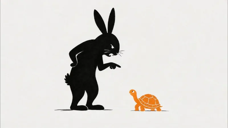
Want to present engaging stories like fables, historical anecdotes, or brand stories in a unique visual style? This skill helps you easily create landscape, minimalist stick figure silhouette short video clips. Just input a story theme, and it generates a complete production plan to make your story visually compelling. The skill provides a ~270-word, 45-second narration script for a smooth and expressive story delivery. It also designs 9 storyboard prompts for 16:9 landscape images, guiding AI to produce minimalist line art and silhouette styles with plenty of white space and clear visual focus, evoking a modern, minimal storybook illustration feel. Additionally, you get 9 Seedance 2.0 image-to-video prompts that perfectly match the storyboard, achieving line-by-line drawing and smooth fade-in effects like a whiteboard animation. Whether you're making short story videos, minimalist animations, or need storyboard and video prompts for line art, silhouette, or paper-cut styles, this tool has you covered. It transforms complex story themes into simple, expressive visual narratives that reach audiences in a fresh, artistic way—perfect for fables, fairy tales, anecdotes, or brand stories. You'll receive a complete voiceover script, storyboard cards, generated images and videos, plus detailed assembly tips to efficiently create your video.
Information
- Version
- v5
- Last updated
- Runtime credits
- Usage-based
- Models
- Gemini 3 Pro
- Capabilities
- Web research