Xiaoxiaodong x Freehand P068
By Xiaoxiaodong
Xiaoxiaodong x Freehand P068
By Xiaoxiaodong
Showcase
Description
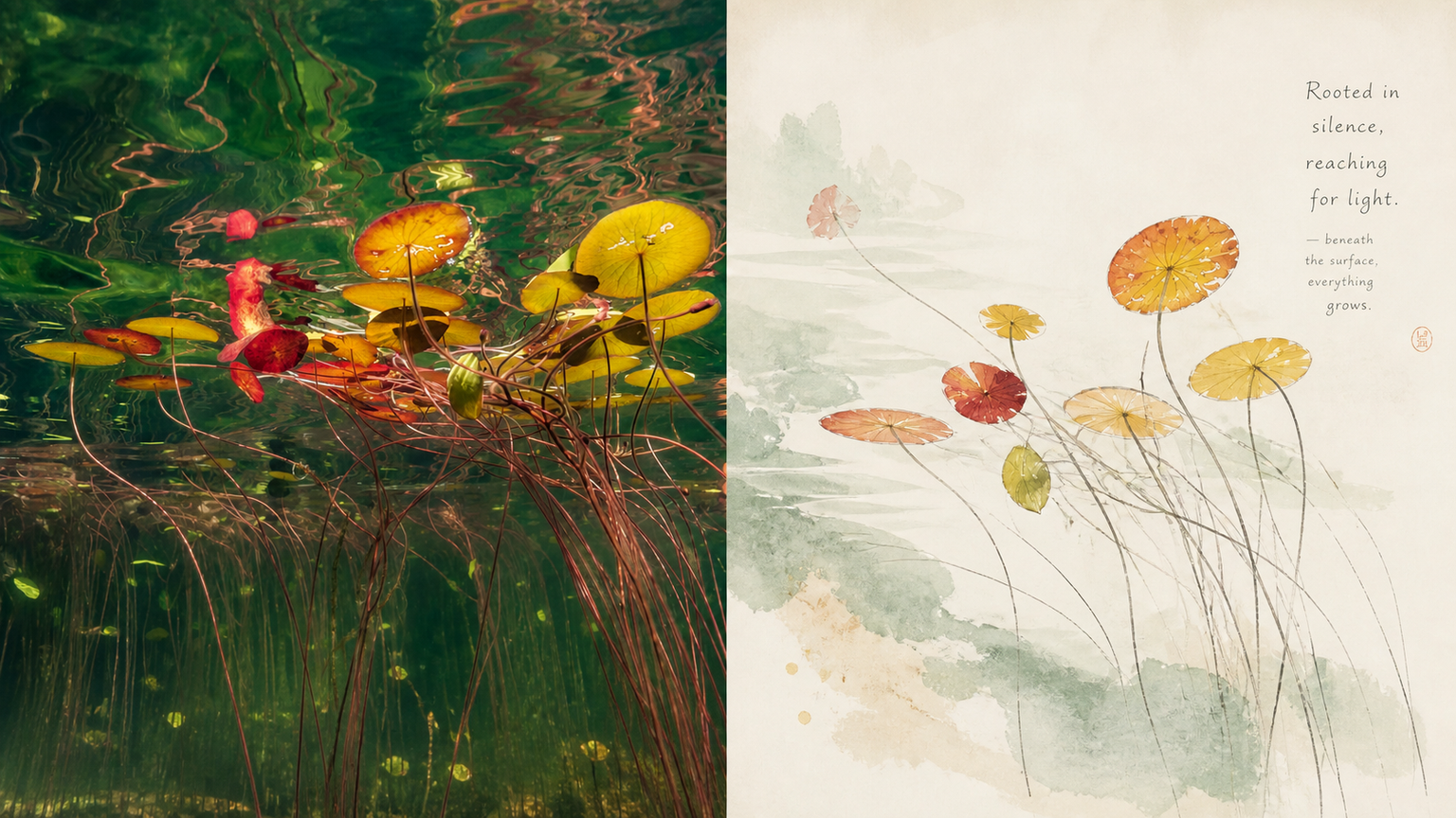
P068 tends to cram in heavy ink washes, dry landscape gardens, seals, cranes, and other piled-up symbols the moment it hears “Chinese style” or “ink wash”—resulting in work that feels both tacky and devoid of the breathing room found in modern publications. If you want to reimagine a photo through Eastern aesthetics but strongly dislike the heavy ink, loud reds, and bright greens that make work look like tourist souvenirs, try this **“Contemporary Eastern Freehand Album-Leaf”** approach. Its underlying logic is simple: suggest rather than spell everything out, and leave space.
Recommended by
淡苍
Why we love this skill
A featured pick for faithfully preserving the original creative brief while adapting it to portrait, landscape, pure-design, and multi-device wallpaper formats. Supports multiple sizes, text strategies, batch-isolated generation, and full PNG checks.
Related Skills
View all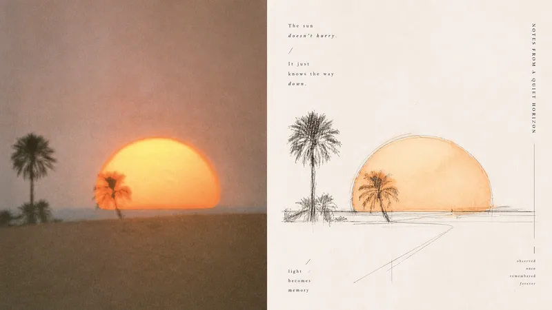 Image
Imagexiaoxiaodong x Sketch Wash P079
Ordinary photo outline filters mechanically copy edges; full watercolor treatments tend to fill the background, making the subject, space, and editorial rhythm feel heavy. Panel 079 keeps only the structures, spaces, gestures, and relationships in the scene most worth remembering: long straight perspective lines, angular lines, and geometric axes build a rational framework; free organic curves, searching lines, and broken lines retain a tactile feel; a small amount of transparent watercolor extracts recognizable colors from the original. Broad areas of natural paper white create air and pauses. Text follows structural lines and whitespace to join the composition, resulting in something like an art-directed architectural travel sketchbook or an independent visual publication. Best suited for these situations - **Architecture, travel, and on-site observation:** Use the strongest straight lines, turns, facets, and proportional relationships to build the space. - **You want to preserve the vitality of an “in-progress drawing”:** Embrace exploratory repeated lines, broken lines, slight misalignment, and unfinished edges. - **You want color drawn from the photo without overfilling the image:** Use a small amount of transparent wash only where needed, layering ink lines, color, and paper white. - **You need flexible delivery:** Supports portrait, landscape, design-only, multiple aspect ratios, and four-edge wallpaper formats, and can batch-process image directories.
 Image
ImageInk Study xiaoxiaodong P181
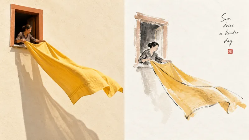
Suitable for organizing personal photography, independent publishing, exhibition exercises, and lifestyle-focused visual creation. Even images with ordinary compositions, cluttered backgrounds, or undersized subjects can be given a new focal point through subtraction, reorganization, cropping, and changes in scale—not by simply applying a filter. The refined visual effect comes from expressive color-ink styling, vignette-like compositions, ink as the dominant color with supporting accents, generous artistic negative space, and a literati-painting-inspired relationship between image and text. Whether the subject is a person, building, animal, plant, object, vehicle, or natural landscape, the focus should be on “capturing its spirit while leaving out the excess.” Avoid complete ink-wash landscapes, realistic fine rendering, fully filled backgrounds, layered heavy colors, a photographic filter look, cartoon styling, and formulaic Chinese-style poster designs.
 Image
ImageXiaoxiaodong x Duotone P065
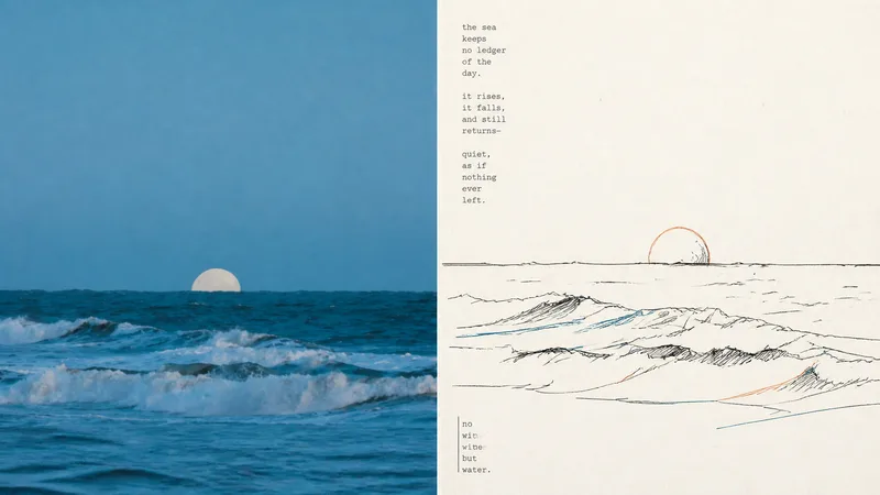
P065 addresses a core problem: AI-generated color illustrations often overfill the image with colors, making them look muddy and like flashy children's doodles. They struggle to capture the restraint and sophistication of niche independent print works made with “just two overprinted colors and slight misregistration.” If you like the duotone printed matter found in independent bookstores—using just one or two touches of color with a subtle misaligned quality—this set of prompts was tuned for you. Rather than using large areas of flat color, it deconstructs your photo with highly avant-garde **“duotone line overprinting”**: ⚬ Black lines form the framework: slightly awkward, hand-drawn pen lines with wobbles and pauses pick out the subject, even allowing lines to cross boundaries or remain partly open, leaving rigid vector outlines behind. ⚬ Exactly 2 extracted colors: AI selects two high-contrast colors from your original image—one cool and one warm, or one dark and one light—and turns them into colored contour lines. They run alongside, overlap, or sit slightly out of register with the black lines, much like the small errors left by an antique printing press during overprinting. ⚬ Light-colored paper and generous whitespace: No complex backgrounds. The subject may be off-center, reduced in scale, or left floating, allowing rough paper texture and broad areas of blank space to carry the image’s sense of air. ⚬ Letterpress typography with handmade irregularities: Pair it with narrow vintage letterpress text, slightly loose tracking, and a subtly wavering baseline, like a carefully typeset private art poster. Smart and restrained, with just a hint of dry humor and relaxed ease.
Information
- Version
- v5
- Last updated
- Runtime credits
- Usage-based
- Models
- Auto
