xiaoxiaodong P121 | Doodle
By xiaoxiaodong
xiaoxiaodong P121 | Doodle
By xiaoxiaodong
Description
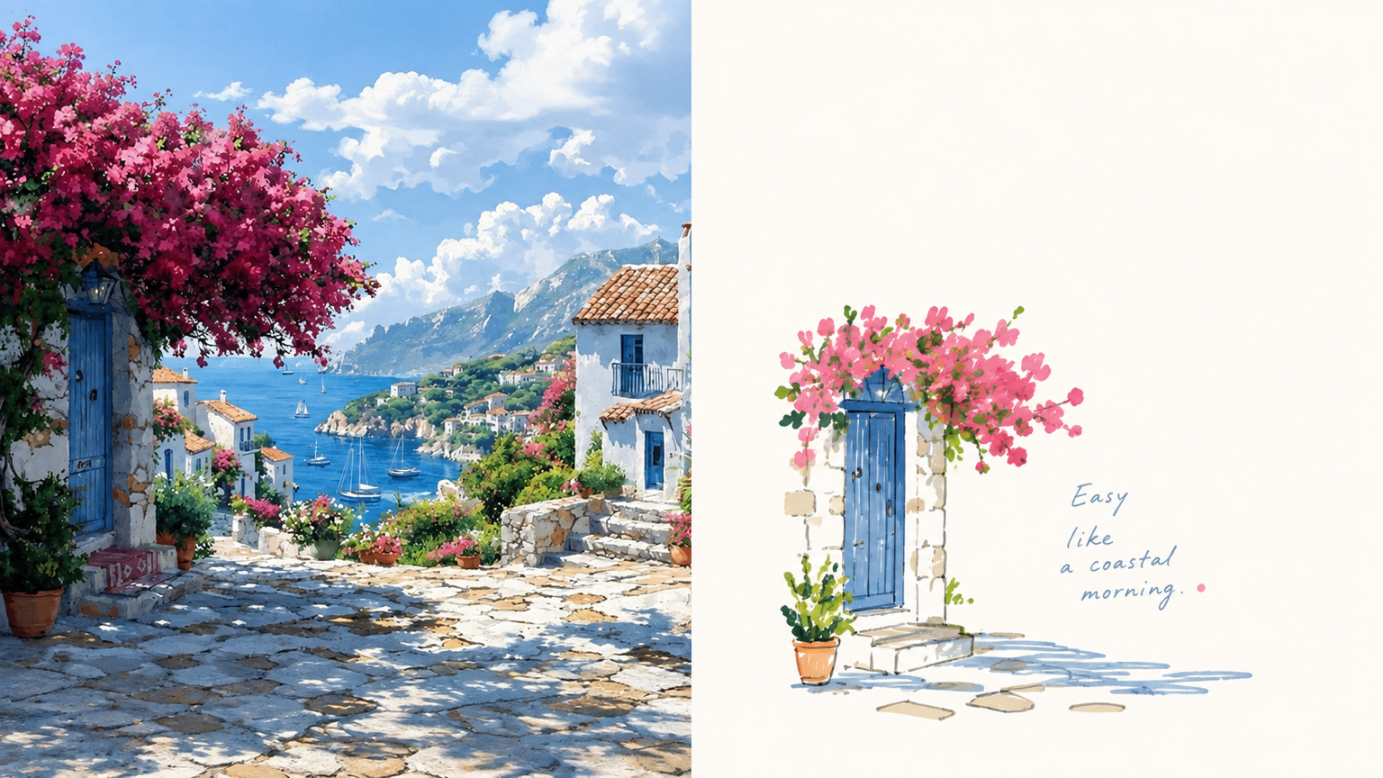
An everyday photo may contain a compelling pose or relationship, yet ordinary composition and a cluttered background can distract from it. Panel 121 preserves the photo’s authentic identity, re-extracts the most recognizable subject, and uses relaxed marker-style doodles, edited handwritten text, and generous negative space to turn a slice of life into a finished work. Best for People, everyday objects, and scenes that need to become independent magazine or lifestyle editorial illustrations. You want to preserve the subject’s outline, pose, and narrative relationships while actively removing most of the background and secondary objects. You like the relaxed feel of naive hand-drawing, while still caring about the mature arrangement of graphics, text, and empty space. You need consistent delivery formats, including top-and-bottom, left-and-right, design-only, multiple aspect ratios, wallpaper, or catalog batches. What it solves Even ordinary photos can establish a new visual focus through reduction, rearrangement, cropping, and changes in scale. Graphics and text first share an invisible grid, visual axes, and a reading path, avoiding “one line of text above, one person below.” Graphic elements occupy only a small proportion of the composition. Negative space provides distance, pauses, and breathing room instead of being filled with random small icons. Comparison images use two strict 50:50 areas and are generated directly from the original image in this run, avoiding a third band and secondary stylization.
Recommended by
淡苍
Why we love this skill
Turns real photos into precisely split top/bottom or left/right doodle posters, balancing mature whitespace with light handwritten copy. Supports standalone designs, wallpaper sets, and catalog batches based solely on the original image.
Showcase
1 / 4
Related Skills
View all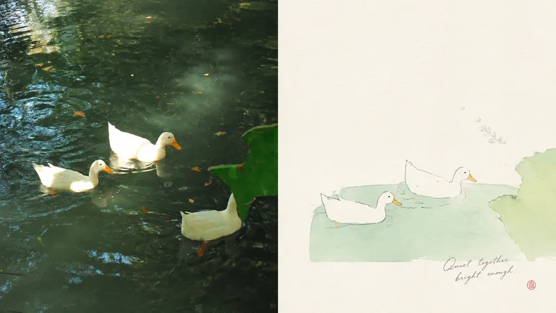 Image
Imagexiaoxiaodong P117 | Fine Line
When a photo is cluttered or ordinarily composed but still contains a subject worth keeping, Panel 117 first identifies one core subject, one visual anchor, and one emotional relationship, then re-directs them into a small-scale image made of fine lines, pale colors, paper texture, and light collage. The original photo can remain in the comparison area, while the design area gains an independent expression through generous, intentional negative space. Best for Keeping the original subject recognizable while rearranging its position, scale, direction, and crop. Creating an artistic poster with few elements and a strong theme, without tracing every object or retaining a cluttered background. Using delicate lines, soft pastels, and the breathing quality of paper while avoiding realistic detail and smooth vector styling. Producing the same style in top-and-bottom, side-by-side, design-only, multiple aspect ratios, four-end wallpapers, or catalog batch processing. What it solves for you Selects the truly important visual anchor from complex source material and removes secondary information. Lets negative space shape positive and negative forms, distance, and asymmetrical balance instead of filling the entire canvas. Keeps the comparison image strictly divided into two areas, each occupying 50%, with no third band or inset panel. Generates each output independently from the current original image in a single round, avoiding the re-rendering of intermediate results.
 Image
Imagexiaoxiaodong P120 Concepts
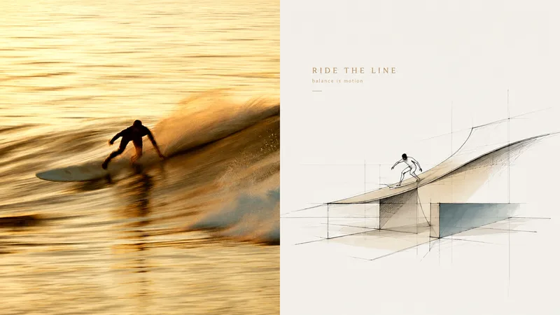
Want to turn a photo into a concept image with a sense of design exploration, without ending up with a fully rendered scene that traces every object? Panel 120 preserves the photo’s identity and spatial memory, distilling its key forms, outlines, and relationships into loose, freehand perspective linework. A few color blocks, geometric guide lines, and generous areas of blank space come together to form the work. Ideal for these situations Architectural, spatial, travel, or object photos need to become concept sketches with an editorial sensibility. The original composition is weak, the background is cluttered, or the subject is small, and you want to reorganize the visual focus through reduction, recomposition, and changes in scale. You want to preserve recognizability and spatial relationships while avoiding full-frame coloring or photorealistic renderings. The same style needs to be delivered in vertical, horizontal, design-only, wallpaper, and catalog batches. What it solves for you Remove backgrounds and secondary objects, leaving the core forms and visual memory points that represent the subject. Use relaxed, restrained, slightly repetitive perspective lines and a few construction lines to express design exploration. Make blank space part of the composition instead of filling the frame with decoration or color blocks. The comparison image contains exactly two equal sections; each source image is generated independently to avoid secondary stylization.
 Image
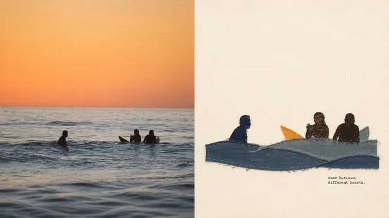
Imagexiaoxiaodong P119 | Fabric
When the people, objects, or actions in a photo are worth preserving but the background is too crowded, Panel 119 distills the central subject into a hand-sewn textile collage. A few large fabric pieces, raw-edge appliqué, and a small amount of embroidery create a compact visual focal point, while generous negative space gives the linen-and-cotton fibers and stitchwork room to be seen. Best for Preserving the true identity of people, everyday objects, and travel memories while adding a warm fabric touch. Distilling the subject, outline, structure, posture, and narrative relationships from a complex photo without redrawing every element of the original scene. Working with lively yet soft 2–4-color fabric palettes and restrained, editorial-style copy. Creating consistent styles for top-and-bottom, left-and-right, pure-design, multiple-aspect-ratio, four-edge wallpaper, or catalog batch processing. What it solves for you It actively removes most of the background and unrelated details to prevent visual information from piling up. It builds recognizability with a few large fabric pieces and hand-stitched details, avoiding a cheap handcrafted look or templated collage style. It strictly uses only two 50:50 areas on the canvas, with no title band, bottom bar, or third section. Each image is generated in a single pass from the current original image, avoiding a second round of stylization on intermediate results.