長文圖解
Featured by
nene@YouMind.AI
Why we love this skill
此技能能將冗長的文章轉化為精美的手繪風格圖解,讓複雜資訊一目了然。它不僅能深入提煉文章核心觀點,還能智慧規劃視覺敘事,並為每個要點設計獨特的手繪圖示和插畫。無論是學習、工作報告或內容創作,都能助你有效率地傳達訊息,達到「一圖勝千言」的效果。
指令
description
將2000-3000 字的長篇文章提煉成3-6 張高資訊密度的手繪風格資訊圖,適合公眾號、社群媒體等管道傳播。
Related Skills
View all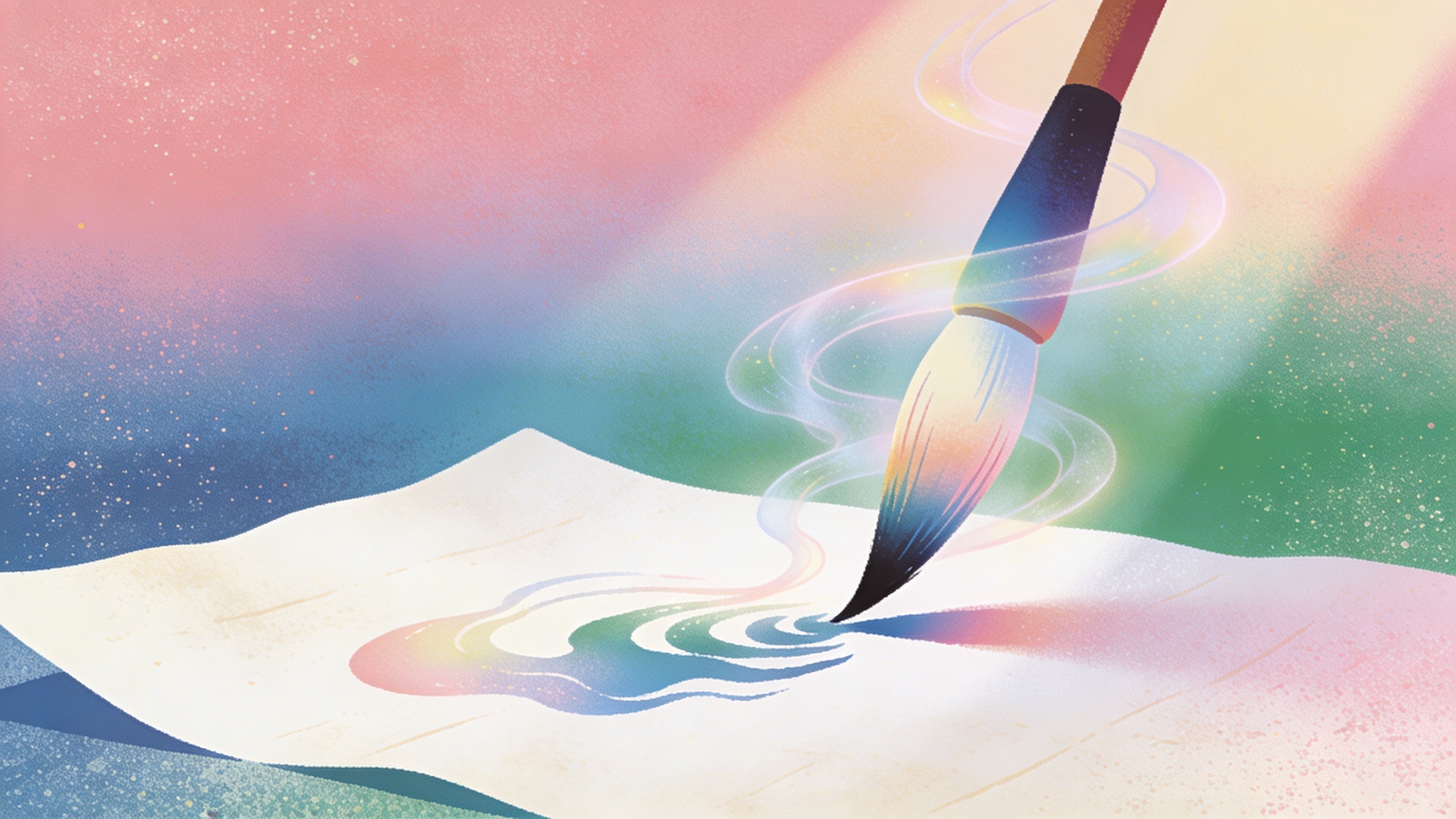
妙手點睛· 技能古風海報Prompt大師
元技能,為任意技能包產生專屬古風海報Prompt。融合中國古畫視覺語法(7種風格)與海報設計學框架(三秒法則/資訊層級/色彩情緒/構圖公式/字體聲音/留白野心),輸出中英雙語Prompt。支持傳統古畫風和畫骨同源風兩種模式,
墨戲連章 小說AI視覺敘事引擎Pro版
將小說文本轉化為專業分鏡漫畫/連環畫→ 影片的全流程引擎。整合古風14種+現代8種雙軌風格庫,透過角色設定圖鎖定解決跨圖人物一致性問題,支援章節切片、對話氣泡、動作分鏡等小說特有場景處理,輸出可直接交付AI繪畫工具的標準化Prompt。基礎版專注連環畫分鏡,,PRO版增強視訊化能力。 輸入一段小說,我輸出: ✓ 切片方案(短篇/單章/長章/全書-你選) ✓ 角色設定圖(先定好好人長什麼樣,後面每格都復用) ✓ 10格分鏡(景別、情緒、文字位置-全設計好) ✓ 雙軌風格庫:古風14種(潑墨山河石…現代8種(新海誠/賽博龐克/美漫/韓漫) ✓ 小說特有文法:對話→氣泡、心理→鋸齒邊框、動作→速度線✓ 逐格AI繪畫Prompt(中英雙語,複製貼上直接用) ✓ PRO版畫=+連環畫+ 視訊分鏡+ 配樂+ 剪輯腳本給我小說分頁你複製到豆包/可靈/即夢,先出角色圖確認,再生成場景
詩畫連章· 古典文學AI視覺敘事引擎Pro版
將古詩詞/古文轉化為AI連環畫分鏡方案。深度解析文字→分鏡設計→角色鎖定→逐格Prompt產生。支持14種古畫風格(洛神賦圖/千里江山圖/富春山居圖等),7種佈局方案,視覺錨點強制復用確保人物一致性。選用PRO版輸出動態影片腳本+剪輯方案。 輸入一段古文,我輸出: ✓ 角色設定圖(先定好人長什麼樣子,後面每格都復用) ✓ 8格分鏡(景別、情緒、文字位置-全設計好) ✓ 逐格AIPrompt(中英雙語,複製貼上直接用) ✓ 14種古畫風格(繪畫繪畫風格(繪畫、千里山大里山神)合成方案(對開頁/長卷/條漫-像翻書一樣講故事) ✓ PRO版= 連環圖+ 視訊分鏡+ 配樂+ 剪輯腳本
長文圖解
Featured by
nene@YouMind.AI
Why we love this skill
此技能能將冗長的文章轉化為精美的手繪風格圖解,讓複雜資訊一目了然。它不僅能深入提煉文章核心觀點,還能智慧規劃視覺敘事,並為每個要點設計獨特的手繪圖示和插畫。無論是學習、工作報告或內容創作,都能助你有效率地傳達訊息,達到「一圖勝千言」的效果。
指令
description
將2000-3000 字的長篇文章提煉成3-6 張高資訊密度的手繪風格資訊圖,適合公眾號、社群媒體等管道傳播。
Related Skills
View all妙手點睛· 技能古風海報Prompt大師
元技能,為任意技能包產生專屬古風海報Prompt。融合中國古畫視覺語法(7種風格)與海報設計學框架(三秒法則/資訊層級/色彩情緒/構圖公式/字體聲音/留白野心),輸出中英雙語Prompt。支持傳統古畫風和畫骨同源風兩種模式,
墨戲連章 小說AI視覺敘事引擎Pro版
將小說文本轉化為專業分鏡漫畫/連環畫→ 影片的全流程引擎。整合古風14種+現代8種雙軌風格庫,透過角色設定圖鎖定解決跨圖人物一致性問題,支援章節切片、對話氣泡、動作分鏡等小說特有場景處理,輸出可直接交付AI繪畫工具的標準化Prompt。基礎版專注連環畫分鏡,,PRO版增強視訊化能力。 輸入一段小說,我輸出: ✓ 切片方案(短篇/單章/長章/全書-你選) ✓ 角色設定圖(先定好好人長什麼樣,後面每格都復用) ✓ 10格分鏡(景別、情緒、文字位置-全設計好) ✓ 雙軌風格庫:古風14種(潑墨山河石…現代8種(新海誠/賽博龐克/美漫/韓漫) ✓ 小說特有文法:對話→氣泡、心理→鋸齒邊框、動作→速度線✓ 逐格AI繪畫Prompt(中英雙語,複製貼上直接用) ✓ PRO版畫=+連環畫+ 視訊分鏡+ 配樂+ 剪輯腳本給我小說分頁你複製到豆包/可靈/即夢,先出角色圖確認,再生成場景
詩畫連章· 古典文學AI視覺敘事引擎Pro版
將古詩詞/古文轉化為AI連環畫分鏡方案。深度解析文字→分鏡設計→角色鎖定→逐格Prompt產生。支持14種古畫風格(洛神賦圖/千里江山圖/富春山居圖等),7種佈局方案,視覺錨點強制復用確保人物一致性。選用PRO版輸出動態影片腳本+剪輯方案。 輸入一段古文,我輸出: ✓ 角色設定圖(先定好人長什麼樣子,後面每格都復用) ✓ 8格分鏡(景別、情緒、文字位置-全設計好) ✓ 逐格AIPrompt(中英雙語,複製貼上直接用) ✓ 14種古畫風格(繪畫繪畫風格(繪畫、千里山大里山神)合成方案(對開頁/長卷/條漫-像翻書一樣講故事) ✓ PRO版= 連環圖+ 視訊分鏡+ 配樂+ 剪輯腳本
Find your next favorite skill
Explore more curated AI skills for research, creation, and everyday work.