E-magazine Style Slides
E-magazine Style Slides
Showcase
Description
Create a horizontal swipe web slides (single HTML file) in the style of 'e-magazine × e-ink', featuring WebGL fluid backgrounds, serif titles + sans-serif body text, chapter title slides, data large-print slides, image grids, and more. Use this skill when you need to make a shareable, speech, or launch-style web slides, or when you mention 'magazine-style slides', 'horizontal swipe deck', 'editorial magazine', or 'e-ink presentation'.
Recommended by
Dancang
Why we love this skill
This skill generates web PPTs in the 'Digital Magazine × E-Ink' style. The unique WebGL fluid backgrounds and exquisite font combinations make your presentations as refined as Monocle magazine, with a highly personal style.
Instructions
Remember to use a webpage to generate the output, and you must ask the user what language they want to use.
Generate horizontally flip-style web-based PPTs (single HTML file) in an "e-magazine × e-ink" style, including templates such as WebGL fluid backgrounds, serif headings + sans-serif body text, chapter covers, large data banners, and image grids. Use this when users need to create web-based PPTs for sharing/presentations/launch events, or when referring to "magazine-style PPTs," "horizontal swipe decks," "editorial magazines," or "e-ink presentations."
# Magazine Web Ppt
## What does this Skill do?
Generate a single-file HTML file with horizontal slideshow formatting. The visual style is:
- A hybrid style combining e-magazine and e-ink
- **WebGL Fluid/Contour/Dispersion Background** (See hero page)
- **Serif headings (Noto Serif SC + Playfair Display) + Sans-serif body text (Noto Sans SC + Inter) + Monospaced metadata (IBM Plex Mono)**
- **Lucide Linear Icons** (No emojis required)
- **Horizontal page turning (left and right on the keyboard, scroll wheel, touch screen swipe, bottom dot, ESC key)**
- **Smooth Interpolation of Theme**: Colors and shaders transition smoothly when navigating to the hero page.
The aesthetics of this skill are neither "business PowerPoint" nor "consumer internet UI"—it's like *Monocle* magazine with code pasted on.
## When to use
**Suitable scenarios:**
- Offline sharing sessions / Industry talks / Private meetings
- AI New Product Launch/Demo Day
- A speech with a strong personal style
- Need a web-based version of slides that can be completed in one go without page-turning tools.
**Inappropriate scenarios:**
- Large sections of table data and overlaid charts (using standard PowerPoint presentations)
- Training materials (insufficient information density)
- Requires collaborative editing by multiple people (this is static HTML)
### Step 1 · Clarify Requirements (**Essential before starting**)
If the user has already provided a complete outline and images, you can skip to Step 2.
If the user only provides a topic or a vague idea, align it with these 6 questions one by one before starting. Don't start writing slides based on guesswork—once the structure is wrong, revisions later are very costly. You can use the askUserQuestion tool when asking questions.
#### 6 Clarification Questions
| # | Question | Why ask? |
|---|------|-----------|
| 1 | **Who is the audience? What is the sharing scenario?** (Industry insiders/Business launch/Demo day/Private meeting) | Determines the language style and depth |
| 2 | **Sharing Duration?** | 15 minutes ≈ 10 pages, 30 minutes ≈ 20 pages, 45 minutes ≈ 25-30 pages |
| 3 | **Do you have any original materials?** (Documents/Data/Old PPTs/Article Links) | If you have materials, use them; if not, build something else for them. |
| 4 | **Are there any pictures? Where should they be placed?** | See "Picture Conventions" below |
| 5 | **Which theme color do you want?** | See @themes.md , choose one of 5 presets |
| 6 | **Are there any hard constraints?** (Must include XX data / YY cannot appear) | To avoid rework |
#### Outline Assistance (if the user does not have an outline)
Use the "narrative arc" template to build the framework, then fill in the content:
```
Hook → Page 1: Present a contrast/question/hard data to make people stop.
Setting the Tone (Context) → Pages 1-2: Explain the background / Who you are / Why you are talking about this
Main content (Core) → Pages 3-5: Core content, interspersed with layouts 4/5/6/9/10.
Shift → Page 1: Breaking Expectations / Presenting a New Perspective
Takeaway → Pages 1-2: Key Quotes / Suspenseful Questions / Action Suggestions
```
Narrative arc + page number planning + theme rhythm table (see @layouts.md ), **align the three tables** before proceeding to Step 2.
It is recommended to save the outline as a `project record` or `outline-v1` for easy subsequent iterations.
#### Image Conventions (Inform Users)
Explain the following to the user before proceeding:
- **Image Location**: Which image is it in the board, or which image was uploaded?
- **What if there are no images?**: To align with the user's layout, you can first generate the structure using placeholder color blocks and add images later; however, you need to inform layout 4/5/10 and other mixed text and image pages that the visual effect cannot be verified without images.
### Step 2 · Reference Template
@template.txt is a **complete and functional** HTML file—CSS, WebGL shaders, pagination JS, and font/icon CDN are all pre-set; only `<main id="deck">` contains 3 sample slides (cover, chapter cover, and blank fill page).
#### 2.1 · Placeholders that must be changed (**Easily missed**)
Immediately after copying, change the following placeholders; otherwise, your browser tabs will display the awkward text "[Required] Replace with PPT title":
| Location | Original | Needs to be changed to |
|------|------|--------|
| `<title>` | `[Required] Replace with PPT title · Deck Title` | Actual deck title (e.g., `A New Way of Working · Luke Wroblewski`) |
#### 2.2 · Select Theme Color (5 presets · Custom colors not allowed)
This skill **only allows selection from 5 carefully curated presets**, and does not accept user-defined hex values—mismatched colors instantly make the image look ugly; protecting aesthetics is more important than giving freedom.
| # | Theme | Suitable for |
|---|------|------|
| 1 | 🖋 Classic Ink | General/Commercial Release/Default if unsure |
| 2 | 🌊 Indigo Porcelain | Technology/Research/Data/Technology Release Conference |
| 3 | 🌿 Forest Ink | Nature/Sustainability/Culture/Nonfiction |
| 4 | 🍂 Kraft Paper | Nostalgia/Humanities/Literature/Independent Magazine |
| 5 | 🌙 Sand Dunes | Art/Design/Creativity/Gallery |
**operate**:
1. Recommend a set of content based on the theme, or directly ask the user which set they would like to choose.
2. Open @themes.md and find the `:root` block for the corresponding theme.
3. **Complete replacement** of the lines marked "theme color" within the `:root{` block at the beginning of @template.txt (`--ink` / `--ink-rgb` / `--paper` / `--paper-rgb` / `--paper-tint` / `--ink-tint`).
4. All other CSS uses `var(--...)`, requiring no other modifications.
**Hard rules**:
- Use only one theme for each deck; do not change the color scheme midway through.
- Do not accept arbitrary hex values provided by the user—politely decline and show 5 options for selection.
- Don't mix and match (e.g., ink for Ink Classic, paper for Dune) - it will look completely out of place.
### Step 3 · Fill in the content
#### 3.0 · Preflight Check: Class names must be defined in @template.txt (**Most Important**)
This is the root of all the generation problems. The skeleton of @layouts.md uses many class names (`h-hero` / `h-xl` / `stat-card` / `pipeline` / `grid-2-7-5`, etc.). If there is no corresponding definition in `<style>` of `assets/template.html`, the browser will fallback to the default style—headlines become sans-serif, data cards are crammed together, pipelines are blurred into a single line, and images are piled up at the bottom of the page.
**Before writing any slide code:**
1. **First, read @template.txt ** (at least up to the end of the `<style>` block).
2. **Refer to the Pre-flight list in @layouts.md ** to confirm that every class you want to use exists in the `<style>` tag.
3. If a class is missing: **add it in the `<style>` section of @template.txt **, do not rewrite it inline in each slide.
4. **@template.txt is the sole source of class names**—do not invent new class names; if you need to customize them, use `style="..."` inline.
Commonly overlooked classes (must be confirmed to exist beforehand):
`h-hero` / `h-xl` / `h-sub` / `h-md` / `lead` / `kicker` / `meta-row` / `stat-card` / `stat-label` / `stat-nb` / `stat-unit` / `stat-note` / `pipeline-section` / `pipeline-label` / `pipeline` / `step` / `step-nb` / `step-title` / `step-desc` / `grid-2-7-5` / `grid-2-6-6` / `grid-2-8-4` / `grid-3-3` / `grid-6` / `grid-3` / `grid-4` / `frame` / `frame-img` / `img-cap` / `callout` / `callout-src` / `chrome` / `foot`
#### 3.0.5 · Planning the Theme Pace (**Equally important as class pre-detection**)
Before choosing a layout, you must first list the theme class for each page (`hero dark` / `hero light` / `light` / `dark`) and align it in a document or draft. See the "Theme Rhythm Planning" section starting with @layouts.md for detailed rules.
**Mandatory Rules**:
- Each page section must include one of `light`, `dark`, `hero light`, or `hero dark`; do not just write `hero`.
- More than 3 consecutive pages on the same topic = visual fatigue, not allowed.
- Pages 8 or more must contain at least one "hero dark" and at least one "hero light".
- The entire deck cannot consist only of "light" text pages; it must also include "dark" text pages to create breathing space.
- Insert one hero page every 3-4 pages (cover/back cover/question/large quote)
**Post-generation self-check: `grep 'class="slide' index.html` lists all topics; manual verification of the reasonable pace is required before delivery.
#### 3.1 · Choosing a Layout
**Don't write slides from scratch.** Open `@layouts.md` , which contains 10 ready-made layout skeletons, each a complete and pasteable `<section>` code block:
| Layout | Purpose |
|---|---|
| 1. Opening Cover | Page 1 |
| 2. Chapter Cover | Opening of Each Act |
3. Data-Driven Posters | Presenting Hard Data |
| 4. Left Text, Right Image (Quote + Image) | Identity Contrast / Story |
| 5. Image Grid | Multiple Image Comparison / Screenshot Evidence |
6. Two-Pipeline | Workflow |
| 7. Suspense ends/Question page | End of chapters/Finale |
8. Big Quote | Serifs/Takeaways |
| 9. Parallel Comparison (Before / After) | Old Mode vs. New Mode |
| 10. Image and Text Combination | Information-Dense Image and Text Pages |
Select the corresponding layout, paste it, and modify the text and image paths. **Complete the 3.0 preflight check first.**
#### 3.2 Image Aspect Ratio Standards
Always use the **standard aspect ratio**, never use odd aspect ratios of the original image (such as `2592/1798`):
| Scenarios | Recommendation Ratio |
|------|---------|
| Text on the left, image on the right (main image) | 16:10 or 4:3 + `max-height:56vh` |
| Image grid (multiple image comparison) | **Fixed `height:26vh`**, no need for aspect-ratio |
| Small image on the left + text on the right | 1:1 or 3:2 |
| Full-screen main visual | 16:9 + `max-height:64vh` |
| Small illustrations in mixed text and image layout | 3:2 or 3:4 |
**Never use `align-self:end` on images**—they will slide to the bottom of the cell and be obscured by the browser toolbar. Use a grid container with `align-items:start` (pre-defined in the template) to keep images at the top; to keep images at the bottom in the left column, use a flex column with `justify-content:space-between`.
Component details (fonts, colors, grids, icons, callouts, stat cards, etc.) are in @components.md .
### Step 4 · Self-check against the checklist
After generating the checklist, be sure to open @checklist.md and check each item against the instructions. It summarizes all the pitfalls encountered during the actual iteration process, and all P0 level issues (emojis, image overloading, title line breaks, font division) must be resolved.
Several points to pay special attention to:
1. **Main headings must be in serif font**—If they are displayed as sans-serif, it's 99% likely that Step 3.0 preflight check failed, and the `h-hero` class is missing in template.html.
2. **Use only `height:Nvh` in the image grid, do not use `aspect-ratio` (it will cause the grid to break).**
3. **Images should not be pushed to the bottom of the page** — Do not use `align-self:end`, use grid + `align-items:start` (see Step 3.2)
4. **Images must be in standard aspect ratios** (16:10 / 4:3 / 3:2 / 1:1 / 16:9). Do not copy images with unusual aspect ratios.
5. **Chinese main headings must be ≤ 5 characters and use `nowrap` (avoid 1 character per line)**
6. **Use Lucide, not emojis.**
7. **Use serifs for headings, sans-serifs for body text, and fixed width for metadata.**
### Step 5 · Iteration
Modified based on user feedback—the template's CSS is now highly parameterized, with 90% of the adjustments being changes to inline styles (font-size:Xvw / height:Yvh / spacing:Zvh).
## Core Design Principles (Philosophy)
These principles are the result of five iterations of creating PPT presentations for a one-person company. Violating any one of them will ruin the visual appeal.
1. **Restraint over technical brilliance** — WebGL backgrounds are only visible on hero pages, and almost invisible on regular pages.
2. **Structure over decoration** — No shadows, no floating cards, no padding boxes; all information is conveyed through **large font size + font contrast + grid spacing**.
3. **Content hierarchy is defined by font size and font type** — Maximum serif = main heading, medium serif = subheading, large sans-serif = lead, small sans-serif = body, fixed width = metadata
4. **Images are the first citizen** — Only crop the bottom of the image, ensuring the top and left/right sides are intact; fix the grid with `height:Nvh`, do not use `aspect-ratio` to expand it.
5. **Pace with Hero Pages** — Alternating between hero and non-hero pages helps prevent eye strain.
6. **Terminology Consistency** — Skills should be translated as Skills, not a mix of Chinese and English.
## References
The visual style of this skill is inspired by:
- Sharing "One-Person Company: Organizations Folded by AI" (April 22, 2026, Page 27)
- Layout of *Monocle* magazine
- A demo of YC President Garry Tan's blog post "Thin Harness, Fat Skills"
They can be used as style anchors.
Related Skills
View all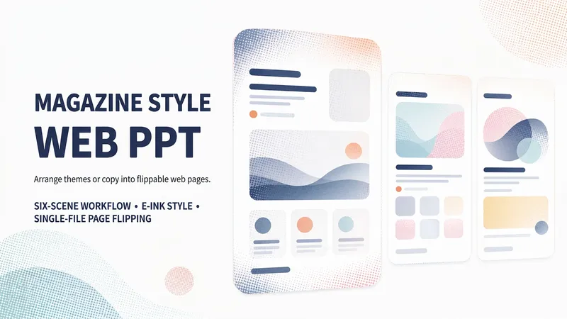 Webpage
Ink Magazine Pro | Slides
Ink Magazine Studio is a magazine-style web Slides generator. Give it a topic, copy, or source material, and it follows its in-house EDITOR six-act workflow—define the story and tone → plan the structure and layout → prepare images and captions → typeset and publish → proof and quality-check → finalize and deliver—to arrange the content into a single-file HTML horizontal page-turning e-magazine webpage. It includes 5 e-ink theme palettes, 9 layout styles, AI-generated illustrations, dual-mode animated backgrounds, and complete page-turning interactions (keyboard / scroll wheel / touch / dot navigation / ESC index view). Each step includes a “stage sign-off” quality checkpoint and masthead progress status to maintain consistent pacing and aesthetics throughout the finished publication.
 Webpage
Magazine Web Slides · AFP
An AFP-architecture web Slides generator in an “e-magazine × e-ink” style. It uses a seven-stage P0–P6 pipeline (requirement clarification→outline planning→class-name preflight→image generation→HTML generation→quality self-check→iterative optimization) to create a single-file HTML, landscape, page-turning Slides. Integrates GPT-Image-2 / Nano Banana Pro 4K for high-quality image generation, with a built-in progress dashboard and Phase Gate quality checkpoints.
 Webpage
Apple-Style PPT
Helps users create an Apple keynote-style PPT presentation web version based on their content.
Information
- Version
- v8
- Last updated
- Runtime credits
- Usage-based
- Models
- Claude Sonnet 4.6
