xiaoxiaodong × Naive P098
By xiaoxiaodong
xiaoxiaodong × Naive P098
By xiaoxiaodong
Description
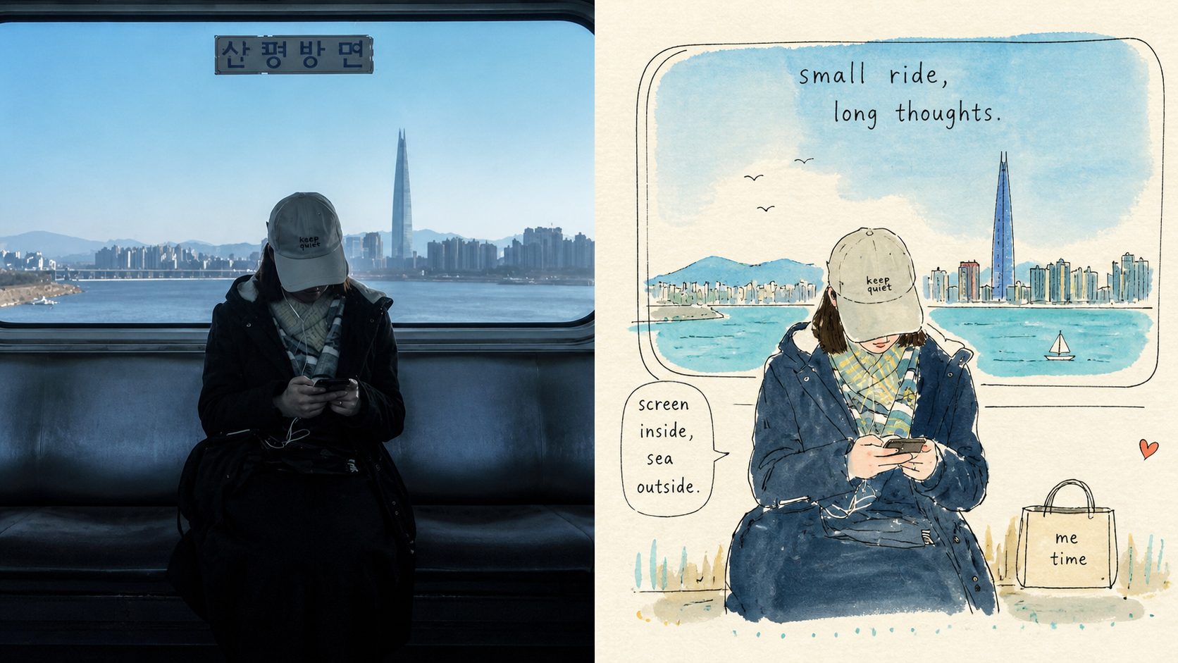
A photo’s meaning doesn’t have to be preserved through complete depiction. Panel 098 simplifies people, animals, buildings, and everyday moments into visual symbols that remain instantly recognizable, then tells them as a small world through loose ink lines, flat watercolor, visible brushstrokes, and childlike handwritten lettering. It may look innocent, but it is supported by sophisticated use of negative space, shifts in scale, and narrative pacing. Good for these situations When you want a lighter photo story: Preserve identity and key poses while intentionally leaving out irrelevant backgrounds and trivial details. When you like an authentic handmade feel: Lines crossing boundaries, watermarks, exposed paper, exploratory lines, and partially open contours all serve as intentional visual language. When you need bright but not cheap-looking colors: Select the liveliest colors from the original image and remix them, leaving pale paper tones for visual breathing room. When you need flexible delivery: Supports vertical, horizontal, pure design, multiple aspect ratios, and four-edge wallpaper, and can also process image directories in batches.
Recommended by
Shuting@YouMind
Why we love this skill
Uses the original picture-book prompt as its sole aesthetic authority, preserving its childlike visual logic while supporting flexible layouts, wallpapers, batch delivery, and rigorous quality checks.
Showcase
1 / 4
Related Skills
View all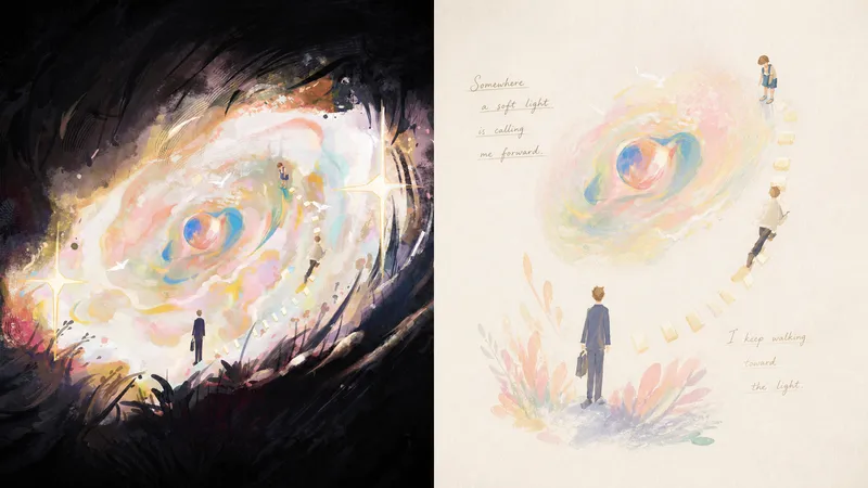 Image
ImageXiaoxiaodong x Pastel P071
Panel 071 distills the subject, pose, and narrative relationships into a small number of soft, slightly naive forms and color blocks. Pastels, wax crayons, water-soluble colored pencils, and light gouache leave behind traces of rubbing, paper show-through, layered color, and pauses. Elements float, echo, or draw one another across a near-white paper surface like fragments of memory. Fine handwritten lines of poetry, with shifting pressure and drifting baselines, move naturally through the negative space instead of being placed into a title template. Good for these situations Want to preserve a memory rather than recreate a scene: The subject’s identity and key relationships remain recognizable at a glance, while complex backgrounds intentionally recede. Like softness without childishness: Powdery texture, rubbing, and translucent layers add tactility, while mature compositions avoid a children’s-cartoon feel. Need text to truly enter the image: Words grow from movement, sound, emotion, or metaphor, creating a reading rhythm through relaxed handwriting. Need flexible delivery: Supports vertical, horizontal, design-only, multiple aspect ratios, and wallpapers for all four edges, as well as batch processing for image directories.
 Image
Imagexiaoxiaodong × P093 Collage
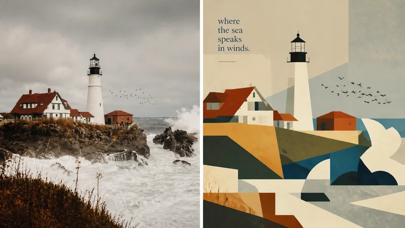
Panel 093 preserves the subject, contours, poses, and narrative relationships from a photo, then distills them into rectangles, trapezoids, triangles, circles, and a few freeform shapes. Instead of relying on realistic perspective and complex shadows, it creates depth through occlusion, changes in scale, layered color fields, and height relationships. Bright colors, subtly hand-drawn edges, and a matte gouache texture give the result both the flat feel of paper cutouts and the finish of an independent publication. Great for these situations Want to make a complex photo instantly readable: Merge repeated elements while preserving the most important identity cues with as few shapes as possible. Need colors that feel lively, not cheap: Start with the brightest and most memorable colors in the original image, then reorganize them into a limited, clear palette of cohesive color fields. Seeking a refined modernist simplicity: Use flat space, subtly irregular edges, and a matte gouache/acrylic finish to avoid a polished vector look and template feel. Need flexible delivery: Supports top-and-bottom, left-and-right, design-only, multiple aspect ratios, and four-platform wallpapers, as well as batch processing for image directories.
 Image
Imagexiaoxiaodong x Sketch Wash P079
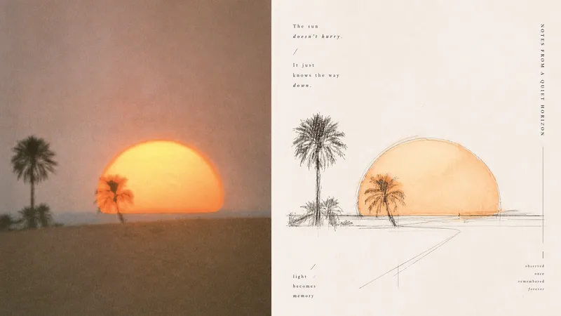
Ordinary photo outline filters mechanically copy edges; full watercolor treatments tend to fill the background, making the subject, space, and editorial rhythm feel heavy. Panel 079 keeps only the structures, spaces, gestures, and relationships in the scene most worth remembering: long straight perspective lines, angular lines, and geometric axes build a rational framework; free organic curves, searching lines, and broken lines retain a tactile feel; a small amount of transparent watercolor extracts recognizable colors from the original. Broad areas of natural paper white create air and pauses. Text follows structural lines and whitespace to join the composition, resulting in something like an art-directed architectural travel sketchbook or an independent visual publication. Best suited for these situations - **Architecture, travel, and on-site observation:** Use the strongest straight lines, turns, facets, and proportional relationships to build the space. - **You want to preserve the vitality of an “in-progress drawing”:** Embrace exploratory repeated lines, broken lines, slight misalignment, and unfinished edges. - **You want color drawn from the photo without overfilling the image:** Use a small amount of transparent wash only where needed, layering ink lines, color, and paper white. - **You need flexible delivery:** Supports portrait, landscape, design-only, multiple aspect ratios, and four-edge wallpaper formats, and can batch-process image directories.