xiaoxiaodong P097: Retro Print
By xiaoxiaodong
xiaoxiaodong P097: Retro Print
By xiaoxiaodong
Description
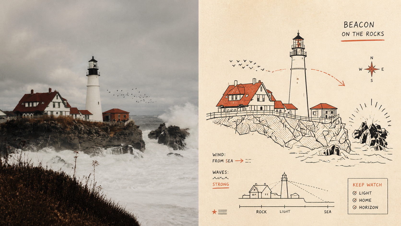
Panel 097 uses economical linework, flat schematic perspective, and a few geometric shapes to preserve the subject’s identity; deep black handles outlines and information layers, while a second spot color is extracted from the photo to create restrained two-color spot printing. Hand-drawn commercial lettering, guide lines, and a touch of awkward functional humor make “explaining this” itself part of the image. Suitable for these situations Need an instantly recognizable diagram: Use outlines, boxes, holes, panels, and directional relationships to clarify the subject and story. Like the strength of vintage printing: Pair deep black with a second spot color extracted from the original image, plus a warm off-white paper surface and subtle misregistration grain. Want understated humor: Vintage commercial hand lettering and a few supporting symbols serve the narrative without creating decorative noise. Need flexible delivery: Supports top-to-bottom, left-to-right, pure design, multiple aspect ratios, and four-edge wallpapers, while also allowing images to be processed in batches from a directory.
Recommended by
Shuting@YouMind
Why we love this skill
A retro two-color spot-printing style that transforms source imagery into distinctive designs, with flexible layouts and wallpaper outputs while preserving the original creative brief.
Showcase
1 / 4
Best for
Creators who want to turn photos into recognizable illustrated works with a vintage print texture and lighthearted humor.
How to use this Skill
Provide your input
Provide one or more images, with optional choices for the final layout, size, text language, or custom copy.
Run the Skill
Choose your settings to generate an image in a retro two-color spot-printing style.
Review your result
Get finished PNGs for display, wallpapers, or delivery in multiple aspect ratios.
Related Skills
View all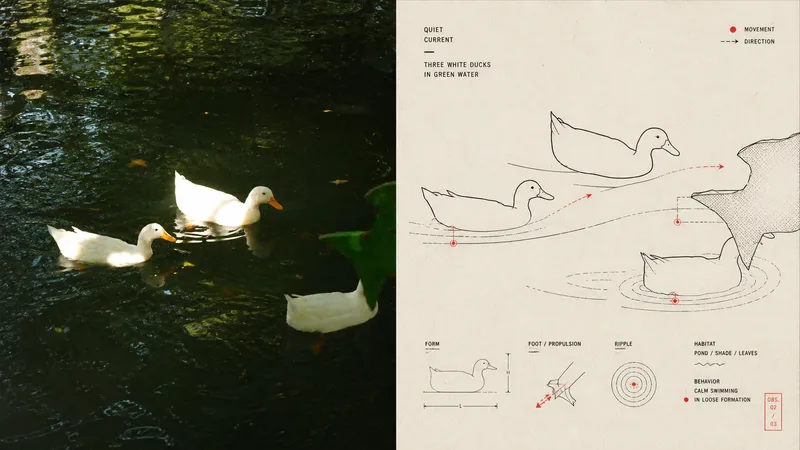 Image
Imagexiaoxiaodong × Red-Black P095
Panel 095 centers on Mid-century modern diagrammatic editorial illustration: visual shorthand, pictographic simplification, fine lines, curves, icons, partial sections, and leader lines preserve the contours, nodes, directions, actions, and relationships that define an object’s identity. Black carries most of the information, while vermilion/coral red is used only as a precise spot color. Warm white paper, ink grain, registration shifts, and overprint give it the feel of plates from early information design and independent publications. Best suited for these situations Need to explain complex objects clearly: Preserve identity, structure, and action with the fewest accurate visual details. Like the reading paths of vintage publications: Use the main diagram as the sole anchor, with supporting diagrams echoing it through differences in scale, offsets, alignment, and leader lines. Want a restrained two-color system: Black, red, and paper white create a clear rhythm, with red marking only the nodes that deserve emphasis. Need flexible delivery: Supports top-to-bottom, left-to-right, design-only, multiple aspect ratios, and four-sided wallpapers, and can also process image folders in batches.
 Image
Imagexiaoxiaodong x Line P081
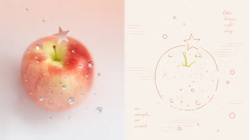
Panel 081 uses a near-uniform-width monoline system to compress subjects, contours, poses, and relationships into a small set of memorable symbols. Open contours, broken edges, subtle jitter, and misalignment remove the mechanical vector feel; 2–4 colored lines extracted from the original image encode information directly, establishing foreground and background through line density, brightness, and spot-color hierarchy. Grain, registration shifts, and uneven inking create the authentic warmth of a commemorative print. Good for these situations Want to turn photos into a personal keepsake album: Use a few colored monolines to preserve the details in people, places, objects, and relationships that are truly worth remembering. Dislike the cartoon look of black outlines: Let 2–4 spot-color lines derived from the original image handle contours, structure, and information hierarchy directly. Need negative space and editorial order: Use open contours, layered line density, and asymmetric layouts to bring air, distance, and emotion into the image. Need flexible delivery: Supports top-and-bottom, side-by-side, design-only, multi-ratio, and four-edge wallpapers, and can also process image directories in batches.
 Image
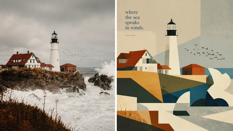
Imagexiaoxiaodong × P093 Collage
Panel 093 preserves the subject, contours, poses, and narrative relationships from a photo, then distills them into rectangles, trapezoids, triangles, circles, and a few freeform shapes. Instead of relying on realistic perspective and complex shadows, it creates depth through occlusion, changes in scale, layered color fields, and height relationships. Bright colors, subtly hand-drawn edges, and a matte gouache texture give the result both the flat feel of paper cutouts and the finish of an independent publication. Great for these situations Want to make a complex photo instantly readable: Merge repeated elements while preserving the most important identity cues with as few shapes as possible. Need colors that feel lively, not cheap: Start with the brightest and most memorable colors in the original image, then reorganize them into a limited, clear palette of cohesive color fields. Seeking a refined modernist simplicity: Use flat space, subtly irregular edges, and a matte gouache/acrylic finish to avoid a polished vector look and template feel. Need flexible delivery: Supports top-and-bottom, left-and-right, design-only, multiple aspect ratios, and four-platform wallpapers, as well as batch processing for image directories.