Sales/growth/budget report
Featured by
nene@YouMind.AI
Why we love this skill
This report generator transforms raw data into visually compelling and strategic presentations. Using innovative design elements like glassmorphism and Aurora gradients, it makes complex numbers accessible and engaging. Ideal for growth forecasting, budgeting, or marketing performance analysis, it enables the effective communication of crucial financial information.
Instructions
Based on selected content to generate slides. Ask user how many pages they want before start creating.
1. Visual Philosophy & Mood
Philosophy: “Organic Integration.” It breaks away from the rigid boxes of traditional corporate decks, using fluid "blob" shapes to represent agility and continuous growth. This softness effectively counteracts the potential "coldness" of hard data, making complex marketing or growth logic feel more accessible.
Mood: Modern, transparent, and forward-thinking. It strikes a perfect balance between "professional trust" and "innovative energy"—ideal for carrying high-growth forecasts or large-scale budget proposals.
2. Color System & Materiality
Palette: "Aurora Gradients."
Bright Coral (#FF6B81): Used to highlight sales spikes, conversion peaks, or core growth KPIs.
Sky Blue (#48C6EF): Represents the baseline, stable budget foundations, or technological trust.
Deep Navy Violet (#2D326F): Used for typography to ensure maximum readability for financial figures.
Materiality: “Glassmorphism.” The use of frosted, semi-transparent overlays creates a sense of depth, allowing data layers to "float" above the background. This prevents complex charts from feeling cluttered or heavy.
3. Layout Logic & Grid
Asymmetric Balance: Leverages significant negative space and shifted centers of gravity to create balance. This provides the necessary "visual breathing room" required when comparing multi-dimensional datasets.
Modular Encapsulation (Card UI): Content is housed in rounded, semi-transparent containers. This "dashboard-style" logic is perfect for displaying parallel KPIs, budget breakdowns, or multi-channel ROI while maintaining granular clarity.
4. Typography Personality
Font Choice: Geometric Sans-serifs (eg, Montserrat, Poppins, Gilmer).
Characteristics: Heavyweight titles are reserved for bold financial numbers to convey authority and certainty. Small body text with generous line spacing ensures that even dense sales terms or growth footnotes remain easy to scan during a presentation.
5. Graphic Elements & Language
Fluid Vector Shapes: Large, smooth S-curves or cloud-like gradients subliminally suggest market momentum and unstoppable growth trends.
Dynamic Spheres: Scattered gradient orbs act as visual anchors, strategically placed to draw the eye toward critical data inflection points within a chart.
Streamlined Data Visualization: Simplified lines and dot-markers turn complex growth curves into abstract trends, forcing the audience to focus on the "big picture" rather than minor data noise.
6. Visual Hierarchy & Depth
Hierarchy:
Top Layer: North Star Metrics (Total Sales, ROI, Growth %).
Middle Layer: Data explanation cards and supporting infographics.
Base Layer: Soft brand-ambient gradients.
Sense of Depth: By using opacity overlaps instead of harsh drop shadows, the deck remains lightweight and efficient, even when packed with budget tables and pie charts.
7. Scenarios & Industry Alignment
Core Scenarios: Specifically engineered for data-heavy environments. It excels at marketing performance reviews, annual budget allocations, sales forecasting, and user growth funnels. It transforms heavy data into a compelling brand narrative.
Target Audience: From the perspective of an AI Company CMO, this style is most effective for convincing stakeholders who demand both rational data results and emotional brand momentum
description
Perfect for data-driven presentations. Generate dynamic presentations with elegant Aurora gradients and Glassmorphism effects, ensuring your data always looks compelling and clear.
Related Skills
View all
Professional Slide Architect(English)
Extract brand colors from logos, refine English content with spell/grammar checks and title optimization, condense into structured slides with localized design language, generate M-variant preview batches, upsample through three quality gates, and assemble a complete presentation deck.

Presentation and defense standard PPT terminator
Users provide the logo/organization information and original content; the system automatically extracts color schemes, groups key points, matches page templates, and generates complete slides after chapter-by-chapter preview and confirmation.
Game-Style Hand-Drawn Master Pro
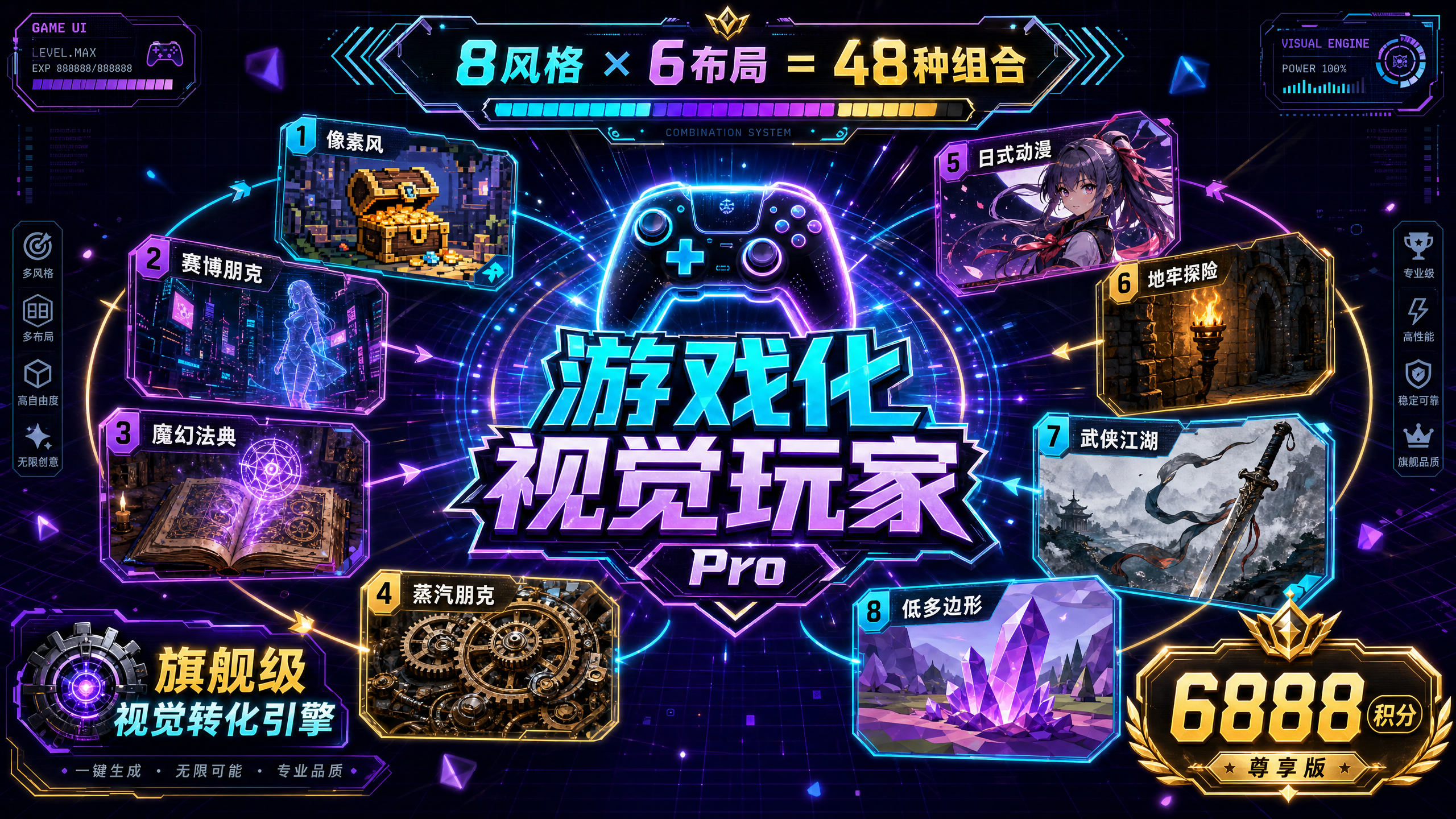
💎 Core Competencies: 8 Selected Game Styles: • Pixel Retro Style - Nostalgic and exciting, suitable for games/tech content • Cyberpunk Style - Avant-garde and cool, suitable for AI/technology content • Magic Academy Style - Mysterious and ritualistic, suitable for education and training • Steampunk Style - Industrial aesthetics, suitable for project management/history • Japanese Anime Style - Healing and energetic, suitable for youthful brands • Dungeon Adventure Style - Adventure and challenge, suitable for problem solving • Wuxia Style - Eastern aesthetics, suitable for traditional culture • Low-Poly Style - Modern and minimalist, suitable for business presentations 6 Professional Layouts: Vertical Infographic (9:16) | Horizontal Widescreen (16:9) | Square Card (1:1) | Triple-Screen Long Image (9:32) | Double-Column Contrast (3:4) | Center Radial (1:1/4:3) ━━━━━━━━━━━━━━━━━━━━━━ ✨ Core Differentiation ✅ Intelligent Recommendation+ Customizable dual-mode for beginners: one-click quick generation; advanced users: fine-grained control. ✅ A mandatory confirmation mechanism before generation displays the complete framework to avoid wasting points. ✅ Dual output formats: Infographic mode (quick sharing) + Slides mode (editable presentation). ✅ Flexible system adjustments: supports changing styles, layouts, and regenerating single pages. ✅ Default minor optimization retains the essence of the original content, adding only gamified visual DNA. ━━━━━━━━━━━━━━━━━━━━━━ 🎯 Applicable Scenarios • Tutorials & Guides - Learning paths, operation guides, skill trees • Paid Knowledge - Course outlines, training camp content, knowledge graphs • Personal Branding - Growth stories, portfolios, personal introductions • Product Launches - Feature matrices, roadmaps, product comparisons • Project Reports - Progress reports, data analysis, solution presentations • Social Media - Xiaohongshu long images, WeChat official account in-depth articles, WeChat Moments cards ━━━━━━━━━━━━━━━━━━━━━━ 💡 Input content using the workflow (text/file/@reference) ↓ AI intelligently analyzes content structure ↓ Select mode (quick recommendation or custom) ↓ Confirm framework before generation ↓ One-click generation of gamified visual works ↓ Flexible adjustments (change style/change layout/regenerate) ━━━━━━━━━━━━━━━━━━━━━ 🏆 Why is it worth 6888 points? (Limited-time flash sale price 4999 points) This product offers: • 48 visual combinations (8 styles × 6 layouts) • Dual output formats (infographic + editable slides) • Pre-generation confirmation mechanism (extremely low rate of rejected images) • Complete gamified visual DNA system • Flagship-level visual conversion engine ━━━━━━━━━━━━━━━━━━━━━━ ⚡ Everything can be gamified, turning every boring piece of content into an engaging gamified experience.
Sales/growth/budget report
Featured by
nene@YouMind.AI
Why we love this skill
This report generator transforms raw data into visually compelling and strategic presentations. Using innovative design elements like glassmorphism and Aurora gradients, it makes complex numbers accessible and engaging. Ideal for growth forecasting, budgeting, or marketing performance analysis, it enables the effective communication of crucial financial information.
Instructions
Based on selected content to generate slides. Ask user how many pages they want before start creating.
1. Visual Philosophy & Mood
Philosophy: “Organic Integration.” It breaks away from the rigid boxes of traditional corporate decks, using fluid "blob" shapes to represent agility and continuous growth. This softness effectively counteracts the potential "coldness" of hard data, making complex marketing or growth logic feel more accessible.
Mood: Modern, transparent, and forward-thinking. It strikes a perfect balance between "professional trust" and "innovative energy"—ideal for carrying high-growth forecasts or large-scale budget proposals.
2. Color System & Materiality
Palette: "Aurora Gradients."
Bright Coral (#FF6B81): Used to highlight sales spikes, conversion peaks, or core growth KPIs.
Sky Blue (#48C6EF): Represents the baseline, stable budget foundations, or technological trust.
Deep Navy Violet (#2D326F): Used for typography to ensure maximum readability for financial figures.
Materiality: “Glassmorphism.” The use of frosted, semi-transparent overlays creates a sense of depth, allowing data layers to "float" above the background. This prevents complex charts from feeling cluttered or heavy.
3. Layout Logic & Grid
Asymmetric Balance: Leverages significant negative space and shifted centers of gravity to create balance. This provides the necessary "visual breathing room" required when comparing multi-dimensional datasets.
Modular Encapsulation (Card UI): Content is housed in rounded, semi-transparent containers. This "dashboard-style" logic is perfect for displaying parallel KPIs, budget breakdowns, or multi-channel ROI while maintaining granular clarity.
4. Typography Personality
Font Choice: Geometric Sans-serifs (eg, Montserrat, Poppins, Gilmer).
Characteristics: Heavyweight titles are reserved for bold financial numbers to convey authority and certainty. Small body text with generous line spacing ensures that even dense sales terms or growth footnotes remain easy to scan during a presentation.
5. Graphic Elements & Language
Fluid Vector Shapes: Large, smooth S-curves or cloud-like gradients subliminally suggest market momentum and unstoppable growth trends.
Dynamic Spheres: Scattered gradient orbs act as visual anchors, strategically placed to draw the eye toward critical data inflection points within a chart.
Streamlined Data Visualization: Simplified lines and dot-markers turn complex growth curves into abstract trends, forcing the audience to focus on the "big picture" rather than minor data noise.
6. Visual Hierarchy & Depth
Hierarchy:
Top Layer: North Star Metrics (Total Sales, ROI, Growth %).
Middle Layer: Data explanation cards and supporting infographics.
Base Layer: Soft brand-ambient gradients.
Sense of Depth: By using opacity overlaps instead of harsh drop shadows, the deck remains lightweight and efficient, even when packed with budget tables and pie charts.
7. Scenarios & Industry Alignment
Core Scenarios: Specifically engineered for data-heavy environments. It excels at marketing performance reviews, annual budget allocations, sales forecasting, and user growth funnels. It transforms heavy data into a compelling brand narrative.
Target Audience: From the perspective of an AI Company CMO, this style is most effective for convincing stakeholders who demand both rational data results and emotional brand momentum
description
Perfect for data-driven presentations. Generate dynamic presentations with elegant Aurora gradients and Glassmorphism effects, ensuring your data always looks compelling and clear.
Related Skills
View allProfessional Slide Architect(English)
Extract brand colors from logos, refine English content with spell/grammar checks and title optimization, condense into structured slides with localized design language, generate M-variant preview batches, upsample through three quality gates, and assemble a complete presentation deck.
Presentation and defense standard PPT terminator
Users provide the logo/organization information and original content; the system automatically extracts color schemes, groups key points, matches page templates, and generates complete slides after chapter-by-chapter preview and confirmation.
Game-Style Hand-Drawn Master Pro
💎 Core Competencies: 8 Selected Game Styles: • Pixel Retro Style - Nostalgic and exciting, suitable for games/tech content • Cyberpunk Style - Avant-garde and cool, suitable for AI/technology content • Magic Academy Style - Mysterious and ritualistic, suitable for education and training • Steampunk Style - Industrial aesthetics, suitable for project management/history • Japanese Anime Style - Healing and energetic, suitable for youthful brands • Dungeon Adventure Style - Adventure and challenge, suitable for problem solving • Wuxia Style - Eastern aesthetics, suitable for traditional culture • Low-Poly Style - Modern and minimalist, suitable for business presentations 6 Professional Layouts: Vertical Infographic (9:16) | Horizontal Widescreen (16:9) | Square Card (1:1) | Triple-Screen Long Image (9:32) | Double-Column Contrast (3:4) | Center Radial (1:1/4:3) ━━━━━━━━━━━━━━━━━━━━━━ ✨ Core Differentiation ✅ Intelligent Recommendation+ Customizable dual-mode for beginners: one-click quick generation; advanced users: fine-grained control. ✅ A mandatory confirmation mechanism before generation displays the complete framework to avoid wasting points. ✅ Dual output formats: Infographic mode (quick sharing) + Slides mode (editable presentation). ✅ Flexible system adjustments: supports changing styles, layouts, and regenerating single pages. ✅ Default minor optimization retains the essence of the original content, adding only gamified visual DNA. ━━━━━━━━━━━━━━━━━━━━━━ 🎯 Applicable Scenarios • Tutorials & Guides - Learning paths, operation guides, skill trees • Paid Knowledge - Course outlines, training camp content, knowledge graphs • Personal Branding - Growth stories, portfolios, personal introductions • Product Launches - Feature matrices, roadmaps, product comparisons • Project Reports - Progress reports, data analysis, solution presentations • Social Media - Xiaohongshu long images, WeChat official account in-depth articles, WeChat Moments cards ━━━━━━━━━━━━━━━━━━━━━━ 💡 Input content using the workflow (text/file/@reference) ↓ AI intelligently analyzes content structure ↓ Select mode (quick recommendation or custom) ↓ Confirm framework before generation ↓ One-click generation of gamified visual works ↓ Flexible adjustments (change style/change layout/regenerate) ━━━━━━━━━━━━━━━━━━━━━ 🏆 Why is it worth 6888 points? (Limited-time flash sale price 4999 points) This product offers: • 48 visual combinations (8 styles × 6 layouts) • Dual output formats (infographic + editable slides) • Pre-generation confirmation mechanism (extremely low rate of rejected images) • Complete gamified visual DNA system • Flagship-level visual conversion engine ━━━━━━━━━━━━━━━━━━━━━━ ⚡ Everything can be gamified, turning every boring piece of content into an engaging gamified experience.
Find your next favorite skill
Explore more curated AI skills for research, creation, and everyday work.