Luxury travel presentation
high-end travel magazine, boutique travel agency pitch deck
Інструкції
Reversed Prompt: Minimal Luxury Travel Presentation Style
Create a complete presentation deck in a refined minimalist luxury travel editorial style.
The deck should feel like a high-end travel magazine, boutique travel agency pitch deck, or premium destination package brochure. The most important elements are: cinematic travel photography, elegant layout, muted forest-green color palette, oversized thin serif typography, generous negative space, and carefully structured editorial composition.
Topic
Create the presentation based on the following user-provided topic:
[INSERT PRESENTATION TOPIC HERE]
If the user does not provide image assets, generate all photographic image assets yourself. The generated images must match the original presentation’s visual language: cinematic travel photography, natural landscapes, road trips, mountains, lakes, beaches, architecture, cultural landmarks, calm travelers, boutique lifestyle scenes, and soft editorial atmosphere.
Do not use generic stock-photo aesthetics. The images should feel curated, poetic, slightly nostalgic, and premium.
Visual Style
Use a dark muted forest-green background as the main brand color. The overall palette should include:
Deep forest green
Dark teal green
Warm ivory / cream white
Soft beige
Muted gray-green
Occasional natural colors from photography, such as sky blue, foliage green, stone beige, sunset gold, and faded red
Apply a subtle vintage film treatment to all images: slightly lowered contrast, soft grain, muted saturation, natural light, and gentle atmospheric haze.
The deck should feel calm, elegant, spacious, and editorial. Avoid bright colors, busy gradients, cartoon illustrations, glossy corporate visuals, or overly modern tech-style UI elements.
Typography
Use two clearly contrasting type styles:
Main titles
Use an ultra-thin, high-fashion serif display font.
It should look elegant, tall, narrow, and editorial, similar to luxury magazine typography.
Use very large title sizes, often spanning across the top or left side of the slide.
Titles may be uppercase and can be partially oversized or cropped near the canvas edges for a dramatic editorial effect.
Body text and labels
Use a condensed sans-serif font in white or ivory.
Keep body text small, clean, and structured.
Use uppercase labels for sections such as PRICE, WHAT’S INCLUDED, PLACES TO VISIT, PACKAGE 1, etc.
Typography should be part of the composition, not just information. Large serif titles should dominate the page visually.
Layout Principles
Use a 16:9 horizontal presentation format.
The layout should feel like a luxury editorial spread. Use strong alignment, asymmetric composition, and generous empty space.
Use the following recurring layout systems:
1. Full-bleed hero image layout
For opening and closing slides, use a cinematic full-screen travel image as the background. Apply a dark translucent green/gray overlay so white typography remains readable.
Place an oversized serif title across the top or center.
Add small supporting text at the bottom corners or side edges.
Example visual direction: a vintage red car on a quiet road surrounded by green hills, a misty mountain valley, a traveler facing a lake, or a scenic countryside road.
2. Dark green editorial text layout
For informational slides, use a solid dark forest-green background with large serif titles on the left or top.
Place images in rectangular blocks with sharp edges.
Use body text in small structured columns.
3. Vertical image collage layout
For contents or overview slides, use a narrow vertical stack of travel photos in the center or slightly off-center.
Balance it with large serif title text on the left and structured navigation text on the right.
4. Statistics layout
For experience, results, or metrics slides, use a faded full-bleed landscape image in the background with a gray-green overlay.
Place large numbers in elegant serif type.
Use small uppercase sans-serif labels and short descriptions beside each number.
5. Package / product card layout
For package or offering slides, use three large rectangular image cards arranged horizontally.
Each card should include a destination or product image, a package label, and a short title underneath.
Keep spacing clean and consistent.
6. Detailed package layout
For detailed offering slides, combine two travel photos with a large serif title and structured information blocks: price, description, included items, places to visit, schedule, or benefits.
Use bullet points sparingly.
Keep the structure elegant and readable.
7. Testimonial layout
Use three portrait photos in a horizontal grid.
Below each portrait, include the client name, star rating, and a short testimonial.
The background should remain dark forest green with a large serif title at the top.
Image Generation Rules
Since the user may not provide any image assets, generate all required images directly.
Images should follow these rules:
Use realistic cinematic photography, not illustrations.
Use natural lighting: golden hour, cloudy daylight, misty morning, or soft sunset.
Add subtle film grain and muted color grading.
Prefer landscapes, travel moments, roads, mountains, lakes, beaches, old towns, cultural landmarks, boutique hotels, relaxed travelers, and lifestyle scenes.
Images should feel cohesive across the entire deck.
Avoid overly saturated stock images.
Avoid cheesy smiling-tourist stock photography.
Avoid random unrelated visuals.
Avoid AI-looking surreal details.
Use clean rectangular crops with no rounded corners.
Make sure each image has enough empty space or dark areas for text overlay when needed.
For travel topics, generate destination-specific imagery.
For non-travel topics, reinterpret the subject through this same premium editorial visual language. For example, if the topic is an AI tool, use elegant workspace photography, abstract research scenes, soft-lit screens, notebooks, city windows, and calm human-centered productivity images, while preserving the same forest-green luxury editorial style.
Slide Structure
Create a complete deck with the following structure, unless the user specifies otherwise:
Cover Slide
Full-bleed cinematic image, oversized serif title, short subtitle, small brand label.
Table of Contents / Agenda
Dark green background, large serif title, vertical image collage, numbered agenda items.
About / Overview
Large serif heading, one large image, one smaller supporting image, concise body text.
Experience / Key Metrics
Full-bleed muted landscape image, large serif numbers, short descriptions.
Packages / Main Offerings
Three image cards with titles and short descriptions.
Offering Detail 1
Image grid, large serif title, price / features / benefits / description.
Offering Detail 2
Full-bleed background image with overlay, large title, structured details.
Offering Detail 3
Dark green background, asymmetrical images, title and detailed information blocks.
Client Testimonials / Social Proof
Three portrait cards, names, star ratings, testimonials.
Closing / Thank You
Full-bleed cinematic image, oversized “THANK YOU” or closing statement, contact details along the bottom.
Content Rules
Use concise, elegant, presentation-ready copy.
Do not overcrowd the slides.
Use short paragraphs, compact labels, and enough breathing room.
The writing should feel premium, calm, confident, and editorial.
For every slide, make sure the text hierarchy is clear:
Huge serif title
Small uppercase label
Short supporting copy
Structured details in compact blocks
Avoid long bullet lists unless necessary.
Design Details
Use lots of negative space.
Align elements to a clean invisible grid.
Use white or ivory text on dark green backgrounds.
Use image blocks with clean rectangular edges.
Keep margins generous.
Avoid decorative icons unless absolutely necessary.
Do not add colorful vector illustrations.
Do not use modern SaaS gradients, neon colors, or glassmorphism.
Do not use cartoon-style visuals.
Keep every slide visually connected through the same typography, color palette, image treatment, and editorial spacing.
Final Output Requirement
Generate a polished presentation deck that feels like a premium travel editorial brochure.
Every slide should look visually cohesive with the others.
The generated image assets should feel intentionally curated and stylistically consistent.
The final deck should have the same overall feeling as a minimalist beige-and-green luxury travel package presentation: cinematic, quiet, elegant, spacious, and refined.
Опис
This skill crafts elegant presentation decks in a minimalist luxury travel editorial style, perfect for boutique travel agencies, high-end hospitality brands, or anyone seeking to present a topic with sophisticated visual appeal. It transforms your chosen subject into a visually stunning narrative, evoking the feel of a premium travel magazine or exclusive destination brochure. Users can expect a presentation characterized by cinematic travel photography, an elegant layout, and a muted forest-green color palette. The skill utilizes oversized, thin serif typography for impactful titles and condensed sans-serif fonts for clear body text, all while incorporating generous negative space to create a calm and refined atmosphere. Visuals are carefully curated or generated to feature natural landscapes, architectural beauty, and serene lifestyle scenes, all treated with a subtle vintage film aesthetic. The skill structures your content into a complete deck, including a cover, table of contents, overview, key metrics, offerings, testimonials, and a closing slide. It focuses on concise, elegant copy and a clear visual hierarchy, ensuring each slide is both informative and aesthetically pleasing. The final output is a polished presentation that feels cohesive, luxurious, and highly professional, ready to impress any audience with its understated elegance and premium design.
Схожі навички
Переглянути всі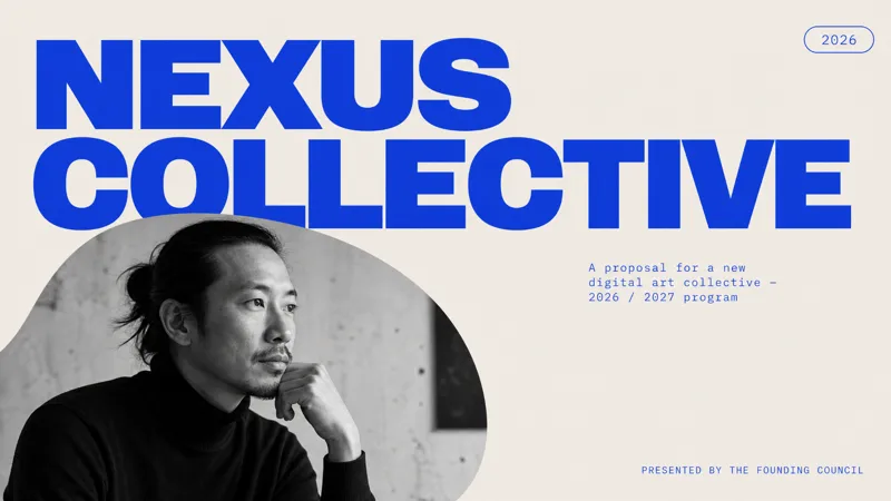 Слайди
 сучасного мистецтва
Цей навик створює вишукані мінімалістичні презентації проектних пропозицій, ідеально підходить для професіоналів у творчих сферах, таких як мистецтво, культура, дизайн, мода та планування виставок. Він призначений для тих, кому потрібно представити проект із сильною сучасною візуальною ідентичністю, яка виділяється. Презентації мають виразну редакційну естетику, що характеризується великим шрифтом без зарубок, вражаючою чорно-білою портретною фотографією та строгою палітрою королівського синього та м'якого сірого кольорів. Очікуйте чисті асиметричні макети з великим негативним простором та унікальними заокругленими масками зображень, що надає кожному слайду журнальної композиції. Навик автоматично генерує всі необхідні зображення, забезпечуючи узгодженість і відповідність вашій темі, від професійних портретів до динамічних сцен дії. Користувачі можуть ввести деталі свого проекту, і навик створить повну, відшліфовану презентацію. Результат — візуально запам'ятовувана та професійна пропозиція, яка виглядає впевнено та структуровано, ідеально підходить для творчих проектних пропозицій, бренд-кампаній або презентацій дизайн-студій.
 Слайди
Сучасна професійна презентація
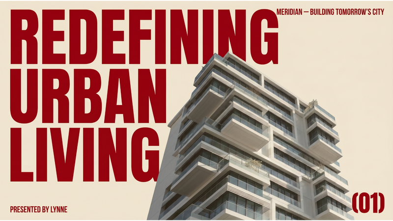
Ця навичка створює повну бізнес-презентацію з виразною, сучасною редакційною естетикою. Вона ідеально підходить для підприємців, стартапів і бізнес-професіоналів, які хочуть представити свої ідеї з вишуканим і вражаючим візуальним стилем, що вирізняється на тлі звичайних корпоративних презентацій. Навичка проєктує кожен слайд, щоб викликати відчуття елітного архітектурного журналу або модної редакції, використовуючи теплий бежевий фон і великі темно-червоні шрифти. Вона застосовує сильні асиметричні макети, великі білі простори та ретельно підібрані редакційні фотоколажі. Ви можете вказати тему презентації, назву компанії, доповідача, слоган і бажану кількість слайдів, і навичка згенерує всі необхідні візуальні матеріали, включаючи професійні, знебарвлені зображення, які доповнюють загальний дизайн. Отримана презентація наголошує на чіткості та візуальному впливі, забезпечуючи авторитетне подання вашого основного повідомлення. Кінцевий результат — це повна, візуально цілісна презентація, де кожен слайд виглядає як унікально розроблений плакат, що робить вашу презентацію запам'ятовуваною та захопливою.
Двоколірний ефект накладання
Створюйте презентації з виразною рукотворною естетикою, натхненною класичними техніками накладання фарб. Ця навичка перетворює ваш контент на візуально яскраві слайди зі стриманою редакційною красою, обмеженими кольоровими палітрами та великою кількістю вільного простору. Оберіть одну з трьох добірних двоколірних палітр: холодну «Кобальт і маджента» для класичного європейського настрою, теплу «Кіноварний і лісовий зелений», що нагадує вінтажну Америку, або сміливу «Шавлієво-зелений і яскраво-рожевий» із сучасним східноазійським акцентом. Кожен дизайн вирізняється авторською типографікою: заголовками з грубою фактурою ксилографічного друку та чистим шрифтом без зарубок для основного тексту. Усе відтворюється з текстурою некрейдованого паперу й видимими ефектами суміщення фарб. Ваші презентації оживуть завдяки деталізованим ілюстраціям у стилі гравюри на міді, які доповнюють повідомлення, не перевантажуючи його. Навичка ретельно балансує текст і зображення, забезпечуючи читабельність та візуальний вплив завдяки асиметричним макетам і зосередженню на найважливішому. Створюйте професійні слайди, що запам’ятовуються та вирізняються унікальним поєднанням історичної чарівності друку й сучасного дизайнерського бачення.
Luxury travel presentation
high-end travel magazine, boutique travel agency pitch deck
Інструкції
Reversed Prompt: Minimal Luxury Travel Presentation Style
Create a complete presentation deck in a refined minimalist luxury travel editorial style.
The deck should feel like a high-end travel magazine, boutique travel agency pitch deck, or premium destination package brochure. The most important elements are: cinematic travel photography, elegant layout, muted forest-green color palette, oversized thin serif typography, generous negative space, and carefully structured editorial composition.
Topic
Create the presentation based on the following user-provided topic:
[INSERT PRESENTATION TOPIC HERE]
If the user does not provide image assets, generate all photographic image assets yourself. The generated images must match the original presentation’s visual language: cinematic travel photography, natural landscapes, road trips, mountains, lakes, beaches, architecture, cultural landmarks, calm travelers, boutique lifestyle scenes, and soft editorial atmosphere.
Do not use generic stock-photo aesthetics. The images should feel curated, poetic, slightly nostalgic, and premium.
Visual Style
Use a dark muted forest-green background as the main brand color. The overall palette should include:
Deep forest green
Dark teal green
Warm ivory / cream white
Soft beige
Muted gray-green
Occasional natural colors from photography, such as sky blue, foliage green, stone beige, sunset gold, and faded red
Apply a subtle vintage film treatment to all images: slightly lowered contrast, soft grain, muted saturation, natural light, and gentle atmospheric haze.
The deck should feel calm, elegant, spacious, and editorial. Avoid bright colors, busy gradients, cartoon illustrations, glossy corporate visuals, or overly modern tech-style UI elements.
Typography
Use two clearly contrasting type styles:
Main titles
Use an ultra-thin, high-fashion serif display font.
It should look elegant, tall, narrow, and editorial, similar to luxury magazine typography.
Use very large title sizes, often spanning across the top or left side of the slide.
Titles may be uppercase and can be partially oversized or cropped near the canvas edges for a dramatic editorial effect.
Body text and labels
Use a condensed sans-serif font in white or ivory.
Keep body text small, clean, and structured.
Use uppercase labels for sections such as PRICE, WHAT’S INCLUDED, PLACES TO VISIT, PACKAGE 1, etc.
Typography should be part of the composition, not just information. Large serif titles should dominate the page visually.
Layout Principles
Use a 16:9 horizontal presentation format.
The layout should feel like a luxury editorial spread. Use strong alignment, asymmetric composition, and generous empty space.
Use the following recurring layout systems:
1. Full-bleed hero image layout
For opening and closing slides, use a cinematic full-screen travel image as the background. Apply a dark translucent green/gray overlay so white typography remains readable.
Place an oversized serif title across the top or center.
Add small supporting text at the bottom corners or side edges.
Example visual direction: a vintage red car on a quiet road surrounded by green hills, a misty mountain valley, a traveler facing a lake, or a scenic countryside road.
2. Dark green editorial text layout
For informational slides, use a solid dark forest-green background with large serif titles on the left or top.
Place images in rectangular blocks with sharp edges.
Use body text in small structured columns.
3. Vertical image collage layout
For contents or overview slides, use a narrow vertical stack of travel photos in the center or slightly off-center.
Balance it with large serif title text on the left and structured navigation text on the right.
4. Statistics layout
For experience, results, or metrics slides, use a faded full-bleed landscape image in the background with a gray-green overlay.
Place large numbers in elegant serif type.
Use small uppercase sans-serif labels and short descriptions beside each number.
5. Package / product card layout
For package or offering slides, use three large rectangular image cards arranged horizontally.
Each card should include a destination or product image, a package label, and a short title underneath.
Keep spacing clean and consistent.
6. Detailed package layout
For detailed offering slides, combine two travel photos with a large serif title and structured information blocks: price, description, included items, places to visit, schedule, or benefits.
Use bullet points sparingly.
Keep the structure elegant and readable.
7. Testimonial layout
Use three portrait photos in a horizontal grid.
Below each portrait, include the client name, star rating, and a short testimonial.
The background should remain dark forest green with a large serif title at the top.
Image Generation Rules
Since the user may not provide any image assets, generate all required images directly.
Images should follow these rules:
Use realistic cinematic photography, not illustrations.
Use natural lighting: golden hour, cloudy daylight, misty morning, or soft sunset.
Add subtle film grain and muted color grading.
Prefer landscapes, travel moments, roads, mountains, lakes, beaches, old towns, cultural landmarks, boutique hotels, relaxed travelers, and lifestyle scenes.
Images should feel cohesive across the entire deck.
Avoid overly saturated stock images.
Avoid cheesy smiling-tourist stock photography.
Avoid random unrelated visuals.
Avoid AI-looking surreal details.
Use clean rectangular crops with no rounded corners.
Make sure each image has enough empty space or dark areas for text overlay when needed.
For travel topics, generate destination-specific imagery.
For non-travel topics, reinterpret the subject through this same premium editorial visual language. For example, if the topic is an AI tool, use elegant workspace photography, abstract research scenes, soft-lit screens, notebooks, city windows, and calm human-centered productivity images, while preserving the same forest-green luxury editorial style.
Slide Structure
Create a complete deck with the following structure, unless the user specifies otherwise:
Cover Slide
Full-bleed cinematic image, oversized serif title, short subtitle, small brand label.
Table of Contents / Agenda
Dark green background, large serif title, vertical image collage, numbered agenda items.
About / Overview
Large serif heading, one large image, one smaller supporting image, concise body text.
Experience / Key Metrics
Full-bleed muted landscape image, large serif numbers, short descriptions.
Packages / Main Offerings
Three image cards with titles and short descriptions.
Offering Detail 1
Image grid, large serif title, price / features / benefits / description.
Offering Detail 2
Full-bleed background image with overlay, large title, structured details.
Offering Detail 3
Dark green background, asymmetrical images, title and detailed information blocks.
Client Testimonials / Social Proof
Three portrait cards, names, star ratings, testimonials.
Closing / Thank You
Full-bleed cinematic image, oversized “THANK YOU” or closing statement, contact details along the bottom.
Content Rules
Use concise, elegant, presentation-ready copy.
Do not overcrowd the slides.
Use short paragraphs, compact labels, and enough breathing room.
The writing should feel premium, calm, confident, and editorial.
For every slide, make sure the text hierarchy is clear:
Huge serif title
Small uppercase label
Short supporting copy
Structured details in compact blocks
Avoid long bullet lists unless necessary.
Design Details
Use lots of negative space.
Align elements to a clean invisible grid.
Use white or ivory text on dark green backgrounds.
Use image blocks with clean rectangular edges.
Keep margins generous.
Avoid decorative icons unless absolutely necessary.
Do not add colorful vector illustrations.
Do not use modern SaaS gradients, neon colors, or glassmorphism.
Do not use cartoon-style visuals.
Keep every slide visually connected through the same typography, color palette, image treatment, and editorial spacing.
Final Output Requirement
Generate a polished presentation deck that feels like a premium travel editorial brochure.
Every slide should look visually cohesive with the others.
The generated image assets should feel intentionally curated and stylistically consistent.
The final deck should have the same overall feeling as a minimalist beige-and-green luxury travel package presentation: cinematic, quiet, elegant, spacious, and refined.
Опис
This skill crafts elegant presentation decks in a minimalist luxury travel editorial style, perfect for boutique travel agencies, high-end hospitality brands, or anyone seeking to present a topic with sophisticated visual appeal. It transforms your chosen subject into a visually stunning narrative, evoking the feel of a premium travel magazine or exclusive destination brochure. Users can expect a presentation characterized by cinematic travel photography, an elegant layout, and a muted forest-green color palette. The skill utilizes oversized, thin serif typography for impactful titles and condensed sans-serif fonts for clear body text, all while incorporating generous negative space to create a calm and refined atmosphere. Visuals are carefully curated or generated to feature natural landscapes, architectural beauty, and serene lifestyle scenes, all treated with a subtle vintage film aesthetic. The skill structures your content into a complete deck, including a cover, table of contents, overview, key metrics, offerings, testimonials, and a closing slide. It focuses on concise, elegant copy and a clear visual hierarchy, ensuring each slide is both informative and aesthetically pleasing. The final output is a polished presentation that feels cohesive, luxurious, and highly professional, ready to impress any audience with its understated elegance and premium design.
Схожі навички
Переглянути всіСлайдиСлайди сучасного мистецтва
Цей навик створює вишукані мінімалістичні презентації проектних пропозицій, ідеально підходить для професіоналів у творчих сферах, таких як мистецтво, культура, дизайн, мода та планування виставок. Він призначений для тих, кому потрібно представити проект із сильною сучасною візуальною ідентичністю, яка виділяється. Презентації мають виразну редакційну естетику, що характеризується великим шрифтом без зарубок, вражаючою чорно-білою портретною фотографією та строгою палітрою королівського синього та м'якого сірого кольорів. Очікуйте чисті асиметричні макети з великим негативним простором та унікальними заокругленими масками зображень, що надає кожному слайду журнальної композиції. Навик автоматично генерує всі необхідні зображення, забезпечуючи узгодженість і відповідність вашій темі, від професійних портретів до динамічних сцен дії. Користувачі можуть ввести деталі свого проекту, і навик створить повну, відшліфовану презентацію. Результат — візуально запам'ятовувана та професійна пропозиція, яка виглядає впевнено та структуровано, ідеально підходить для творчих проектних пропозицій, бренд-кампаній або презентацій дизайн-студій.
СлайдиСучасна професійна презентація
Ця навичка створює повну бізнес-презентацію з виразною, сучасною редакційною естетикою. Вона ідеально підходить для підприємців, стартапів і бізнес-професіоналів, які хочуть представити свої ідеї з вишуканим і вражаючим візуальним стилем, що вирізняється на тлі звичайних корпоративних презентацій. Навичка проєктує кожен слайд, щоб викликати відчуття елітного архітектурного журналу або модної редакції, використовуючи теплий бежевий фон і великі темно-червоні шрифти. Вона застосовує сильні асиметричні макети, великі білі простори та ретельно підібрані редакційні фотоколажі. Ви можете вказати тему презентації, назву компанії, доповідача, слоган і бажану кількість слайдів, і навичка згенерує всі необхідні візуальні матеріали, включаючи професійні, знебарвлені зображення, які доповнюють загальний дизайн. Отримана презентація наголошує на чіткості та візуальному впливі, забезпечуючи авторитетне подання вашого основного повідомлення. Кінцевий результат — це повна, візуально цілісна презентація, де кожен слайд виглядає як унікально розроблений плакат, що робить вашу презентацію запам'ятовуваною та захопливою.
Двоколірний ефект накладання
Створюйте презентації з виразною рукотворною естетикою, натхненною класичними техніками накладання фарб. Ця навичка перетворює ваш контент на візуально яскраві слайди зі стриманою редакційною красою, обмеженими кольоровими палітрами та великою кількістю вільного простору. Оберіть одну з трьох добірних двоколірних палітр: холодну «Кобальт і маджента» для класичного європейського настрою, теплу «Кіноварний і лісовий зелений», що нагадує вінтажну Америку, або сміливу «Шавлієво-зелений і яскраво-рожевий» із сучасним східноазійським акцентом. Кожен дизайн вирізняється авторською типографікою: заголовками з грубою фактурою ксилографічного друку та чистим шрифтом без зарубок для основного тексту. Усе відтворюється з текстурою некрейдованого паперу й видимими ефектами суміщення фарб. Ваші презентації оживуть завдяки деталізованим ілюстраціям у стилі гравюри на міді, які доповнюють повідомлення, не перевантажуючи його. Навичка ретельно балансує текст і зображення, забезпечуючи читабельність та візуальний вплив завдяки асиметричним макетам і зосередженню на найважливішому. Створюйте професійні слайди, що запам’ятовуються та вирізняються унікальним поєднанням історичної чарівності друку й сучасного дизайнерського бачення.
Знайдіть свою наступну улюблену навичку
Досліджуйте більше підібраних AI-навичок для досліджень, творчості та повсякденної роботи.