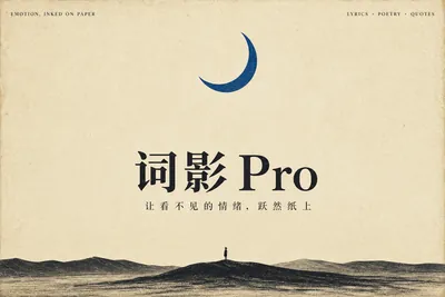
Lyric Shadow · Poster Pro
Turn words and feelings into resonant posters
Lyric Shadow · Poster Pro
Turn words and feelings into resonant posters
Showcase
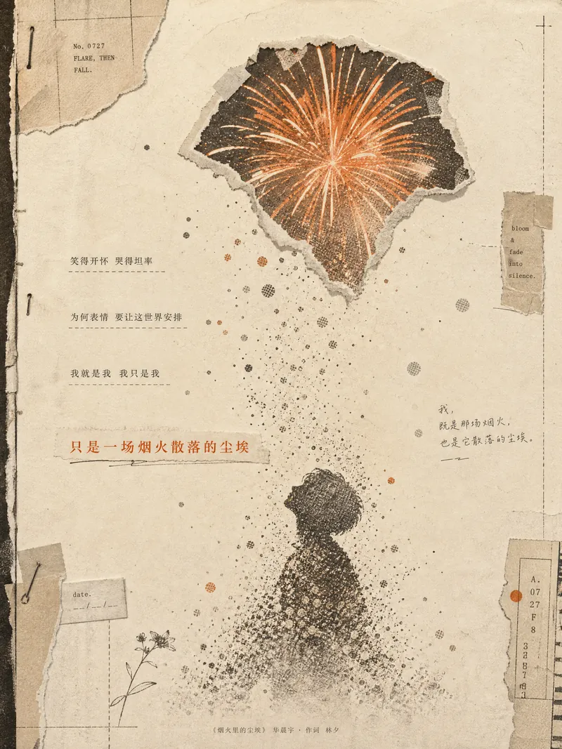
《烟火里的尘埃》歌词海报
烟火里的尘埃 · ZINE 歌词海报
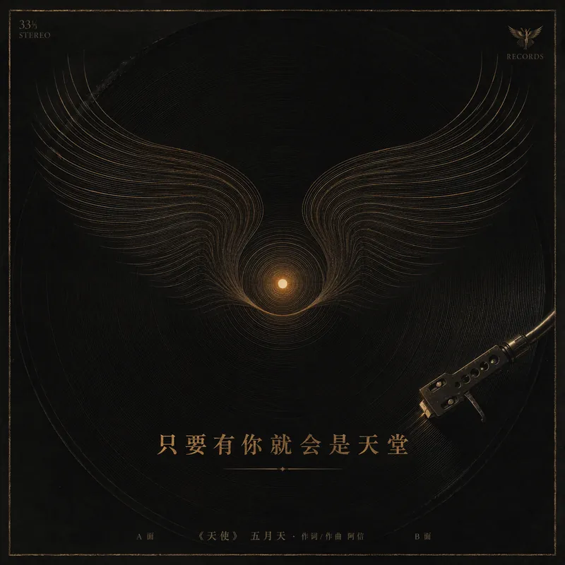
五月天《天使》歌词赏析
天使 · 黑胶唱片封面
《烟火里的尘埃》歌词海报
烟火里的尘埃 · ZINE 歌词海报
五月天《天使》歌词赏析
天使 · 黑胶唱片封面
Description
Turn a favorite lyric, piece of film narration, poem, or quote into a vivid visual expression—transforming its emotion into a poster with resonance, a clear point of view, and a sophisticated editorial design sensibility. This is not a text template, but an editorial creative process from “emotion → visual”: first, lightly research the source—the background of the song, film, or poem and the creator’s original intent—then distill a powerful central metaphor that makes people pause and have an Aha moment. Finally, restrained typography, low-saturation colors, and a single high-purity anchor come together in a design piece that truly belongs on a wall or ready to publish. The visual metaphor always takes center stage. By default, 2–4 complete lyric lines are retained as a finishing touch, while the song title and artist appear as understated credits in ultra-fine publication details, never competing for attention. Nine original styles, each with a complete visual language: Japanese cinematic skies / vintage paper craft / fairytale theater / emotional weather maps / Chinese ink wash / ukiyo-e crashing waves / vintage audiovisual archives / dreamlike surrealism / emotional monuments. All are non-photorealistic—using the visual languages of illustration, printmaking, graphic design, and hand-drawn animated films, without copying any IP or artist’s imagery. Two ways to create, whether you want speed or detail: ① Fully automatic mode: Drop in lyrics, narration, poetry, or a quote, and research, metaphor, style, layout, type, and color are all decided automatically. Get the image directly with no choices to make. ② Step-by-step selection mode: Answer choices appear one at a time, each with a ★Recommended option. You can also upload a reference image to fine-tune the mood only. Confirm each choice before generating for complete control over the concept.
Recommended by
淡苍
Why we love this skill
Transforms lyrics, narration, and poetry into editorial posters led by a strong core metaphor, restrained design, and non-photorealistic visual language—with fully automated or step-by-step creation.
Related Skills
View all
Surreal Image Generation
Have you ever felt this way— Abstract thoughts swirling in your mind, yet unable to find the right visual language to express them? Written a deep, insightful article, only to struggle endlessly for an accompanying image—ordinary photos too literal, illustrations lacking soul? Want to create a 'thoughtful' visual for your brand, only to end up with clichés that everyone else has already used? Stuck in a creative rut, scouring your asset library, only to find every image repeating yesterday's self... We desperately need a visual language that can 'read' the emotions, conflicts, and philosophy behind the text. And now, all it takes is a theme, a piece of text—leave the rest to it. What is it exactly? A smart creative tool that transforms abstract concepts and deep thoughts into surreal, wordless images with a single click. How to use it? Ridiculously simple. Enter any text: a sentence, a short essay, a philosophical proposition, or even a few fleeting keywords. Choose a ratio: 16:9, 4:3, 1:1... you decide. Click generate—and a surreal image full of philosophical depth and visual impact appears instantly. No drawing skills needed, no design experience required. You think, it sees. What makes its visual language stand out? It doesn't rely on realism or flatter prettiness. Instead, it uses the 'grammar' of surrealism to translate your thoughts: Scale paradox — a giant apple floating above a miniature city; Material alienation — books growing bones, clocks flowing into rivers; Spatial misconstruction — staircases leading to the sky, windows opening to another universe; Collage grafting — unrelated elements colliding into striking metaphors. In terms of color, it is restrained to the point of being cold—low-saturation, high-end grays as the main tone, with local high-saturation highlights at key points, creating a dreamlike detachment and silent astonishment. Every frame is clean, exquisite, and balanced, uniformly using a pure white background—extreme simplicity to accentuate extreme absurdity. Where can it be used? Art creation for inspiration — let the subconscious surface as images; Concept covers / album visuals — instantly captivating at first glance; Deep articles / poetry illustrations — image and text resonate, striking the heart; Brand visual extension — create a unique, story-rich visual identity.
 Image
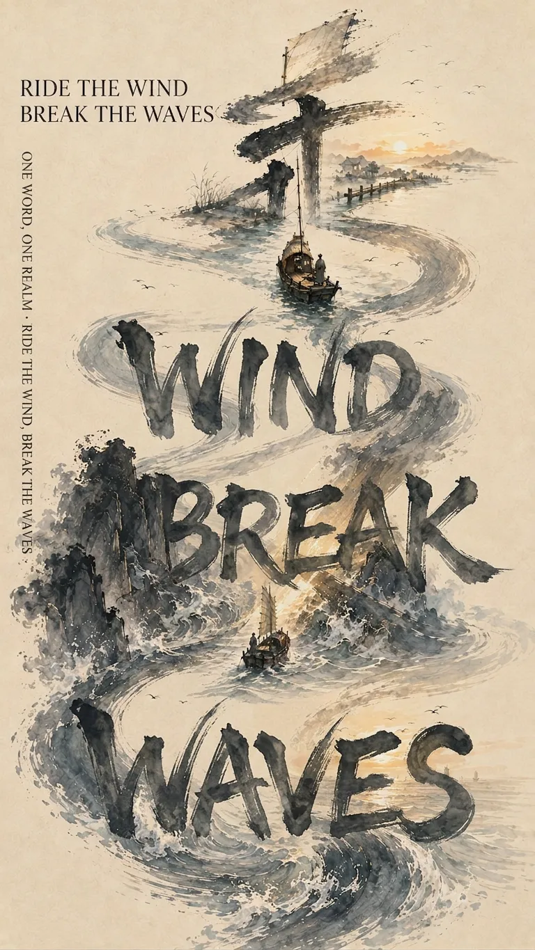
ImageOne Character, One World
This Skill does not simply apply an ink-wash filter to Chinese characters. It first understands the core meaning of the text in its full context, then determines how the imagery, calligraphy, and layout should work together. Give it a Chinese character, name, place name, idiom, line of poetry, or public-domain classical Chinese poem or prose passage. It first interprets the meaning, then transforms the character’s strokes into mountains, rivers, bridges, figures, architecture, or narrative paths, making the calligraphy itself the framework of the composition. Different meanings automatically call for different brush movements, colors, and compositions, rather than being forced into a fixed template. It supports single-character posters, multi-character series, combined-character compositions, and storyboard sequences based on classical poetry and prose. Names, place names, and idioms can be turned into sequential series with one character per poster, or idioms, poetic lines, and parallel phrases can be combined into a single poster. Classical poetry and prose can be divided into 6–12 consecutive posters according to the original order and emotional arc, with nine posters by default for WeChat Moments, while naturally incorporating the corresponding original text into the imagery. The Skill actively avoids common failures: illegible characters, calligraphy that looks like a computer font, misinterpretations caused by checking characters one by one, forcing the entire image into a character-shaped mask, changing only the text while leaving the narrative unchanged across a series, placing the main text in an awkward standalone white box, and presenting garbled small text as a finished design. It is suited to Chinese posters, urban cultural visuals, name-based gifts, idiom and poetry projects, nine-image WeChat Moments posts, Xiaohongshu graphics, and collectible Eastern editorial design. The final result is influenced by YouMind’s current image model. When long text must be accurate character by character, the Skill prioritizes editable text layers for typesetting; when that is not possible, it clearly labels the result as a conceptual base and provides accurate typesetting specifications.
 Image
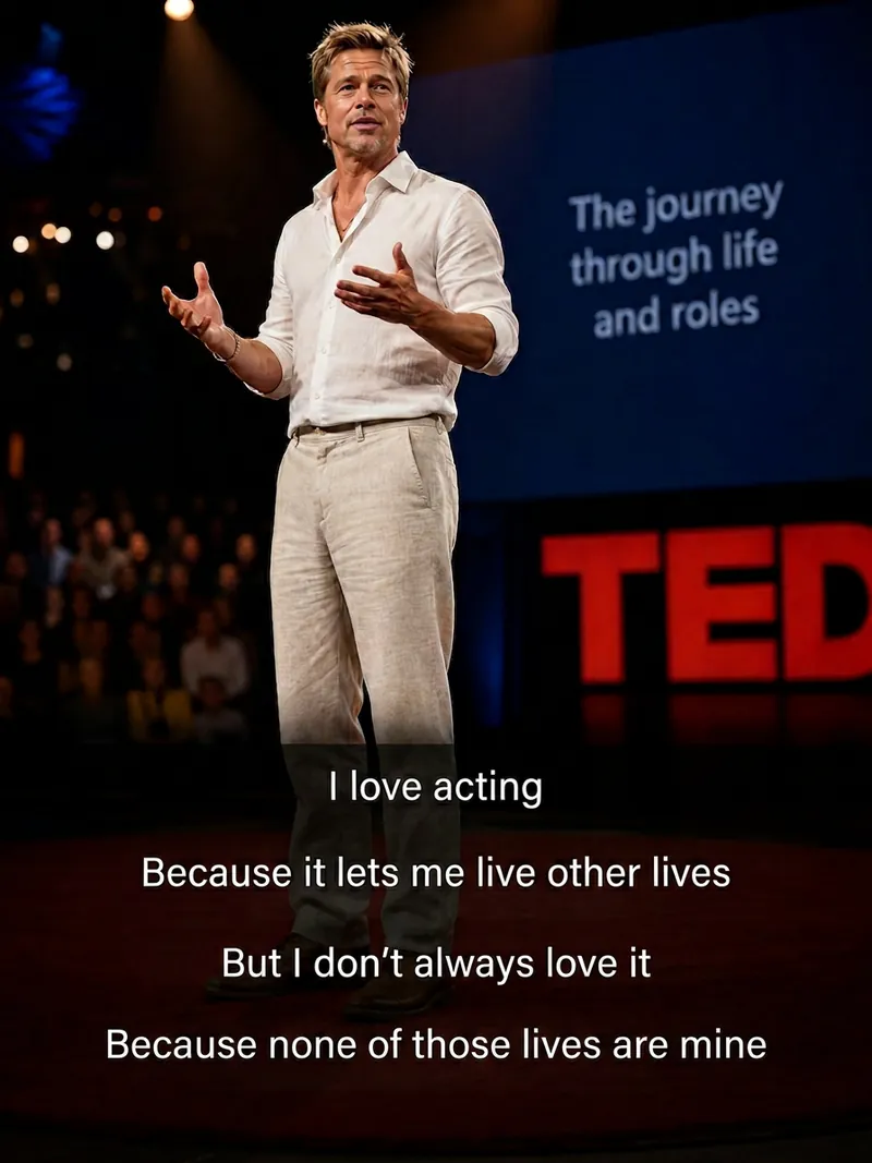
ImageCinematic Quote Portraits
Turn a portrait photo and a quote into a vertical quote poster with a cinematic narrative feel. Facial features, hairstyle, and identity are kept as consistent as possible with the reference photo, while the quote’s emotion shapes scenes such as an interview, an intimate conversation at home, a courtroom statement, a seaside monologue, a rainy nighttime street, or a retro Hong Kong-inspired setting. Ideal for character quote graphics, mood posters, and social media content. Choose a preset template or customize the scene, clothing, pose, and atmosphere. The Skill also supports speaking mouth shapes, Chinese-English bilingual text, classic typography, subtitle styles, minimalist designs, and Hong Kong-inspired color tones, with output in 3:4, 9:16, or 1:1 formats. Longer quotes are condensed and line-broken for poster presentation, keeping the text concentrated near the bottom of the image so it does not cover the subject’s face and remains clear and readable. The final deliverable is an AI-generated cinematic quote poster, accompanied by the selected scene, text style, and aspect ratio. Because the text is rendered directly by AI, complex or lengthy quotes may occasionally contain incorrect characters. If the text is inaccurate, shorten the quote or request a new generation.
Information
- Version
- v23
- Last updated
- Runtime credits
- Usage-based
- Models
- Auto
