Han Stone Relief Poster
Ancient stone poster with bold lines & colors
Description
Recommended by
Shuting@YouMind
Why we love this skill
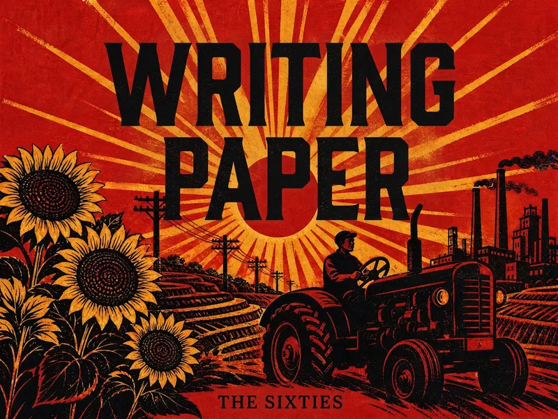
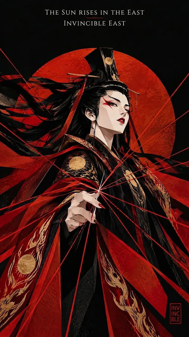
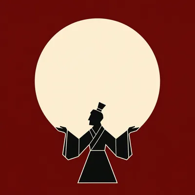
Combines the bold lines of Han stone reliefs with high-contrast classical colors. Through minimalist geometric compositions, it injects a compelling Eastern stone-and-metal aesthetic into modern event posters.
A visual system extracted from Han stone reliefs: geometric silhouette figures × classical background colors × asymmetric editorial layout. Suitable for event posters, live stream previews, podcast covers, and more. You just say the theme, and it carves modern content into the aesthetics of two thousand years.
Related Skills
View all
ImageModern Chinese Era Visuals
Transform titles, themes, or graphics into visual designs inspired by modern Chinese eras, suitable for book covers, posters, cards, illustrations, typography, and social media graphics. Simply provide the text, target era, design format, and aspect ratio to receive a visual concept tailored to your theme. If no ratio is specified, a portrait cover composition can be used. Supports a range of styles from the 1920s–30s Republic of China period and the 1940s through the 2000s, including Eastern Constructivism, War of Resistance woodcut, revolutionary realism, understated literary design, humanistic minimalism, and digital visual styles. Each era-based style presents a distinct design language through its color palette, composition, typography, graphics, and print texture—for example, geometric display lettering, woodcut marks, limited-color flat fills, asymmetrical layouts, paper grain, and balanced negative space. Whether you need a literary book cover, an era-themed poster, or a simple Chinese title design, you can evoke the aesthetics of the corresponding period while keeping the text clear and the composition clean. Supports common aspect ratios including 1:1, 2:3, 3:2, 4:3, 16:9, and 9:16, making it suitable for publishing visuals, exhibition promotion, content graphics, and personal creative work.
ImageOne Character, One World
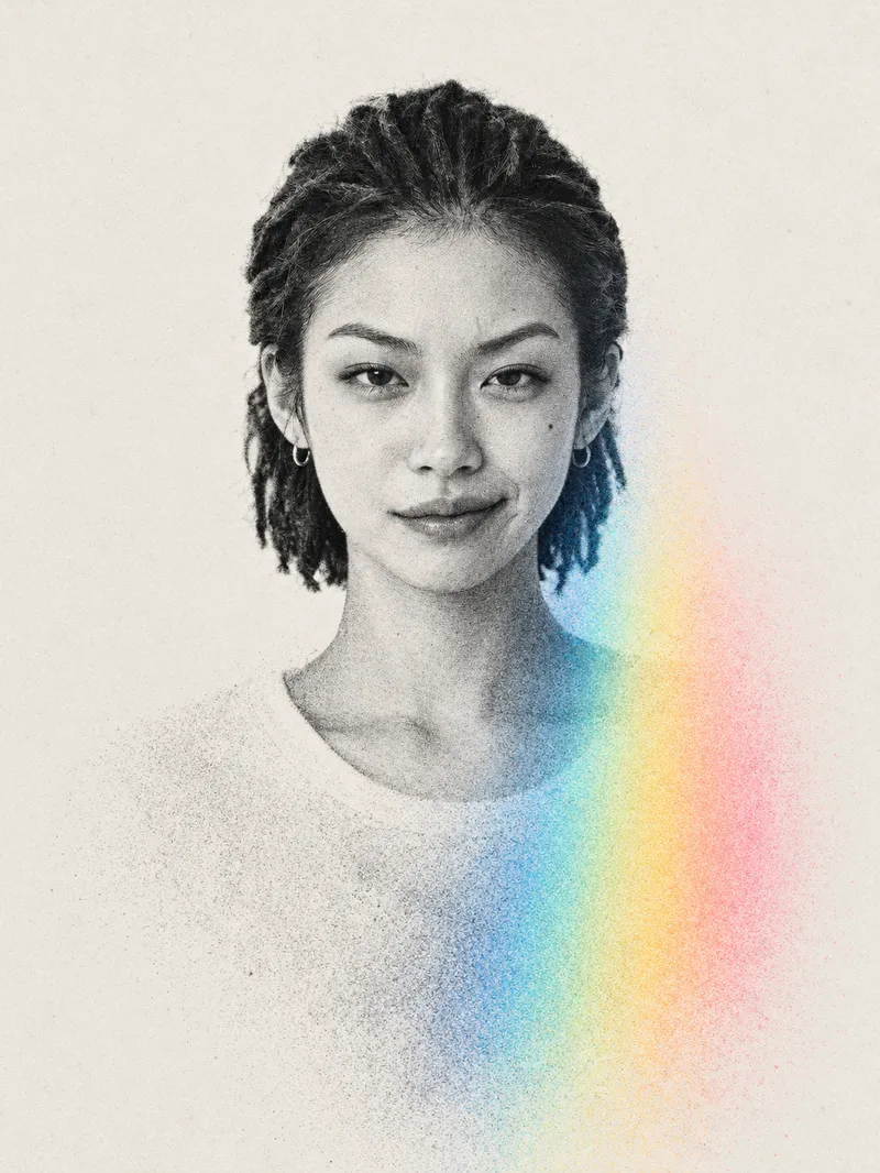
This Skill does not simply apply an ink-wash filter to Chinese characters. It first understands the core meaning of the text in its full context, then determines how the imagery, calligraphy, and layout should work together. Give it a Chinese character, name, place name, idiom, line of poetry, or public-domain classical Chinese poem or prose passage. It first interprets the meaning, then transforms the character’s strokes into mountains, rivers, bridges, figures, architecture, or narrative paths, making the calligraphy itself the framework of the composition. Different meanings automatically call for different brush movements, colors, and compositions, rather than being forced into a fixed template. It supports single-character posters, multi-character series, combined-character compositions, and storyboard sequences based on classical poetry and prose. Names, place names, and idioms can be turned into sequential series with one character per poster, or idioms, poetic lines, and parallel phrases can be combined into a single poster. Classical poetry and prose can be divided into 6–12 consecutive posters according to the original order and emotional arc, with nine posters by default for WeChat Moments, while naturally incorporating the corresponding original text into the imagery. The Skill actively avoids common failures: illegible characters, calligraphy that looks like a computer font, misinterpretations caused by checking characters one by one, forcing the entire image into a character-shaped mask, changing only the text while leaving the narrative unchanged across a series, placing the main text in an awkward standalone white box, and presenting garbled small text as a finished design. It is suited to Chinese posters, urban cultural visuals, name-based gifts, idiom and poetry projects, nine-image WeChat Moments posts, Xiaohongshu graphics, and collectible Eastern editorial design. The final result is influenced by YouMind’s current image model. When long text must be accurate character by character, the Skill prioritizes editable text layers for typesetting; when that is not possible, it clearly labels the result as a conceptual base and provides accurate typesetting specifications.
ImageRelic Art
Transform a real photo into a vertical "relic art" poster that blends documentary value with artistic expression: the upper part keeps the original photograph untouched, while the lower part uses warm paper or restrained light and shadow to compress a memory-derived graphic from the image. It's not a typical illustration or decorative poster; instead, it uses sparse ink blocks, softened edges, white-space cuts, and sparse lines to distill architectural, urban, water, road, human-scale, horizon, and light-shadow relationships, so the subject remains recognizable even in thumbnails. The overall feel is quiet, restrained, and like a modern print. Colors are taken from the source photo, primarily deep blue, ink black, gray-green, stone, or low-saturation warm tones, with a small warm accent added when fitting. The title is kept very small, poetic, and similar to an exhibition label, never overwhelming. This is suitable for minimalist art posters, photographic relic series, architectural and urban image posters, abstract editorial photography, gallery-style photo covers, and visual series for mobile platforms like Douyin. The final output preserves the authentic content of the original photo while adding a consistent "memory imprint" below, giving each photo its own mood and an expandable visual identity.
Han Stone Relief Poster
Ancient stone poster with bold lines & colors
Description
Recommended by
Shuting@YouMind
Why we love this skill
Combines the bold lines of Han stone reliefs with high-contrast classical colors. Through minimalist geometric compositions, it injects a compelling Eastern stone-and-metal aesthetic into modern event posters.
A visual system extracted from Han stone reliefs: geometric silhouette figures × classical background colors × asymmetric editorial layout. Suitable for event posters, live stream previews, podcast covers, and more. You just say the theme, and it carves modern content into the aesthetics of two thousand years.
Related Skills
View all
ImageModern Chinese Era Visuals
Transform titles, themes, or graphics into visual designs inspired by modern Chinese eras, suitable for book covers, posters, cards, illustrations, typography, and social media graphics. Simply provide the text, target era, design format, and aspect ratio to receive a visual concept tailored to your theme. If no ratio is specified, a portrait cover composition can be used. Supports a range of styles from the 1920s–30s Republic of China period and the 1940s through the 2000s, including Eastern Constructivism, War of Resistance woodcut, revolutionary realism, understated literary design, humanistic minimalism, and digital visual styles. Each era-based style presents a distinct design language through its color palette, composition, typography, graphics, and print texture—for example, geometric display lettering, woodcut marks, limited-color flat fills, asymmetrical layouts, paper grain, and balanced negative space. Whether you need a literary book cover, an era-themed poster, or a simple Chinese title design, you can evoke the aesthetics of the corresponding period while keeping the text clear and the composition clean. Supports common aspect ratios including 1:1, 2:3, 3:2, 4:3, 16:9, and 9:16, making it suitable for publishing visuals, exhibition promotion, content graphics, and personal creative work.
ImageOne Character, One World
This Skill does not simply apply an ink-wash filter to Chinese characters. It first understands the core meaning of the text in its full context, then determines how the imagery, calligraphy, and layout should work together. Give it a Chinese character, name, place name, idiom, line of poetry, or public-domain classical Chinese poem or prose passage. It first interprets the meaning, then transforms the character’s strokes into mountains, rivers, bridges, figures, architecture, or narrative paths, making the calligraphy itself the framework of the composition. Different meanings automatically call for different brush movements, colors, and compositions, rather than being forced into a fixed template. It supports single-character posters, multi-character series, combined-character compositions, and storyboard sequences based on classical poetry and prose. Names, place names, and idioms can be turned into sequential series with one character per poster, or idioms, poetic lines, and parallel phrases can be combined into a single poster. Classical poetry and prose can be divided into 6–12 consecutive posters according to the original order and emotional arc, with nine posters by default for WeChat Moments, while naturally incorporating the corresponding original text into the imagery. The Skill actively avoids common failures: illegible characters, calligraphy that looks like a computer font, misinterpretations caused by checking characters one by one, forcing the entire image into a character-shaped mask, changing only the text while leaving the narrative unchanged across a series, placing the main text in an awkward standalone white box, and presenting garbled small text as a finished design. It is suited to Chinese posters, urban cultural visuals, name-based gifts, idiom and poetry projects, nine-image WeChat Moments posts, Xiaohongshu graphics, and collectible Eastern editorial design. The final result is influenced by YouMind’s current image model. When long text must be accurate character by character, the Skill prioritizes editable text layers for typesetting; when that is not possible, it clearly labels the result as a conceptual base and provides accurate typesetting specifications.
ImageRelic Art
Transform a real photo into a vertical "relic art" poster that blends documentary value with artistic expression: the upper part keeps the original photograph untouched, while the lower part uses warm paper or restrained light and shadow to compress a memory-derived graphic from the image. It's not a typical illustration or decorative poster; instead, it uses sparse ink blocks, softened edges, white-space cuts, and sparse lines to distill architectural, urban, water, road, human-scale, horizon, and light-shadow relationships, so the subject remains recognizable even in thumbnails. The overall feel is quiet, restrained, and like a modern print. Colors are taken from the source photo, primarily deep blue, ink black, gray-green, stone, or low-saturation warm tones, with a small warm accent added when fitting. The title is kept very small, poetic, and similar to an exhibition label, never overwhelming. This is suitable for minimalist art posters, photographic relic series, architectural and urban image posters, abstract editorial photography, gallery-style photo covers, and visual series for mobile platforms like Douyin. The final output preserves the authentic content of the original photo while adding a consistent "memory imprint" below, giving each photo its own mood and an expandable visual identity.
Find your next favorite skill
Explore more curated AI skills for research, creation, and everyday work.