xiaoxiaodong P110 Scene Map
By xiaoxiaodong
xiaoxiaodong P110 Scene Map
By xiaoxiaodong
Description
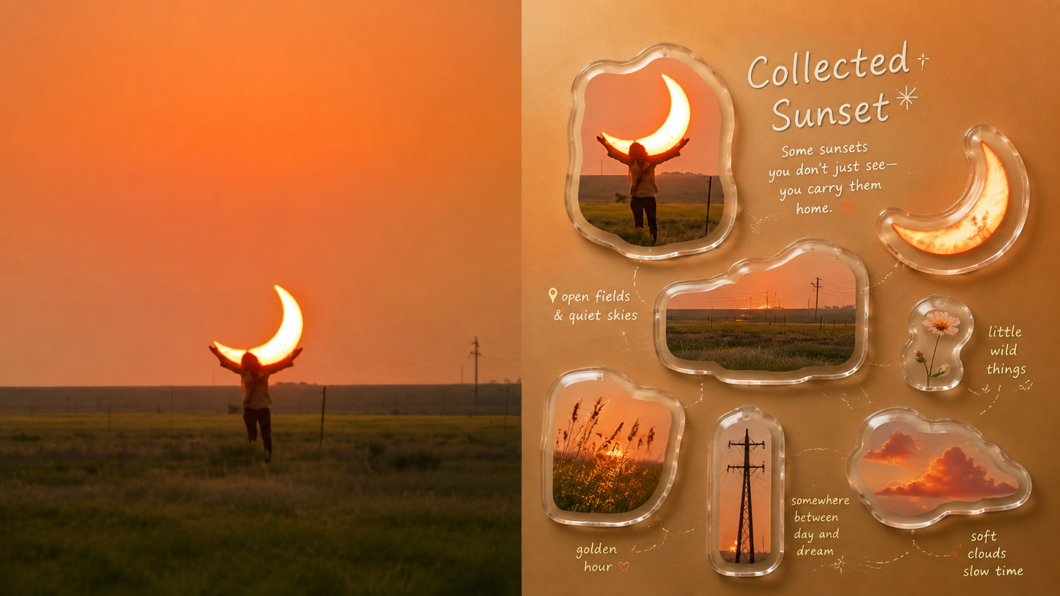
When a lifestyle photo contains many memorable objects, routes, and emotional connections, 110 organizes them into a Japanese-style lifestyle Scene Map: the authentic photo remains at the top, while around 4–7 real objects are selected and rearranged below with an acrylic collectible feel, dynamic routes, and charming annotations. Ideal for Turning travel scenes, coffee moments, rooms, street corners, or everyday objects into lifestyle posters with a collectible feel. A preference for authentic, clear, soft INS tones and acrylic/resin borders—not flat cartoons or plastic 3D. Creating a different diagonal, S-shaped, circular, stepped, or floating route for each image instead of using a fixed four-panel grid. What it helps you solve Selects 4–7 genuinely memorable elements from a complex photo, avoiding evenly spaced layouts and information overload. Uses fine dotted lines, curved arrows, nodes, and labels to create a personal route map rather than a complex flowchart. Keeps every finished image consistent with a two-zone structure: a strict 50:50 split, with no third band added. Quick check: Is Panel 110 right for you? What you get: An authentic photo on top plus 4–7 objects below, arranged into a dynamic Scene Map At a glance: Real objects, acrylic collectible borders, dynamic routes, light labels, and generous negative space How the original image is respected: Object identity, texture, lighting, color, and relationships are preserved; only selection, rearrangement, and subtle color adjustments are made
Recommended by
淡苍
Why we love this skill
Transforms real photos into Japanese lifestyle scene maps with design appeal, supporting top-bottom, side-by-side, design-only, and wallpaper-set formats.
Showcase
1 / 4
Related Skills
View all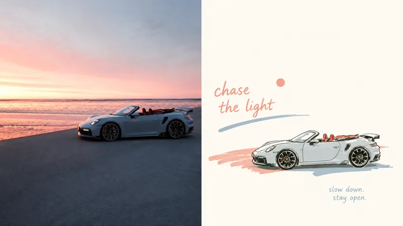 Image
Imagexiaoxiaodong P121 | Doodle
An everyday photo may contain a compelling pose or relationship, yet ordinary composition and a cluttered background can distract from it. Panel 121 preserves the photo’s authentic identity, re-extracts the most recognizable subject, and uses relaxed marker-style doodles, edited handwritten text, and generous negative space to turn a slice of life into a finished work. Best for People, everyday objects, and scenes that need to become independent magazine or lifestyle editorial illustrations. You want to preserve the subject’s outline, pose, and narrative relationships while actively removing most of the background and secondary objects. You like the relaxed feel of naive hand-drawing, while still caring about the mature arrangement of graphics, text, and empty space. You need consistent delivery formats, including top-and-bottom, left-and-right, design-only, multiple aspect ratios, wallpaper, or catalog batches. What it solves Even ordinary photos can establish a new visual focus through reduction, rearrangement, cropping, and changes in scale. Graphics and text first share an invisible grid, visual axes, and a reading path, avoiding “one line of text above, one person below.” Graphic elements occupy only a small proportion of the composition. Negative space provides distance, pauses, and breathing room instead of being filled with random small icons. Comparison images use two strict 50:50 areas and are generated directly from the original image in this run, avoiding a third band and secondary stylization.
 Image
Imagexiaoxiaodong P106: Soft Pixel
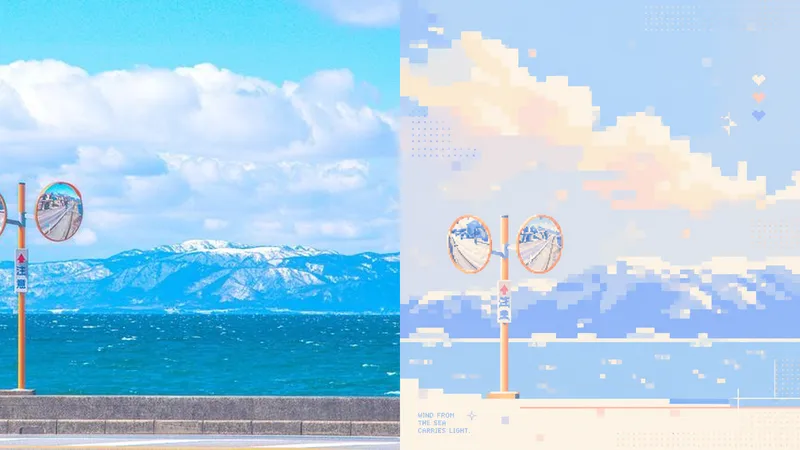
Photos often contain too many details, yet what stays memorable may be just a silhouette, a gesture, a sense of distance, or a patch of color. Panel 106 selects 2–4 visual anchors that define the subject’s identity from the original image, then reconstructs them as a soft, clear pixel memory with geometric order: from a distance, it looks like a refined abstract composition; up close, you can still tell that it is your photo. Works well when Your photo is complex, but you don’t want to lose its identity: Remove secondary objects and trivial structures, keeping only the silhouettes, poses, directions, and color relationships that truly define the image. You want an abstract poster without turning it into unrecognizable decoration: Use a regular grid, hard-edged color blocks, localized dithering, and positive and negative space to let the subject gradually emerge from the abstract order. You like a fresh, soothing look but dislike a cheap candy-like feel: Recompose a soft, bright limited palette from the original image, using colors such as creamy white, peach pink, milky blue, and mint green for a sweet but balanced result. You need flexible delivery in a consistent style: Supports top-and-bottom comparisons, side-by-side comparisons, pure designs, multiple aspect ratios, four-device wallpapers, and batch processing of image folders. What it solves for you It does not simply shrink the photo, apply a filter, or pixelate each object individually. Instead, it reorganizes the visual memory directly from the original image in a single pass. The 2–4 anchors work together to form one single-focus image, rather than being split into cards, grids, or a collage wall. Comparison mode always has exactly two 50:50 areas: top-and-bottom places the original image on top and the design below; side-by-side places the original on the left and the design on the right, with no extra third strip. Get started quickly Use XXD Panel 106 to process this image for me, starting by recommending the most suitable composition and size.
 Image
ImageXiaodong x Paper Collage P077
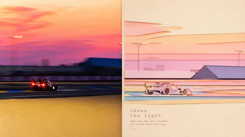
Panel 077 distills the subject, character movement, contour structure, and scene relationships into a paper-cut collage: crisp cut-paper outlines, layered foreground and background shapes, subtle paper grain, cut edges, and soft shadows work together to create a sense of space. The background is deliberately simplified, while pastel colors are remixed from the most vibrant and emotionally resonant parts of the photo. The result feels more like a high-end travel magazine or independent art publication than a collage of cartoon stickers. Great for these situations Want to turn travel photos into paper-art publications: Not by simply shrinking the photo, but by reorganizing the relationship between the subject and the scene. Need a flat design with convincing depth: Cut-paper edges, layered elements, and soft shadows create a tactile feel without heavy plastic-like 3D. Prefer something soft, bright, and refined: Pastel colors are generated from the original image’s vitality and emotional warmth rather than applying a fixed candy-color palette. Need flexible delivery: Supports top-and-bottom, left-and-right, pure design, multiple aspect ratios, and four-edge wallpapers, along with batch processing for image directories.