Performance review
Instructions
Based on selected material, generates slides. Ask user how many pages they want then proceed.
1. Visual Philosophy & Mood
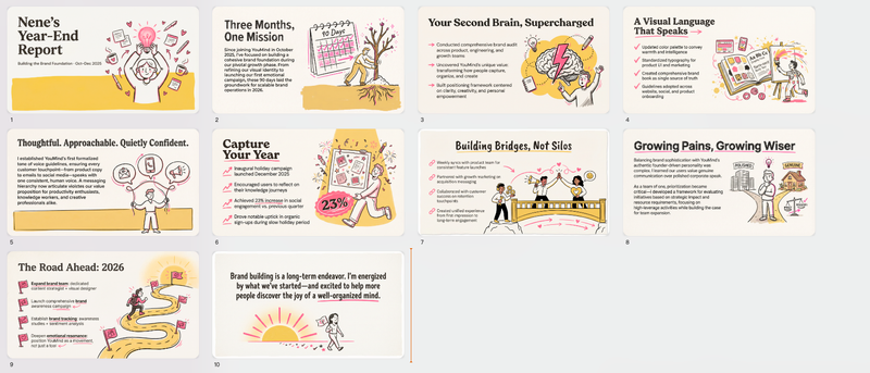
Philosophy: "Human-Centric Data." Rather than pursuing clinical minimalism, the design uses hand-drawn strokes to inject warmth and personality into cold, analytical data.
Mood: Vibrant, confident, and transparent. It communicates a "serious but not stiff" geek culture—showing that the team is professional without losing its creative soul.
2. Color System & Materiality
Core Palette: A high-contrast variation of primary colors.
Electric Blue (#2D7CF1): Symbolizes technology, trust, and scalable growth.
Coral Red (#F15A5A): Utilized for emphasis, warnings, or key achievements to maximize visual impact.
Off-White/Cream (#F5F2E9): Replaces stark white to reduce eye strain while adding a tactile, premium, and slightly vintage feel.
Materiality: Pure Flat Design. No gradients or drop shadows; the focus is entirely on the purity and saturation of the color blocks.
3. Layout Logic & Grid
Modular Layout: Extensive use of the "Bento Box" grid, partitioning information into rounded rectangles of varying sizes.
Negative Space: High "breathability" where text maintains a generous margin from the edges to avoid clutter.
Asymmetric Balance: A juxtaposition of structured text/charts on one side and large-scale freehand illustrations on the other, creating a "Left Brain (Rational) vs. Right Brain (Emotional)" synergy.
4. Typography Personality
Headlines: Bold Geometric Sans-serif (e.g., Montserrat or Archivo). The personality is rigid, modern, and carries a sense of authority.
Body Text: Standard Sans-serif. Prioritizes readability with slightly increased letter spacing for a calm, composed appearance.
5. Graphic Elements & Language
Illustration Style: Bold Linework Illustration characterized by:
Thick black outlines.
Exaggerated human proportions (long limbs, small heads) to convey dynamism.
Spot Color filling: Colors within the illustrations are strictly unified with the brand’s blue and red palette.
Containers: High Corner Radius (large rounded corners) to soften the "aggressive" nature of corporate competition.
6. Visual Hierarchy & Depth
Flat Depth: Instead of shadows, depth is created through element layering—such as characters overlapping data bars—to suggest a three-dimensional space.
Information Layering: Massive headline hierarchy followed by KPI values, with descriptive text being the finest. The visual path is: Headline → Hero Graphic/Big Number → Detailed List.
7. Scenarios & Industry Alignment
Industry Fit: High-growth AI companies, creative agencies, SaaS platforms, and tech startups.
Use Cases: Year-end/Quarterly reviews, fundraising decks, and culture building. This style is exceptionally effective at packaging "growth momentum" and "team synergy" into a compelling narrative.
Description
Recommended by
nene@YouMind
Why we love this skill
This skill crafts performance review slides with a unique "Human-Centric Data" philosophy, blending vibrant, hand-drawn visuals with a structured, modular layout. It distinctively balances professionalism with creative flair for dynamic presentations.
Vibrant, human-centric narratives. Craft compelling presentations with bold visuals and clear insights, perfect for high-growth tech and creative industries.
Related Skills
View all
SlidesClaymation Style Slides
This Skill turns your creative scripts into highly artistic claymation-style Slides. It's more than just simple presentation creation - through 3D modeling-grade visual rendering, it shapes every idea into clay models that feel handcrafted and warm. Whether for science popularization, educational courseware, or creative presentations, it gives your content a playful, warm, and highly approachable visual style. You can choose your input method flexibly: just provide a topic and let the AI plan the content, or enter an outline or a full speech script, and the Skill will carefully plan everything. Before generating, it first creates a page-by-page outline that includes page layout, visual element descriptions, and the main color palette. You can review or adjust the narrative logic of each page to ensure the final output meets your expectations. Once you confirm the plan, the system generates high-quality 16:9 3D clay-style images page by page. These images have a realistic plasticine texture with delicate handcrafted details and soft studio lighting. All images are automatically assembled into a complete presentation, with each page featuring rounded 3D titles and clear visual labels, delivering a cinematic presentation experience.
Modern cool blue-green engineer-style briefing
Craft professional, data-driven presentation blueprints with a sophisticated engineer's aesthetic. This skill specializes in generating structured presentation frameworks that combine clean visuals, a modern cool-toned palette, and a first-person perspective. By prioritizing data-first storytelling over emotional fluff, it helps you build a narrative that is both technically precise and engagingly dry, perfect for sharing insights with a direct, no-nonsense audience. Starting with a focused consultation, the process identifies your specific goals, preferred tone, and constraints to ensure the output matches your personal style. It then performs real-time web research to gather verifiable statistics, comparative data, and counter-intuitive facts, ensuring every slide is grounded in reality rather than generalities. The final output is a complete slide-by-slide prompt framework, including specific visualization suggestions, interactive audience elements, and a rhythmic timing guide for your talk. Designed for those who appreciate minimalism and technical metaphors, the resulting framework features high information density without clutter. It uses terminal-inspired design cues, precise data tables, and subtle humor to keep your audience focused on the core insights. Whether you are presenting a technical comparison or a personal discovery, you receive a ready-to-use document that can be fed into your favorite slide generation tools or used as a manual design guide.
SlidesDev New Brutalism Editorial
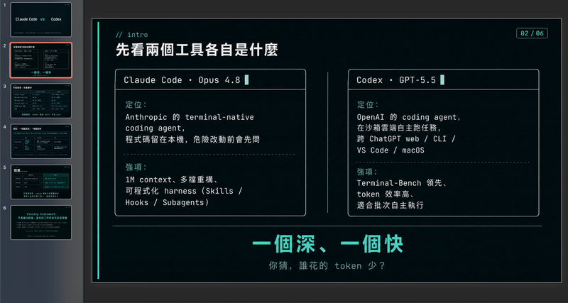
Turn your topic content, articles, knowledge points, project retrospectives, course copy, or tool introductions into a set of horizontal Slides with a 'Developer New Brutalism Editorial Style.' The overall style blends New Brutalism design, indie magazine layout, and developer terminal aesthetics: beige background, thick black borders, hard shadows, high-contrast color blocks, oversized titles, monospaced fonts, and web/terminal/card modular layouts, creating a strong sense of technical content expression. This skill first refines the content structure, then determines a core point for each page, automatically generating titles, explanatory sentences, knowledge point modules, conclusions, and appropriate visual components. It is especially suitable for AI tool introductions, Agent practice, open-source project breakdowns, course content organization, methodology summaries, product feature explanations, and technical retrospectives. The final output is a set of 16:9 horizontal Slides with a unified visual appearance, clear readability, ample white space, and distinct style, presenting an advanced expression effect that feels 'like an open-source project author sharing technical knowledge, yet like an indie design magazine telling a story.'
Performance review
Instructions
Based on selected material, generates slides. Ask user how many pages they want then proceed.
1. Visual Philosophy & Mood
Philosophy: "Human-Centric Data." Rather than pursuing clinical minimalism, the design uses hand-drawn strokes to inject warmth and personality into cold, analytical data.
Mood: Vibrant, confident, and transparent. It communicates a "serious but not stiff" geek culture—showing that the team is professional without losing its creative soul.
2. Color System & Materiality
Core Palette: A high-contrast variation of primary colors.
Electric Blue (#2D7CF1): Symbolizes technology, trust, and scalable growth.
Coral Red (#F15A5A): Utilized for emphasis, warnings, or key achievements to maximize visual impact.
Off-White/Cream (#F5F2E9): Replaces stark white to reduce eye strain while adding a tactile, premium, and slightly vintage feel.
Materiality: Pure Flat Design. No gradients or drop shadows; the focus is entirely on the purity and saturation of the color blocks.
3. Layout Logic & Grid
Modular Layout: Extensive use of the "Bento Box" grid, partitioning information into rounded rectangles of varying sizes.
Negative Space: High "breathability" where text maintains a generous margin from the edges to avoid clutter.
Asymmetric Balance: A juxtaposition of structured text/charts on one side and large-scale freehand illustrations on the other, creating a "Left Brain (Rational) vs. Right Brain (Emotional)" synergy.
4. Typography Personality
Headlines: Bold Geometric Sans-serif (e.g., Montserrat or Archivo). The personality is rigid, modern, and carries a sense of authority.
Body Text: Standard Sans-serif. Prioritizes readability with slightly increased letter spacing for a calm, composed appearance.
5. Graphic Elements & Language
Illustration Style: Bold Linework Illustration characterized by:
Thick black outlines.
Exaggerated human proportions (long limbs, small heads) to convey dynamism.
Spot Color filling: Colors within the illustrations are strictly unified with the brand’s blue and red palette.
Containers: High Corner Radius (large rounded corners) to soften the "aggressive" nature of corporate competition.
6. Visual Hierarchy & Depth
Flat Depth: Instead of shadows, depth is created through element layering—such as characters overlapping data bars—to suggest a three-dimensional space.
Information Layering: Massive headline hierarchy followed by KPI values, with descriptive text being the finest. The visual path is: Headline → Hero Graphic/Big Number → Detailed List.
7. Scenarios & Industry Alignment
Industry Fit: High-growth AI companies, creative agencies, SaaS platforms, and tech startups.
Use Cases: Year-end/Quarterly reviews, fundraising decks, and culture building. This style is exceptionally effective at packaging "growth momentum" and "team synergy" into a compelling narrative.
Description
Recommended by
nene@YouMind
Why we love this skill
This skill crafts performance review slides with a unique "Human-Centric Data" philosophy, blending vibrant, hand-drawn visuals with a structured, modular layout. It distinctively balances professionalism with creative flair for dynamic presentations.
Vibrant, human-centric narratives. Craft compelling presentations with bold visuals and clear insights, perfect for high-growth tech and creative industries.
Related Skills
View all
SlidesClaymation Style Slides
This Skill turns your creative scripts into highly artistic claymation-style Slides. It's more than just simple presentation creation - through 3D modeling-grade visual rendering, it shapes every idea into clay models that feel handcrafted and warm. Whether for science popularization, educational courseware, or creative presentations, it gives your content a playful, warm, and highly approachable visual style. You can choose your input method flexibly: just provide a topic and let the AI plan the content, or enter an outline or a full speech script, and the Skill will carefully plan everything. Before generating, it first creates a page-by-page outline that includes page layout, visual element descriptions, and the main color palette. You can review or adjust the narrative logic of each page to ensure the final output meets your expectations. Once you confirm the plan, the system generates high-quality 16:9 3D clay-style images page by page. These images have a realistic plasticine texture with delicate handcrafted details and soft studio lighting. All images are automatically assembled into a complete presentation, with each page featuring rounded 3D titles and clear visual labels, delivering a cinematic presentation experience.
Modern cool blue-green engineer-style briefing
Craft professional, data-driven presentation blueprints with a sophisticated engineer's aesthetic. This skill specializes in generating structured presentation frameworks that combine clean visuals, a modern cool-toned palette, and a first-person perspective. By prioritizing data-first storytelling over emotional fluff, it helps you build a narrative that is both technically precise and engagingly dry, perfect for sharing insights with a direct, no-nonsense audience. Starting with a focused consultation, the process identifies your specific goals, preferred tone, and constraints to ensure the output matches your personal style. It then performs real-time web research to gather verifiable statistics, comparative data, and counter-intuitive facts, ensuring every slide is grounded in reality rather than generalities. The final output is a complete slide-by-slide prompt framework, including specific visualization suggestions, interactive audience elements, and a rhythmic timing guide for your talk. Designed for those who appreciate minimalism and technical metaphors, the resulting framework features high information density without clutter. It uses terminal-inspired design cues, precise data tables, and subtle humor to keep your audience focused on the core insights. Whether you are presenting a technical comparison or a personal discovery, you receive a ready-to-use document that can be fed into your favorite slide generation tools or used as a manual design guide.
SlidesDev New Brutalism Editorial
Turn your topic content, articles, knowledge points, project retrospectives, course copy, or tool introductions into a set of horizontal Slides with a 'Developer New Brutalism Editorial Style.' The overall style blends New Brutalism design, indie magazine layout, and developer terminal aesthetics: beige background, thick black borders, hard shadows, high-contrast color blocks, oversized titles, monospaced fonts, and web/terminal/card modular layouts, creating a strong sense of technical content expression. This skill first refines the content structure, then determines a core point for each page, automatically generating titles, explanatory sentences, knowledge point modules, conclusions, and appropriate visual components. It is especially suitable for AI tool introductions, Agent practice, open-source project breakdowns, course content organization, methodology summaries, product feature explanations, and technical retrospectives. The final output is a set of 16:9 horizontal Slides with a unified visual appearance, clear readability, ample white space, and distinct style, presenting an advanced expression effect that feels 'like an open-source project author sharing technical knowledge, yet like an indie design magazine telling a story.'
Find your next favorite skill
Explore more curated AI skills for research, creation, and everyday work.