Tech product launch
Featured by
nene@YouMind.AI
Why we love this skill
Craft stunning, high-stakes tech product launch presentations with an unparalleled Cyber-Lux Minimalism aesthetic. This skill generates slides with sophisticated design, featuring monolithic black, amber glow accents, and 3D iridescent elements. Perfect for deep tech, AI, or Web3 pitches where visual impact and avant-garde style are paramount.
Instructions
Based on selected material, generates slides. Ask user how many pages they want then proceed.
### 1. Visual Philosophy & Mood
- **Design School**: **Cyber-Lux Minimalism**. Unlike generic "tech" aesthetics, it bridges the restraint of high-end luxury with the raw tension of futurism.
- **Atmosphere & Tone**: **Sophisticated** (deep and wise), **Premium** (high perceived value), and **Avant-Garde** (pioneering).
- **Core Keyword**: **Negative Space**. The "premiumness" of this style is defined not by what is added, but by the courage to place a single visual anchor within a vast monolithic black void.
### 2. Color System & Materiality
- **Primary Tone (Monolithic Black)**: True **#000000 (Pitch Black)** rather than dark gray. It represents cosmic depth and absolute commercial authority.
- **Accent Color (Amber Glow)**: **Amber Yellow (#FFB800)**. This is treated as a "lighting effect" rather than just a pigment—simulating a high-intensity spotlight in the dark with extreme piercing power.
- **Texture Layer (Iridescent Chromaticism)**: 3D elements feature a **Holographic/Iridescent** finish. It mimics the fusion of "liquid metal" and "stained glass," where light diffracts across the surface to reveal fluid gradients of cyan, violet, and pale pink.
- **Lighting Logic**: **Internal Glow**. All decorative elements appear self-illuminated from within, rather than being lit by external light sources.
### 3. Layout Logic & Grid
- **Grid System**: **Modern Swiss Grid**. Employs rigid alignment logic but breaks monotony through deliberate asymmetric arrangements.
- **Visual Tension (Scale Contrast)**: Extreme contrast between massive typography (e.g., giant numerals or hero words) and tiny metadata, creating a sense of **Visual Gigantism**.
- **Weight Offset**: **Asymmetric Balance**. Headers are typically anchored to the top-left or bottom-left, while 3D hero assets occupy the right 2/3 of the canvas, creating a dynamic "breathing" rhythm.
- **Information Density**: **Ultra-Low Density**. One core insight per slide; zero textual clutter.
### 4. Typography Personality
- **Typeface Selection**: **Geometric Sans-Serif**.
- *Recommended*: Montserrat, Poppins, or the high-precision **Inter**.
- **Stroke Weight Strategy**:
- *Headlines*: **Extra Bold / Black (900)** for volume and structural power.
- *Body*: **Light / Thin (200-300)** for elegance and transparency.
- **Typographic Detailing**:
- **Wide Kerning**: Increasing character spacing (tracking +5% to +10%) for all-caps headers to instantly elevate the brand's international prestige.
- **All-Caps**: Used for strategic keywords to project a sense of command and finality.
### 5. Graphic Elements & Language
- **3D Asset Typology**: **Abstract Fluid Prisms**. Features flowing silk-like ribbons, translucent spheres, and warped Mobius loops.
- **Stroke Attributes**: **Hairline Strokes**. Scattering ultra-fine lines or coordinate points around 3D assets to evoke a "precision engineering" or "industrial design" atmosphere.
- **Edge Treatment**: **Super-Ellipse (Squircle)**. Rounded corners for all containers are not simple radii but smooth-transitioning iOS-style super-ellipses to maintain organic softness amidst the dark tech theme.
### 6. Visual Hierarchy & Depth
- **Z-Axis Layering**: Utilizing **Glassmorphism** and background blur (frosted glass effect). 3D elements appear to float above the background, with depth created via soft drop shadows and ambient glows.
- **Guiding Path**: Amber lines or icons act as visual **anchors**, guiding the eye from the primary header (top-left) to the core conclusion (bottom-right).
### 7. Scenarios & Industry Alignment
- **Scenario Definition**: **High-Stakes Pitching** (Multi-million dollar fundraising or strategic keynotes).
- **Industry Fit**: **Deep Tech**, **Artificial Intelligence (AI)**, **Luxury Consulting**, and **Web3/Crypto-Economy**.
Description
Cyber-lux design, great for tech pitch deck and product launch with avant-garde visuals, deep black, and amber glow, commanding attention and securing funding like never before.
Related Skills
View all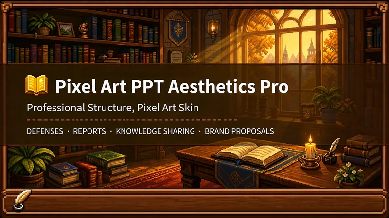 Slides
Pixel Game Style PPT Aesthetics Designer Pro
Who says professional PPTs have to be white backgrounds with black text, blue-gray color schemes, and monotonous templates? If you love games, adore pixel art, and happen to need to prepare a presentation, report, knowledge sharing session, or brand proposal—then you absolutely must try this. Pixel Game Style PPT Aesthetics Designer Pro does something simple: the skeleton remains true to professional standards, while the skin remains true to pixel art. It doesn't create a "pixel-style creative PPT," but rather a professional PPT that's presentable in any professional setting—it's just dressed in the aesthetics of 16-bit pixel games. Core design philosophy: separation of skeleton and skin. Information architecture, visual flow, and page templates adhere to professional standards for the scene; colors, borders, icons, and decorations adhere to universal pixel game aesthetics. Text is never pixelated, ensuring readability in 0.8 seconds; pixel elements only appear in backgrounds, borders, icons, and ambient decorations. It doesn't use any game-specific symbols, only cross-game universal symbols—candles, books, coins, stars, hearts, crystals—making it usable by everyone who loves pixel art. 🎮 How to use it? Two modes, choose according to your needs: ① Direct Generation Mode (2 steps): Input topic/materials → AI-extracted framework confirmation → Full image generation. Suitable for everyday scenarios where time is tight and text content requirements are not high. ② Fine-grained Mode (3 steps, saves points): Input topic/materials → AI-extracted framework confirmation → Page-by-page text confirmation → Full image generation. Finalize each page of text first, then generate images all at once—avoiding the waste of points by "finishing the text after the image is generated and having to start over." Use this for important occasions, as it allows for precise content control and saves money. 🏰 Four professional scenarios with adaptive penetration depth: Academic Defense—Primarily shallow penetration, with medium penetration on the cover, and deep penetration of anchor points on the data pages. Judges can understand it at a glance, and they will be impressed when they turn to the key pages. Work Report—Shallow penetration + medium penetration on indicator pages, and risk pages are not pixelated. The boss sees professionalism, and colleagues remember the style. Knowledge Sharing—Primarily medium penetration + deep penetration of synthetic formulas. Replace dry flowcharts with "synthetic recipes," making knowledge points as memorable as game items. Brand Proposal—Adapts to your brand's emotional tone. Cool-toned brands use restrained pixelation, warm-toned brands embrace specific scenarios. 🎨 What will you get? ① A complete pixel-style professional PPT (YouMind Slides format, which allows for further text editing, layout adjustments, and page order management in the online editor—modify anytime if you're not satisfied. It's recommended to complete all editing within YouMind and export as an image). ② A pixelated wooden three-layer border system (#5C3A1E outer ring + #8B5E3C inner ring + #F5E6D3 fill, providing a unified visual language throughout). ③ A unique crafting recipe infographic (material grid → crafting circle → finished product grid, replacing traditional flowcharts, providing visual anchors instantly recognizable to RPG players). ④ A four-scene adaptive pacing (not cramming every page with pixels, but using varying degrees of intensity). ⑤ A dual-mode design (generate directly for daily use, refine for important occasions, finalize the draft before outputting the image to save points). 399 points to give your professional content a 16-bit armor. Those who love pixel art know how much this armor is worth.
 Slides
White space | Minimalist and ultra-clean research report PPT
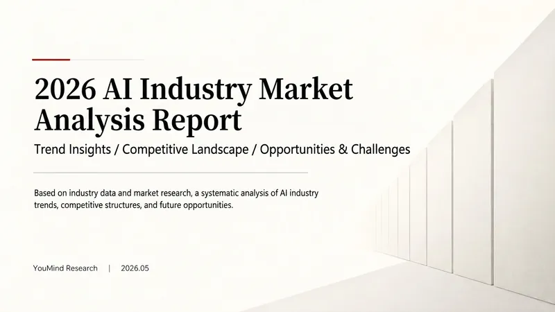
"White Space" is a skill specifically designed to generate minimalist research report-style slides. Upload Word documents, PDFs, web pages, data tables, research materials, or old PPTs, and it will convert them into an editable PPT with a cool white background, black and gray text, large areas of white space, thin lines separating elements, and a few touches of deep red. It automatically performs the following: • Reading and organizing the original materials • Extracting the core conclusions of the report • Establishing a complete presentation storyline • Generating conclusion-style titles with one point per page • Redrawing original editable data charts • Unifying fonts, colors, margins, and page grids • Controlling text and chart density on each page • Adding page numbers, dates, and data sources • Outputting actual editable slides. It defaults to a 16:9 aspect ratio, and its visual features include: • Cool white background • Black and gray text • Single deep red accent color • All left alignment • Large areas of white space • Minimalist architectural geometry • Maximum of two fonts per page • Editable charts and shapes. Suitable for industry research, market analysis, business reports, strategic proposals, course reports, graduation defenses, and management presentations. Simply upload your materials and describe your presentation scenario to generate a clean, professional, and easily editable minimalist PowerPoint presentation.
 Slides
Hand-drawn electronic whiteboard slides
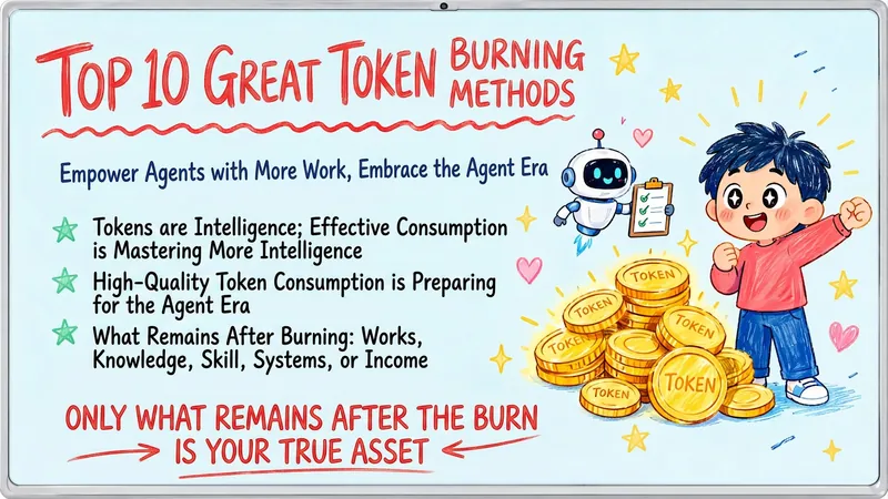
Transform your content, articles, knowledge points, or course materials into a set of creative and engaging "hand-drawn electronic whiteboard style" slides. Whether you need to present core viewpoints, teaching content, or share personal insights, we can extract them and present them in a fresh and vibrant visual format. This skill excels at simplifying complex information; each slide revolves around a core theme, accompanied by vivid hand-drawn illustrations and concise, clear knowledge points. We simulate the feel of a teacher's handwriting on an electronic whiteboard, using a light blue screen background, red and blue handwritten titles, and embellished with hand-drawn elements such as stars and hearts, making learning and sharing more relaxed and fun. Whether it's interpreting famous quotes, providing methodological steps, popularizing scientific knowledge, parenting education, or topics like inspirational growth and AI technology, this skill can automatically match the most suitable visual expression. The final slides will be presented in a 16:9 landscape style, with natural handwritten fonts, soft colors, and a unified overall style, making your content both professional and approachable, like a series of warm and interesting knowledge cards.
Tech product launch
Featured by
nene@YouMind.AI
Why we love this skill
Craft stunning, high-stakes tech product launch presentations with an unparalleled Cyber-Lux Minimalism aesthetic. This skill generates slides with sophisticated design, featuring monolithic black, amber glow accents, and 3D iridescent elements. Perfect for deep tech, AI, or Web3 pitches where visual impact and avant-garde style are paramount.
Instructions
Based on selected material, generates slides. Ask user how many pages they want then proceed.
### 1. Visual Philosophy & Mood
- **Design School**: **Cyber-Lux Minimalism**. Unlike generic "tech" aesthetics, it bridges the restraint of high-end luxury with the raw tension of futurism.
- **Atmosphere & Tone**: **Sophisticated** (deep and wise), **Premium** (high perceived value), and **Avant-Garde** (pioneering).
- **Core Keyword**: **Negative Space**. The "premiumness" of this style is defined not by what is added, but by the courage to place a single visual anchor within a vast monolithic black void.
### 2. Color System & Materiality
- **Primary Tone (Monolithic Black)**: True **#000000 (Pitch Black)** rather than dark gray. It represents cosmic depth and absolute commercial authority.
- **Accent Color (Amber Glow)**: **Amber Yellow (#FFB800)**. This is treated as a "lighting effect" rather than just a pigment—simulating a high-intensity spotlight in the dark with extreme piercing power.
- **Texture Layer (Iridescent Chromaticism)**: 3D elements feature a **Holographic/Iridescent** finish. It mimics the fusion of "liquid metal" and "stained glass," where light diffracts across the surface to reveal fluid gradients of cyan, violet, and pale pink.
- **Lighting Logic**: **Internal Glow**. All decorative elements appear self-illuminated from within, rather than being lit by external light sources.
### 3. Layout Logic & Grid
- **Grid System**: **Modern Swiss Grid**. Employs rigid alignment logic but breaks monotony through deliberate asymmetric arrangements.
- **Visual Tension (Scale Contrast)**: Extreme contrast between massive typography (e.g., giant numerals or hero words) and tiny metadata, creating a sense of **Visual Gigantism**.
- **Weight Offset**: **Asymmetric Balance**. Headers are typically anchored to the top-left or bottom-left, while 3D hero assets occupy the right 2/3 of the canvas, creating a dynamic "breathing" rhythm.
- **Information Density**: **Ultra-Low Density**. One core insight per slide; zero textual clutter.
### 4. Typography Personality
- **Typeface Selection**: **Geometric Sans-Serif**.
- *Recommended*: Montserrat, Poppins, or the high-precision **Inter**.
- **Stroke Weight Strategy**:
- *Headlines*: **Extra Bold / Black (900)** for volume and structural power.
- *Body*: **Light / Thin (200-300)** for elegance and transparency.
- **Typographic Detailing**:
- **Wide Kerning**: Increasing character spacing (tracking +5% to +10%) for all-caps headers to instantly elevate the brand's international prestige.
- **All-Caps**: Used for strategic keywords to project a sense of command and finality.
### 5. Graphic Elements & Language
- **3D Asset Typology**: **Abstract Fluid Prisms**. Features flowing silk-like ribbons, translucent spheres, and warped Mobius loops.
- **Stroke Attributes**: **Hairline Strokes**. Scattering ultra-fine lines or coordinate points around 3D assets to evoke a "precision engineering" or "industrial design" atmosphere.
- **Edge Treatment**: **Super-Ellipse (Squircle)**. Rounded corners for all containers are not simple radii but smooth-transitioning iOS-style super-ellipses to maintain organic softness amidst the dark tech theme.
### 6. Visual Hierarchy & Depth
- **Z-Axis Layering**: Utilizing **Glassmorphism** and background blur (frosted glass effect). 3D elements appear to float above the background, with depth created via soft drop shadows and ambient glows.
- **Guiding Path**: Amber lines or icons act as visual **anchors**, guiding the eye from the primary header (top-left) to the core conclusion (bottom-right).
### 7. Scenarios & Industry Alignment
- **Scenario Definition**: **High-Stakes Pitching** (Multi-million dollar fundraising or strategic keynotes).
- **Industry Fit**: **Deep Tech**, **Artificial Intelligence (AI)**, **Luxury Consulting**, and **Web3/Crypto-Economy**.
Description
Cyber-lux design, great for tech pitch deck and product launch with avant-garde visuals, deep black, and amber glow, commanding attention and securing funding like never before.
Related Skills
View allSlidesPixel Game Style PPT Aesthetics Designer Pro
Who says professional PPTs have to be white backgrounds with black text, blue-gray color schemes, and monotonous templates? If you love games, adore pixel art, and happen to need to prepare a presentation, report, knowledge sharing session, or brand proposal—then you absolutely must try this. Pixel Game Style PPT Aesthetics Designer Pro does something simple: the skeleton remains true to professional standards, while the skin remains true to pixel art. It doesn't create a "pixel-style creative PPT," but rather a professional PPT that's presentable in any professional setting—it's just dressed in the aesthetics of 16-bit pixel games. Core design philosophy: separation of skeleton and skin. Information architecture, visual flow, and page templates adhere to professional standards for the scene; colors, borders, icons, and decorations adhere to universal pixel game aesthetics. Text is never pixelated, ensuring readability in 0.8 seconds; pixel elements only appear in backgrounds, borders, icons, and ambient decorations. It doesn't use any game-specific symbols, only cross-game universal symbols—candles, books, coins, stars, hearts, crystals—making it usable by everyone who loves pixel art. 🎮 How to use it? Two modes, choose according to your needs: ① Direct Generation Mode (2 steps): Input topic/materials → AI-extracted framework confirmation → Full image generation. Suitable for everyday scenarios where time is tight and text content requirements are not high. ② Fine-grained Mode (3 steps, saves points): Input topic/materials → AI-extracted framework confirmation → Page-by-page text confirmation → Full image generation. Finalize each page of text first, then generate images all at once—avoiding the waste of points by "finishing the text after the image is generated and having to start over." Use this for important occasions, as it allows for precise content control and saves money. 🏰 Four professional scenarios with adaptive penetration depth: Academic Defense—Primarily shallow penetration, with medium penetration on the cover, and deep penetration of anchor points on the data pages. Judges can understand it at a glance, and they will be impressed when they turn to the key pages. Work Report—Shallow penetration + medium penetration on indicator pages, and risk pages are not pixelated. The boss sees professionalism, and colleagues remember the style. Knowledge Sharing—Primarily medium penetration + deep penetration of synthetic formulas. Replace dry flowcharts with "synthetic recipes," making knowledge points as memorable as game items. Brand Proposal—Adapts to your brand's emotional tone. Cool-toned brands use restrained pixelation, warm-toned brands embrace specific scenarios. 🎨 What will you get? ① A complete pixel-style professional PPT (YouMind Slides format, which allows for further text editing, layout adjustments, and page order management in the online editor—modify anytime if you're not satisfied. It's recommended to complete all editing within YouMind and export as an image). ② A pixelated wooden three-layer border system (#5C3A1E outer ring + #8B5E3C inner ring + #F5E6D3 fill, providing a unified visual language throughout). ③ A unique crafting recipe infographic (material grid → crafting circle → finished product grid, replacing traditional flowcharts, providing visual anchors instantly recognizable to RPG players). ④ A four-scene adaptive pacing (not cramming every page with pixels, but using varying degrees of intensity). ⑤ A dual-mode design (generate directly for daily use, refine for important occasions, finalize the draft before outputting the image to save points). 399 points to give your professional content a 16-bit armor. Those who love pixel art know how much this armor is worth.
SlidesWhite space | Minimalist and ultra-clean research report PPT
"White Space" is a skill specifically designed to generate minimalist research report-style slides. Upload Word documents, PDFs, web pages, data tables, research materials, or old PPTs, and it will convert them into an editable PPT with a cool white background, black and gray text, large areas of white space, thin lines separating elements, and a few touches of deep red. It automatically performs the following: • Reading and organizing the original materials • Extracting the core conclusions of the report • Establishing a complete presentation storyline • Generating conclusion-style titles with one point per page • Redrawing original editable data charts • Unifying fonts, colors, margins, and page grids • Controlling text and chart density on each page • Adding page numbers, dates, and data sources • Outputting actual editable slides. It defaults to a 16:9 aspect ratio, and its visual features include: • Cool white background • Black and gray text • Single deep red accent color • All left alignment • Large areas of white space • Minimalist architectural geometry • Maximum of two fonts per page • Editable charts and shapes. Suitable for industry research, market analysis, business reports, strategic proposals, course reports, graduation defenses, and management presentations. Simply upload your materials and describe your presentation scenario to generate a clean, professional, and easily editable minimalist PowerPoint presentation.
SlidesHand-drawn electronic whiteboard slides
Transform your content, articles, knowledge points, or course materials into a set of creative and engaging "hand-drawn electronic whiteboard style" slides. Whether you need to present core viewpoints, teaching content, or share personal insights, we can extract them and present them in a fresh and vibrant visual format. This skill excels at simplifying complex information; each slide revolves around a core theme, accompanied by vivid hand-drawn illustrations and concise, clear knowledge points. We simulate the feel of a teacher's handwriting on an electronic whiteboard, using a light blue screen background, red and blue handwritten titles, and embellished with hand-drawn elements such as stars and hearts, making learning and sharing more relaxed and fun. Whether it's interpreting famous quotes, providing methodological steps, popularizing scientific knowledge, parenting education, or topics like inspirational growth and AI technology, this skill can automatically match the most suitable visual expression. The final slides will be presented in a 16:9 landscape style, with natural handwritten fonts, soft colors, and a unified overall style, making your content both professional and approachable, like a series of warm and interesting knowledge cards.
Find your next favorite skill
Explore more curated AI skills for research, creation, and everyday work.