힐링 목판화 스타일 포스터

일상적인 이미지를 목판화 포스터로 재해석하는 힐링 아트 프롬프트입니다. 불완전한 수작업 질감과 종이 위의 부드럽고 제한된 색감을 강조합니다.
프롬프트
업로드하는 각 사진에 대해 독립적인 하이엔드 디자인 포스터를 제작해 주세요. 여러 사진을 합치지 말고, 각 사진을 개별적으로 출력해야 합니다. 전체 구성은 3:4 세로 레이아웃을 사용하며, 상단과 하단 영역은 1:1 높이 비율로 엄격하게 프레임의 50%씩을 차지합니다. 상단 부분은 원본 사진을 유지하여 피사체의 정체성, 구조, 자세, 공간 관계, 실제 질감, 자연스러운 명암 및 원본의 색감을 보존하되, 독립 잡지나 예술 간행물, 전시 사진과 같은 질감을 느낄 수 있도록 약간의 고급스러운 색 보정만 가미합니다. 프레임에 맞추기 위해 하늘, 지면 또는 배경을 자연스럽게 확장할 수는 있지만, 피사체를 늘리거나 왜곡, 대칭, 변형해서는 안 됩니다. 하단 부분은 사진에서 가장 식별하기 쉬운 피사체, 윤곽, 자세, 서사적 관계를 추출하여 종이 위에 떠 있는 제한된 색상의 목판화로 재구성합니다. 사진 전체를 그대로 복사하거나 단순히 필터를 적용하지 말고, 복잡한 배경과 사소한 세부 사항을 과감히 덜어내어 식별성을 결정짓는 윤곽, 비율, 방향, 명암 영역, 핵심 구조 및 공간 관계만 남겨야 합니다. 목판화, 리놀륨 판화, 수제 도장 인쇄의 언어를 사용하여 피사체를 재요약함으로써, 즉각적으로 알아볼 수 있으면서도 소박하고 투박하며 강렬한 수작업 예술적 기질을 갖추도록 하세요. 그래픽 획은 목판화 특유의 투박함과 수작업의 흔적을 담아야 합니다. 선은 매끄럽거나 정밀할 필요가 없으며, 칼로 새긴 듯한 약간의 망설임, 불균일한 두께, 흐릿한 가장자리, 딱딱한 전환, 부분적인 파손, 틈, 어긋남, 불규칙한 여백을 허용합니다. 색면의 가장자리는 드라이 브러싱, 인쇄 누락, 잉크 부족, 거친 입자 질감을 보여줄 수 있습니다. 전체적인 스타일은 세련된 벡터 일러스트레이션이 아니라, 마치 손조각칼과 잉크로 한 획 한 획 새긴 듯한 느낌으로, 단순하고 직접적이며 약간은 서툴지만 매우 견고한 판화의 질감을 전달해야 합니다. 구성은 단일 시각적 앵커 포인트, 넓은 여백, 불완전한 가장자리에 중점을 둡니다. 위치와 크기는 피사체 자체의 시각적 무게 중심, 동작 방향, 구조적 흐름에 따라 결정되며, 중앙 배치, 오프셋, 약간의 크롭 또는 특정 방향으로의 확장이 가능합니다. 피사체 주변에는 따뜻한 종이 느낌의 여백을 충분히 남기고, 가장자리는 잉크의 틈, 파손된 질감, 종이의 투명도, 자연스러운 마모를 통해 점진적으로 사라지게 하여 완전한 사각형 테두리를 피함으로써 이미지가 종이 위에 부드럽게 눌린 기억처럼 느껴지게 합니다. 색상 체계는 상단 사진에서 가장 식별하기 쉽고 생동감 있는 색상을 추출하되, 이를 '리틀 프레시(little fresh)', 부드럽고 힐링 되는 밝은 제한적 색상 논리로 변환합니다. 크림 화이트, 아이보리 화이트, 페일 핑크, 미스티 그린, 라이트 블루, 페일 옐로우, 라이트 오렌지, 민트 그린, 소프트 코랄, 라이트 오커와 같이 깨끗하고 가벼운 종합 색상 시스템을 사용하여 낮은 채도에서 중간 채도, 높은 명도, 부드러운 대비를 유지합니다. 원본 이미지의 가장 감동적인 색상 기억 포인트는 유지하되, 어둡고 칙칙하며 지저분하거나 무겁고 지나치게 복고적인 색상은 피합니다. 모든 색상은 매트한 솔리드 잉크를 층층이 인쇄한 것처럼 부드럽고 선명하게 나타나야 하며, 판화 특유의 입자감과 따뜻함을 유지해야 합니다. 텍스트 또한 고정된 설명 문구가 아닌 판화 구성의 일부로 통합합니다. 사진 속 피사체의 정체성, 동작, 감정, 상태, 위치 또는 은유에서 1~3단어의 메인 타이틀을 추출하고, 매우 짧은 키워드 세트나 미니멀한 설명을 곁들입니다. 메인 타이틀은 피사체의 윤곽, 여백의 경계, 시각적 축 또는 판화 가장자리를 따라 배치하여 그래픽과 상호 보완적이거나 교차하고, 어긋나거나 메아리치는 관계를 형성합니다. 보조적인 작은 텍스트는 여행 일기나 개인 판화 컬렉션의 메모처럼 타자기 폰트, 고정폭 세리프 폰트 또는 오래된 아카이브 스타일의 레이아웃을 사용하여 작고 절제된 상태로 유지합니다. 고정된 연도는 사용하지 말고, 사진 자체에 따라 텍스트가 자연스럽게 생성되도록 하세요. 전체적으로 목판화의 소박한 수작업 느낌, 신선하고 부드러운 제한적 색상, 종이 여백, 불완전한 가장자리, 절제된 레이아웃을 강조하여 따뜻하고 조용하며 힐링이 되는, 밝고 향수를 불러일으키지만 어둡지 않은 하이엔드 판화의 기질을 표현합니다. 피사체가 사람이든, 동물이든, 식물, 건축물, 사물, 차량 또는 자연 풍경이든, 상단의 실제 사진과 하단의 판화 재구성 사이에 명확하고 재치 있는 시각적 메아리를 유지해야 하며, 평범한 필터, 완전한 배경 복제, 매끄러운 벡터 윤곽선, 만화 일러스트, 여행 템플릿 느낌, 저렴한 복고풍 느낌은 피해야 합니다.
비슷한 이미지 생성
프롬프트
이 프롬프트 사용법
- 1
위의 전체 프롬프트를 복사하세요.
- 2
GPT Image 2을 지원하는 플랫폼(예: YouMind)을 열고 프롬프트를 붙여넣으세요.
- 3
원하는 아이디어에 맞게 주제, 스타일, 세부 정보를 바꾼 뒤 생성하세요.
이것은 YouMind 프롬프트 라이브러리의 무료 AI 프롬프트입니다. 복사하고 변형해 쓸 수 있는 수천 개의 이미지 프롬프트가 더 있습니다.
더 많은 이미지 프롬프트 보기


더 많은 프롬프트 기능
AI 라이브러리
AI 프롬프트 검색
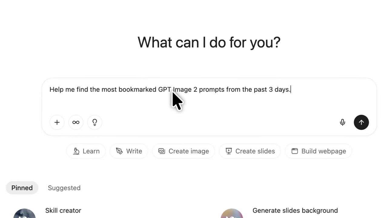
AI가 수만 개의 프롬프트를 검색해줍니다. 모델·기간·키워드로 필터링하고 노출, 북마크, 리포스트 등 인기 지표로 정렬할 수 있어요.
비전 도구
이미지를 프롬프트로
어떤 사진이든 상세한 AI 이미지 프롬프트로 변환하세요. 무료 Image to Prompt 변환기가 구도, 스타일, 조명을 분석해 몇 초 만에 같은 느낌을 재현할 수 있습니다.
크리에이터를 위해, 영원히 무료.
YouMind는 전 세계 크리에이터가 신뢰하는 AI 창작 파트너입니다. 이곳의 모든 프롬프트는 더 빠르고 더 나은 창작을 돕기 위해 엄선되었습니다.