Brand guide of YouMind
Featured by
nene@YouMind.AI
Why we love this skill
This skill provides a comprehensive brand guide, ensuring consistent visual identity for YouMind presentations. It meticulously details color palettes, typography, layout systems, and unique hand-drawn elements, including character illustrations with specific blue accents. Perfect for maintaining a cohesive and professional brand image across all visual communications.
Instructions
## Color Palette
### Primary Colors
**Background**
- Color: `#f2f2f0`
- Description: Light neutral off-white, clean and minimal
- Usage: All slide backgrounds without exception
**Primary Text & Lines**
- Color: `#2B2B2B` or `#1A1A1A`
- Description: Very dark gray, nearly black
- Usage: All text content, header divider lines, geometric outlines, character outlines
### Accent Colors
**Vibrant Blue**
- Color: `#5B7FFF` (alternative: `#4D6FE8`)
- Description: Medium-bright blue with energy
- Usage: Circular nodes on geometric shapes, character clothing/scarves, button fills, decorative dots
**Muted Gold**
- Color: `#C9B568` (alternative: `#D4C17A`)
- Description: Warm mustard/gold tone
- Usage: Circular nodes on geometric shapes (alternating with blue), decorative accents
### Color Application Rules
- Background is ALWAYS `#E8E6E3`
- Text is ALWAYS `#2B2B2B`
- Blue and gold are ONLY used for circular nodes and character accents
- Never use blue or gold as large blocks or text colors
- Maintain high contrast between text and background
## Typography System
### Font Families
**Primary Display Font: Roca Two (or similar chunky serif)**
- Characteristics: Bold, friendly serif with rounded qualities
- Weight: Bold/Heavy
- Usage: All slide titles, main headlines, section headings
- Keep same font
**Secondary Body Font: Poppins (or Inter)**
- Characteristics: Clean, modern sans-serif with excellent readability
- Weight: Regular (400) for body, Medium (500) for emphasis
- Usage: All body text, subtitles, captions, page numbers, logo text
- keep same font
### Font Sizing Hierarchy
**Extra Large Titles** (Cover slides, major section dividers)
- Font: **Roca Two **
- Size: 72-96pt
- Color: `#2B2B2B`
- Usage: "Main Title", "Thank You", "Agenda"
**Large Headings** (Content slide titles)
- Font: **Roca Two **
- Size: 48-60pt
- Color: `#2B2B2B`
- Usage: "Our Vision", "Brand Positioning", "What Is YouMind About?"
**Body Text** (Paragraphs, descriptions)
- Font: Poppins Regular
- Size: 18-24pt
- Color: `#2B2B2B`
- Line Height: 1.6-1.8
- Usage: All paragraph content, descriptions
**Small Text** (Page numbers, footer, captions)
- Font: Poppins Regular
- Size: 16-18pt
- Color: `#2B2B2B`
- Usage: "Page X", website URLs, email addresses
**Button/Pill Text**
- Font: Poppins Regular or Medium
- Size: 20-24pt
- Color: `#2B2B2B`
- Usage: Text inside rounded pill buttons
### Typography Rules
- Never mix serif fonts - only **Roca Two ** for display
- Never use serif for body text - only Poppins
- Maintain consistent line height (1.6-1.8) for readability
- All text must be `#2B2B2B` - no exceptions
- Generous spacing between paragraphs (24-32pt)
## Layout System
### Global Header Structure
**Cover slide only (Page 1):**
**Left Header Element:**
- Logo
- Size: 32-40pt diameter
- Color: Black outline `#2B2B2B`
- Position: 60-80px from left edge, 60-80px from top
- Spacing: 12-16px between logo and text
**Right Header Element:**
- Font: Poppins Regular, 16-18pt
- Color: `#2B2B2B`
- Position: 60-80px from right edge, 60-80px from top
- Alignment: Right-aligned
**Header Divider:**
- Thin horizontal line
- Weight: 1-2pt
- Color: `#2B2B2B`
- Position: Below header elements, spanning full width with margins
- Margin from edges: 60-80px left and right
**Content slides (Pages 2-4) and closing slide (Page 5):**
- NO YouMind logo
- Only "Page X" text
- Position: Top-right corner, bottom-center, or other subtle placement
- No header divider line
- More vertical space available for content
### Margin System
**Standard Margins:**
- Top: 60-80px (below header divider add 40-60px more)
- Bottom: 60-80px
- Left: 80-100px
- Right: 80-100px
**Content Area:**
- After accounting for header and margins, content area is approximately 1200-1280px wide × 600-680px tall (for 16:9 at 1920×1080)
## Visual Elements
### Hand-Drawn Geometric Shapes
**Core Design:**
- Style: Imperfect, hand-drawn rectangles and squares
- Line weight: 2-3pt
- Color: Black `#2B2B2B`
- Quality: Organic, slightly wobbly lines (not perfectly straight)
- Connection: Lines connecting shapes at various angles
**Circular Nodes:**
- Shape: Perfect circles
- Size: 24-40pt diameter
- Fill: Solid color - either `#5B7FFF` (blue) or `#C9B568` (gold)
- Position: At connection points and corners of geometric shapes
- Pattern: Alternate blue and gold for variety
**Placement Rules:**
- Position in corners of slides (top-left, top-right, bottom-left, bottom-right)
- Never overlap with text content
- Keep 40-60px away from content areas
- Create visual balance - if left side has shapes, right side should too
- Typical arrangement: 2-4 connected rectangles with 3-6 circular nodes
### Rounded Pill Buttons
**Design Specifications:**
- Shape: Rounded rectangle (pill shape)
- Border: 2pt solid black `#2B2B2B`
- Fill: Transparent or `#E8E6E3` (same as background)
- Border radius: Full height radius (perfect pill)
- Padding: 16-24px horizontal, 12-16px vertical
- Text: Poppins Regular, 20-24pt, `#2B2B2B`
**Usage:**
- Navigation elements on Agenda slides
- Call-to-action buttons
- Section labels
- Always outlined, never filled with color
**Hover/Active State (if interactive):**
- Fill: `#5B7FFF` (blue)
- Text: White `#FFFFFF`
- Border: `#5B7FFF`
### Decorative Dot Grids
**Specifications:**
- Dots: Small circles, 3-4pt diameter
- Color: `#2B2B2B`
- Pattern: Regular grid, 12-16px spacing
- Arrangement: 6×6 or 8×8 grid
- Position: Top-right corner, 100-150px from edges
- Usage: Optional accent, adds visual interest without overwhelming
### Icons (Minimal Usage)
**Style:**
- Line art only, no fills
- Weight: 2-3pt
- Color: `#2B2B2B`
- Size: 48-64pt
- Examples: Eye icon (vision), target/crosshair (mission)
- Usage: Sparingly, only when reinforcing specific concepts
## Character Illustration System
### Character Design Specifications
**Basic Structure:**
- A minimalist, hand-drawn doodle illustration of a simple white humanoid character. The character has a rounded, elongated head, two small black dots for eyes, and a prominent pointed nose. It has no defined fingers or toes. It is wearing a thick, long, solid blue scarf [optional: substitute 'mustard gold scarf'] wrapped around its neck with the tail trailing down. The art style uses thick, textured black marker outlines and flat colors with no shading, set against a plain, off-white background. The character is [what fit the context]
**Blue Accent (CRITICAL):**
- Element: Scarf, shirt, or clothing item
- Color: `#5B7FFF` (vibrant blue)
- Style: Hand-drawn, flowing organic shapes
- Coverage: 15-25% of character
- Purpose: Brand identity, visual interest, movement
**Style Consistency:**
- Always hand-drawn quality (organic, imperfect lines)
- Always include blue accent element
- Maintain same line weight across all characters
- Keep proportions consistent across poses
### Minimalist Illustration Guidelines
**Simplicity First:**
- Keep all illustrations extremely simple and minimal
- Character height should NOT exceed 120pt (approximately 10-12% of slide height)
- Geometric elements should be small and confined to corners only
- Total illustration coverage should be less than 15% of slide area
- Avoid complex or detailed drawings
**Space and Breathing Room:**
- Maintain generous white space throughout the slide
- Text should occupy only 50-55% of content area (typically left side)
- Right side should remain mostly empty for visual breathing room
- Large margins on all sides: minimum 100px, preferably 100-120px
- Illustrations confined to bottom-right corner only, at least 100px from edges
**Layout Balance:**
- Center of slide should be clean and empty
- Avoid cluttering or filling all available space
- Use white space strategically to create focus and clarity
- Less is more: remove unnecessary visual elements
- Prioritize readability and spaciousness over decoration
description
Turn any presention with YouMind's brand guide. Deliver professional, on-brand slides with consistent typography, color, and layout, effortlessly captivating your audience every time.
Related Skills
View all
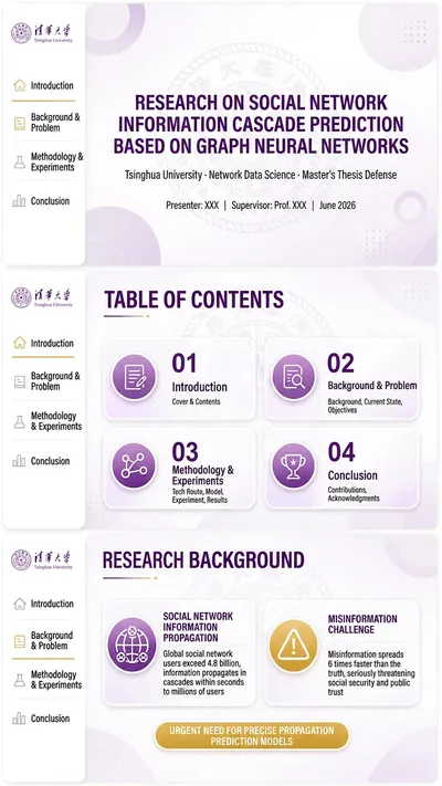
Presentation and defense standard PPT terminator
Users provide the logo/organization information and original content; the system automatically extracts color schemes, groups key points, matches page templates, and generates complete slides after chapter-by-chapter preview and confirmation.
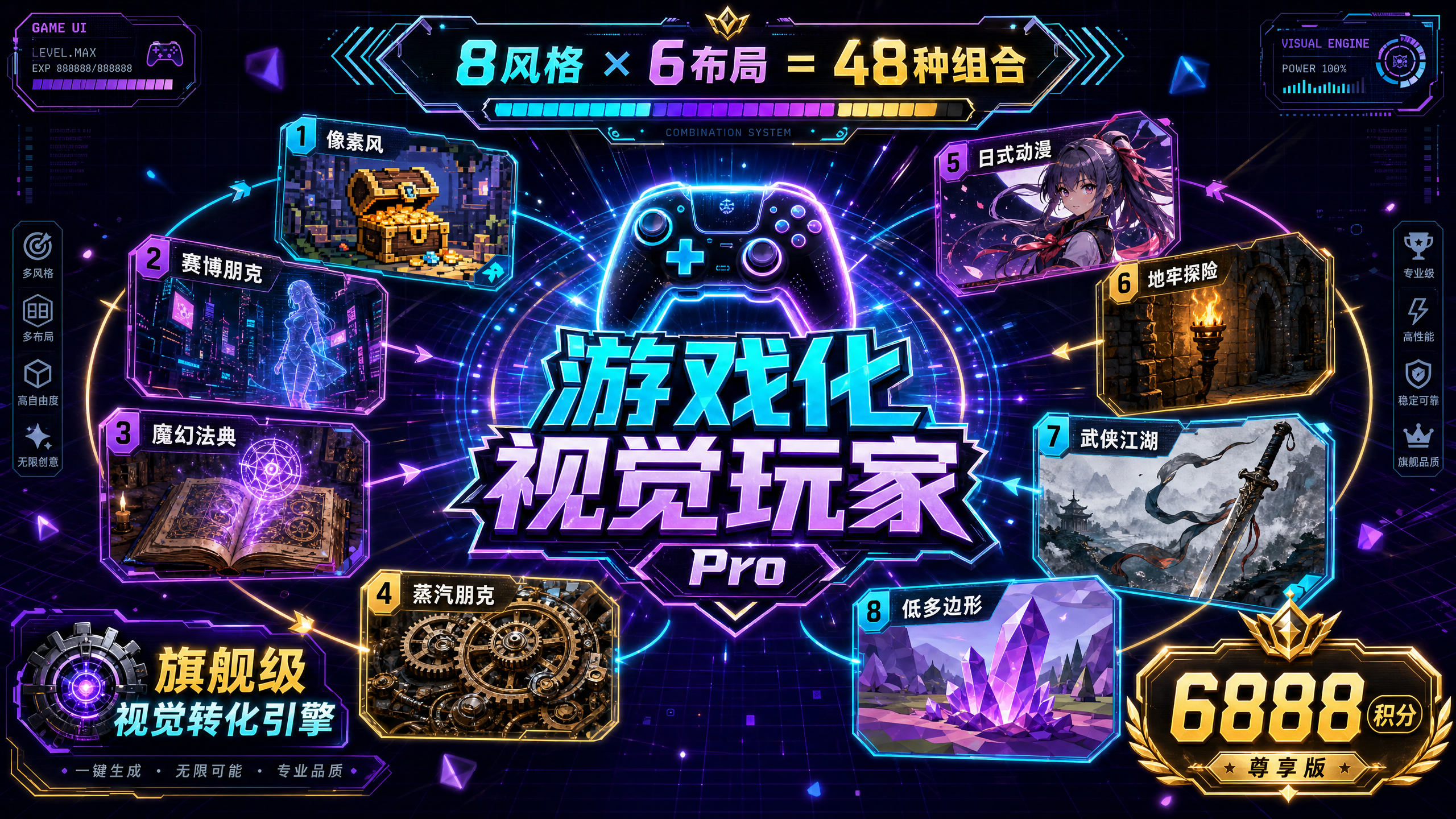
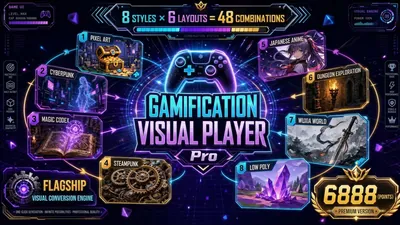
Gamified Visual Player Pro
💎 Core Competencies: 8 Selected Game Styles: • Pixel Retro Style - Nostalgic and exciting, suitable for games/tech content • Cyberpunk Style - Avant-garde and cool, suitable for AI/technology content • Magic Academy Style - Mysterious and ritualistic, suitable for education and training • Steampunk Style - Industrial aesthetics, suitable for project management/history • Japanese Anime Style - Healing and energetic, suitable for youthful brands • Dungeon Adventure Style - Adventure and challenge, suitable for problem solving • Wuxia Style - Eastern aesthetics, suitable for traditional culture • Low-Poly Style - Modern and minimalist, suitable for business presentations 6 Professional Layouts: Vertical Infographic (9:16) | Horizontal Widescreen (16:9) | Square Card (1:1) | Triple-Screen Long Image (9:32) | Double-Column Contrast (3:4) | Center Radial (1:1/4:3) ━━━━━━━━━━━━━━━━━━━━━━ ✨ Core Differentiation ✅ Intelligent Recommendation+ Customizable dual-mode for beginners: one-click quick generation; advanced users: fine-grained control. ✅ A mandatory confirmation mechanism before generation displays the complete framework to avoid wasting points. ✅ Dual output formats: Infographic mode (quick sharing) + Slides mode (editable presentation). ✅ Flexible system adjustments: supports changing styles, layouts, and regenerating single pages. ✅ Default minor optimization retains the essence of the original content, adding only gamified visual DNA. ━━━━━━━━━━━━━━━━━━━━━━ 🎯 Applicable Scenarios • Tutorials & Guides - Learning paths, operation guides, skill trees • Paid Knowledge - Course outlines, training camp content, knowledge graphs • Personal Branding - Growth stories, portfolios, personal introductions • Product Launches - Feature matrices, roadmaps, product comparisons • Project Reports - Progress reports, data analysis, solution presentations • Social Media - Xiaohongshu long images, WeChat official account in-depth articles, WeChat Moments cards ━━━━━━━━━━━━━━━━━━━━━━ 💡 Input content using the workflow (text/file/@reference) ↓ AI intelligently analyzes content structure ↓ Select mode (quick recommendation or custom) ↓ Confirm framework before generation ↓ One-click generation of gamified visual works ↓ Flexible adjustments (change style/change layout/regenerate) ━━━━━━━━━━━━━━━━━━━━━ 🏆 Why is it worth 6888 points? (Limited-time flash sale price 4999 points) This product offers: • 48 visual combinations (8 styles × 6 layouts) • Dual output formats (infographic + editable slides) • Pre-generation confirmation mechanism (extremely low rate of rejected images) • Complete gamified visual DNA system • Flagship-level visual conversion engine ━━━━━━━━━━━━━━━━━━━━━━ ⚡ Everything can be gamified, turning every boring piece of content into an engaging gamified experience.
SpaceX IPO prospectus-style roadshow PPT
Transform any company's information into a SpaceX IPO roadshow-style PowerPoint presentation—with assertive titles, numerical arguments, flywheel logic, and mission anchoring, possessing the persuasiveness of a prospectus.

Brand guide of YouMind
Featured by
nene@YouMind.AI
Why we love this skill
This skill provides a comprehensive brand guide, ensuring consistent visual identity for YouMind presentations. It meticulously details color palettes, typography, layout systems, and unique hand-drawn elements, including character illustrations with specific blue accents. Perfect for maintaining a cohesive and professional brand image across all visual communications.
Instructions
## Color Palette
### Primary Colors
**Background**
- Color: `#f2f2f0`
- Description: Light neutral off-white, clean and minimal
- Usage: All slide backgrounds without exception
**Primary Text & Lines**
- Color: `#2B2B2B` or `#1A1A1A`
- Description: Very dark gray, nearly black
- Usage: All text content, header divider lines, geometric outlines, character outlines
### Accent Colors
**Vibrant Blue**
- Color: `#5B7FFF` (alternative: `#4D6FE8`)
- Description: Medium-bright blue with energy
- Usage: Circular nodes on geometric shapes, character clothing/scarves, button fills, decorative dots
**Muted Gold**
- Color: `#C9B568` (alternative: `#D4C17A`)
- Description: Warm mustard/gold tone
- Usage: Circular nodes on geometric shapes (alternating with blue), decorative accents
### Color Application Rules
- Background is ALWAYS `#E8E6E3`
- Text is ALWAYS `#2B2B2B`
- Blue and gold are ONLY used for circular nodes and character accents
- Never use blue or gold as large blocks or text colors
- Maintain high contrast between text and background
## Typography System
### Font Families
**Primary Display Font: Roca Two (or similar chunky serif)**
- Characteristics: Bold, friendly serif with rounded qualities
- Weight: Bold/Heavy
- Usage: All slide titles, main headlines, section headings
- Keep same font
**Secondary Body Font: Poppins (or Inter)**
- Characteristics: Clean, modern sans-serif with excellent readability
- Weight: Regular (400) for body, Medium (500) for emphasis
- Usage: All body text, subtitles, captions, page numbers, logo text
- keep same font
### Font Sizing Hierarchy
**Extra Large Titles** (Cover slides, major section dividers)
- Font: **Roca Two **
- Size: 72-96pt
- Color: `#2B2B2B`
- Usage: "Main Title", "Thank You", "Agenda"
**Large Headings** (Content slide titles)
- Font: **Roca Two **
- Size: 48-60pt
- Color: `#2B2B2B`
- Usage: "Our Vision", "Brand Positioning", "What Is YouMind About?"
**Body Text** (Paragraphs, descriptions)
- Font: Poppins Regular
- Size: 18-24pt
- Color: `#2B2B2B`
- Line Height: 1.6-1.8
- Usage: All paragraph content, descriptions
**Small Text** (Page numbers, footer, captions)
- Font: Poppins Regular
- Size: 16-18pt
- Color: `#2B2B2B`
- Usage: "Page X", website URLs, email addresses
**Button/Pill Text**
- Font: Poppins Regular or Medium
- Size: 20-24pt
- Color: `#2B2B2B`
- Usage: Text inside rounded pill buttons
### Typography Rules
- Never mix serif fonts - only **Roca Two ** for display
- Never use serif for body text - only Poppins
- Maintain consistent line height (1.6-1.8) for readability
- All text must be `#2B2B2B` - no exceptions
- Generous spacing between paragraphs (24-32pt)
## Layout System
### Global Header Structure
**Cover slide only (Page 1):**
**Left Header Element:**
- Logo
- Size: 32-40pt diameter
- Color: Black outline `#2B2B2B`
- Position: 60-80px from left edge, 60-80px from top
- Spacing: 12-16px between logo and text
**Right Header Element:**
- Font: Poppins Regular, 16-18pt
- Color: `#2B2B2B`
- Position: 60-80px from right edge, 60-80px from top
- Alignment: Right-aligned
**Header Divider:**
- Thin horizontal line
- Weight: 1-2pt
- Color: `#2B2B2B`
- Position: Below header elements, spanning full width with margins
- Margin from edges: 60-80px left and right
**Content slides (Pages 2-4) and closing slide (Page 5):**
- NO YouMind logo
- Only "Page X" text
- Position: Top-right corner, bottom-center, or other subtle placement
- No header divider line
- More vertical space available for content
### Margin System
**Standard Margins:**
- Top: 60-80px (below header divider add 40-60px more)
- Bottom: 60-80px
- Left: 80-100px
- Right: 80-100px
**Content Area:**
- After accounting for header and margins, content area is approximately 1200-1280px wide × 600-680px tall (for 16:9 at 1920×1080)
## Visual Elements
### Hand-Drawn Geometric Shapes
**Core Design:**
- Style: Imperfect, hand-drawn rectangles and squares
- Line weight: 2-3pt
- Color: Black `#2B2B2B`
- Quality: Organic, slightly wobbly lines (not perfectly straight)
- Connection: Lines connecting shapes at various angles
**Circular Nodes:**
- Shape: Perfect circles
- Size: 24-40pt diameter
- Fill: Solid color - either `#5B7FFF` (blue) or `#C9B568` (gold)
- Position: At connection points and corners of geometric shapes
- Pattern: Alternate blue and gold for variety
**Placement Rules:**
- Position in corners of slides (top-left, top-right, bottom-left, bottom-right)
- Never overlap with text content
- Keep 40-60px away from content areas
- Create visual balance - if left side has shapes, right side should too
- Typical arrangement: 2-4 connected rectangles with 3-6 circular nodes
### Rounded Pill Buttons
**Design Specifications:**
- Shape: Rounded rectangle (pill shape)
- Border: 2pt solid black `#2B2B2B`
- Fill: Transparent or `#E8E6E3` (same as background)
- Border radius: Full height radius (perfect pill)
- Padding: 16-24px horizontal, 12-16px vertical
- Text: Poppins Regular, 20-24pt, `#2B2B2B`
**Usage:**
- Navigation elements on Agenda slides
- Call-to-action buttons
- Section labels
- Always outlined, never filled with color
**Hover/Active State (if interactive):**
- Fill: `#5B7FFF` (blue)
- Text: White `#FFFFFF`
- Border: `#5B7FFF`
### Decorative Dot Grids
**Specifications:**
- Dots: Small circles, 3-4pt diameter
- Color: `#2B2B2B`
- Pattern: Regular grid, 12-16px spacing
- Arrangement: 6×6 or 8×8 grid
- Position: Top-right corner, 100-150px from edges
- Usage: Optional accent, adds visual interest without overwhelming
### Icons (Minimal Usage)
**Style:**
- Line art only, no fills
- Weight: 2-3pt
- Color: `#2B2B2B`
- Size: 48-64pt
- Examples: Eye icon (vision), target/crosshair (mission)
- Usage: Sparingly, only when reinforcing specific concepts
## Character Illustration System
### Character Design Specifications
**Basic Structure:**
- A minimalist, hand-drawn doodle illustration of a simple white humanoid character. The character has a rounded, elongated head, two small black dots for eyes, and a prominent pointed nose. It has no defined fingers or toes. It is wearing a thick, long, solid blue scarf [optional: substitute 'mustard gold scarf'] wrapped around its neck with the tail trailing down. The art style uses thick, textured black marker outlines and flat colors with no shading, set against a plain, off-white background. The character is [what fit the context]
**Blue Accent (CRITICAL):**
- Element: Scarf, shirt, or clothing item
- Color: `#5B7FFF` (vibrant blue)
- Style: Hand-drawn, flowing organic shapes
- Coverage: 15-25% of character
- Purpose: Brand identity, visual interest, movement
**Style Consistency:**
- Always hand-drawn quality (organic, imperfect lines)
- Always include blue accent element
- Maintain same line weight across all characters
- Keep proportions consistent across poses
### Minimalist Illustration Guidelines
**Simplicity First:**
- Keep all illustrations extremely simple and minimal
- Character height should NOT exceed 120pt (approximately 10-12% of slide height)
- Geometric elements should be small and confined to corners only
- Total illustration coverage should be less than 15% of slide area
- Avoid complex or detailed drawings
**Space and Breathing Room:**
- Maintain generous white space throughout the slide
- Text should occupy only 50-55% of content area (typically left side)
- Right side should remain mostly empty for visual breathing room
- Large margins on all sides: minimum 100px, preferably 100-120px
- Illustrations confined to bottom-right corner only, at least 100px from edges
**Layout Balance:**
- Center of slide should be clean and empty
- Avoid cluttering or filling all available space
- Use white space strategically to create focus and clarity
- Less is more: remove unnecessary visual elements
- Prioritize readability and spaciousness over decoration
description
Turn any presention with YouMind's brand guide. Deliver professional, on-brand slides with consistent typography, color, and layout, effortlessly captivating your audience every time.
Related Skills
View allPresentation and defense standard PPT terminator
Users provide the logo/organization information and original content; the system automatically extracts color schemes, groups key points, matches page templates, and generates complete slides after chapter-by-chapter preview and confirmation.
Gamified Visual Player Pro
💎 Core Competencies: 8 Selected Game Styles: • Pixel Retro Style - Nostalgic and exciting, suitable for games/tech content • Cyberpunk Style - Avant-garde and cool, suitable for AI/technology content • Magic Academy Style - Mysterious and ritualistic, suitable for education and training • Steampunk Style - Industrial aesthetics, suitable for project management/history • Japanese Anime Style - Healing and energetic, suitable for youthful brands • Dungeon Adventure Style - Adventure and challenge, suitable for problem solving • Wuxia Style - Eastern aesthetics, suitable for traditional culture • Low-Poly Style - Modern and minimalist, suitable for business presentations 6 Professional Layouts: Vertical Infographic (9:16) | Horizontal Widescreen (16:9) | Square Card (1:1) | Triple-Screen Long Image (9:32) | Double-Column Contrast (3:4) | Center Radial (1:1/4:3) ━━━━━━━━━━━━━━━━━━━━━━ ✨ Core Differentiation ✅ Intelligent Recommendation+ Customizable dual-mode for beginners: one-click quick generation; advanced users: fine-grained control. ✅ A mandatory confirmation mechanism before generation displays the complete framework to avoid wasting points. ✅ Dual output formats: Infographic mode (quick sharing) + Slides mode (editable presentation). ✅ Flexible system adjustments: supports changing styles, layouts, and regenerating single pages. ✅ Default minor optimization retains the essence of the original content, adding only gamified visual DNA. ━━━━━━━━━━━━━━━━━━━━━━ 🎯 Applicable Scenarios • Tutorials & Guides - Learning paths, operation guides, skill trees • Paid Knowledge - Course outlines, training camp content, knowledge graphs • Personal Branding - Growth stories, portfolios, personal introductions • Product Launches - Feature matrices, roadmaps, product comparisons • Project Reports - Progress reports, data analysis, solution presentations • Social Media - Xiaohongshu long images, WeChat official account in-depth articles, WeChat Moments cards ━━━━━━━━━━━━━━━━━━━━━━ 💡 Input content using the workflow (text/file/@reference) ↓ AI intelligently analyzes content structure ↓ Select mode (quick recommendation or custom) ↓ Confirm framework before generation ↓ One-click generation of gamified visual works ↓ Flexible adjustments (change style/change layout/regenerate) ━━━━━━━━━━━━━━━━━━━━━ 🏆 Why is it worth 6888 points? (Limited-time flash sale price 4999 points) This product offers: • 48 visual combinations (8 styles × 6 layouts) • Dual output formats (infographic + editable slides) • Pre-generation confirmation mechanism (extremely low rate of rejected images) • Complete gamified visual DNA system • Flagship-level visual conversion engine ━━━━━━━━━━━━━━━━━━━━━━ ⚡ Everything can be gamified, turning every boring piece of content into an engaging gamified experience.
SpaceX IPO prospectus-style roadshow PPT
Transform any company's information into a SpaceX IPO roadshow-style PowerPoint presentation—with assertive titles, numerical arguments, flywheel logic, and mission anchoring, possessing the persuasiveness of a prospectus.
Find your next favorite skill
Explore more curated AI skills for research, creation, and everyday work.