Minimalist Infographic
Featured by
nene@YouMind.AI
Why we love this skill
Craft stunning, minimalist infographics that make complex information immediately understandable. This skill excels at distilling any topic into a visually quiet, yet impactful design, perfect for quickly educating a target audience. Highlight key takeaways with a single accent color and clear hierarchy, ensuring effortless comprehension.
Instructions
Design an **Infographic** to explain [Topic & Content] to [Target Audience: e.g., "non-specialist managers / general public / junior engineers"], rendered in a **clean, clear, pleasing, and visually quiet** style.
### 1) Information Structure & Hierarchy (Emphasis & Hierarchy)
- **Top:** A **main headline** (one sentence summarizing the key takeaway), followed by a **subheadline** (providing context, scope, or date).
- **Middle:** Feature **one critical number or conclusion** as the visual anchor (largest font size / largest block)—the viewer should instantly know what matters most.
- **Bottom:** Break content into **3–5 modules** (each with a sub-header + 2–3 bullet points, kept as short as possible).
- Establish clear hierarchy through **font size / weight / whitespace / positioning**: Headline > Key Conclusion > Module Headers > Body Points.
### 2) Scale & Proportion
- The key conclusion block should be noticeably larger; other modules decrease in size by importance.
- Balance graphics and text proportionally—avoid making all elements the same size, which creates "no focal point."
- Use a grid system (e.g., 12-column grid) with consistent spacing to achieve visual harmony.
### 3) Contrast Without Excess
- Use only **one high-contrast accent color** to highlight "key conclusions / critical paths / CTA-style labels"; keep all other colors low-saturation and softly neutral.
- Create contrast through *difference*, not *loudness*: size contrast, weight contrast, value contrast, shape contrast.
- Avoid multiple high-contrast elements competing simultaneously—this creates visual noise and chaos.
### 4) Repetition & Pattern
- Apply a unified card style across all modules: same border radius, margins, header styling, and icon treatment.
- Icons should share consistent stroke width and style (choose either line or flat, not both); maintain uniform layout within modules (icons consistently left or top).
- Use repetition to establish order and scannability.
### 5) Balance, Alignment & Whitespace
- Leave ample whitespace—let the information breathe; don't fill every inch.
- Align rigorously: baseline-align headlines, edge-align cards, left-align body text, and adhere to the grid throughout.
- Balance visual weight: pair heavy information blocks with lighter elements (thin rules, muted annotations) to counterbalance.
### 6) Movement & Visual Flow
- Organize content along a **clear reading path**—top-to-bottom or left-to-right (e.g., numbered steps 1→2→3, subtle arrows, progressive sizing).
- Rhythm comes from *intentional repetition and spacing*, not flashy effects; guide the eye naturally through the composition.
### 7) Typography & Readability
- Limit to **2 font styles max** (or different weights of a single typeface); avoid decorative fonts.
- Body text should be large enough with comfortable line spacing; keep each point to 1.5 lines or less (favor brevity).
- If technical terms are unavoidable, include a one-line plain-language explanation or annotation.
### 8) Output Specs (adjust as needed)
- **Canvas:** [Aspect ratio 16:9 ], Resolution: 1K
- **Style:** Modern minimalist, fresh, lightweight, vector-like aesthetic; subtle or no shadows; avoid heavy gradients and intricate textures.
- **Background:** Solid color or very light tint—should never compete with the content.
**Negative Constraints:**
No cramped layouts • No more than 1 accent color • No multiple high-contrast blocks fighting for attention • No decorative patterns or noise textures • No more than 2 typefaces • No equal visual weight across all modules • No misalignment.
**Topic & Content:**
ask user to provide so you can analyze
---
You don't need to ask user the target audience, the goal of this infographic is to help user to learn a subject fast and great.
description
Turn any complex content into crystal-clear infographics. Design like a pro, ensuring your message is visually quiet yet powerfully impactful, guiding your audience effortlessly.
Related Skills
View allClassroom Explanation Diagram Generator
Transform the lecture transcript into a complete set of Keynote-style 16:9 teaching infographics, outputting both a text and image explanation version and a minimalist image collection in two documents. Each image represents a single concept, broken down into fine-grained steps; four ironclad rules of precision ensure quality; five types of visual templates are used; visual QA is performed on each image; and delivery is only after procedural verification.

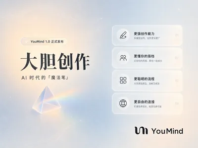
YouMind Landing Page Style Poster
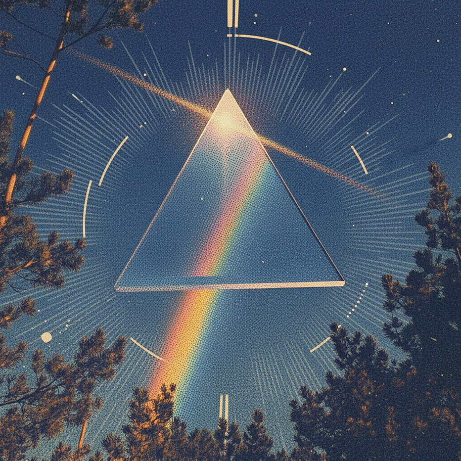
Transform your content into a stunning visual narrative with a YouMind Landing Page Style Poster. This skill crafts beautiful infographic posters that capture attention with a unique Natural Retro-Futurism aesthetic. Perfect for showcasing key data, project highlights, or product features, your information will be presented in a sophisticated and easily digestible format. Leveraging a balanced cool-warm color palette featuring a light gray-blue base with subtle beige-peach accents, each poster embodies a modern UI feel. Expect elegant typography, with authoritative Source Han Serif for titles and clean sans-serif for body text, ensuring readability. The layout utilizes a dynamic Bento grid, arranging your content into visually engaging, soft-edged cards with generous breathing room, avoiding cluttered designs. Beyond striking visuals, the skill integrates subtle design elements like a uniform fine film grain, impressionistic rendering, and optional frosted glass icons for your data points. A single, translucent triangular prism can be added for an elegant accent, while the YouMind official logo is always discreetly placed to maintain brand consistency. This results in a professional, airy, and modern infographic that effectively communicates your message.
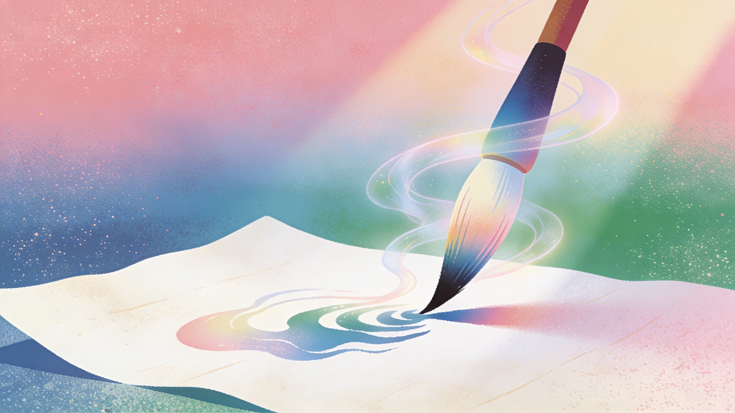
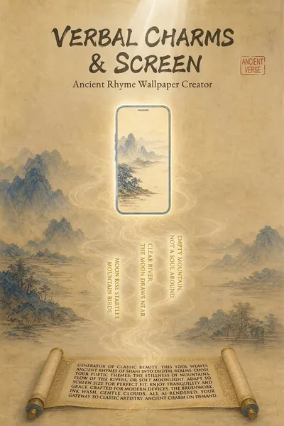
Poetry Reflected on the Screen: Ancient Style Wallpaper Generator
"Your poems, your words, your wallpapers." Turn poetry into personalized wallpapers. We offer conversational request collection, outputting four versions of the Prompt (phone lock screen/desktop + computer lock screen/desktop), bilingual (Chinese and English), including secure zone guidelines. Supports a library of ancient painting styles (such as *Luoshen Fu*, *A Thousand Miles of Rivers and Mountains*, and *Dwelling in the Fuchun Mountains*). We provide a full-process service including image selection (seven-dimensional evaluation), image analysis, modification iteration, and installation guide. Transform poems, mottos, and to-do reminders into personalized wallpapers. Supports four output versions: phone lock screen, phone desktop, computer lock screen, and computer desktop, with bilingual (Chinese and English) Prompts, compatible with Doubao, Jimeng, Keling, Midjourney, and Stable Diffusion. What can Poetry Screen do? In short: You tell me the poem title, tell me what words to write, I'll generate four versions of the Prompt plus an installation guide; you generate, take screenshots, and I'll revise until you're satisfied. What can you input? Ancient poems (e.g., "Spring River Flower Moon Night"), mottoes (e.g., "Let life take its course in a straw raincoat and misty rain"), work task reminders (e.g., "Do today's work today"), visual descriptions (e.g., "Bamboo forest in the rain, a cup of tea"), festivals and solar terms (e.g., "Mid-Autumn Moon"). What will you get? Four versions of bilingual (Chinese and English) Prompts (phone lock screen, phone desktop, computer lock screen, computer desktop), text embedding schemes (what words to write, where to place them, color, font size, font suggestions), safe zone avoidance guide (where is the system time/icon, where should the main body and text be placed), installation and setup guide (step-by-step setup for iPhone, Android, Windows, and Mac), after-sales image analysis (screenshot diagnosis of occlusion issues, providing a revised Prompt until you are satisfied), other formats (long scroll version, tablet version, pure image sharing version, printable and framed version can be generated at any time). Core logic: poetic imagery → emotional color temperature → ancient painting style → style matching → text position recommendation → four versions of Prompt → installation guide → after-sales image analysis. You decide what to write, I'll handle the artwork, the text, and after-sales support. Text Strategy Explanation: 💡 Warm Reminder: AI-generated precise text is prone to garbled characters, so I use a "reserved area + post-processing overlay" solution. This will leave clean space on the screen; you can add text later using your phone's system font or a photo editing app – the most reliable method. Can't choose? I'll help you! "Landscape and Pastoral Scenery, Seeking Tranquility" → Ancient ink painting, light ochre with white space, seal-style text in the lower right corner. "Ancient Epic, Requires Grandeur" → Heavy colors and greens, gold outlines, scroll-like text at the bottom. "Work Task Reminder" → Minimalist dark colors, horizontal layout at the top center, clear and high contrast. "Uncertain" → I recommend colors based on the poem's mood and color temperature: warm tones for heavy colors, cool tones for ink painting, and neutral to minimalism. Now, tell me your poem and your text. I'll turn it into a reflection on your screen.
Minimalist Infographic
Featured by
nene@YouMind.AI
Why we love this skill
Craft stunning, minimalist infographics that make complex information immediately understandable. This skill excels at distilling any topic into a visually quiet, yet impactful design, perfect for quickly educating a target audience. Highlight key takeaways with a single accent color and clear hierarchy, ensuring effortless comprehension.
Instructions
Design an **Infographic** to explain [Topic & Content] to [Target Audience: e.g., "non-specialist managers / general public / junior engineers"], rendered in a **clean, clear, pleasing, and visually quiet** style.
### 1) Information Structure & Hierarchy (Emphasis & Hierarchy)
- **Top:** A **main headline** (one sentence summarizing the key takeaway), followed by a **subheadline** (providing context, scope, or date).
- **Middle:** Feature **one critical number or conclusion** as the visual anchor (largest font size / largest block)—the viewer should instantly know what matters most.
- **Bottom:** Break content into **3–5 modules** (each with a sub-header + 2–3 bullet points, kept as short as possible).
- Establish clear hierarchy through **font size / weight / whitespace / positioning**: Headline > Key Conclusion > Module Headers > Body Points.
### 2) Scale & Proportion
- The key conclusion block should be noticeably larger; other modules decrease in size by importance.
- Balance graphics and text proportionally—avoid making all elements the same size, which creates "no focal point."
- Use a grid system (e.g., 12-column grid) with consistent spacing to achieve visual harmony.
### 3) Contrast Without Excess
- Use only **one high-contrast accent color** to highlight "key conclusions / critical paths / CTA-style labels"; keep all other colors low-saturation and softly neutral.
- Create contrast through *difference*, not *loudness*: size contrast, weight contrast, value contrast, shape contrast.
- Avoid multiple high-contrast elements competing simultaneously—this creates visual noise and chaos.
### 4) Repetition & Pattern
- Apply a unified card style across all modules: same border radius, margins, header styling, and icon treatment.
- Icons should share consistent stroke width and style (choose either line or flat, not both); maintain uniform layout within modules (icons consistently left or top).
- Use repetition to establish order and scannability.
### 5) Balance, Alignment & Whitespace
- Leave ample whitespace—let the information breathe; don't fill every inch.
- Align rigorously: baseline-align headlines, edge-align cards, left-align body text, and adhere to the grid throughout.
- Balance visual weight: pair heavy information blocks with lighter elements (thin rules, muted annotations) to counterbalance.
### 6) Movement & Visual Flow
- Organize content along a **clear reading path**—top-to-bottom or left-to-right (e.g., numbered steps 1→2→3, subtle arrows, progressive sizing).
- Rhythm comes from *intentional repetition and spacing*, not flashy effects; guide the eye naturally through the composition.
### 7) Typography & Readability
- Limit to **2 font styles max** (or different weights of a single typeface); avoid decorative fonts.
- Body text should be large enough with comfortable line spacing; keep each point to 1.5 lines or less (favor brevity).
- If technical terms are unavoidable, include a one-line plain-language explanation or annotation.
### 8) Output Specs (adjust as needed)
- **Canvas:** [Aspect ratio 16:9 ], Resolution: 1K
- **Style:** Modern minimalist, fresh, lightweight, vector-like aesthetic; subtle or no shadows; avoid heavy gradients and intricate textures.
- **Background:** Solid color or very light tint—should never compete with the content.
**Negative Constraints:**
No cramped layouts • No more than 1 accent color • No multiple high-contrast blocks fighting for attention • No decorative patterns or noise textures • No more than 2 typefaces • No equal visual weight across all modules • No misalignment.
**Topic & Content:**
ask user to provide so you can analyze
---
You don't need to ask user the target audience, the goal of this infographic is to help user to learn a subject fast and great.
description
Turn any complex content into crystal-clear infographics. Design like a pro, ensuring your message is visually quiet yet powerfully impactful, guiding your audience effortlessly.
Related Skills
View allClassroom Explanation Diagram Generator
Transform the lecture transcript into a complete set of Keynote-style 16:9 teaching infographics, outputting both a text and image explanation version and a minimalist image collection in two documents. Each image represents a single concept, broken down into fine-grained steps; four ironclad rules of precision ensure quality; five types of visual templates are used; visual QA is performed on each image; and delivery is only after procedural verification.
YouMind Landing Page Style Poster
Transform your content into a stunning visual narrative with a YouMind Landing Page Style Poster. This skill crafts beautiful infographic posters that capture attention with a unique Natural Retro-Futurism aesthetic. Perfect for showcasing key data, project highlights, or product features, your information will be presented in a sophisticated and easily digestible format. Leveraging a balanced cool-warm color palette featuring a light gray-blue base with subtle beige-peach accents, each poster embodies a modern UI feel. Expect elegant typography, with authoritative Source Han Serif for titles and clean sans-serif for body text, ensuring readability. The layout utilizes a dynamic Bento grid, arranging your content into visually engaging, soft-edged cards with generous breathing room, avoiding cluttered designs. Beyond striking visuals, the skill integrates subtle design elements like a uniform fine film grain, impressionistic rendering, and optional frosted glass icons for your data points. A single, translucent triangular prism can be added for an elegant accent, while the YouMind official logo is always discreetly placed to maintain brand consistency. This results in a professional, airy, and modern infographic that effectively communicates your message.
Poetry Reflected on the Screen: Ancient Style Wallpaper Generator
"Your poems, your words, your wallpapers." Turn poetry into personalized wallpapers. We offer conversational request collection, outputting four versions of the Prompt (phone lock screen/desktop + computer lock screen/desktop), bilingual (Chinese and English), including secure zone guidelines. Supports a library of ancient painting styles (such as *Luoshen Fu*, *A Thousand Miles of Rivers and Mountains*, and *Dwelling in the Fuchun Mountains*). We provide a full-process service including image selection (seven-dimensional evaluation), image analysis, modification iteration, and installation guide. Transform poems, mottos, and to-do reminders into personalized wallpapers. Supports four output versions: phone lock screen, phone desktop, computer lock screen, and computer desktop, with bilingual (Chinese and English) Prompts, compatible with Doubao, Jimeng, Keling, Midjourney, and Stable Diffusion. What can Poetry Screen do? In short: You tell me the poem title, tell me what words to write, I'll generate four versions of the Prompt plus an installation guide; you generate, take screenshots, and I'll revise until you're satisfied. What can you input? Ancient poems (e.g., "Spring River Flower Moon Night"), mottoes (e.g., "Let life take its course in a straw raincoat and misty rain"), work task reminders (e.g., "Do today's work today"), visual descriptions (e.g., "Bamboo forest in the rain, a cup of tea"), festivals and solar terms (e.g., "Mid-Autumn Moon"). What will you get? Four versions of bilingual (Chinese and English) Prompts (phone lock screen, phone desktop, computer lock screen, computer desktop), text embedding schemes (what words to write, where to place them, color, font size, font suggestions), safe zone avoidance guide (where is the system time/icon, where should the main body and text be placed), installation and setup guide (step-by-step setup for iPhone, Android, Windows, and Mac), after-sales image analysis (screenshot diagnosis of occlusion issues, providing a revised Prompt until you are satisfied), other formats (long scroll version, tablet version, pure image sharing version, printable and framed version can be generated at any time). Core logic: poetic imagery → emotional color temperature → ancient painting style → style matching → text position recommendation → four versions of Prompt → installation guide → after-sales image analysis. You decide what to write, I'll handle the artwork, the text, and after-sales support. Text Strategy Explanation: 💡 Warm Reminder: AI-generated precise text is prone to garbled characters, so I use a "reserved area + post-processing overlay" solution. This will leave clean space on the screen; you can add text later using your phone's system font or a photo editing app – the most reliable method. Can't choose? I'll help you! "Landscape and Pastoral Scenery, Seeking Tranquility" → Ancient ink painting, light ochre with white space, seal-style text in the lower right corner. "Ancient Epic, Requires Grandeur" → Heavy colors and greens, gold outlines, scroll-like text at the bottom. "Work Task Reminder" → Minimalist dark colors, horizontal layout at the top center, clear and high contrast. "Uncertain" → I recommend colors based on the poem's mood and color temperature: warm tones for heavy colors, cool tones for ink painting, and neutral to minimalism. Now, tell me your poem and your text. I'll turn it into a reflection on your screen.
Find your next favorite skill
Explore more curated AI skills for research, creation, and everyday work.