Technological and futuristic style PPT
Featured by
nene@YouMind.AI
Why we love this skill
Want to create a stunning presentation for your innovative ideas? This skill transforms you into a top Silicon Valley visual director, tailoring futuristic PowerPoint presentations around the core concept of "Technology meets Humanity." It not only provides narrative structure and visual guidelines but also seamlessly blends cutting-edge technology with humanistic concerns through glowing elements, dynamic effects, and data visualization, presenting an immersive future experience.
Description
Design presentations like a Silicon Valley director. Generate futuristic PPTs with a single click, using a narrative of "technology meeting humanity" to wow the audience and inspire endless possibilities.
Related Skills
View all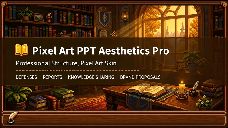 Slides
Pixel Game PPT Designer Pro
Who says professional PPTs have to be white backgrounds, black text, blue-gray colors, and cookie-cutter templates? If you love games, adore pixel art, and happen to need a thesis defense, report, knowledge sharing session, or brand proposal—then you have to try this. Pixel Game PPT Aesthetic Designer Pro does one simple thing: the skeleton is professional, the skin is pixel. It doesn't just make a "pixel-style creative PPT"; it makes a serious PPT that's fit for any professional occasion—only this one wears a 16-bit pixel game aesthetic coat. Core design philosophy: Separate skeleton and skin. Information architecture, visual flow, and page templates stick to professional norms; colors, borders, icons, and decorations adhere to universal pixel game aesthetics. Text is never pixelated, ensuring readability within 0.8 seconds. Pixel elements only appear in backgrounds, borders, icons, and decorative accents. No game-specific symbols are used—only cross-game universal symbols like candles, books, coins, stars, hearts, and crystals—so any pixel fan can use it. 🎮 How to use? Two modes, choose as needed: ① Direct Generation (2 steps): Enter topic/materials → AI confirms framework → Full output. Ideal for everyday scenarios with tight deadlines and moderate text requirements. ② Fine Mode (3 steps, saves credits): Enter topic/materials → AI confirms framework → Confirm text per slide → Full output. Finalize text per slide before generating images—avoids wasting credits on regenerating due to text errors. Use this for important occasions to control content and save credits. 🏰 Four professional scenarios with adaptive immersion depth: Academic Defense — Light immersion mainly, medium immersion on cover, deep immersion anchor points on data pages. Judges get it at a glance, and key pages make an impression. Work Reports — Light immersion plus medium immersion on metrics pages; risk pages stay non-pixelated. Bosses see professionalism, colleagues remember the style. Knowledge Sharing — Medium immersion mainly plus deep immersion on synthesis recipes. Replace boring flowcharts with "synthesis recipes" so knowledge sticks like game items. Brand Proposals — Adapts to brand temperature: cool brands get restrained pixel use, warm brands embrace the scene. 🎨 What you'll get: ① A complete pixel-style professional PPT (YouMind Slides format, editable online—text, layout, page order—change anytime. Edit within YouMind, then export locally as images.) ② A three-layer pixel wood border system (#5C3A1E outer ring + #8B5E3C inner ring + #F5E6D3 fill, unified visual language across the deck) ③ Exclusive synthesis recipe infographic (ingredient grid → synthesis circle → result grid, replacing traditional flowcharts with a visual anchor that RPG players instantly understand) ④ Adaptive immersion rhythm across four scenarios (not every page crammed with pixels—heavy where needed, light where not) ⑤ Dual-mode design (direct generation for daily use, fine mode for important occasions—finalize text first, then generate images to save credits) 399 credits. Give your professional content a 16-bit armor. Anyone who loves pixel art knows its worth.
 Slides
White Space | Minimalist PPT
"White Space" is a Skill specifically designed to generate minimalist research report slides. Upload Word, PDF, web pages, data tables, research materials, or old PPTs, and it will convert them into an editable PPT with a cool white background, black-gray text, generous white space, thin line separators, and a touch of deep red accents. It automatically completes: · Reading and organizing raw materials · Extracting core conclusions from the report · Building a complete presentation storyline · Generating conclusion-style titles with one point per page · Redrawing native editable data charts · Unifying fonts, colors, margins, and page grids · Controlling text and chart density per page · Adding page numbers, dates, and data sources · Outputting actually editable Slides By default, it uses a 16:9 aspect ratio, with visual features including: · Cool white background · Black-gray text · Single deep red accent color · All left-aligned · Generous white space · Minimalist architectural geometry · At most two fonts throughout · Charts and shapes are fully editable Suitable for industry research, market analysis, business presentations, strategic plans, course reports, graduation defenses, and management reports. Simply upload your materials and describe the presentation scenario to generate a clean, professional, directly editable and presentable minimalist PPT.
 Slides
Hand-Drawn Whiteboard Slides
Transform your topic content, articles, knowledge points, or course copy into a set of creative and warm hand-drawn whiteboard style Slides. Whether you need to present key ideas, teaching content, or share personal insights, we can refine them and present them in a fresh, lively visual form. This skill excels at simplifying complex information. Each Slide revolves around a core topic, accompanied by vivid hand-drawn illustrations and clear, concise key points. We simulate the feel of a teacher writing on a digital whiteboard in class, using a light blue screen background, red and blue handwritten titles, and hand-drawn elements like stars and hearts to make learning and sharing more fun and engaging. Whether it's quote interpretation, method steps, science popularization, parent-child education, inspirational growth, or AI technology topics, this skill automatically matches the most suitable visual expression. The final Slides will be in 16:9 landscape format, with natural handwriting-style fonts, soft colors, and a unified overall style, making your content both professional and approachable, like warm and interesting knowledge cards.
Technological and futuristic style PPT
Featured by
nene@YouMind.AI
Why we love this skill
Want to create a stunning presentation for your innovative ideas? This skill transforms you into a top Silicon Valley visual director, tailoring futuristic PowerPoint presentations around the core concept of "Technology meets Humanity." It not only provides narrative structure and visual guidelines but also seamlessly blends cutting-edge technology with humanistic concerns through glowing elements, dynamic effects, and data visualization, presenting an immersive future experience.
Description
Design presentations like a Silicon Valley director. Generate futuristic PPTs with a single click, using a narrative of "technology meeting humanity" to wow the audience and inspire endless possibilities.
Related Skills
View allSlidesPixel Game PPT Designer Pro
Who says professional PPTs have to be white backgrounds, black text, blue-gray colors, and cookie-cutter templates? If you love games, adore pixel art, and happen to need a thesis defense, report, knowledge sharing session, or brand proposal—then you have to try this. Pixel Game PPT Aesthetic Designer Pro does one simple thing: the skeleton is professional, the skin is pixel. It doesn't just make a "pixel-style creative PPT"; it makes a serious PPT that's fit for any professional occasion—only this one wears a 16-bit pixel game aesthetic coat. Core design philosophy: Separate skeleton and skin. Information architecture, visual flow, and page templates stick to professional norms; colors, borders, icons, and decorations adhere to universal pixel game aesthetics. Text is never pixelated, ensuring readability within 0.8 seconds. Pixel elements only appear in backgrounds, borders, icons, and decorative accents. No game-specific symbols are used—only cross-game universal symbols like candles, books, coins, stars, hearts, and crystals—so any pixel fan can use it. 🎮 How to use? Two modes, choose as needed: ① Direct Generation (2 steps): Enter topic/materials → AI confirms framework → Full output. Ideal for everyday scenarios with tight deadlines and moderate text requirements. ② Fine Mode (3 steps, saves credits): Enter topic/materials → AI confirms framework → Confirm text per slide → Full output. Finalize text per slide before generating images—avoids wasting credits on regenerating due to text errors. Use this for important occasions to control content and save credits. 🏰 Four professional scenarios with adaptive immersion depth: Academic Defense — Light immersion mainly, medium immersion on cover, deep immersion anchor points on data pages. Judges get it at a glance, and key pages make an impression. Work Reports — Light immersion plus medium immersion on metrics pages; risk pages stay non-pixelated. Bosses see professionalism, colleagues remember the style. Knowledge Sharing — Medium immersion mainly plus deep immersion on synthesis recipes. Replace boring flowcharts with "synthesis recipes" so knowledge sticks like game items. Brand Proposals — Adapts to brand temperature: cool brands get restrained pixel use, warm brands embrace the scene. 🎨 What you'll get: ① A complete pixel-style professional PPT (YouMind Slides format, editable online—text, layout, page order—change anytime. Edit within YouMind, then export locally as images.) ② A three-layer pixel wood border system (#5C3A1E outer ring + #8B5E3C inner ring + #F5E6D3 fill, unified visual language across the deck) ③ Exclusive synthesis recipe infographic (ingredient grid → synthesis circle → result grid, replacing traditional flowcharts with a visual anchor that RPG players instantly understand) ④ Adaptive immersion rhythm across four scenarios (not every page crammed with pixels—heavy where needed, light where not) ⑤ Dual-mode design (direct generation for daily use, fine mode for important occasions—finalize text first, then generate images to save credits) 399 credits. Give your professional content a 16-bit armor. Anyone who loves pixel art knows its worth.
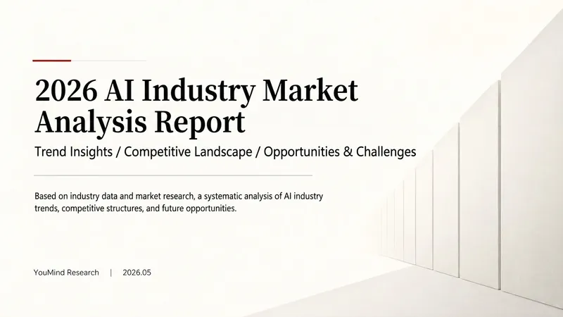
SlidesWhite Space | Minimalist PPT
"White Space" is a Skill specifically designed to generate minimalist research report slides. Upload Word, PDF, web pages, data tables, research materials, or old PPTs, and it will convert them into an editable PPT with a cool white background, black-gray text, generous white space, thin line separators, and a touch of deep red accents. It automatically completes: · Reading and organizing raw materials · Extracting core conclusions from the report · Building a complete presentation storyline · Generating conclusion-style titles with one point per page · Redrawing native editable data charts · Unifying fonts, colors, margins, and page grids · Controlling text and chart density per page · Adding page numbers, dates, and data sources · Outputting actually editable Slides By default, it uses a 16:9 aspect ratio, with visual features including: · Cool white background · Black-gray text · Single deep red accent color · All left-aligned · Generous white space · Minimalist architectural geometry · At most two fonts throughout · Charts and shapes are fully editable Suitable for industry research, market analysis, business presentations, strategic plans, course reports, graduation defenses, and management reports. Simply upload your materials and describe the presentation scenario to generate a clean, professional, directly editable and presentable minimalist PPT.
SlidesHand-Drawn Whiteboard Slides
Transform your topic content, articles, knowledge points, or course copy into a set of creative and warm hand-drawn whiteboard style Slides. Whether you need to present key ideas, teaching content, or share personal insights, we can refine them and present them in a fresh, lively visual form. This skill excels at simplifying complex information. Each Slide revolves around a core topic, accompanied by vivid hand-drawn illustrations and clear, concise key points. We simulate the feel of a teacher writing on a digital whiteboard in class, using a light blue screen background, red and blue handwritten titles, and hand-drawn elements like stars and hearts to make learning and sharing more fun and engaging. Whether it's quote interpretation, method steps, science popularization, parent-child education, inspirational growth, or AI technology topics, this skill automatically matches the most suitable visual expression. The final Slides will be in 16:9 landscape format, with natural handwriting-style fonts, soft colors, and a unified overall style, making your content both professional and approachable, like warm and interesting knowledge cards.
Find your next favorite skill
Explore more curated AI skills for research, creation, and everyday work.