PPT estilo revista creativa
Seleccionado por
nene@YouMind.AI
Por qué recomendamos esta habilidad
Esta habilidad trae al director de arte de las revistas creativas internacionales a tu pantalla para crear presentaciones visualmente impactantes a tu medida. Combina de forma innovadora la estética del diseño editorial con la narración digital, ofreciendo no solo un diseño exquisito sino también la filosofía 'El diseño editorial se encuentra con la narración digital', haciendo que tu presentación no sea una simple diapositiva, sino una historia visual cautivadora.
Descripción
Diseña presentaciones como un director de arte internacional, fusionando la estética de revista con la narrativa digital, con cada página llena de impacto visual para transformar tu contenido en una obra de arte al instante.
Habilidades relacionadas
Ver todo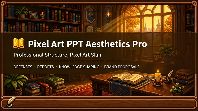 Diapositivas
Diseñador Pro PPT Pixel
¿Quién dice que un PPT profesional tiene que ser fondo blanco, texto negro, colores azul grisáceo y plantillas repetitivas? Si te gustan los juegos, amas el estilo pixel y necesitas hacer una defensa de tesis, presentación, charla de conocimiento o propuesta de marca, entonces debes probar esto. El Pro Diseñador de Estética PPT Pixel hace algo simple: el esqueleto es fiel a lo profesional, la piel es fiel al pixel. No se trata de hacerte un "PPT creativo de estilo pixel", sino un PPT serio que puedas usar en cualquier contexto profesional, solo que este PPT lleva un abrigo estético de juegos pixel de 16 bits. Filosofía de diseño central: separación del esqueleto y la piel. La arquitectura de información, la línea visual y las plantillas de página son fieles a las normas profesionales de la escena; los colores, bordes, iconos y decoraciones son fieles a la estética universal de juegos pixel. El texto nunca se pixeliza, garantizando legibilidad en 0.8 segundos; los elementos pixel solo aparecen en fondos, bordes, iconos y decoraciones de ambiente. No se usan símbolos exclusivos de ningún juego en particular, solo símbolos universales entre juegos: velas, libros, monedas, estrellas, corazones, cristales, para que cualquiera que ame el estilo pixel pueda usarlo. 🎮 ¿Cómo usarlo? Dos modos, elige según necesidad: ① Modo de generación directa (2 pasos): Ingresa tema/material → AI extrae marco y confirma → genera todas las imágenes. Ideal para escenarios cotidianos con poco tiempo y bajos requisitos de contenido textual. ② Modo detallado (3 pasos, ahorra créditos): Ingresa tema/material → AI extrae marco y confirma → confirma texto página por página → genera todas las imágenes. Primero finaliza el texto de cada página, luego genera todas las imágenes de una vez, evitando el desperdicio de créditos al tener que rehacer después de generadas las imágenes. Usa esto para ocasiones importantes, controlas el contenido y ahorras. 🏰 Cuatro escenarios profesionales con profundidad de permeación adaptativa: Defensa académica — principalmente permeación superficial, permeación media en portada, permeación profunda en páginas de datos. Los evaluadores lo entienden de un vistazo, y al pasar a las páginas clave se sorprenden. Informe de trabajo — permeación superficial + permeación media en páginas de indicadores, páginas de riesgo no pixeladas. El jefe ve profesionalismo, los colegas recuerdan el estilo. Charlas de conocimiento — principalmente permeación media + permeación profunda con recetas de combinación. Usa 'recetas de combinación' para reemplazar diagramas de flujo aburridos, haciendo que los puntos de conocimiento se recuerden como objetos de juego. Propuesta de marca — se adapta según la temperatura de la marca. Marcas frías moderan el pixel, marcas cálidas abrazan la escena. 🎨 ¿Qué obtienes? ① Un PPT profesional completo de estilo pixel (formato YouMind Slides, editable en el editor en línea: texto, diseño, orden de páginas, puedes cambiarlo cuando quieras. Se recomienda completar todas las ediciones en YouMind; al exportar localmente será en formato de imagen). ② Sistema de bordes de madera pixel de tres capas (exterior #5C3A1E + interior #8B5E3C + relleno #F5E6D3, lenguaje visual unificado en todo el documento). ③ Infografía de recetas de combinación original (cuadrícula de ingredientes → círculo de combinación → cuadrícula de producto final, reemplaza diagramas de flujo tradicionales, punto visual que los jugadores de RPG entienden al instante). ④ Ritmo de permeación adaptativa para cuatro escenarios (no saturar todas las páginas con pixel, sino intensificar donde corresponde). ⑤ Diseño de doble modo (generación directa para uso diario, refinamiento detallado para ocasiones importantes, primero finalizar el texto y luego generar imágenes para ahorrar créditos). 399 créditos, para que tu contenido profesional se vista con una armadura de 16 bits. Los que aman el estilo pixel saben cuánto vale esta armadura.
 Diapositivas
Blanco | PPT informe mínimo
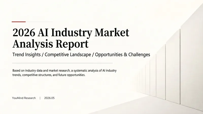
“Blanco” es un Skill diseñado para generar diapositivas de informes de investigación minimalistas. Sube documentos de Word, PDF, páginas web, hojas de datos, materiales de investigación o PPT antiguos, y se convertirán en un PPT editable con fondo blanco frío, texto gris oscuro, amplios espacios en blanco, líneas finas de separación y pocos acentos en rojo oscuro. Realiza automáticamente: · Leer y organizar el material original · Extraer las conclusiones clave del informe · Construir una línea narrativa completa para la presentación · Generar títulos de conclusión con una idea por diapositiva · Redibujar gráficos de datos editables nativos · Unificar fuentes, colores, márgenes y la cuadrícula de la página · Controlar la densidad de texto y gráficos en cada diapositiva · Agregar números de página, fecha y fuentes de datos · Generar Slides realmente editables Por defecto, usa relación de aspecto 16:9, y sus características visuales incluyen: · Fondo blanco frío · Texto gris oscuro · Un solo color de acento rojo oscuro · Todo alineado a la izquierda · Amplios espacios en blanco · Geometría arquitectónica minimalista · Como máximo dos tipos de fuentes · Gráficos y formas editables Es adecuado para investigaciones sectoriales, análisis de mercado, informes comerciales, planes estratégicos, informes de cursos, defensas de tesis y presentaciones para la dirección. Basta con subir el material y describir el escenario de la presentación para obtener un PPT minimalista, limpio, profesional, listo para modificar y presentar.
 Diapositivas
Slides pizarra blanca a mano
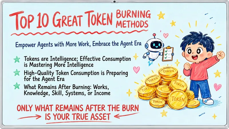
Convierta su contenido temático, artículos, puntos de conocimiento o textos de cursos en un conjunto de Slides creativos y cálidos con estilo de 'pizarra blanca digital dibujada a mano'. Ya sea que necesite presentar ideas clave, contenido educativo o compartir reflexiones personales, podemos destilarlo y mostrarlo en una forma visual fresca y animada. Esta habilidad se especializa en simplificar información compleja: cada Slide se centra en un tema central, acompañada de ilustraciones vívidas dibujadas a mano y puntos de conocimiento claros. Simulamos la sensación de una pizarra blanca en el aula, con fondo azul claro, títulos escritos a mano en rojo y azul, y elementos dibujados a mano como estrellas y corazones, haciendo que el aprendizaje y el intercambio sean más fáciles y divertidos. Ya sea interpretación de citas, métodos y pasos, divulgación científica, educación familiar, crecimiento motivacional o temas de tecnología AI, esta habilidad elige automáticamente la expresión visual más adecuada. Los Slides finales tienen formato horizontal 16:9, con fuentes de escritura a mano natural, colores suaves y un estilo unificado, haciendo que su contenido sea profesional y accesible, como tarjetas de conocimiento cálidas y divertidas.
PPT estilo revista creativa
Seleccionado por
nene@YouMind.AI
Por qué recomendamos esta habilidad
Esta habilidad trae al director de arte de las revistas creativas internacionales a tu pantalla para crear presentaciones visualmente impactantes a tu medida. Combina de forma innovadora la estética del diseño editorial con la narración digital, ofreciendo no solo un diseño exquisito sino también la filosofía 'El diseño editorial se encuentra con la narración digital', haciendo que tu presentación no sea una simple diapositiva, sino una historia visual cautivadora.
Descripción
Diseña presentaciones como un director de arte internacional, fusionando la estética de revista con la narrativa digital, con cada página llena de impacto visual para transformar tu contenido en una obra de arte al instante.
Habilidades relacionadas
Ver todoDiapositivasDiseñador Pro PPT Pixel
¿Quién dice que un PPT profesional tiene que ser fondo blanco, texto negro, colores azul grisáceo y plantillas repetitivas? Si te gustan los juegos, amas el estilo pixel y necesitas hacer una defensa de tesis, presentación, charla de conocimiento o propuesta de marca, entonces debes probar esto. El Pro Diseñador de Estética PPT Pixel hace algo simple: el esqueleto es fiel a lo profesional, la piel es fiel al pixel. No se trata de hacerte un "PPT creativo de estilo pixel", sino un PPT serio que puedas usar en cualquier contexto profesional, solo que este PPT lleva un abrigo estético de juegos pixel de 16 bits. Filosofía de diseño central: separación del esqueleto y la piel. La arquitectura de información, la línea visual y las plantillas de página son fieles a las normas profesionales de la escena; los colores, bordes, iconos y decoraciones son fieles a la estética universal de juegos pixel. El texto nunca se pixeliza, garantizando legibilidad en 0.8 segundos; los elementos pixel solo aparecen en fondos, bordes, iconos y decoraciones de ambiente. No se usan símbolos exclusivos de ningún juego en particular, solo símbolos universales entre juegos: velas, libros, monedas, estrellas, corazones, cristales, para que cualquiera que ame el estilo pixel pueda usarlo. 🎮 ¿Cómo usarlo? Dos modos, elige según necesidad: ① Modo de generación directa (2 pasos): Ingresa tema/material → AI extrae marco y confirma → genera todas las imágenes. Ideal para escenarios cotidianos con poco tiempo y bajos requisitos de contenido textual. ② Modo detallado (3 pasos, ahorra créditos): Ingresa tema/material → AI extrae marco y confirma → confirma texto página por página → genera todas las imágenes. Primero finaliza el texto de cada página, luego genera todas las imágenes de una vez, evitando el desperdicio de créditos al tener que rehacer después de generadas las imágenes. Usa esto para ocasiones importantes, controlas el contenido y ahorras. 🏰 Cuatro escenarios profesionales con profundidad de permeación adaptativa: Defensa académica — principalmente permeación superficial, permeación media en portada, permeación profunda en páginas de datos. Los evaluadores lo entienden de un vistazo, y al pasar a las páginas clave se sorprenden. Informe de trabajo — permeación superficial + permeación media en páginas de indicadores, páginas de riesgo no pixeladas. El jefe ve profesionalismo, los colegas recuerdan el estilo. Charlas de conocimiento — principalmente permeación media + permeación profunda con recetas de combinación. Usa 'recetas de combinación' para reemplazar diagramas de flujo aburridos, haciendo que los puntos de conocimiento se recuerden como objetos de juego. Propuesta de marca — se adapta según la temperatura de la marca. Marcas frías moderan el pixel, marcas cálidas abrazan la escena. 🎨 ¿Qué obtienes? ① Un PPT profesional completo de estilo pixel (formato YouMind Slides, editable en el editor en línea: texto, diseño, orden de páginas, puedes cambiarlo cuando quieras. Se recomienda completar todas las ediciones en YouMind; al exportar localmente será en formato de imagen). ② Sistema de bordes de madera pixel de tres capas (exterior #5C3A1E + interior #8B5E3C + relleno #F5E6D3, lenguaje visual unificado en todo el documento). ③ Infografía de recetas de combinación original (cuadrícula de ingredientes → círculo de combinación → cuadrícula de producto final, reemplaza diagramas de flujo tradicionales, punto visual que los jugadores de RPG entienden al instante). ④ Ritmo de permeación adaptativa para cuatro escenarios (no saturar todas las páginas con pixel, sino intensificar donde corresponde). ⑤ Diseño de doble modo (generación directa para uso diario, refinamiento detallado para ocasiones importantes, primero finalizar el texto y luego generar imágenes para ahorrar créditos). 399 créditos, para que tu contenido profesional se vista con una armadura de 16 bits. Los que aman el estilo pixel saben cuánto vale esta armadura.
DiapositivasBlanco | PPT informe mínimo
“Blanco” es un Skill diseñado para generar diapositivas de informes de investigación minimalistas. Sube documentos de Word, PDF, páginas web, hojas de datos, materiales de investigación o PPT antiguos, y se convertirán en un PPT editable con fondo blanco frío, texto gris oscuro, amplios espacios en blanco, líneas finas de separación y pocos acentos en rojo oscuro. Realiza automáticamente: · Leer y organizar el material original · Extraer las conclusiones clave del informe · Construir una línea narrativa completa para la presentación · Generar títulos de conclusión con una idea por diapositiva · Redibujar gráficos de datos editables nativos · Unificar fuentes, colores, márgenes y la cuadrícula de la página · Controlar la densidad de texto y gráficos en cada diapositiva · Agregar números de página, fecha y fuentes de datos · Generar Slides realmente editables Por defecto, usa relación de aspecto 16:9, y sus características visuales incluyen: · Fondo blanco frío · Texto gris oscuro · Un solo color de acento rojo oscuro · Todo alineado a la izquierda · Amplios espacios en blanco · Geometría arquitectónica minimalista · Como máximo dos tipos de fuentes · Gráficos y formas editables Es adecuado para investigaciones sectoriales, análisis de mercado, informes comerciales, planes estratégicos, informes de cursos, defensas de tesis y presentaciones para la dirección. Basta con subir el material y describir el escenario de la presentación para obtener un PPT minimalista, limpio, profesional, listo para modificar y presentar.
DiapositivasSlides pizarra blanca a mano
Convierta su contenido temático, artículos, puntos de conocimiento o textos de cursos en un conjunto de Slides creativos y cálidos con estilo de 'pizarra blanca digital dibujada a mano'. Ya sea que necesite presentar ideas clave, contenido educativo o compartir reflexiones personales, podemos destilarlo y mostrarlo en una forma visual fresca y animada. Esta habilidad se especializa en simplificar información compleja: cada Slide se centra en un tema central, acompañada de ilustraciones vívidas dibujadas a mano y puntos de conocimiento claros. Simulamos la sensación de una pizarra blanca en el aula, con fondo azul claro, títulos escritos a mano en rojo y azul, y elementos dibujados a mano como estrellas y corazones, haciendo que el aprendizaje y el intercambio sean más fáciles y divertidos. Ya sea interpretación de citas, métodos y pasos, divulgación científica, educación familiar, crecimiento motivacional o temas de tecnología AI, esta habilidad elige automáticamente la expresión visual más adecuada. Los Slides finales tienen formato horizontal 16:9, con fuentes de escritura a mano natural, colores suaves y un estilo unificado, haciendo que su contenido sea profesional y accesible, como tarjetas de conocimiento cálidas y divertidas.
Encuentra tu próxima habilidad favorita
Explora más habilidades de IA seleccionadas para investigación, creación y trabajo cotidiano.