Visual Diagrams
Visual Diagrams
Showcase
Description
Clarify complex information with a single diagram. Intelligently identify structural relationships and automatically generate accurate, intuitive visual diagrams.
Related Skills
View all
9D Visual Deconstruction
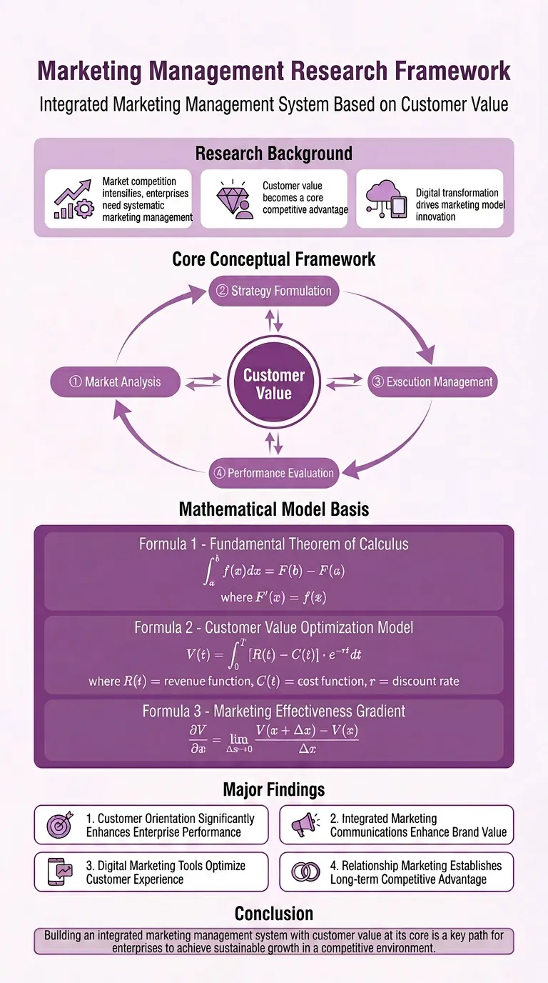
Break down one or more infographics, data visualizations, flowcharts, timelines, maps, knowledge graphs, and organizational charts into reusable visual and information structures. Understand precisely why an image is organized the way it is and reconstruct a similar communicative effect. The skill examines spatial composition, dimensionality and materials, color hierarchy, typography and layout, and module relationships, while also identifying chart encodings, reading paths, visual-symbol metaphors, and geographic or network relationships—so the analysis goes beyond simply describing what the style resembles. You will receive a parameterized visual deconstruction covering the canvas and compositional logic, visual hierarchy, text density, module topology, ways of expressing data and relationships, and the narrative flow within the image. For statistical charts, maps, and relationship networks, the output focuses on how data is mapped to visual variables such as color, position, size, connecting lines, and nodes. For complex subject-specific visuals, it further organizes the coordinated relationships among graphics, text, and metaphor systems. Based on this analysis, the skill generates detailed, clearly structured English image-generation prompts suitable for infographic recreation, visual research, design reference, brand content exploration, and concept development. Whether you provide an existing image or an idea for a theme and visual direction, you will receive prompts aimed at reproducing the underlying structure—not just a vague description of the style.
 Image
ImageResearch Paper Infographic
Easily transform your scientific research paper content into professional, high-definition academic infographics. Supports 18 mainstream types, making complex research results clear at a glance. Whether showcasing core mechanisms, experimental workflows, or creating graphical abstracts and technical roadmaps, this tool delivers precise results. We understand the rigor required in scientific illustrations, so beyond visual appeal, we prioritize scientific accuracy to ensure every image is clear and free of misleading information. You can directly provide the full paper, key sections, or a research description, and select the most suitable graph type, such as intracellular mechanism diagrams, tumor immune microenvironment diagrams, material catalysis mechanism diagrams, etc. We also offer a variety of color schemes like blue-green, orange, purple, and chart structure styles like left-label and vertical flow, making your infographics both academically compliant and professionally aesthetic. Beyond traditional academic graph types, this tool also supports 15 creative templates for scientific visualization scenarios, helping you turn research concepts into unique visual works such as magazine-quality posters, interface breakdowns, app design boards, etc., suitable for group meetings, social media, or report covers. We provide a strict controllability checklist and a three-step verification process, and support partial modifications to generated images, ensuring every step closely matches your needs, presenting your research results in the most intuitive and accurate way.
Minimal Explainer Diagram
Turn selected text, articles, files, or project information into a clear, compact explainer diagram. It extracts key nodes and relationships to help you organize processes, hierarchies, comparisons, timelines, or connections between different approaches. It’s suited to project presentations, team communication, content summaries, and organizing ideas. You can specify the diagram type, focus, layout direction, or accent color. Or simply provide the material, and it will determine a suitable way to present the content. It supports flowcharts, structure diagrams, comparison diagrams, timelines, and solution relationship diagrams. Before drawing, it lets you confirm the diagram type, layout, and colors to help prevent misunderstandings about the information’s focus. The finished diagram uses a white background, generous whitespace, fine lines, and flat geometric shapes, with a single low-saturation accent color. Short node labels and clear connecting lines show the relationships. It doesn’t crowd the original text or add people and decorative illustrations, so readers can quickly understand the content structure without first reading lengthy explanations.
Information
- Version
- v1
- Last updated
- Runtime credits
- Usage-based
- Models
- Nano Banana 2
- Capabilities
- Web research
