DataCanvas
Description
Data speaks for itself; it just needs a stage. DataCanvas automatically transforms your CSV/Excel/JSON data into professional-grade visual analysis reports. Inspired by the anti-AI aesthetic philosophy of the 11k-star project huashu-design (banning purple gradients, emoji decorations, and bento grids), all charts are hand-coded in pure SVG without relying on any external JS libraries. It includes 6 report templates (Daily/Weekly Operations, Competitor Comparison, User Profiles, Investment Analysis, Free Report) x 5 design styles (Information Architecture, Oriental Minimalism, Swiss Grid, Dark Data, Business Classic), supporting over 20 chart types. From data upload to polished report, everything is automated: data cleaning, statistical analysis, trend insights, chart generation — all in one go.
Related Skills
View all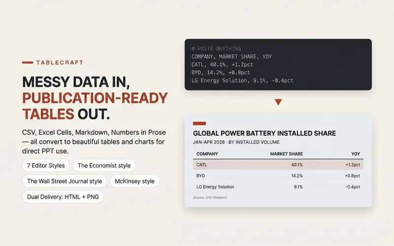 Slides
TableCraft
Transforms raw table data into professional, beautiful publication-grade charts, eliminating the hassle of manual formatting. Whether your data is in CSV, JSON, Markdown tables, directly pasted spreadsheet cells, or any other tabulable text, this tool intelligently parses and identifies header and numeric columns to ensure accurate data presentation. You can choose from seven carefully designed styles, including The Economist, The Wall Street Journal, Financial Times, McKinsey, Instagram social style, minimalist modern, and high-end dark. Each style has its own unique character and is suitable for different scenarios. Whether for financial reports, market analysis, corporate presentations, or social media posts, you will find the most fitting visual presentation. Just provide the data, and the tool automatically generates high-quality HTML files and PPT-ready PNG images, making your tables stand out in presentations, reports, or social posts. For complex situations like wide tables, long text, or mixed number formats, it also provides smart suggestions to ensure a flawless final result. Complementary tools: For infographics beyond tables, find "Infographic Maker"; for turning key points into card sets, find "Knowledge Card Generator Workshop".
 Image
ImageInfographic Maker
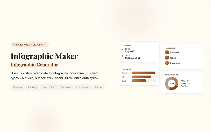
Easily turn any article, table, link, or casual note into a professional infographic, making your data and insights stand out. Whether it's a single poster or a multi-page carousel, this tool intelligently identifies content structure and automatically extracts key information—no manual formatting required. Choose from six chart types: timeline, flowchart, ranking, proportion, comparison, or funnel, and pair them with visual styles like Business Blue, Creative Color, Dark Tech, Elegant Warm, Minimalist Black & White, or Xiaohongshu-exclusive styles. We specially support Chinese content and brand colors to ensure visuals are both professional and aligned with your brand identity. Whether for annual reports, social media (e.g., Xiaohongshu, Instagram, X), or study notes, this tool generates high-resolution PNG images in multiple sizes, helping your information spread in the most appealing way. Say goodbye to tedious design work—create stunning infographics with one click, letting data speak and stories come alive. Companion tools: For final drafts to be published on WeChat Official Accounts, look for '公众号排版器'; for data tables needing publication-grade formatting, look for 'TableCraft'; for quote card sets, look for '知识卡片生成工坊'.

Data Analysis Pipeline
📊 From raw Excel to reports with charts, all in one pipeline—no more jumping between multiple tools. 🔁 Four-stage analytical relay (AI automatically switches analysis style—no need to manually change models): 🧹 Data cleaning: automatically handles nulls, outliers, formatting, and duplicates, outputting clean tables 🔬 Deep analysis: descriptive statistics, correlation, attribution, trends, hypothesis testing, with supporting data evidence 📈 Visualization: automatically selects optimal chart types—2–4 core charts explained in one sentence 📝 Report writing: conclusion-first, well-structured analysis reports in Chinese, with actionable recommendations 👥 Use cases: business data analysis, operational reviews, financial reports, user behavior research, academic data exploration—any scenario where you need to turn tables into insights. 💡 Default output is Markdown reports, convertible to Word/PPT. Report style automatically adjusts based on the reader's role (manager/colleague/yourself).
DataCanvas
Description
Data speaks for itself; it just needs a stage. DataCanvas automatically transforms your CSV/Excel/JSON data into professional-grade visual analysis reports. Inspired by the anti-AI aesthetic philosophy of the 11k-star project huashu-design (banning purple gradients, emoji decorations, and bento grids), all charts are hand-coded in pure SVG without relying on any external JS libraries. It includes 6 report templates (Daily/Weekly Operations, Competitor Comparison, User Profiles, Investment Analysis, Free Report) x 5 design styles (Information Architecture, Oriental Minimalism, Swiss Grid, Dark Data, Business Classic), supporting over 20 chart types. From data upload to polished report, everything is automated: data cleaning, statistical analysis, trend insights, chart generation — all in one go.
Related Skills
View allSlidesTableCraft
Transforms raw table data into professional, beautiful publication-grade charts, eliminating the hassle of manual formatting. Whether your data is in CSV, JSON, Markdown tables, directly pasted spreadsheet cells, or any other tabulable text, this tool intelligently parses and identifies header and numeric columns to ensure accurate data presentation. You can choose from seven carefully designed styles, including The Economist, The Wall Street Journal, Financial Times, McKinsey, Instagram social style, minimalist modern, and high-end dark. Each style has its own unique character and is suitable for different scenarios. Whether for financial reports, market analysis, corporate presentations, or social media posts, you will find the most fitting visual presentation. Just provide the data, and the tool automatically generates high-quality HTML files and PPT-ready PNG images, making your tables stand out in presentations, reports, or social posts. For complex situations like wide tables, long text, or mixed number formats, it also provides smart suggestions to ensure a flawless final result. Complementary tools: For infographics beyond tables, find "Infographic Maker"; for turning key points into card sets, find "Knowledge Card Generator Workshop".
ImageInfographic Maker
Easily turn any article, table, link, or casual note into a professional infographic, making your data and insights stand out. Whether it's a single poster or a multi-page carousel, this tool intelligently identifies content structure and automatically extracts key information—no manual formatting required. Choose from six chart types: timeline, flowchart, ranking, proportion, comparison, or funnel, and pair them with visual styles like Business Blue, Creative Color, Dark Tech, Elegant Warm, Minimalist Black & White, or Xiaohongshu-exclusive styles. We specially support Chinese content and brand colors to ensure visuals are both professional and aligned with your brand identity. Whether for annual reports, social media (e.g., Xiaohongshu, Instagram, X), or study notes, this tool generates high-resolution PNG images in multiple sizes, helping your information spread in the most appealing way. Say goodbye to tedious design work—create stunning infographics with one click, letting data speak and stories come alive. Companion tools: For final drafts to be published on WeChat Official Accounts, look for '公众号排版器'; for data tables needing publication-grade formatting, look for 'TableCraft'; for quote card sets, look for '知识卡片生成工坊'.
Data Analysis Pipeline
📊 From raw Excel to reports with charts, all in one pipeline—no more jumping between multiple tools. 🔁 Four-stage analytical relay (AI automatically switches analysis style—no need to manually change models): 🧹 Data cleaning: automatically handles nulls, outliers, formatting, and duplicates, outputting clean tables 🔬 Deep analysis: descriptive statistics, correlation, attribution, trends, hypothesis testing, with supporting data evidence 📈 Visualization: automatically selects optimal chart types—2–4 core charts explained in one sentence 📝 Report writing: conclusion-first, well-structured analysis reports in Chinese, with actionable recommendations 👥 Use cases: business data analysis, operational reviews, financial reports, user behavior research, academic data exploration—any scenario where you need to turn tables into insights. 💡 Default output is Markdown reports, convertible to Word/PPT. Report style automatically adjusts based on the reader's role (manager/colleague/yourself).
Find your next favorite skill
Explore more curated AI skills for research, creation, and everyday work.