Xiaoxiaodong x Duotone x Print x P065
By Xiaoxiaodong
Description
Recommended by
淡苍
Why we love this skill
Selected for its disciplined use of the original creative brief, plus support for vertical, horizontal, pure-design, and multi-device wallpaper formats, with batch processing and per-image quality checks.
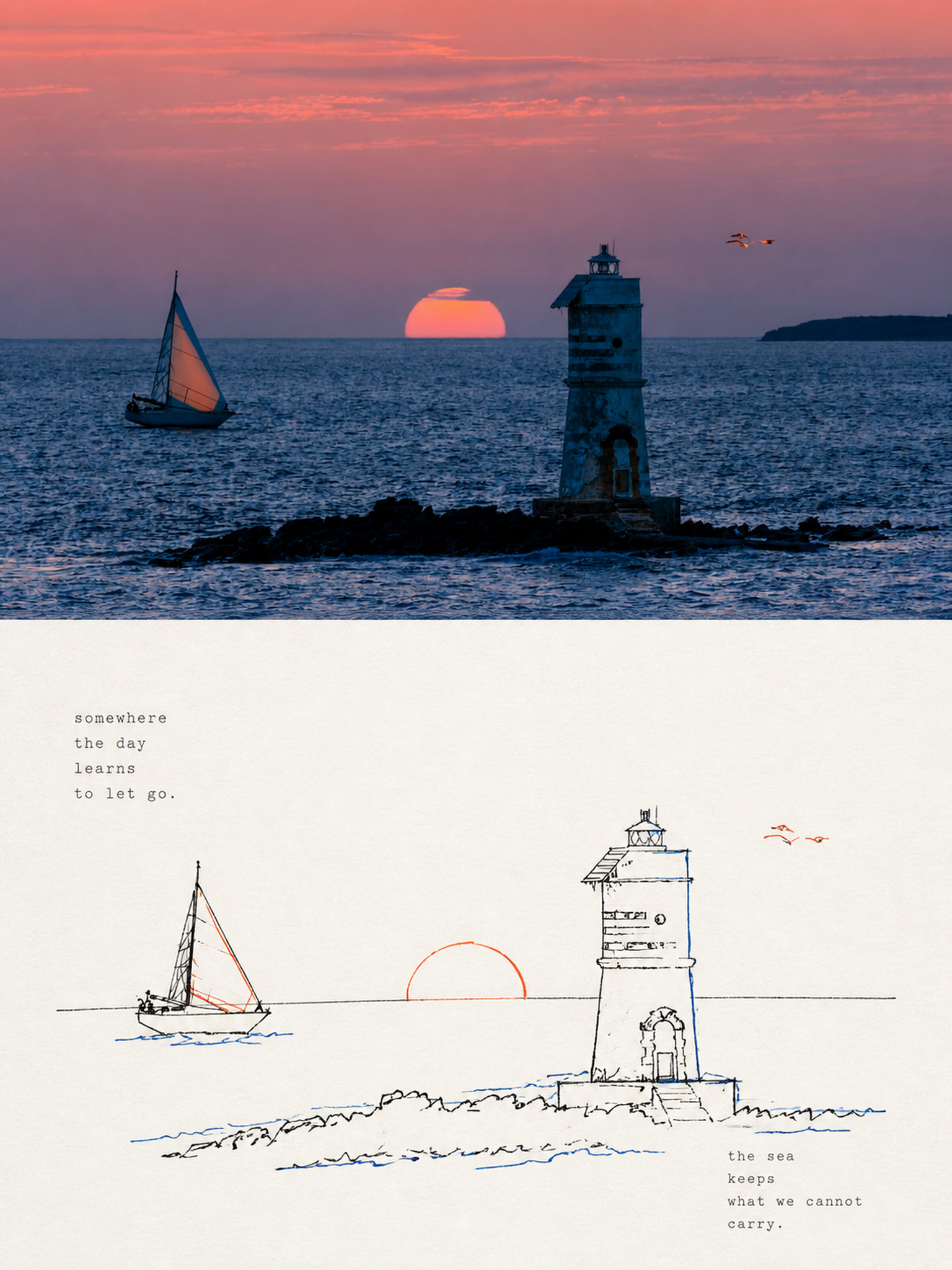
Core challenge: AI-generated color illustrations tend to overfill the image with color, making them look muddy and like flashy children’s doodles. They struggle to capture the restraint and refinement of niche independent prints with “only two-color overprinting and slight misregistration.” If you like the kind of duotone printed matter found in independent bookstores—using just a touch or two of color with a subtle sense of misalignment—these prompts are tuned for you. Rather than using large areas of flat color, they deconstruct your photo through highly avant-garde **“duotone line overprinting”**: ⚬ Black lines form the framework: slightly clumsy, shaky, interrupted pen-drawn lines trace the subject, even allowing lines to overshoot or remain partially open, completely leaving behind rigid vector outlines. ⚬ Exactly 2 extracted colors: AI selects two high-contrast colors from your original image—one cool and one warm, or one dark and one light—and turns them into colored contour lines. They run alongside, overlap, or shift slightly against the black lines, much like the small imperfections left by an antique printing press during color registration. ⚬ Light-colored paper and generous negative space: No complex backgrounds. The subject may be off-center, reduced in scale, or left floating, allowing the rough paper texture and expansive blank space to create the composition’s sense of air. ⚬ Letterpress typography with handcrafted irregularities: Paired with narrow vintage letterpress text, slightly loose tracking, and a subtly wavering baseline, like an intimate art poster that has been carefully typeset. Smart and restrained, with just a touch of dry humor and ease.
Related Skills
View all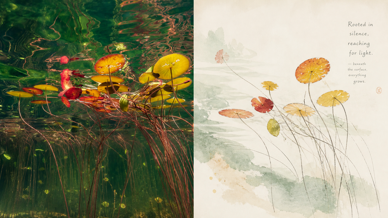 Image
ImageXiaoxiaodong x Freehand P068
Whenever someone hears “Chinese style” or “ink wash,” they reflexively cram in bold ink-and-color contrasts, dry landscape gardens, seals, cranes, and other piled-up symbols—both tacky and utterly lacking the breathing room of a modern publication. If you want to reimagine photos through an Eastern aesthetic, but strongly dislike the heavy ink and bright red-and-green look of something like a tourist souvenir, try this **“Contemporary Eastern Freehand Album”** approach. Its core logic is simple: convey the idea without showing every stroke, and leave room to breathe.
 Image
ImageXiaoxiaodong x Doodle x P067
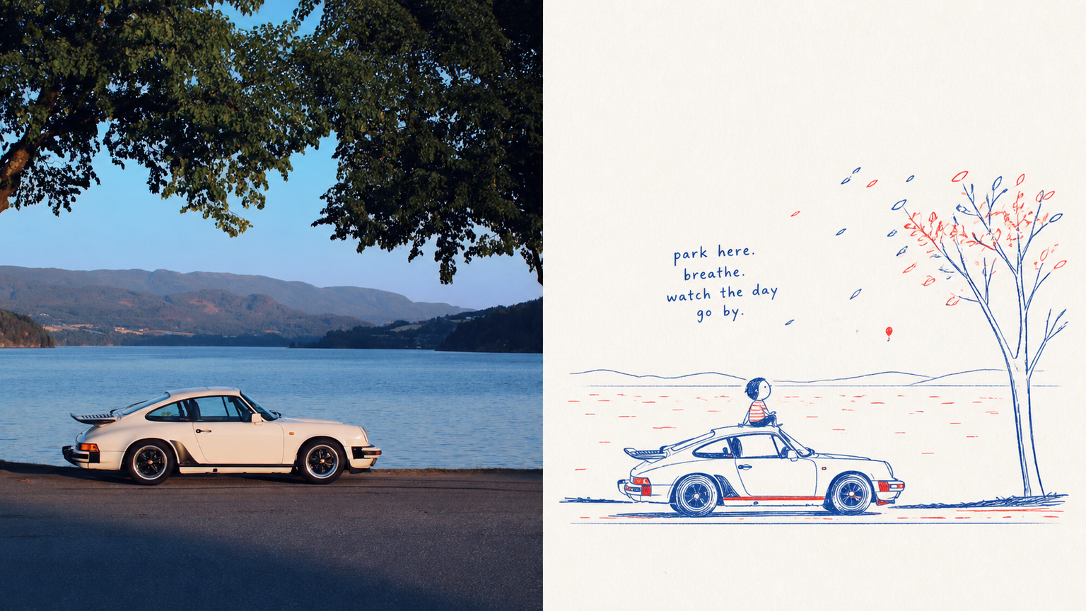
This prompt set captures the lively spirit of a sketch on scrap paper: ⚬ Pure red-and-blue ink: The entire image leaves out every other color, using only a vintage blue and tomato red with the texture of a ballpoint pen or crayon. The lines are fine, with slight signs of hand tremors and repeated tracing. The two colors are distributed unevenly, appearing naturally only in key contours and small areas of color. ⚬ One clear visual focal point: The background is deliberately not copied from the original image. Only the most essential action and expression are extracted, with room for a touch of innocent exaggeration in the proportions. The result is recognizable at a glance, yet much more humorous. ⚬ A clean, nearly white paper background: Broad areas of pure white space replace dirty, yellowed filters. Only a very subtle paper-fiber texture remains, keeping the image airy, as if it was just drawn. ⚬ A handwritten short phrase with baseline shifts: The text is no longer a rigid poster headline, but a childlike exclamation, sound effect, or conversational phrase written on the spur of the moment. Uneven strokes float in the empty space and naturally echo the red-and-blue arrows or small symbols. The upper half shows serious, realistic light and shadow; the lower half becomes a private observation notebook full of breathing room.
 Image
ImageXiaoxiaodong · P066 Color
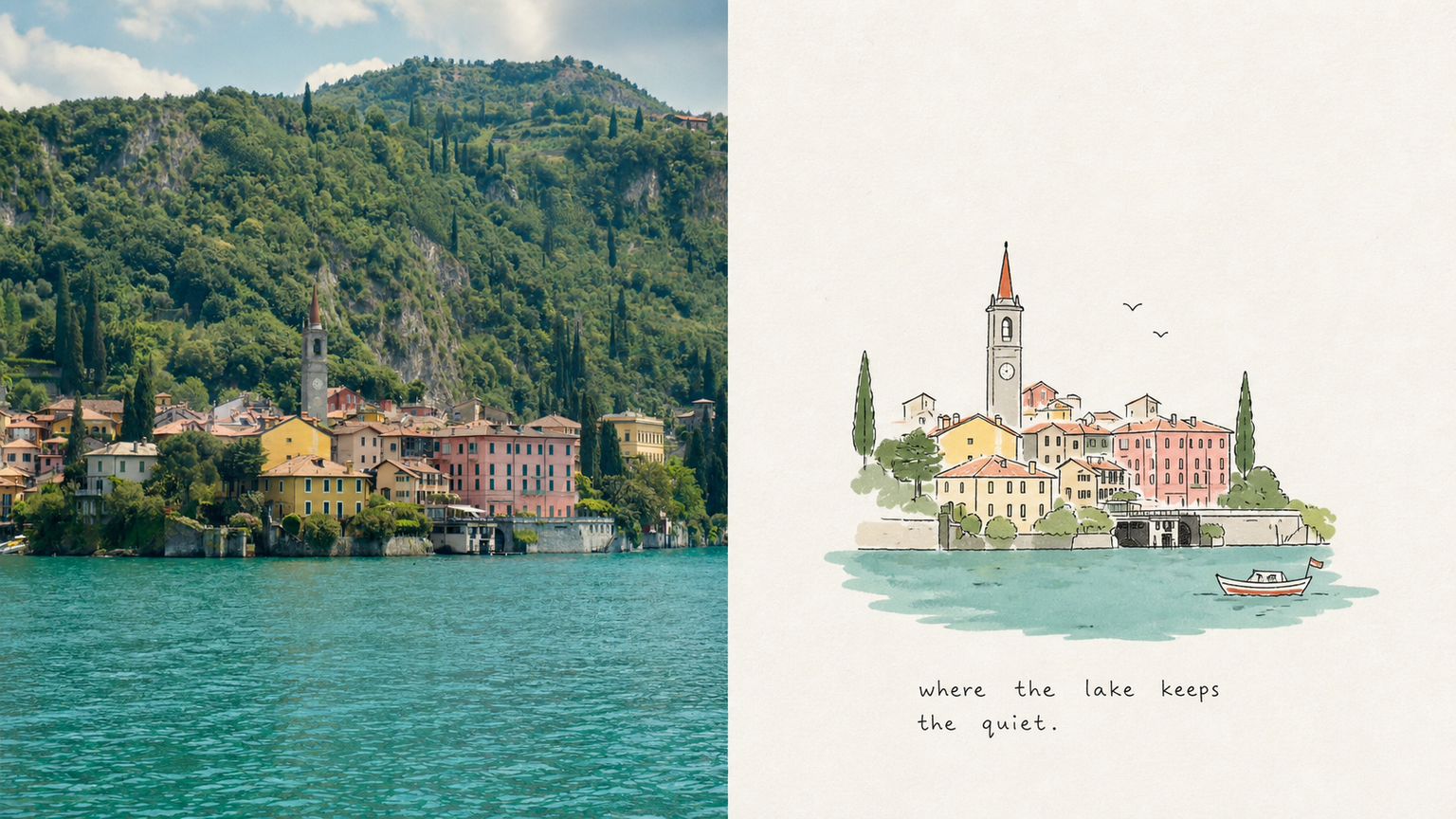
If you want to turn an everyday snapshot—such as a cat sunning itself by the roadside, two elderly people sitting side by side in a park, or a half-finished glass of water on a table—into a picture-book interior page with a childhood feel and an exceptionally refined finish, these prompts hit the mark. What makes this style so captivating is how it balances **“childlike innocence” with “art-director-level restraint in the layout”**: ⚬ Awkward yet deeply expressive lines: The subject is captured with fine, slightly wobbly hand-drawn black lines, complete with pauses and broken strokes. Clutter is left out, while complex buildings or people are simplified into charming, pure forms. ⚬ Low-saturation flat color blocks: Three to six of the most pleasing colors are drawn from the original image and blended into clear, soft flat color blocks. One or two bright primary colors add visual accents, keeping the result light and clean without ever applying a dingy, aged filter. ⚬ Generous white space that lets the image breathe: Against a very pale paper-textured background, the subject may be off-center, reduced in scale, or partially cropped. Ample space is left around it, making the image feel like a carefully edited visual essay rather than a child’s assignment covering the entire page. ⚬ Small handwritten notes that look casually written: Stiff commercial type is replaced with a short, naive handwritten phrase featuring slight writing imperfections. It follows the movement or settles naturally into the white space, like a spontaneous mood caption jotted down after finishing the drawing.
Xiaoxiaodong x Duotone x Print x P065
By Xiaoxiaodong
Description
Recommended by
淡苍
Why we love this skill
Selected for its disciplined use of the original creative brief, plus support for vertical, horizontal, pure-design, and multi-device wallpaper formats, with batch processing and per-image quality checks.
Core challenge: AI-generated color illustrations tend to overfill the image with color, making them look muddy and like flashy children’s doodles. They struggle to capture the restraint and refinement of niche independent prints with “only two-color overprinting and slight misregistration.” If you like the kind of duotone printed matter found in independent bookstores—using just a touch or two of color with a subtle sense of misalignment—these prompts are tuned for you. Rather than using large areas of flat color, they deconstruct your photo through highly avant-garde **“duotone line overprinting”**: ⚬ Black lines form the framework: slightly clumsy, shaky, interrupted pen-drawn lines trace the subject, even allowing lines to overshoot or remain partially open, completely leaving behind rigid vector outlines. ⚬ Exactly 2 extracted colors: AI selects two high-contrast colors from your original image—one cool and one warm, or one dark and one light—and turns them into colored contour lines. They run alongside, overlap, or shift slightly against the black lines, much like the small imperfections left by an antique printing press during color registration. ⚬ Light-colored paper and generous negative space: No complex backgrounds. The subject may be off-center, reduced in scale, or left floating, allowing the rough paper texture and expansive blank space to create the composition’s sense of air. ⚬ Letterpress typography with handcrafted irregularities: Paired with narrow vintage letterpress text, slightly loose tracking, and a subtly wavering baseline, like an intimate art poster that has been carefully typeset. Smart and restrained, with just a touch of dry humor and ease.
Related Skills
View allImageXiaoxiaodong x Freehand P068
Whenever someone hears “Chinese style” or “ink wash,” they reflexively cram in bold ink-and-color contrasts, dry landscape gardens, seals, cranes, and other piled-up symbols—both tacky and utterly lacking the breathing room of a modern publication. If you want to reimagine photos through an Eastern aesthetic, but strongly dislike the heavy ink and bright red-and-green look of something like a tourist souvenir, try this **“Contemporary Eastern Freehand Album”** approach. Its core logic is simple: convey the idea without showing every stroke, and leave room to breathe.
ImageXiaoxiaodong x Doodle x P067
This prompt set captures the lively spirit of a sketch on scrap paper: ⚬ Pure red-and-blue ink: The entire image leaves out every other color, using only a vintage blue and tomato red with the texture of a ballpoint pen or crayon. The lines are fine, with slight signs of hand tremors and repeated tracing. The two colors are distributed unevenly, appearing naturally only in key contours and small areas of color. ⚬ One clear visual focal point: The background is deliberately not copied from the original image. Only the most essential action and expression are extracted, with room for a touch of innocent exaggeration in the proportions. The result is recognizable at a glance, yet much more humorous. ⚬ A clean, nearly white paper background: Broad areas of pure white space replace dirty, yellowed filters. Only a very subtle paper-fiber texture remains, keeping the image airy, as if it was just drawn. ⚬ A handwritten short phrase with baseline shifts: The text is no longer a rigid poster headline, but a childlike exclamation, sound effect, or conversational phrase written on the spur of the moment. Uneven strokes float in the empty space and naturally echo the red-and-blue arrows or small symbols. The upper half shows serious, realistic light and shadow; the lower half becomes a private observation notebook full of breathing room.
ImageXiaoxiaodong · P066 Color
If you want to turn an everyday snapshot—such as a cat sunning itself by the roadside, two elderly people sitting side by side in a park, or a half-finished glass of water on a table—into a picture-book interior page with a childhood feel and an exceptionally refined finish, these prompts hit the mark. What makes this style so captivating is how it balances **“childlike innocence” with “art-director-level restraint in the layout”**: ⚬ Awkward yet deeply expressive lines: The subject is captured with fine, slightly wobbly hand-drawn black lines, complete with pauses and broken strokes. Clutter is left out, while complex buildings or people are simplified into charming, pure forms. ⚬ Low-saturation flat color blocks: Three to six of the most pleasing colors are drawn from the original image and blended into clear, soft flat color blocks. One or two bright primary colors add visual accents, keeping the result light and clean without ever applying a dingy, aged filter. ⚬ Generous white space that lets the image breathe: Against a very pale paper-textured background, the subject may be off-center, reduced in scale, or partially cropped. Ample space is left around it, making the image feel like a carefully edited visual essay rather than a child’s assignment covering the entire page. ⚬ Small handwritten notes that look casually written: Stiff commercial type is replaced with a short, naive handwritten phrase featuring slight writing imperfections. It follows the movement or settles naturally into the white space, like a spontaneous mood caption jotted down after finishing the drawing.
Find your next favorite skill
Explore more curated AI skills for research, creation, and everyday work.