xiaoxiaodong P106: Soft Pixel
By xiaoxiaodong
Description
Recommended by
淡苍
Why we love this skill
Featured for its strict one-pass workflow, source isolation, and precise validation across comparison layouts, pure designs, wallpapers, text, proportions, and PNG output.
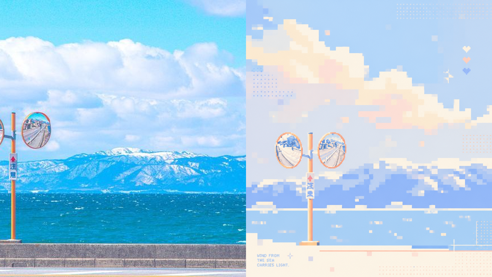
Photos often contain too many details, yet what stays memorable may be just a silhouette, a gesture, a sense of distance, or a patch of color. Panel 106 selects 2–4 visual anchors that define the subject’s identity from the original image, then reconstructs them as a soft, clear pixel memory with geometric order: from a distance, it looks like a refined abstract composition; up close, you can still tell that it is your photo. Works well when Your photo is complex, but you don’t want to lose its identity: Remove secondary objects and trivial structures, keeping only the silhouettes, poses, directions, and color relationships that truly define the image. You want an abstract poster without turning it into unrecognizable decoration: Use a regular grid, hard-edged color blocks, localized dithering, and positive and negative space to let the subject gradually emerge from the abstract order. You like a fresh, soothing look but dislike a cheap candy-like feel: Recompose a soft, bright limited palette from the original image, using colors such as creamy white, peach pink, milky blue, and mint green for a sweet but balanced result. You need flexible delivery in a consistent style: Supports top-and-bottom comparisons, side-by-side comparisons, pure designs, multiple aspect ratios, four-device wallpapers, and batch processing of image folders. What it solves for you It does not simply shrink the photo, apply a filter, or pixelate each object individually. Instead, it reorganizes the visual memory directly from the original image in a single pass. The 2–4 anchors work together to form one single-focus image, rather than being split into cards, grids, or a collage wall. Comparison mode always has exactly two 50:50 areas: top-and-bottom places the original image on top and the design below; side-by-side places the original on the left and the design on the right, with no extra third strip. Get started quickly Use XXD Panel 106 to process this image for me, starting by recommending the most suitable composition and size.
Related Skills
View all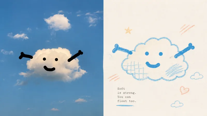 Image
Imagexiaoxiaodong P116 | Doodle
Some photos are truly moving not because of how much information they contain, but because of a single subject, a particular pose, a few colors, and the emotion captured in the image. Panel 116 keeps the real photo in the upper half, then translates the lower half into pastel crayon doodles on an extremely light paper surface: coarse-grain outlines, a few soft color blocks, minimal symbols, and small-scale subjects that leave room to breathe. Ideal for these situations You want to preserve the photo’s identity and natural texture while creating a lighter poster that feels more like an art publication. You don’t want to trace every object, create a realistic redraw, or fill the background with details. You only want to retain the core subject, relationships, and visual memories. You like bright, soothing pastel colors but don’t want anything gloomy, low-contrast, fluorescent, or cheaply candy-colored. You need the same style to produce consistent results across top-and-bottom layouts, left-and-right layouts, pure designs, multiple aspect ratios, four-end wallpapers, or catalog batch processing. What it solves for you It removes secondary information from complex photos so the subject isn’t overwhelmed by details and decoration. It uses clear colored lines and a light paper background to maintain recognizability and keep the subject from blending into the background. It ensures the split composition contains exactly two 50:50 regions, with no title strip, bottom bar, or third section. Each image is generated directly from the current original in a single pass, without sending samples, intermediate results, or work from other Panels back into the model.
 Image
ImageXiaodong x Paper Collage P077
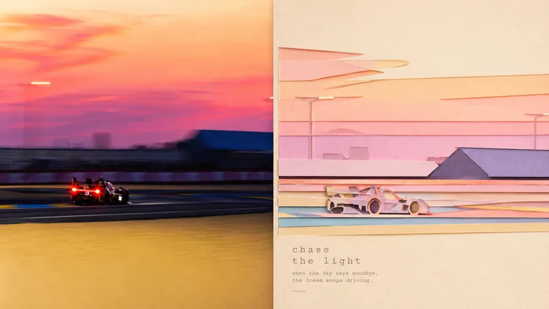
Panel 077 distills the subject, character movement, contour structure, and scene relationships into a paper-cut collage: crisp cut-paper outlines, layered foreground and background shapes, subtle paper grain, cut edges, and soft shadows work together to create a sense of space. The background is deliberately simplified, while pastel colors are remixed from the most vibrant and emotionally resonant parts of the photo. The result feels more like a high-end travel magazine or independent art publication than a collage of cartoon stickers. Great for these situations Want to turn travel photos into paper-art publications: Not by simply shrinking the photo, but by reorganizing the relationship between the subject and the scene. Need a flat design with convincing depth: Cut-paper edges, layered elements, and soft shadows create a tactile feel without heavy plastic-like 3D. Prefer something soft, bright, and refined: Pastel colors are generated from the original image’s vitality and emotional warmth rather than applying a fixed candy-color palette. Need flexible delivery: Supports top-and-bottom, left-and-right, pure design, multiple aspect ratios, and four-edge wallpapers, along with batch processing for image directories.
 Image
Imagexiaoxiaodong P117 | Fine Line
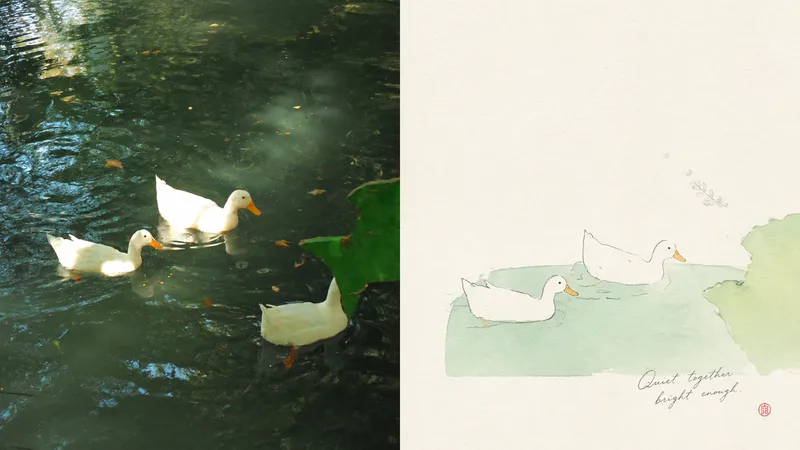
When a photo is cluttered or ordinarily composed but still contains a subject worth keeping, Panel 117 first identifies one core subject, one visual anchor, and one emotional relationship, then re-directs them into a small-scale image made of fine lines, pale colors, paper texture, and light collage. The original photo can remain in the comparison area, while the design area gains an independent expression through generous, intentional negative space. Best for Keeping the original subject recognizable while rearranging its position, scale, direction, and crop. Creating an artistic poster with few elements and a strong theme, without tracing every object or retaining a cluttered background. Using delicate lines, soft pastels, and the breathing quality of paper while avoiding realistic detail and smooth vector styling. Producing the same style in top-and-bottom, side-by-side, design-only, multiple aspect ratios, four-end wallpapers, or catalog batch processing. What it solves for you Selects the truly important visual anchor from complex source material and removes secondary information. Lets negative space shape positive and negative forms, distance, and asymmetrical balance instead of filling the entire canvas. Keeps the comparison image strictly divided into two areas, each occupying 50%, with no third band or inset panel. Generates each output independently from the current original image in a single round, avoiding the re-rendering of intermediate results.
xiaoxiaodong P106: Soft Pixel
By xiaoxiaodong
Description
Recommended by
淡苍
Why we love this skill
Featured for its strict one-pass workflow, source isolation, and precise validation across comparison layouts, pure designs, wallpapers, text, proportions, and PNG output.
Photos often contain too many details, yet what stays memorable may be just a silhouette, a gesture, a sense of distance, or a patch of color. Panel 106 selects 2–4 visual anchors that define the subject’s identity from the original image, then reconstructs them as a soft, clear pixel memory with geometric order: from a distance, it looks like a refined abstract composition; up close, you can still tell that it is your photo. Works well when Your photo is complex, but you don’t want to lose its identity: Remove secondary objects and trivial structures, keeping only the silhouettes, poses, directions, and color relationships that truly define the image. You want an abstract poster without turning it into unrecognizable decoration: Use a regular grid, hard-edged color blocks, localized dithering, and positive and negative space to let the subject gradually emerge from the abstract order. You like a fresh, soothing look but dislike a cheap candy-like feel: Recompose a soft, bright limited palette from the original image, using colors such as creamy white, peach pink, milky blue, and mint green for a sweet but balanced result. You need flexible delivery in a consistent style: Supports top-and-bottom comparisons, side-by-side comparisons, pure designs, multiple aspect ratios, four-device wallpapers, and batch processing of image folders. What it solves for you It does not simply shrink the photo, apply a filter, or pixelate each object individually. Instead, it reorganizes the visual memory directly from the original image in a single pass. The 2–4 anchors work together to form one single-focus image, rather than being split into cards, grids, or a collage wall. Comparison mode always has exactly two 50:50 areas: top-and-bottom places the original image on top and the design below; side-by-side places the original on the left and the design on the right, with no extra third strip. Get started quickly Use XXD Panel 106 to process this image for me, starting by recommending the most suitable composition and size.
Related Skills
View allImagexiaoxiaodong P116 | Doodle
Some photos are truly moving not because of how much information they contain, but because of a single subject, a particular pose, a few colors, and the emotion captured in the image. Panel 116 keeps the real photo in the upper half, then translates the lower half into pastel crayon doodles on an extremely light paper surface: coarse-grain outlines, a few soft color blocks, minimal symbols, and small-scale subjects that leave room to breathe. Ideal for these situations You want to preserve the photo’s identity and natural texture while creating a lighter poster that feels more like an art publication. You don’t want to trace every object, create a realistic redraw, or fill the background with details. You only want to retain the core subject, relationships, and visual memories. You like bright, soothing pastel colors but don’t want anything gloomy, low-contrast, fluorescent, or cheaply candy-colored. You need the same style to produce consistent results across top-and-bottom layouts, left-and-right layouts, pure designs, multiple aspect ratios, four-end wallpapers, or catalog batch processing. What it solves for you It removes secondary information from complex photos so the subject isn’t overwhelmed by details and decoration. It uses clear colored lines and a light paper background to maintain recognizability and keep the subject from blending into the background. It ensures the split composition contains exactly two 50:50 regions, with no title strip, bottom bar, or third section. Each image is generated directly from the current original in a single pass, without sending samples, intermediate results, or work from other Panels back into the model.
ImageXiaodong x Paper Collage P077
Panel 077 distills the subject, character movement, contour structure, and scene relationships into a paper-cut collage: crisp cut-paper outlines, layered foreground and background shapes, subtle paper grain, cut edges, and soft shadows work together to create a sense of space. The background is deliberately simplified, while pastel colors are remixed from the most vibrant and emotionally resonant parts of the photo. The result feels more like a high-end travel magazine or independent art publication than a collage of cartoon stickers. Great for these situations Want to turn travel photos into paper-art publications: Not by simply shrinking the photo, but by reorganizing the relationship between the subject and the scene. Need a flat design with convincing depth: Cut-paper edges, layered elements, and soft shadows create a tactile feel without heavy plastic-like 3D. Prefer something soft, bright, and refined: Pastel colors are generated from the original image’s vitality and emotional warmth rather than applying a fixed candy-color palette. Need flexible delivery: Supports top-and-bottom, left-and-right, pure design, multiple aspect ratios, and four-edge wallpapers, along with batch processing for image directories.
Imagexiaoxiaodong P117 | Fine Line
When a photo is cluttered or ordinarily composed but still contains a subject worth keeping, Panel 117 first identifies one core subject, one visual anchor, and one emotional relationship, then re-directs them into a small-scale image made of fine lines, pale colors, paper texture, and light collage. The original photo can remain in the comparison area, while the design area gains an independent expression through generous, intentional negative space. Best for Keeping the original subject recognizable while rearranging its position, scale, direction, and crop. Creating an artistic poster with few elements and a strong theme, without tracing every object or retaining a cluttered background. Using delicate lines, soft pastels, and the breathing quality of paper while avoiding realistic detail and smooth vector styling. Producing the same style in top-and-bottom, side-by-side, design-only, multiple aspect ratios, four-end wallpapers, or catalog batch processing. What it solves for you Selects the truly important visual anchor from complex source material and removes secondary information. Lets negative space shape positive and negative forms, distance, and asymmetrical balance instead of filling the entire canvas. Keeps the comparison image strictly divided into two areas, each occupying 50%, with no third band or inset panel. Generates each output independently from the current original image in a single round, avoiding the re-rendering of intermediate results.
Find your next favorite skill
Explore more curated AI skills for research, creation, and everyday work.