
No prompts found
TRY SEARCHING FOR SOMETHING ELSE
Try These AI Skills Instead
Discover featured tools that can help you generate amazing content.
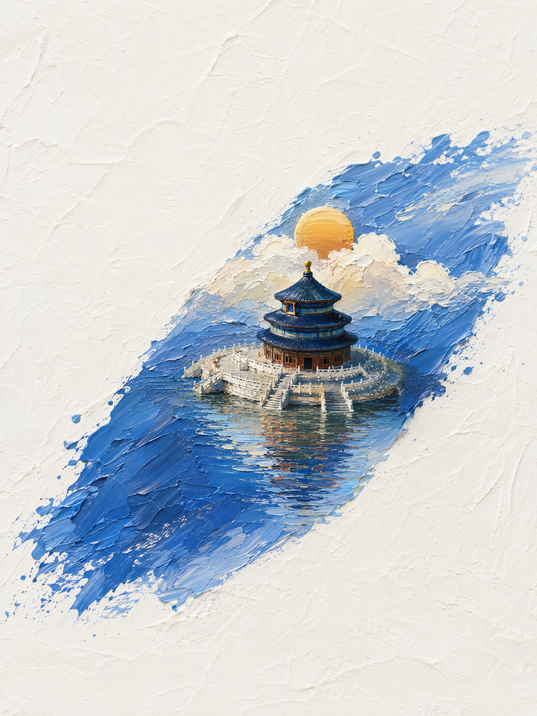
Landmark Oil-Painting Miniatures
Transform one or more landmark buildings into oil-painting-style 3D miniature landscapes with a distinct sense of place. Whether it’s the Temple of Heaven in Beijing, the Eiffel Tower, the Taj Mahal, or another famous structure, each scene is designed around the building’s materials, historical style, and signature colors, with a custom central diagonal brushstroke that brings the architecture to life in three dimensions. The composition uses a minimalist top-down view, thick impasto texture, and a white textured paper background, with generous negative space and clouds, sunlight, surrounding scenery, and water reflections that complement the building’s character. Chinese classical, ancient Roman, modern harbor, and Mughal architecture each receive their own fitting sky and landscape treatment instead of a uniform color scheme. When multiple buildings are provided, each one generates its own vertical 3:4 image, accompanied by a brief explanation in Chinese of the brushstroke colors and stylistic matches. The artwork remains a pure artistic presentation, without text, branding, slogans, or unrelated elements. If no building name has been provided, you’ll first be asked to specify a landmark.

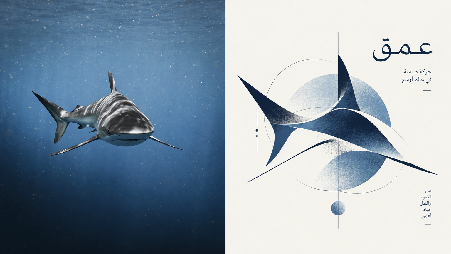
Totem | xiaoxiaodong P304
Turn an ordinary photo into a visual symbol for an art institution or high-end magazine. Compress the photo’s core spirit, subject features, and emotional tone into a standalone abstract logo / icon. Rather than explaining literally, it is built from a few organic forms, circles, rectangles, irregular color blocks, and a single gestural fine line. Organic and geometric forms, order and improvisation coexist, with partial occlusion, misalignment, and cuts allowed. The result may look spontaneous but remains highly controlled. Use one core symbol with precise proportions and generous negative space; set it against soft neutral tones with a single, highly recognizable accent color, such as deep blue, vermilion, forest green, warm orange, or soft pink. Avoid complete human portraits, realistic illustrations, complex scenes, bright childlike colors, technological gradients, and meaningless geometric collages.

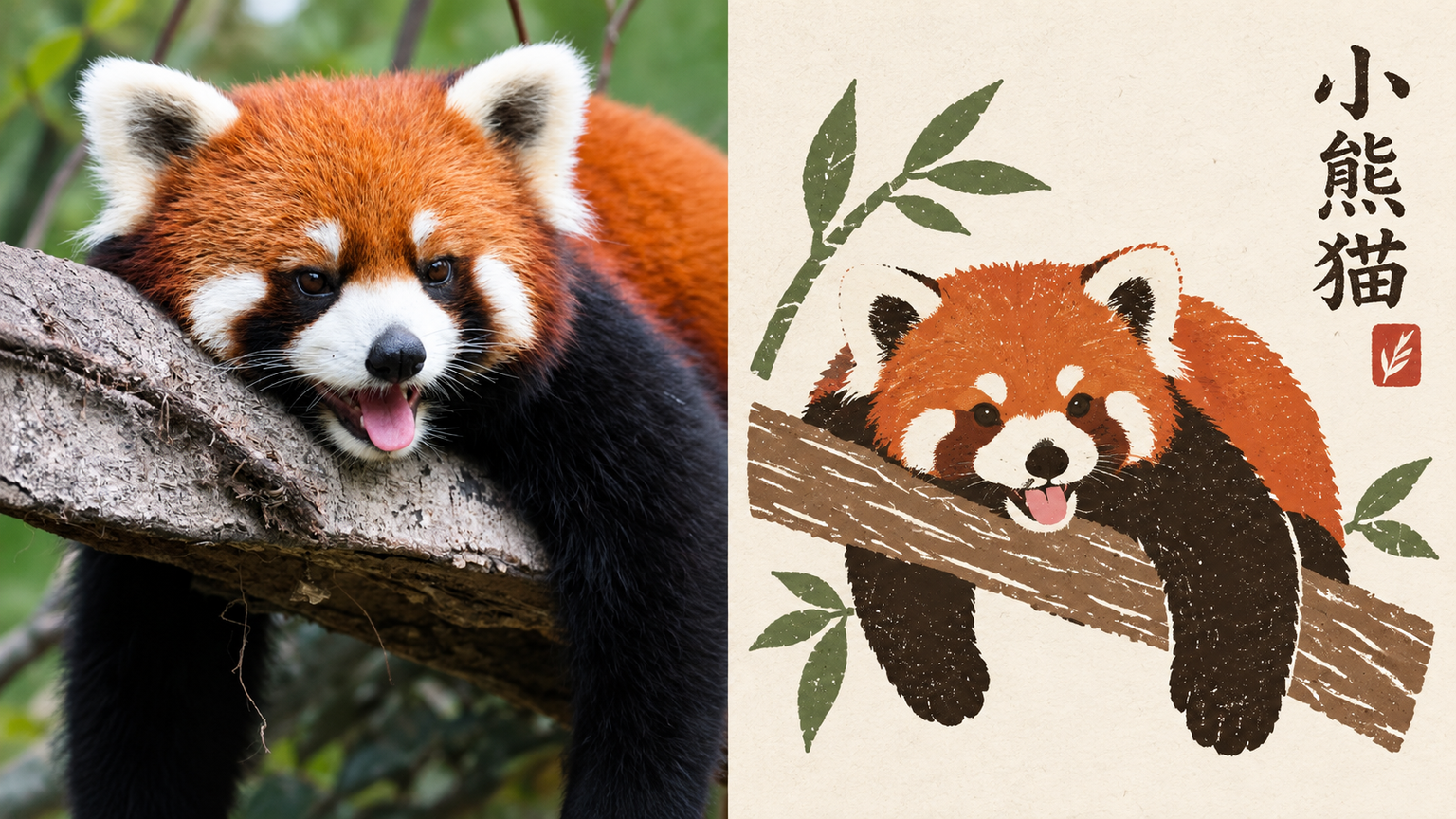
Folk P306 | xiaoxiaodong
Ideal for distilling an ordinary photo into a folk pattern designed to be preserved for a long time. The top half shows the original image; the bottom half uses a paper-cut silhouette, broad areas of flat color, and a few interior carved lines. Forms may overlap slightly, preserving the naive quality of folk motifs. Symbols are small and blank space is abundant, with an off-center layout and paper texture and misregistration along the edges. Text appears as a small note beside a handmade stamp. The palette is simple yet lively: powder blue, off-white, botanical green, coral red, warm yellow, and ochre, with clear visual hierarchy. Avoid complete scenes, smooth vector graphics, commercial cartoon styling, 3D, and a cheap merchandise aesthetic.

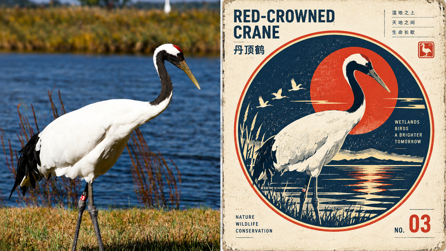
Civ. Emblem | xiaoxiaodong P284
Ideal for turning an ordinary photo into a preserved symbol of civilization. The top half shows the original image; the bottom half places the subject in a stable circular, shield-shaped, or square frame, like a miniature monument. A few orbit lines, a horizon, or a solar arc may be added. The symbol is small in scale but carries monument-like weight. Retain halftone dots, ink spread, and uneven printing. Use a retro-futurist warm-cool contrast: deep space blue against solar yellow, warm red, or orange. Set the lettering in a compact institutional sans-serif. Avoid complete scenes, cinematic sci-fi, 3D, cyberpunk, app logos, and souvenir badges crowded with elements.

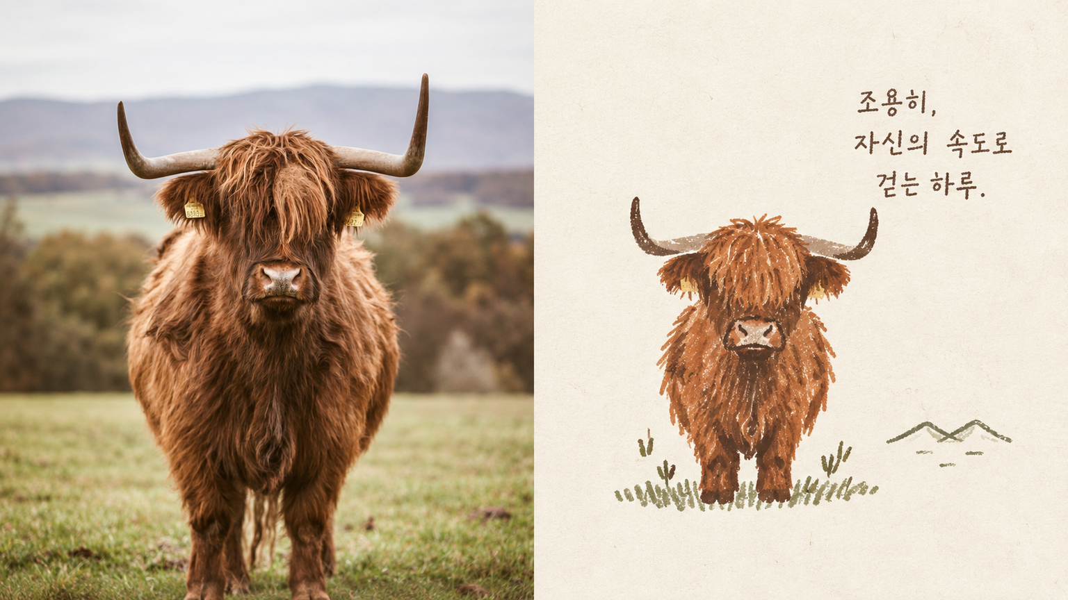
Old Sigil | xiaoxiaodong P290
Ideal for turning an ordinary photo into a warm little totem. The top half shows the original image; the bottom half uses an uneven, slightly shaky hand-drawn outline with limited flat color, along with the imperfections of old printing: ink bleed, misregistration, and visible paper fibers. The symbol is small, with generous blank space preserving a touch of loneliness, while the text resembles a handwritten collection number. The palette is a limited, warm vintage selection: faded orange, washed blue, olive green, warm off-white, ink black, and soft red. Avoid full illustrations, commercial logos, standard mascots, smooth vector graphics, and 3D.

Social Ranking Card Maker
This Skill turns a topic into ranking graphics with clear comparison angles and reasons behind each rank. Enter a theme such as “childhood snacks,” “hot pot,” or “cities known for street food.” You can also specify the TOP count, visual style, and sorting criteria. The Skill first identifies a worthwhile comparison, organizes the list and supporting rationale, then creates the cards with 1 recommended title, 2 alternate titles, a description, and tags. Visual style and layout adapt to the topic; long rankings are split into cards for easier phone reading. You can also preview the topic direction or text first. The example is “National Childhood Snacks TOP10”: cute hand-drawn cards ask, “Where does your number one rank?” to invite readers to compare their childhood favorites. Subjective recommendations explain the criteria; data-based rankings retain the source, reporting period, and unit. For creators making Xiaohongshu and general social graphics. The runtime environment must support the relevant search and image-generation capabilities. A complete local Codex example is currently available; YouMind-side operation still needs testing. Layered illustration source files are not included.

Common Questions
Ready to create with
YouMind?
Turn these prompts into images with the models available in YouMind.
LET YOUR IMAGINATION SOAR